Rust Color Palette — Rust Dusk
A warm five-color scheme led by deep rust, balanced with soft clay, oatmeal, and a smoky teal accent — every color matched to real paint you can buy.
By Maya Patel · Reviews Editor & Product Tester
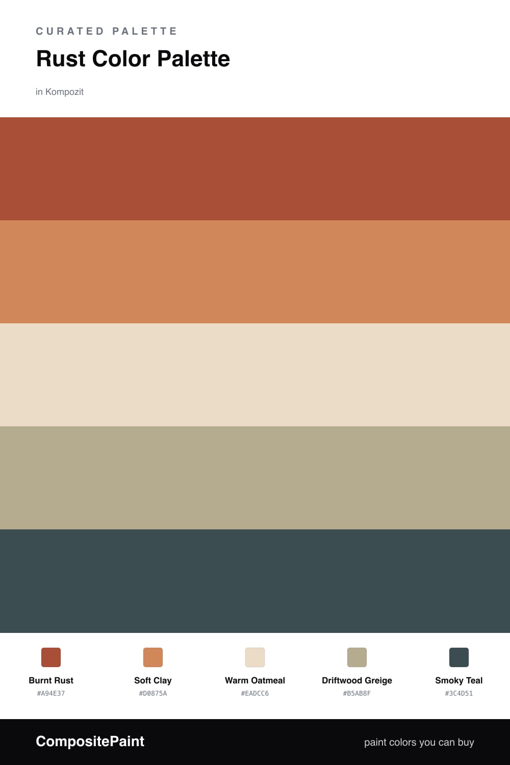
Rust is having a real moment in 2026, and this scheme leans all the way in. Burnt Rust does the heavy lifting here, a deep terracotta that feels closer to a fired clay pot than a bright orange. It is the kind of color that makes a wall feel intentional.
Around it I kept things soft and warm. Soft Clay is a lighter echo of the lead, Warm Oatmeal opens the space back up, and Driftwood Greige quietly ties the warm tones to the cooler ones. None of these fight the rust, they just give it room to breathe.
The move that makes this palette modern is the Smoky Teal accent. A muted, dusky green-blue is the one cool note in an otherwise warm room, and a little goes a long way. Use it on a single door or a small built-in and let the rust stay in charge.
Buy These Colors
Each color matched to the closest real paint in every brand, by ΔE2000. Kompozit first; take any SKU to the store — these mix on demand.
Questions
Rust reads warm and grounded, so it carries a room without feeling heavy. Pairing it with lighter clay and oatmeal keeps it from going too dark, and the teal accent stops the whole scheme from feeling flat.
Let rust take roughly two-thirds of the visible color, push the clay and neutrals into the supporting role, and save the smoky teal for one small moment like a door or a piece of trim.
Similar Palettes
Closest schemes by color — not by label.