CP

Brown Color Palette — Brown Velvet

A warm five-color brown scheme built on a velvety cocoa, layered with caramel, soft beige, and a single brass accent — every color matched to real paint you can buy.

By Jessica Williams · Color Stylist & Interior Editor

Velvet Cocoa
Dominant
Kompozit Film Noir · 0144
#473933
LRV 5
Warm Caramel
Secondary
Kompozit Golden Glove · 0171
#9E7551
LRV 21
Soft Oat
Base
Kompozit White Elephant · 0223
#E3DBC8
LRV 71
Mushroom Taupe
Support
Kompozit Sedge · 0226
#B1A591
LRV 38
Antique Brass
Accent
Kompozit Bugle Boy · 0899
#BB8F4F
LRV 31
View palette in

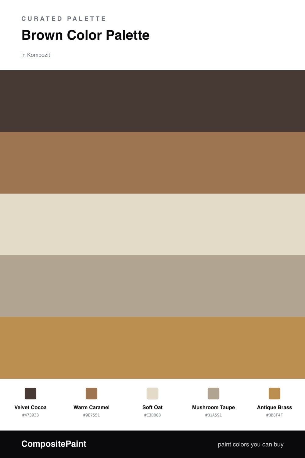
Brown is having a real moment in 2026, and this scheme leans all the way into it. The star is Velvet Cocoa, a deep, soft brown that feels less like dirt and more like a suede sofa you want to sink into. It carries the whole room.

Warm Caramel steps in as the second voice, glowing where the light hits it, while Soft Oat and Mushroom Taupe keep everything calm and breathable so the darker tones never close in. Think of them as the quiet space around the richness.

Then there is Antique Brass — just a whisper of it. Use it on a lamp, a frame, or a single hardware run. That one warm glint is what makes the whole brown story feel intentional and a little bit luxe.

Buy These Colors

Each color matched to the closest real paint in every brand, by ΔE2000. Kompozit first; take any SKU to the store — these mix on demand.

Velvet Cocoa
#4A382C · LRV 4 · Dominant
Kompozit Film Noir · 0144 ΔE 3.37
Backdrop After Hours · BD-AH ΔE 13.68
Behr Chocolate Coco · S-G-760 ΔE 3.09
Benjamin Moore Tarpley Brown · CW-170 ΔE 2.11
Clare Blackish · PNT100-DP-54 ΔE 10.48
Dunn-Edwards Black · DEA187 ΔE 10.13
Farrow & Ball Pitch Black · No. 256 ΔE 9.39
Magnolia Home Moments · JG-150 ΔE 5.62
PPG / Glidden Black Magic · 1001-7 ΔE 10.24
Sherwin-Williams Turkish Coffee · SW 6076 ΔE 2.26
Valspar Deep Earth · 6010-2 ΔE 2.66
Warm Caramel
#9C6F47 · LRV 19 · Secondary
Kompozit Golden Glove · 0171 ΔE 2.43
Backdrop Old Soul · BD-OS ΔE 16.53
Behr Olympic Bronze · PPU4-17 ΔE 1.64
Benjamin Moore Runyon Canyon Tan · 1140 ΔE 1.12
Clare Big Apple · PNT100-DP-30 ΔE 16.1
Dunn-Edwards Autumn Bark · DEA164 ΔE 0.34
Farrow & Ball Picture Gallery Red · No. 42 ΔE 13.75
Magnolia Home Remote Trail · JG-165 ΔE 10.48
PPG / Glidden Apple Butter · 15-02 ΔE 1.34
Sherwin-Williams Renwick Golden Oak · SW 2824 ΔE 2.75
Valspar Chestnut Beach · 3002-7A ΔE 2.61
Soft Oat
#E6DBC7 · LRV 72 · Base
Kompozit White Elephant · 0223 ΔE 1.36
Backdrop Cookies & Cream · BD-CC ΔE 2.07
Behr Ivory Paper · MQ3-12 ΔE 0.9
Benjamin Moore Lambskin · 1051 ΔE 0.55
Clare Greenish · PNT100-LT-68 ΔE 4.17
Dunn-Edwards Cream Wave · DE6198 ΔE 0.95
Farrow & Ball Lime White · No. 1 ΔE 0.95
Magnolia Home Morning Snow · JG-167 ΔE 0.9
PPG / Glidden Almond Paste · 1103-2 ΔE 1.06
Sherwin-Williams Antique White · SW 6119 ΔE 0.76
Valspar Natural Soap · T559 ΔE 0.48
Mushroom Taupe
#B7A48C · LRV 39 · Support
Kompozit Sedge · 0226 ΔE 3.05
Backdrop Carry the Two · BD-CT ΔE 4.59
Behr Sierra · N240-4 ΔE 1.22
Benjamin Moore Interlude · AF-135 ΔE 1.43
Clare Subrosa · PNT100-MD-76 ΔE 13.33
Dunn-Edwards Desert Gray · DEC760 ΔE 1.74
Farrow & Ball London Stone · No. 6 ΔE 1.68
Magnolia Home Juniper Tree · JG-166 ΔE 5.54
PPG / Glidden Antelope · 15-09 ΔE 1.41
Sherwin-Williams Outerbanks · SW 7534 ΔE 0.4
Valspar Puppy Love · V131-4 ΔE 3.06
Antique Brass
#C2924A · LRV 33 · Accent
Kompozit Bugle Boy · 0899 ΔE 1.96
Backdrop Anita · BD-AN ΔE 14.68
Behr Burnt Pumpkin · M250-5 ΔE 3
Benjamin Moore French Horn · 195 ΔE 2.12
Clare Good as Gold · PNT100-DP-59 ΔE 5.42
Dunn-Edwards Maple Syrup · DE5362 ΔE 2.26
Farrow & Ball India Yellow · No. 66 ΔE 3.57
Magnolia Home Vintage Crown · JG-152 ΔE 8.41
PPG / Glidden Amaretto Sours · 1106-6 ΔE 2.65
Sherwin-Williams Different Gold · SW 6396 ΔE 2
Valspar Creole Mustard · V092-4 ΔE 1.13

Questions

Why do these browns work together?

They all share a warm, slightly red undertone, so they read as one family rather than a clash. Going from deep cocoa to pale oat gives you depth without ever feeling muddy.

How do I keep an all-brown room from feeling flat?

Lean on contrast in lightness, not in color. Let the deep Velvet Cocoa anchor the space, keep the oat and taupe light and airy, and use the brass only in small doses to catch the light.

Similar Palettes

Closest schemes by color — not by label.