Thermal
The near-black teal Behr sells across five different product lines, reviewed honestly: the light it needs to show any color at all, and the rooms where it just goes flat black.

Jessica has spec'd whites and neutrals for more than 300 rooms and keeps a sample wall of painted drawdowns in her studio. Every color review is checked against real reader rooms in the comments and re-tested when a formula changes. About the testing process →
- 1Thermal7
- 2Hidden Gem14
- 3Van Courtland Blue31
The Fast Verdict
Thermal is Behr's deep blue-green at LRV 7 — dark enough to read almost black the moment the light drops, dramatic enough to earn its name when direct sun finds it. It is not a color for a dim room hoping for a little personality; it is a color for a room with a real light plan, where it pays that plan back with a genuine teal-navy nobody else's living room has.
A bedroom or den with real daylight or good lamps · a kitchen island or cabinet run under task lighting · a front door with strong porch light · anyone who wants blue-green, not another safe navy
Your room only gets overhead can light · you're painting the whole kitchen, not just the island · your floors are honey oak wall-to-wall · you want the color to read the same at every hour
- Genuine blue-green, not another safe navy or generic black
- Sold across five Behr product lines — walls, cabinets and doors, and exterior, all in one color
- Deep enough (LRV 7) to hold its own as a whole small-room commitment
- Reads differently through the day — green in sun, blue-navy in shade — without ever going warm or purple
- Excellent on an island, a front door, or interior doors where a little color goes a long way
- Goes essentially black in dim rooms or under a single overhead can
- Not a whole-kitchen color unless every surface gets real light
- Fights honey oak and other golden wood tones
- The color you get depends on the hour and the bulb more than most paints admit
What Color Is Thermal, Really?
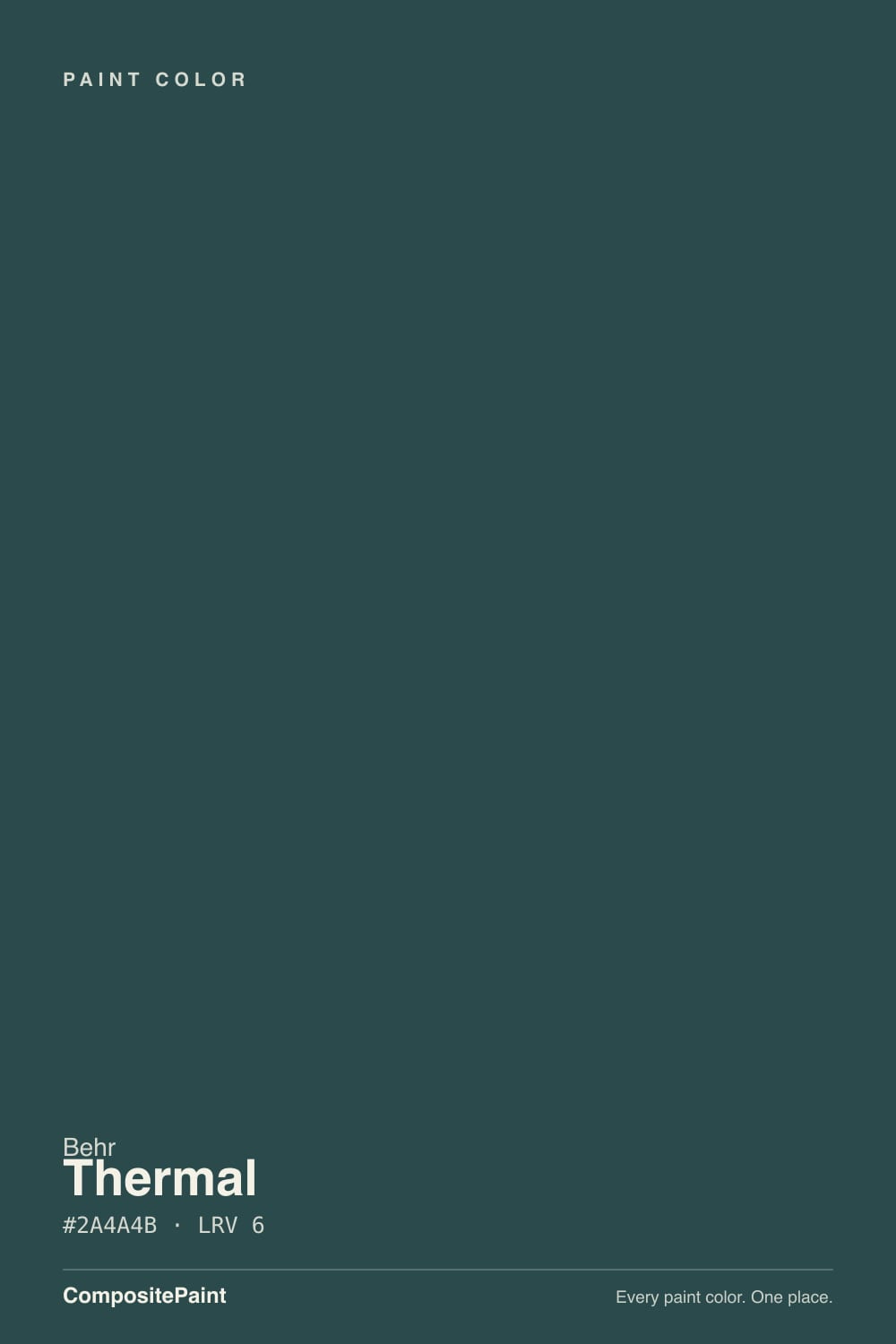
A deep blue-green with a shadowy gray base — Behr's own color page files it as a saturated teal-navy, and the balance between the blue and the green is close enough that which one you see depends almost entirely on the light in front of you. In direct sun the green comes forward and it reads like a dark forest teal; pull the sun away and the blue takes over, pushing it toward navy. Both readings are honestly the same paint.
At LRV 7, Thermal sits in true near-black territory — the same depth bracket as Sherwin-Williams Tricorn Black and Benjamin Moore Wrought Iron, just with color hiding inside the darkness instead of true neutral. That is the whole trade this color makes: in flat or dim light, there is not enough reflected light left for your eye to separate blue from green from black, and the wall simply reads as a very dark, slightly cool black. Give it a window or a real fixture and the color reappears.
Undertone in one line: blue-green, gray-based, genuinely torn between navy and teal depending on the light — never warm, never purple. Behr sells it under one plain name, Thermal, across its Premium, Premium Plus, Marquee, and Ultra lines in interior wall, cabinet-and-door, and exterior formulas, which tells you the color was built to work as a whole small-project color, not just a wall accent.
Where It Shines
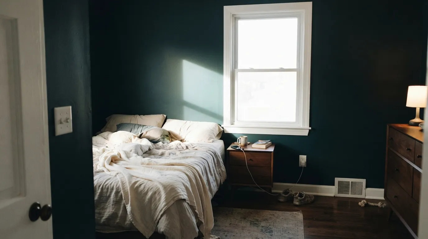
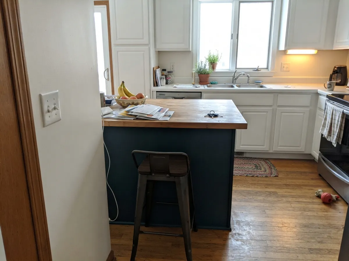
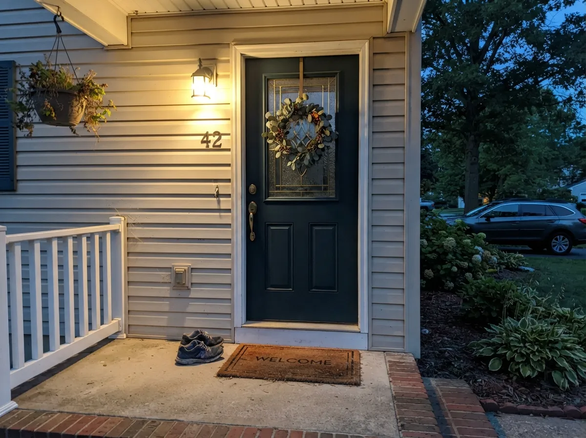
Put real light on it and Thermal earns the drama it promises. A bedroom or den with a window that actually sees the sun, or a lamp-lit reading corner, is where the teal comes forward and the room feels enveloping instead of just dark. Its other natural home is the small, contained commitment Behr itself sells it for: a kitchen island, a cabinet run, an interior door, or a front door with a porch light doing real work after dark. In every one of those spots it reads as a deliberate, expensive-looking dark color rather than a plain black stand-in.
Where It Fails
Almost every disappointed story about Thermal comes down to one of three predictable setups, and all three show up before the first coat dries. None of them are the paint's fault — Behr is honest that this color needs light to work — but if your room matches one, sample it big before you commit to four walls.
In low light the blue in Thermal takes over and the color can genuinely look black — Behr's own guidance says so. Buy this color expecting an obvious teal in a dim room and you'll get a flat, moody black wall instead. The paint isn't wrong; the light plan is missing. Add a lamp with a warm bulb before you decide the color failed.
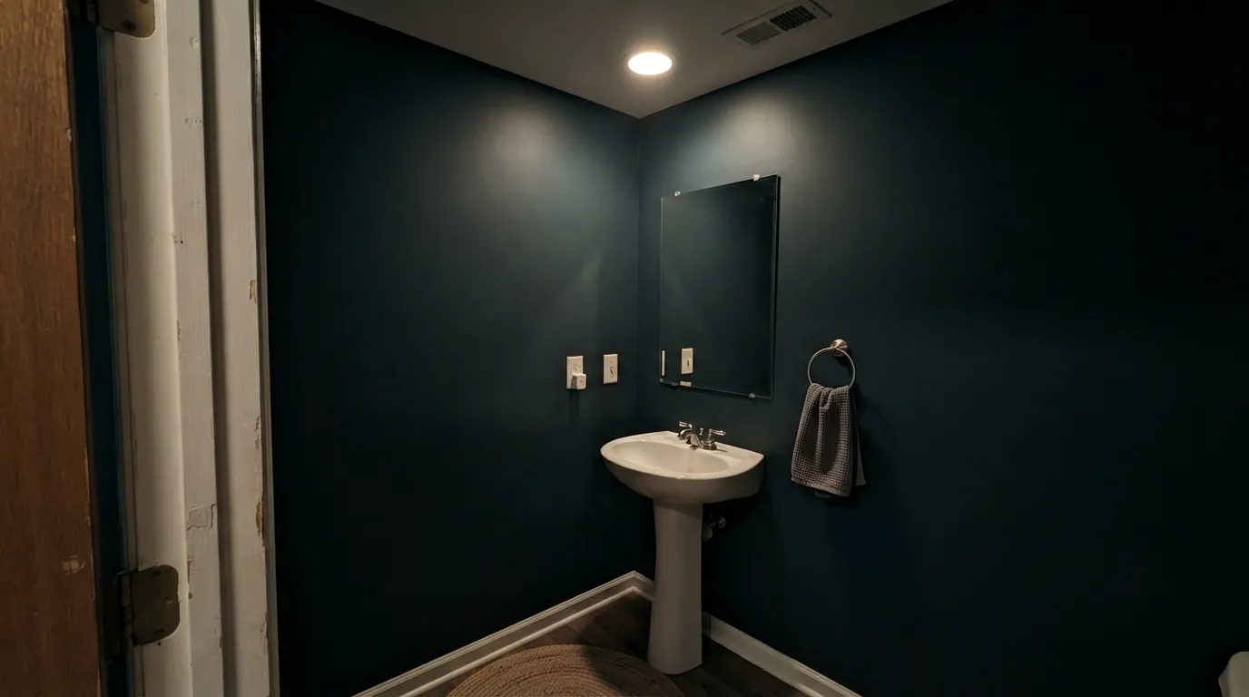
LRV 7 already swallows most of the light that hits it; in a small interior bath lit by a single overhead can, there isn't enough bounce left for the eye to find any color at all. This is Thermal's best small-room job when it's done right — but it needs a real vanity fixture at eye level, ideally warm white, or the drama collapses into plain dark.
Blue-green sits close to the opposite side of the wheel from warm honey-orange wood, and against a room full of golden oak trim or flooring, the wood reads more orange while the wall reads muddier instead of richly teal. Walnut, espresso, or painted white oak are the safer floor partners; if the golden wood is staying, keep Thermal to a door or an island, not the whole room.
Room by Room
A window with real daylight or a pair of warm lamps is what turns this from a dark box into a genuine teal-navy retreat. Matte or eggshell on the walls; keep the trim a warm white so the contrast does the work.
A closed, lamp-lit room built for focus is exactly the setting Thermal wants. Pair it with walnut shelving or a leather chair and it reads considered, not just dark.
Behr sells Thermal specifically in a cabinet-and-door formula, and that is its strongest kitchen job: one island or a run of lower cabinets under task lighting, with white or warm-white walls and uppers around it. A full kitchen of Thermal walls fights its own light-hungry nature.
Small rooms take deep color well, and a powder room is short enough to get consistent light from one good sconce or vanity light. Skip it if the only light source is a single overhead can — see the fails section above.
Available in Behr's exterior-rated Ultra line, so it's built for the job. A porch light that actually reaches the door at night keeps the color from vanishing into black after dark; in daylight, full sun pulls the green forward against a light-colored house.
Beautiful as a closed, evening-lit room; risky in an open floor plan where it has to hold its own against whatever light and color the adjacent kitchen or hallway is throwing at it. Test it at the darkest hour you'll actually be in the room, not just at noon.
Your Light Is the Risk
Full sun on the wall pulls the green forward and the color reads as a genuine dark teal, not black. The light this color was made to show off in.
With little light bouncing back, blue and green collapse into each other and the wall reads flat near-black. Test with the lights you'll actually use, not showroom lighting.
Green comes forward at midday sun, blue takes over as the light fades toward evening. The same wall genuinely looks like two different colors across one day.
Warm 2700K bulbs keep some blue-green alive after dark; cool white LEDs flatten it toward plain black. Pick bulbs deliberately if you want the color to survive after sunset.
Most complaints about Thermal are a light mismatch. Upload a photo of your actual room and see it on your walls — then ask for the same wall in north light or evening lamps before you buy a single sample.
Need It From Another Brand?
Any paint counter can custom-tint Behr S440-7 directly. If you would rather stay in one brand's own deck, these are the closest stock matches, measured as ΔE2000. Under 2 is a difference you will not see on the wall.
| Brand | Closest color | ΔE | LRV | |
|---|---|---|---|---|
| Sherwin-Williams | TarragonSW 9660 · Sherwin-Williams | 3.3 | 7 | Color page → |
| Benjamin Moore | Lead Gray2131-30 · Benjamin Moore | 3.2 | 7 | Color page → |
| Valspar | Slate Court5001-4C · Valspar | 2.2 | 7 | Color page → |
| PPG / Glidden | Night WatchPPG1145-7 · PPG / Glidden | 3.1 | 7 | Color page → |
| Glidden | Night WatchPPG1145-7 · Glidden | 2.4 | 7 | Color page → |
| Dutch Boy | Shaded Forest427-7DB · Dutch Boy | 1.8 | 7 | Color page → |
Similar Behr Colors
The nearest shades to Thermal within Behr's own range, ranked by perceptual color distance — useful when you want the same look a touch lighter, darker, or warmer.
WCAG 2.1: AA is 4.5 : 1 for normal text, 3 : 1 for large text, AAA is 7 : 1.
Thermal vs the Colors You're Also Considering
Every Thermal sample board has the same rivals on it. The numbers show the real lightness gap — then it comes down to which risk you would rather live with.
Pick this if you want blue in the mix — Thermal shows real teal-blue in daylight where Black Evergreen only ever shows green.
Behr MQ6-44 · LRV 8Black EvergreenPick this if you want the near-black instinct with no blue at all — Black Evergreen stays a mossy gray-green in every light, even under lamps.
Pick this for the green edge — Thermal is the more balanced blue-green of the two and reads less like a plain navy.
Behr HDC-CL-28 · LRV 7Nocturne BluePick this if you want the blue to win outright — Nocturne Blue reads navy-teal with almost no green, even in bright sun.
Pick this for the same deep blue-green mood at a fraction of the price, mixed same-day at any Behr dealer.
Farrow & Ball No. 30 · LRV 6Hague BluePick this if premium British paint isn't a budget concern and you want the color the design world already knows by name.
Pick this for the cooler, more contemporary blue-green — Thermal reads modern-moody where Narragansett Green reads heritage.
Benjamin Moore HC-157 · LRV 8Narragansett GreenPick this for a warmer, more historic green — Narragansett Green leans brown-green, a Colonial color instead of a modern one.
Inside the Behr deck, Dark As Night 720F-7 (#304749, LRV 6) is the closest sibling. It is a shade lighter and grayer, so it reads slightly less teal. Hidden Forest ECC-51-3 (#324D47, LRV 6) pushes green and Sled 750F-6 (#324450, LRV 5) pushes blue, so the two bracket Thermal on either side of the hue.
Across brands, Benjamin Moore Miramichi CC-752 (#30484A, LRV 7) has a deltaE of 2.55 against Thermal. That is very close, but sample first. Sherwin-Williams Westhaven SW 9675 (#2A4442, LRV 5) at 2.66 and Dunn-Edwards Deep Pine DEA180 (#254A47, LRV 5) at 2.8 land in the same band and both lean a little greener.
Glidden Dark Hunter Green 30GG 06/113 (#354C46, LRV 6) at 4.2 and Valspar Peacock House 5010-4 (#2C4841, LRV 5.5) at 4.31 are close but visibly different side by side, each carrying more green than Thermal does.
Thermal Coordinating Colors
The rule for coordinating with Thermal is simple: give it a light or warm-white partner to bounce light back into the room, and keep golden wood tones at arm's length. Here are the partners that keep it reading as color instead of collapsing it toward black:
One Color, Five Product Lines
Thermal isn't sold as a single niche wall color — Behr offers it across Premium, Premium Plus, Marquee, and Ultra, in interior wall formulas, a dedicated cabinet-door-and-trim enamel, and an exterior-rated line, in sheens from flat through gloss. That spread matters more than it sounds: it means the same exact color can run from a bedroom wall to a kitchen island to a front door without ever leaving Behr's own catalog or guessing at a cross-brand match.
It also explains why the color behaves so consistently across the surfaces reviewers describe it on — a matte bedroom wall, a satin cabinet, a semi-gloss door — the pigment is the same, only the sheen and the light hitting it changes what you see.
Thermal With Wood Tones and Metals
Dark, cool-based woods are this color's best company: walnut, espresso, and ebonized oak all deepen the mood instead of fighting it. Pale, gray-washed or white oak is a safe, more contemporary partner that keeps the room from feeling heavy.
The one wood to test carefully is honey or golden oak — its warm orange lean sits close to the opposite side of the wheel from Thermal's blue-green, and large expanses of both together tend to make each other look worse rather than better. For metals, unlacquered brass and matte black both read intentional against it; polished chrome is the only finish that comes across a little cold by comparison.
Three Ready Palettes Built on Thermal
A color is never alone on the wall. These are complete combinations in the 60-30-10 pattern, with the reason each one holds together. Every one opens in the visualizer.
A warm white trim keeps the teal from tipping into flat black at the edges, and a warm beige just outside the door gives the eye a soft landing between the dark bedroom and the rest of the house.
Try this palette in your roomOne dark island against light perimeter cabinets is the classic way to spend a color this deep in a working kitchen: it gets full daylight from every side, so the teal reads clearly instead of collapsing into black.
Try this palette in your roomA bright white body lets the door carry all the color, and near-black shutters keep the palette from reading as three unrelated darks and lights — the door stays the one note of blue-green in an otherwise crisp exterior.
Try this palette in your roomThermal FAQ
Is Behr Thermal blue or green?
Both, and which one you see depends on the light. Direct sun pulls the green forward into a dark teal; dimmer or artificial light lets the blue take over and it drifts toward navy. It never reads warm and never reads purple — the shift is only between blue and green.
Will Thermal just look black in my room?
At LRV 7 it can, if the room doesn't get real light. Behr itself notes it can look nearly black in low light. Sample it at the darkest hour you'll actually use the room in, with the lamps you'll actually use, before committing to four walls.
Is it good for kitchen cabinets?
Yes — Behr sells it specifically in a cabinet-and-door formula. It works best as an island or a lower-cabinet run against lighter perimeter cabinets and walls, not as the color for every cabinet in the room.
What trim white goes with Thermal walls?
A warm white like Behr Swiss Coffee keeps the edges soft; a brighter white like Behr Polar Bear or Behr White gives a crisper, more modern contrast. Either works — the wrong move is a dingy off-white that muddies the line between wall and trim.
Does it work on a front door?
Yes, and Behr sells it in an exterior-rated exterior line for exactly this. Pair it with a lighter house color so the door reads as the intentional dark note, and make sure the porch light actually reaches it — otherwise the color disappears after dark.
Does Thermal work with honey oak floors?
Not its best pairing. Blue-green sits close to the opposite side of the color wheel from warm honey-orange wood, so a room full of golden oak tends to push both the floor and the wall the wrong way. Walnut, espresso, or painted white oak are safer; keep Thermal to a door or an island if the golden floor is staying.
Have you painted with Thermal?
Rate it — one tap helps the next reader decide.
Ask a Question