Narragansett Green
A near-black historical green reviewed honestly: the light where it finally reads green, the rooms where it just reads black, and what to pick instead.

Jessica has spec'd whites and neutrals for more than 300 rooms and keeps a sample wall of painted drawdowns in her studio. Every color review is checked against real reader rooms in the comments and re-tested when a formula changes. About the testing process →
- 1Deep Space3
- 2Narragansett Green8
- 3Hidden Gem14
- 4Van Courtland Blue31
The Fast Verdict
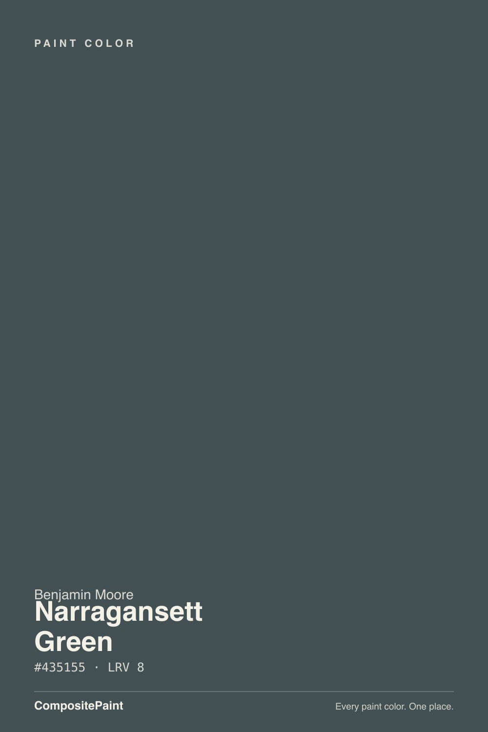
Narragansett Green is what green looked like when colonial-era pigments ran dark: a blue-gray-black with just enough green underneath to earn the name — but only in real light. At LRV 8 it sits at true-black depth, and it behaves like a true black almost everywhere except full sun and close range. Buy it because you want a quiet, historically correct dark accent, not because you want a color that reads green from the sidewalk.
Front doors and shutters on colonial, farmhouse or Cape-style exteriors · kitchen islands under real daylight or task lighting · powder rooms and mudrooms that can go dark and moody · anyone who wants a documented Historical Collection color instead of a trend
You want a color that reads clearly green from across the yard · the room only gets indirect or dim light · you're pairing it with true-black hardware and expecting the two to match · you want a color the internet is currently talking about
- A documented Historical Collection color, not a trend chasing color
- Reads convincingly green in real daylight, not just black with a name
- The correct, period-appropriate choice for colonial and farmhouse doors and shutters
- Deep enough (LRV 8) to hide dirt, fingerprints and weather staining on a door
- Pairs effortlessly with brass, warm whites and true grays
- Reads flat black in dim light or from a distance — the green is easy to miss
- Too dark and heavy for full walls or whole-house exteriors
- Visually clashes with true-black hardware in bright light
- Depth needs a big sample — a paint chip does not show what the wall will do
What Color Is Narragansett Green, Really?
Narragansett Green is one of Benjamin Moore's HC-prefixed Historical Collection colors — a line built from documented paint research on 18th- and 19th-century American buildings, named for the New England shutter-and-door tradition rather than for any current trend. Deep, saturated near-black colors were common on colonial-era trim, partly because the pigments available at the time (verdigris, lampblack, iron oxides) naturally landed dark. Narragansett Green, named for the bay in Rhode Island, is the site's answer for a period-correct dark green on a colonial or farmhouse exterior.
The undertone is cooler and grayer than most greens sold as "hunter" or "forest": a blue-gray-green that our own color engine actually files under gray, not green, because at this depth the hue reads closer to slate than to grass. At LRV 8 it sits in the same near-black band as Benjamin Moore's other deep neutrals — Wrought Iron, Kendall Charcoal — and it shares their core behavior: color needs light to show up, and this color gets very little light to work with.
Undertone in one line: blue-gray first, green a distant second — never warm, never true black. Compared with Essex Green, Benjamin Moore's other near-black exterior classic, Narragansett Green leans cooler and quieter; Essex Green pushes warmer and reads more obviously green at the same depth.
Where It Shines
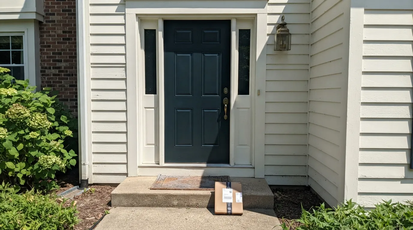
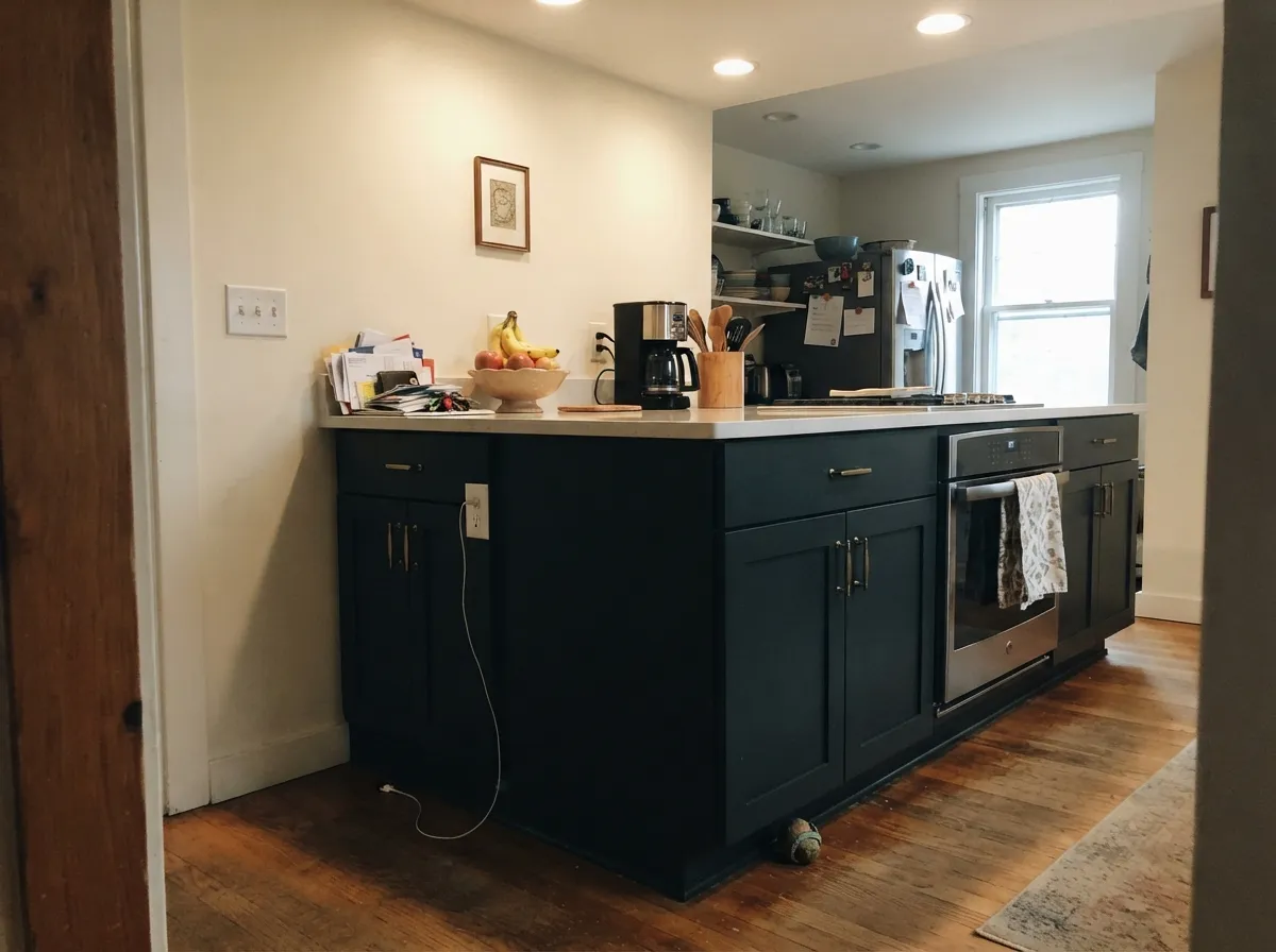
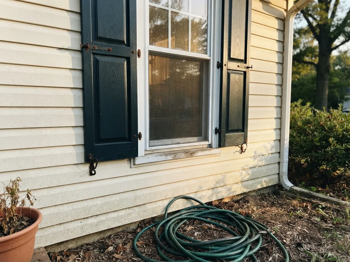
This color earns its keep on small, well-lit surfaces: a front door in real sun, an island under kitchen can lights, a pair of shutters that catch afternoon side light. Give it direct light and a close look and the green comes forward — deep, cool, genuinely handsome next to brass and warm white trim. It is a color for people restoring or building a colonial-style house who want the documented, period-correct choice rather than whatever green is trending this year.
Where It Fails
Almost every disappointed review of Narragansett Green comes from one of three situations, and all three are predictable before the first coat. None of them are the paint's fault — but if your situation matches one, this is not your color, and a bigger sample will only confirm the problem.
At a glance, and from any real distance, this reads black or near-black. The green only shows in strong direct sun or up close against the sheen. If you want a green that announces itself even in average light, look at Essex Green or Rosemary — both push warmer and read more clearly green at the same near-black depth.
LRV 8 needs help from real light. A windowless powder room or a north hallway with no lamp turns this into a flat black hole rather than a color. Add a sconce or real daylight, or pick a lighter, easier color for that specific room.
A matte-black lantern, house numbers or hinges against a Narragansett Green door look like a mismatch rather than a coordinated pair — the cool blue-green and the true neutral black argue with each other in bright light. Pick one: black hardware with an actual black door, or warm brass and oil-rubbed bronze with this green.
Room by Room
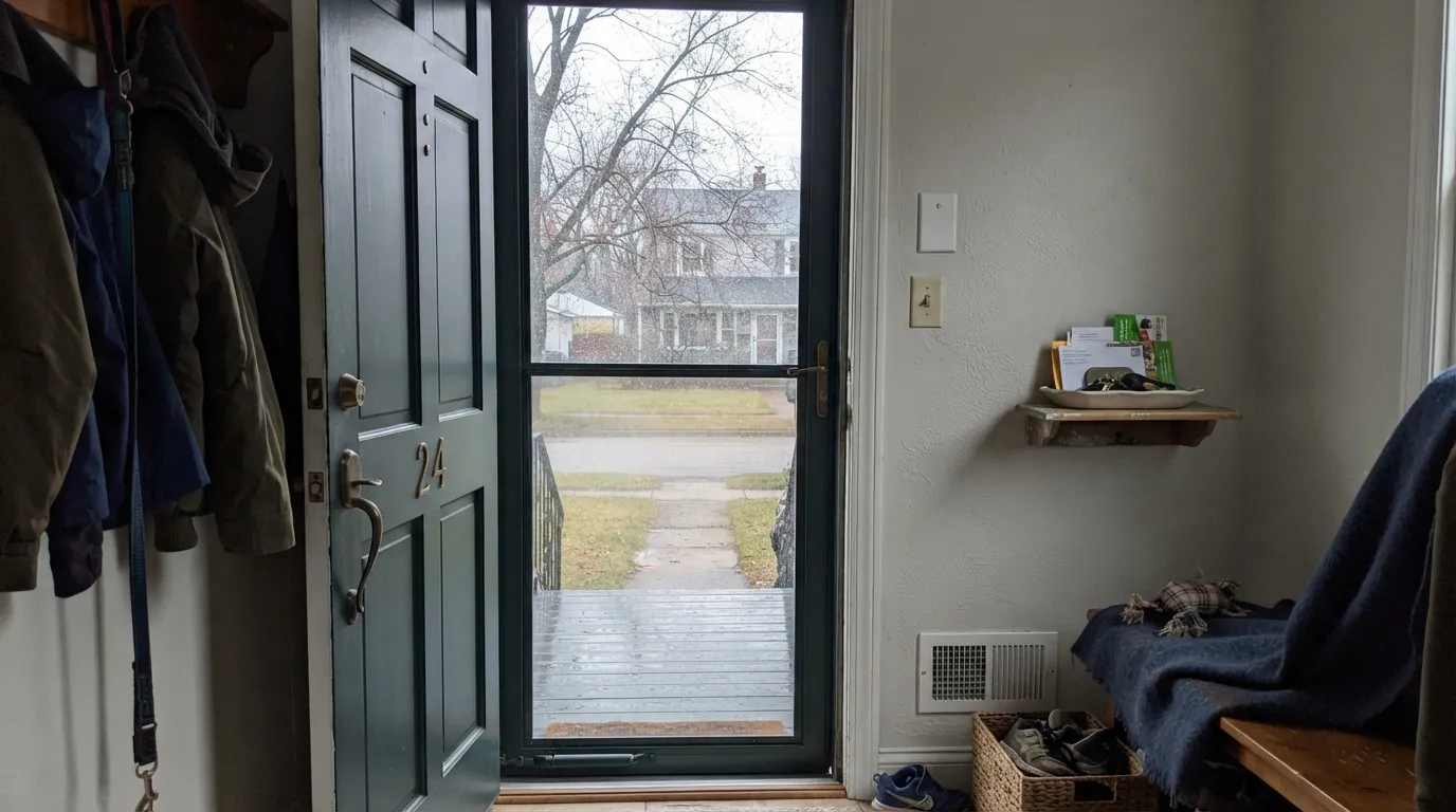
Historically correct and genuinely handsome in daylight. Semi-gloss reads deep and rich at noon, near-black at dusk — that shift is charming here, not a flaw, because a front door is meant to read as a strong dark note either way.
Paired with white or cream siding, shutters need direct light to register as green rather than black. Even in shade they read handsomely as near-black against a light house — the classic colonial contrast still works.
Under can lighting or a bright window it reads as a moody green-black that flatters brass hardware and butcher block. Without task lighting overhead it just becomes "the dark island" — plan the lighting before you plan the color.
Small windowless rooms take this color best specifically because guests expect drama here, not because the green reads clearly. Treat it as sophisticated near-black and it over-delivers; expect a garden-green and you'll be let down.
Only works with strong daylight or real accent lighting. In an average room with average light it just recedes to flat black, wasting the whole reason you picked a green in the first place.
This is a trim and accent color by design. A full elevation at LRV 8 absorbs heat, reads heavy at residential scale, and loses the contrast that makes it work on a door or shutters. Keep it small; let a lighter body color carry the siding.
Your Light Is the Risk
Direct sun is the only light that reliably shows the green — the blue-gray lifts and a real, if dark, green comes through on a door or shutter.
Without direct light it drops straight to near-black. Overcast days and shaded porches erase the color almost entirely — test on a genuinely gray day before committing.
An east-facing door gets soft morning light and reads closer to black most of the day; a west-facing door catches strong late sun and shows more green before dusk.
Warm 2700K porch bulbs bring out a faint green glow after dark. Cool white LED security lights flatten it straight back to black.
Most complaints about Narragansett Green are a light mismatch. Upload a photo of your actual room and see it on your walls — then ask for the same wall in north light or evening lamps before you buy a single sample.
Need It From Another Brand?
Any paint counter can custom-tint Benjamin Moore HC-157 directly. If you would rather stay in one brand's own deck, these are the closest stock matches, measured as ΔE2000. Under 2 is a difference you will not see on the wall.
| Brand | Closest color | ΔE | LRV | |
|---|---|---|---|---|
| Sherwin-Williams | TarragonSW 9660 · Sherwin-Williams | 1.5 | 7 | Color page → |
| Behr | Evening StormPPF-48 · Behr | 3.5 | 8 | Color page → |
| Valspar | Long Water8003-39G · Valspar | 4.0 | 8 | Color page → |
| PPG / Glidden | ObsidianPPG1035-7 · PPG / Glidden | 0.9 | 8 | Color page → |
| Glidden | ObsidianPPG1035-7 · Glidden | 1.3 | 8 | Color page → |
| Dutch Boy | Shaded Forest427-7DB · Dutch Boy | 2.6 | 7 | Color page → |
Similar Benjamin Moore Colors
The nearest shades to Narragansett Green within Benjamin Moore's own range, ranked by perceptual color distance — useful when you want the same look a touch lighter, darker, or warmer.
WCAG 2.1: AA is 4.5 : 1 for normal text, 3 : 1 for large text, AAA is 7 : 1.
Narragansett Green vs the Colors You're Also Considering
Every Narragansett Green sample board has the same rivals on it. The numbers show the real lightness gap — then it comes down to which risk you would rather live with.
Pick this if you want the cooler, moodier blue-green-black — Narragansett Green reads more like slate than forest.
Benjamin Moore PM-22 · LRV 4Essex GreenPick this if you want a true grass-green that still reads clearly green in full sun — Essex Green leans warmer and greener at nearly the same near-black depth.
Pick this if a quiet historical green feels more at home on your house than another blue door.
Benjamin Moore HC-154 · LRV 6Hale NavyPick this if you'd rather commit to blue than green — Hale Navy holds the same near-black depth with unmistakable navy instead of a green you have to defend.
Pick this if you want that same near-black weight to hint at green once the sun hits it.
Benjamin Moore 2124-10 · LRV 6Wrought IronPick this if you want the near-black weight with zero color argument at all — Wrought Iron is a true neutral that goes with literally everything.
Pick this for the deeper, more historical, closer-to-black version of the same idea.
Sherwin-Williams SW 6187 · LRV 12RosemaryPick this for a dark green that reads clearly green even in average light — Rosemary sits several LRV points brighter and shows its color far more easily.
Within the brand, Navy Masterpiece 1652 is identical on paper at #435155 and LRV 8. Amazon Green 2136-30 and Everard Blue CW-575 both sit at LRV 10, two points lighter, which is not much but is enough to matter in a dark room. Lead Gray 2131-30 at LRV 7 drops the green almost entirely and reads as a straight dark gray.
Cross-brand, PPG Obsidian PPG1035-7 at LRV 8 has a deltaE of 0.88 and Dunn-Edwards Lunar Eclipse DE5776 at LRV 7 comes in at 0.97, so both are effectively the same color. Sherwin-Williams Tarragon SW 9660 at LRV 7 and deltaE 1.52 is visually identical in normal room light.
Further out, Behr Evening Storm PPF-48 at LRV 8 and deltaE 3.52 and Farrow and Ball Chine Green No. 35 at LRV 8 and deltaE 4.1 are close but visibly different side by side, with Chine Green carrying more green and less blue.
Narragansett Green Coordinating Colors
The rule for coordinating with Narragansett Green: keep the trim warm and keep your expectations realistic about how much green will actually show. It pairs naturally with warm whites, true grays and brass, and it holds its own next to Benjamin Moore's other historical near-blacks without ever quite matching them. These are the partners that keep showing up on the houses that use it well:
The Historical Collection Story Behind Narragansett Green
Narragansett Green carries the HC prefix — Benjamin Moore's Historical Collection, built from research into paint colors documented on 18th- and 19th-century American buildings and named for the New England towns and landmarks the research drew from. Narragansett Bay sits in Rhode Island, and the deep, near-black green fits the colonial and federal-era shutter-and-door tradition the collection was built to preserve: very dark, saturated colors were common on period trim, in part because the pigments of the era naturally produced dark, muted results.
This is not a color with a viral moment or a Color of the Year run — it has never been either, and no famous room or show has made it famous. What it has instead is decades of steady use by people restoring or building colonial and farmhouse-style homes who want a documented, period-correct dark green rather than whatever green happens to be trending. That is an honest, useful job, even if it will never be the color people ask about on social media.
Narragansett Green With Wood Tones and Metals
Hardware decides more than most people expect here. Unlacquered brass and oil-rubbed bronze both read warm against the cool green and photograph beautifully in daylight — this is the traditional pairing for a reason. Matte black hardware is the one to test first: right next to true black, this color's blue-green undertone can look like a mismatched near-black rather than a deliberate pair, especially in bright light.
Against wood, a stained mahogany or walnut door reads as the warmer, more traditional choice if you would rather skip paint on the door itself and use Narragansett Green only on shutters and trim. Where the color meets siding, warm whites and true grays both work; avoid parking it directly against a warm honey-toned wood trim, which pulls the cool green toward looking simply dull rather than deliberate.
Three Ready Palettes Built on Narragansett Green
A color is never alone on the wall. These are complete combinations in the 60-30-10 pattern, with the reason each one holds together. Every one opens in the visualizer.
Cloud White is the warm trim white most often paired with historical dark exteriors — it keeps the facade from going cold. Kendall Charcoal ties the roofline to the door without repeating the green, giving the house two dark notes that read as a family instead of a clash.
Try this palette in your roomSwiss Coffee keeps the room bright enough that the island's green actually registers instead of reading as plain black. White Dove trim softens the handoff and matches the warmth already in Swiss Coffee, so the kitchen still feels cohesive around one very dark anchor.
Try this palette in your roomStonington Gray is a true gray, not a greige, so it doesn't compete with the door's cool undertone the way a warm siding color would. White Dove trim adds the one warm note the scheme needs so the whole facade doesn't tip cold.
Try this palette in your roomNarragansett Green FAQ
Is Narragansett Green actually green?
Yes, but only some of the time. At LRV 8 it sits at true-black depth, and the green only shows in strong direct light — full sun on a door, a bright kitchen with an island under can lights. In shade, at dusk, or from across the street, most people call it black. That is not a flaw in the paint; it is what any near-black color does.
What's the difference between Narragansett Green and Essex Green?
Both are Benjamin Moore near-black exterior greens, but the undertone splits them: Essex Green (PM-22) leans warmer and truer green, Narragansett Green leans cooler and more blue-gray. Side by side in daylight, Essex Green reads more obviously as green; Narragansett Green reads closer to a dark slate. Pick based on whether you want the green to announce itself or stay quiet.
Is it too dark for a front door?
No — this is exactly the job it was made for. Deep, near-black colors are the traditional choice for colonial and farmhouse doors because they hide dirt and weather staining and read as intentional, not dated. The only real risk is a door with no direct sun at all, where it will read flat black year-round; if that is fine with you, it is still a handsome door color.
Can I use it on kitchen cabinets or an island?
Yes, and it is a good use of the color — an island gets closer inspection and usually better light than a shaded porch. Pair it with a lighter wall color like Swiss Coffee or White Dove so the room has enough contrast for the green to register, and use a satin urethane-fortified cabinet enamel.
What trim white goes best with Narragansett Green?
A warm white — Cloud White or White Dove — softens the color's cool undertone and matches the traditional historical pairing. A stark cool white will make the green look even bluer and colder by contrast; that can work for a modern take, just know what you are choosing.
Does it work as a whole-house exterior color, not just doors and shutters?
Not recommended. This is a trim and accent color by design — a full elevation at LRV 8 absorbs heat, reads heavy at residential scale, and loses the contrast that makes it work on a door or shutters in the first place. Keep it to doors, shutters and small architectural elements, and let a lighter body color carry the siding.
Have you painted with Narragansett Green?
Rate it — one tap helps the next reader decide.
Ask a Question