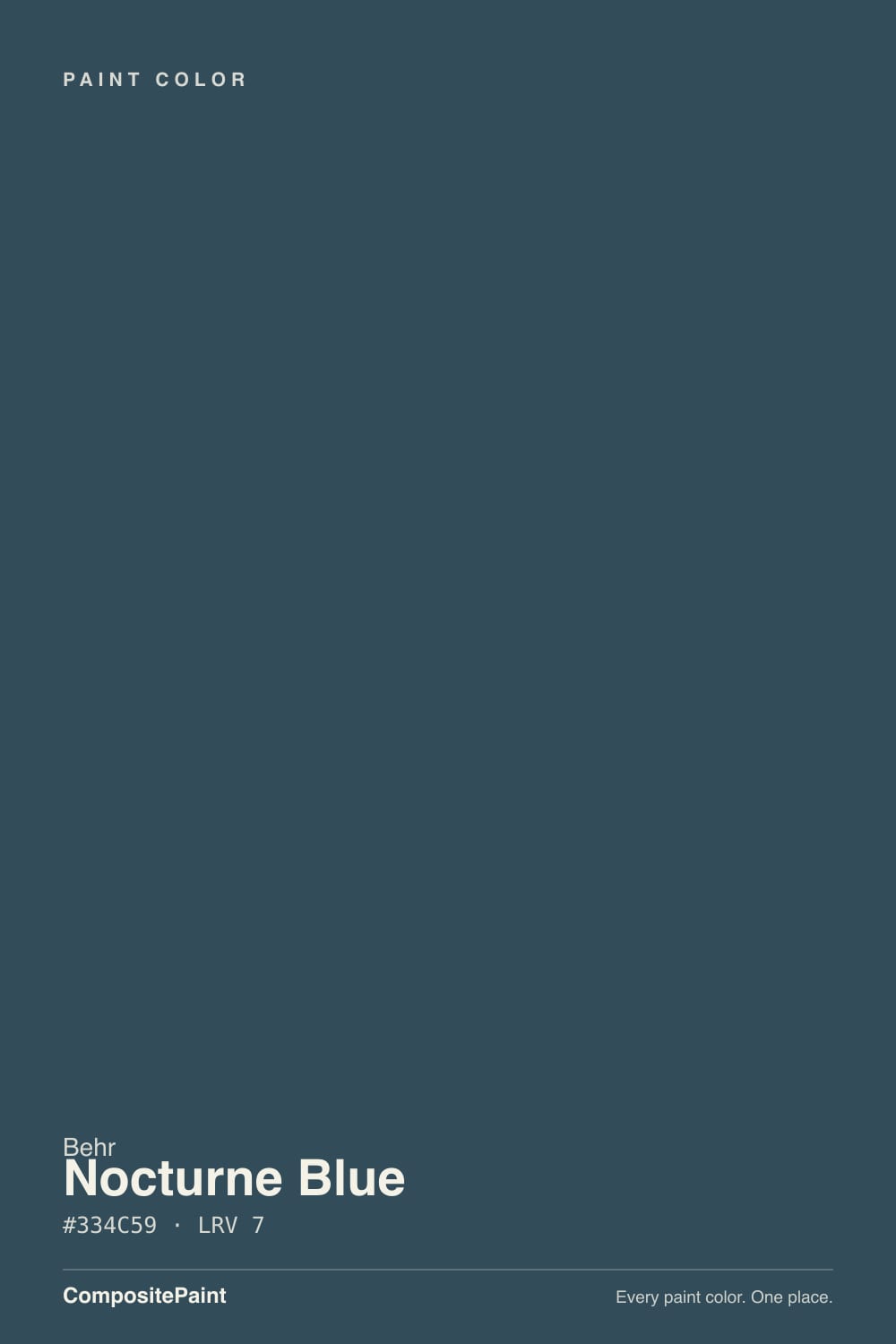
Nocturne Blue
Behr's darkest teal-navy, reviewed honestly: the near-black color quietly doing island, door and cabinet duty in houses whose owners have never heard of the Home Decorators Collection line it's filed under.

Jessica has spec'd whites and neutrals for more than 300 rooms and keeps a sample wall of painted drawdowns in her studio. Every color review is checked against real reader rooms in the comments and re-tested when a formula changes. About the testing process →
- 1Nocturne Blue7
- 2Hidden Gem14
- 3Van Courtland Blue31
The Fast Verdict
Nocturne Blue is a true near-black at LRV 7 — deep enough that in anything less than direct light it reads simply as "dark," not as blue. Give it a real light source and the teal-leaning undertone comes forward: more green-blue than a classic navy like Hale Navy, closer in hue to Sherwin-Williams Waterloo or Cyberspace than to anything Behr sells under a bigger name. It carries the HDC-CL code of Behr's Home Decorators Collection line — the curated, less-browsed palette tied to the Home Decorators furniture brand at Home Depot — which is likely why it has almost no design-blog footprint despite doing solid, dependable work on doors, islands and built-ins.
Kitchen islands and cabinetry · front doors and exterior shutters · a den or office wall with a real window · anyone who wants a navy with more green in it than Hale Navy
Your room has no direct daylight or a strong overhead fixture · you want the color to read clearly blue at a glance, not near-black · you were picturing a true violet-leaning navy · your floors and trim run deep honey-orange
- A genuine teal-leaning alternative to violet-leaning navies like Hale Navy
- Reads rich and deliberate on islands, cabinets and doors with direct light
- Deep enough (LRV 7) to hide scuffs and fingerprints on high-touch surfaces
- Pairs cleanly with both brass and matte black hardware
- An uncrowded corner of the Behr deck — nobody else's kitchen looks like this
- Collapses to flat near-black without a direct light source
- Green pull surprises buyers expecting a straightforward navy
- Fights honey-orange wood and warm yellow trim
- Almost no design-blog or owner-review track record to check against
What Color Is Nocturne Blue, Really?
Nocturne Blue sits at RGB 51/76/89 — blue clearly leads, green trails close behind, and red drops out almost entirely. That ratio puts it in the same hue family as Sherwin-Williams Waterloo and Cyberspace: a slate-teal rather than a true navy. Compare it to Hale Navy or SW Naval, both of which lean slightly toward violet-blue, and Nocturne Blue is visibly greener — less "formal navy suit," more "deep harbor water at dusk." It carries an HDC-CL code, Behr's numbering for its Home Decorators Collection line, a palette curated for the Home Decorators furniture brand and sold through Home Depot rather than pushed through Behr's flagship in-store fan decks — which likely explains why it has almost no independent design coverage despite being a perfectly competent color.
At LRV 7, this is a near-black by any measure — the same depth bracket as Cyberspace and only a shade lighter than true navy references like Naval (LRV 4) and Hale Navy (LRV 6). That number matters more than the hex code for how the color actually behaves: near-black colors absorb almost all the light that hits them, so the paint needs a real, direct light source to show its hue at all. Ambient room light alone will not do it; without a window it's aiming at directly or a lamp within a few feet, Nocturne Blue reads as flat charcoal-black, not blue.
Undertone in one line: blue-forward with a genuine green pull — teal-adjacent, never violet. In strong daylight or under a warm spotlight the green surfaces and the color reads as a moody storm-teal; in shadow or overcast light the green retreats and it collapses toward plain black. That range is honest, not a defect — it is what every LRV 7 color does — but it means the paint chip in the store, held under bright fluorescent light, will look bluer and more colorful than most rooms will actually deliver.
Where It Shines
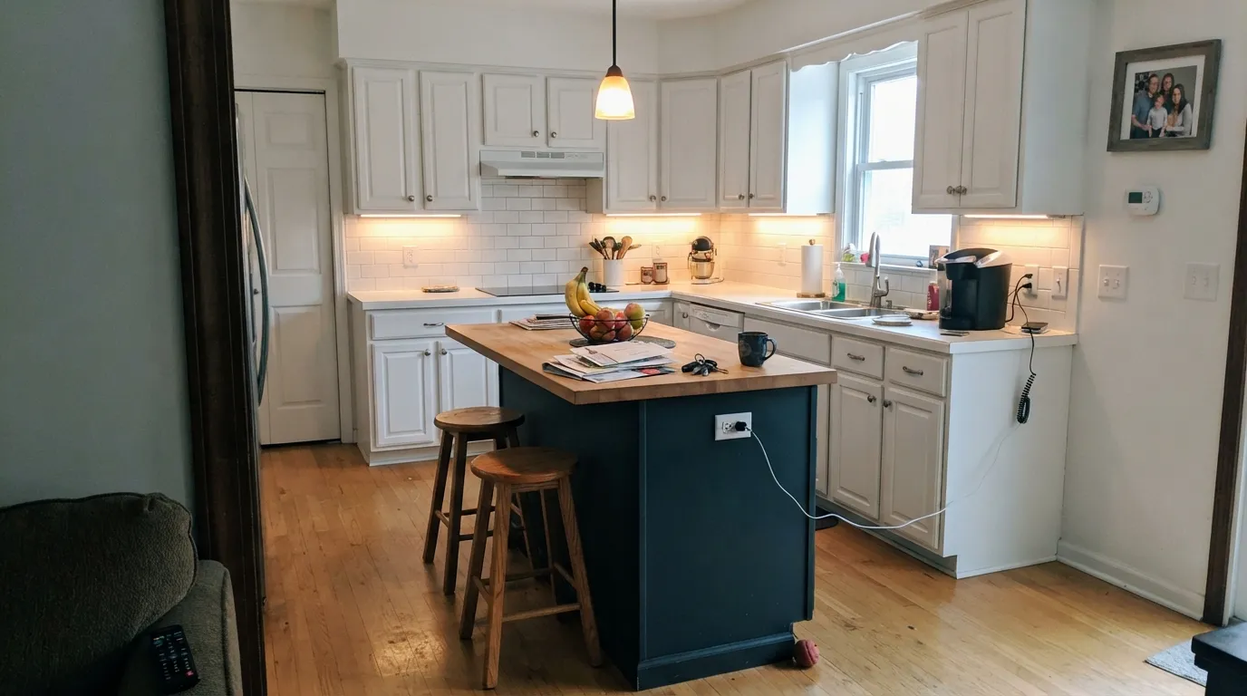
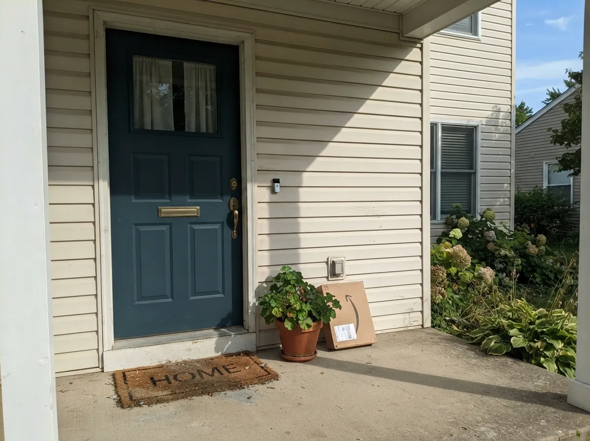
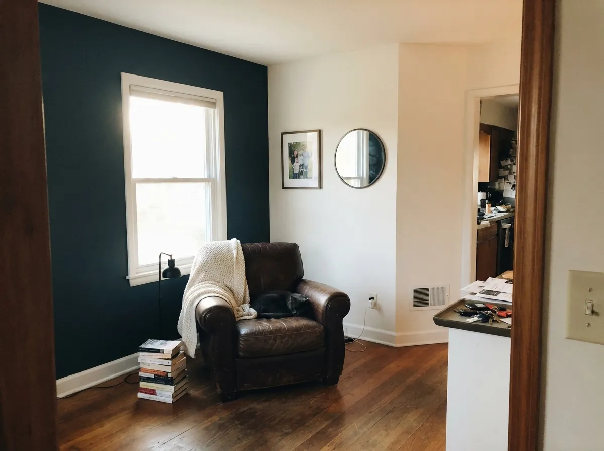
This color needs a job with a light source attached to it, and where it gets one it earns its keep. Under cabinets, an island with task lighting overhead shows the full teal-navy depth instead of collapsing to black. A front door in full sun does the same — Nocturne Blue reads as a deliberate, expensive-looking dark color rather than a flat black door, and it plays well with brass or matte-black hardware either way. In a den or office with a real window, it makes a credible accent wall that reads different at 10am and 6pm without ever going cartoonish.
Where It Fails
The complaints this color is likely to generate all trace back to the same root cause: it is a near-black hue-dependent color, and near-black hue-dependent colors punish rooms without real light. None of these are the paint being unstable — they are the predictable behavior of LRV 7 pigment, and they are worth knowing before the gallon is open.
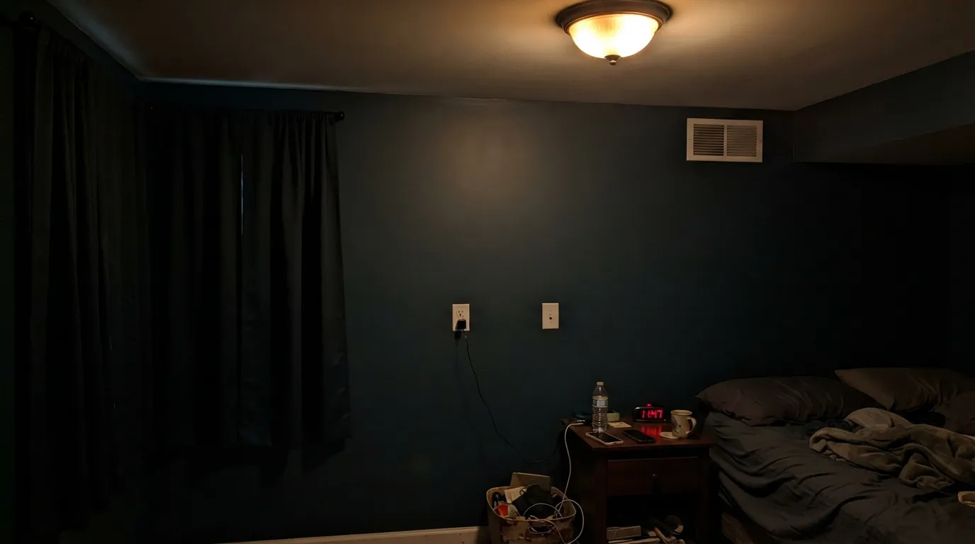
Ambient daylight alone is not enough at LRV 7 — the color needs a window it faces or a lamp nearby to show any blue-green at all. In a windowless powder room or a hallway lit only by a ceiling fixture, Nocturne Blue will read as plain black, full stop. If a colored dark wall is the goal, that is fine; if you specifically wanted "blue," add a spotlight or pick a lighter color instead.
Nocturne Blue's green pull is real and it is more visible than most navies allow. Buyers coming from Hale Navy or Naval and expecting the same violet-leaning formality will notice this color drifting toward storm-teal in good light. It is not a flaw, but it is a different color family than "navy" — check it next to an actual navy chip before assuming they are interchangeable.
Blue and orange sit opposite each other on the color wheel, and at this depth the clash reads as muddy rather than intentional — deep golden oak trim or honey-toned flooring will fight the paint instead of framing it. Walnut, black-stained wood, white oak or a cool gray floor all pair cleanly; orange-leaning oak does not.
Room by Room
Under cabinet lighting or a pendant over the island, the teal-navy depth shows fully and reads custom, not generic-dark. Satin, urethane-fortified cabinet enamel; brass or matte-black hardware both work.
Full exterior sun does the job an interior lamp can't: the color reads as a deliberate deep blue-teal rather than a flat black door. Semi-gloss exterior enamel; pairs with white, greige or light gray body colors.
A room that gets direct daylight through part of the day earns back the color's depth without going cave-like. A north-facing office with no direct sun will read closer to charcoal-black most of the day.
One wall behind the headboard, lit by bedside lamps, is manageable. Four walls of a near-black color in a room used mainly at night with lamps off will read as a void rather than a color — most buyers regret the full-room commitment more than the accent.
A vanity light directly above the mirror gives Nocturne Blue exactly the light it needs. Skip it on a vanity lit only by a single overhead can light set back from the mirror.
As an accent — door, shutters, a small outbuilding — it is excellent. As full siding in a hot-sun climate, LRV 7 absorbs significant heat, which is a real durability and cooling-cost consideration most dark exterior colors share, not something specific to this one.
Your Light Is the Risk
Strong, direct light — a window it faces, task lighting, an exterior door in full sun — is what pulls the teal-navy hue out of the near-black base. This is the light the color needs to be worth choosing.
Ambient-only rooms — a windowless hallway, a room lit by one recessed can — let LRV 7 do what LRV 7 does: read as plain black with no visible blue or green.
Orientation matters more than time of day at this depth. A north-facing wall gets only cool, indirect light, so the color settles into a stark, tailored charcoal-navy most of the day. A south- or west-facing wall pulls real sun across it and the green-blue undertone comes forward, reading noticeably richer and more clearly teal in the afternoon than it does in the morning.
Warm 2700K lamps mute it toward a soft charcoal at night — cozy, but the blue mostly disappears. Cooler 3500-4000K LED light keeps the blue-teal legible after dark; pick bulb temperature based on which effect you want.
Most complaints about Nocturne Blue are a light mismatch. Upload a photo of your actual room and see it on your walls — then ask for the same wall in north light or evening lamps before you buy a single sample.
Need It From Another Brand?
Any paint counter can custom-tint Behr HDC-CL-28 directly. If you would rather stay in one brand's own deck, these are the closest stock matches, measured as ΔE2000. Under 2 is a difference you will not see on the wall.
| Brand | Closest color | ΔE | LRV | |
|---|---|---|---|---|
| Sherwin-Williams | SeaworthySW 7620 · Sherwin-Williams | 1.8 | 7 | Color page → |
| Benjamin Moore | Blue Note2129-30 · Benjamin Moore | 4.6 | 9 | Color page → |
| Valspar | Cadet Song8004-38G · Valspar | 1.1 | 7 | Color page → |
| PPG / Glidden | Sailor's CoatPPG1153-7 · PPG / Glidden | 0.4 | 6 | Color page → |
| Glidden | Ship'S HarborPPG1161-5 · Glidden | 0.4 | 6 | Color page → |
| Dutch Boy | Navigation432-7DB · Dutch Boy | 3.8 | 7 | Color page → |
Similar Behr Colors
The nearest shades to Nocturne Blue within Behr's own range, ranked by perceptual color distance — useful when you want the same look a touch lighter, darker, or warmer.
WCAG 2.1: AA is 4.5 : 1 for normal text, 3 : 1 for large text, AAA is 7 : 1.
Nocturne Blue vs the Colors You're Also Considering
Every Nocturne Blue sample board has the same rivals on it. The numbers show the real lightness gap — then it comes down to which risk you would rather live with.
Pick this for the slightly more saturated, more clearly teal-leaning version of the same idea.
Sherwin-Williams SW 7964 · LRV 7CyberspacePick this if you want the same near-black depth and nearly the same hue from a mainstream retail brand.
Pick this for more green, less black-blue formality.
Sherwin-Williams SW 6244 · LRV 4NavalPick this if you actually want a true, violet-leaning navy — Naval commits to blue where Nocturne Blue drifts toward teal.
Within Behr the neighbors are close but not interchangeable. Midnight Blue N480-7 at LRV 7, hex #354E61, carries more blue and less green, so it reads as a truer navy. Orion Gray N510-6 at LRV 7, hex #3D4C55, drops most of the color and lands nearer charcoal. Restless Sea PPU13-20 at LRV 8 is a step lighter and slightly more teal, and Moody Black BNC-40 at LRV 7 is its closest sibling at hex #324F5D.
Across brands, PPG Sailor's Coat PPG1153-7 and Glidden Ship's Harbor PPG1161-5 both land at deltaE 0.43, effectively the same color. Valspar Cadet Song 8004-38G at deltaE 1.11 and Sherwin-Williams Seaworthy SW 7620 at deltaE 1.79 are visually identical in normal room light. Farrow and Ball Hague Blue No. 30 at deltaE 3.55 and Benjamin Moore Blue Note 2129-30 at deltaE 4.6 are close but visibly different side by side, both reading grayer.
Nocturne Blue Coordinating Colors
The coordinating rule here is about light, not just hue: pair Nocturne Blue with colors light enough to bounce some brightness back onto it, and keep wood tones on the cool-to-neutral side rather than orange-warm. These are the partners that do that job well:
An Honest Story: A Color With No Track Record
Most colors this site reviews arrive with a paper trail — a Color of the Year title, a viral designer room, at least a stack of owner complaints to sort through. Nocturne Blue doesn't have one. It carries the HDC-CL code of Behr's Home Decorators Collection line, a palette built to coordinate with Home Decorators furniture and sold through Home Depot rather than pushed as a flagship Behr color, and that placement appears to be why it has almost no independent design-blog coverage or forum discussion to draw on.
That is a fair thing to know before buying a sample, and it is not a knock on the paint itself. The color science is straightforward and checks out: a genuine dark teal-navy, LRV 7, blue-forward with a real green pull. What is missing is other people's rooms to learn from. If you paint it, the comment section below is doing real work for the next reader — there simply isn't much else written about this specific color yet.
Nocturne Blue With Wood Tones and Metals
Cooler and neutral woods are this color's friends: walnut, black-stained oak, white oak and gray-washed floors all sit comfortably against the blue-green depth without fighting it. The one wood to avoid is honey-orange oak — its warm yellow-orange sits directly opposite this hue on the color wheel, and at LRV 7 the clash reads as muddy rather than intentional.
Metals are forgiving. Brass and unlacquered brass warm the color up nicely on cabinet or door hardware; matte black reinforces the near-black depth for a moodier, more unified look. Polished chrome and nickel read a touch cold against it but are not a hard clash the way honey wood is.
Three Ready Palettes Built on Nocturne Blue
A color is never alone on the wall. These are complete combinations in the 60-30-10 pattern, with the reason each one holds together. Every one opens in the visualizer.
White Dove perimeter cabinets keep the room bright enough that the island's under-cabinet lighting has something to contrast against, which is exactly the direct light Nocturne Blue needs to read as color instead of black. Wrought Iron on stools or hardware trim ties in without competing.
Try this palette in your roomA light body gives the door the full-sun contrast it needs to read as deep blue-teal rather than plain black from the curb. Iron Ore shutters sit close enough in depth to the door that the two near-blacks read as a coordinated pair rather than a clash of undertones.
Try this palette in your roomKeeping three of four walls in a soft warm white lets whatever daylight the room has concentrate on the accent wall, giving Nocturne Blue the direct light it needs. Adirondack Blue on shelf backs echoes the same family at a lighter depth instead of introducing an unrelated color.
Try this palette in your roomNocturne Blue FAQ
Is nocturne blue a navy or a teal?
Closer to teal. The RGB numbers show blue leading with a real green pull behind it — greener than a classic navy like Hale Navy or Naval, both of which lean slightly violet instead. It sits in the same hue family as Sherwin-Williams Waterloo and Cyberspace, just darker.
Why haven't i heard of this color?
It carries an HDC-CL code — Behr's Home Decorators Collection line, curated for the Home Decorators furniture brand and sold through Home Depot rather than promoted through Behr's flagship in-store fan decks. That means less design-blog coverage, not a lesser paint.
Can i use it on all four walls of a bedroom?
You can, but think hard first. At LRV 7 it needs real light to read as blue; a bedroom used mainly with lamps off at night will mostly read as a dark void. One accent wall behind the headboard, lit by bedside lamps, is the safer version of the same idea.
What white pairs best with nocturne blue?
A soft warm white — White Dove, Pure White or Alabaster — rather than a stark cool white. The warmth in the white balances the color's cool blue-green lean without fighting it, and a lighter perimeter also supplies the contrast light the paint needs to read as color.
Does it work over honey oak floors or trim?
Not comfortably. Blue and orange sit opposite each other on the color wheel, and honey-toned oak reads as a direct clash against this depth of blue-green. Walnut, black-stained wood, white oak or gray flooring all pair far more cleanly.
Is it a good exterior door color?
Yes — one of its strongest uses. Full sun supplies exactly the direct light the color needs, so a door in Nocturne Blue reads as a deliberate deep blue-teal rather than a flat black door, and it works with either a light or a mid-tone house body.
Have you painted with Nocturne Blue?
Rate it — one tap helps the next reader decide.
Ask a Question