Blush Living Room Palette — Soft Blush & Warm Clay
A warm, layered 5-color scheme for living rooms: soft blush walls, a creamy backdrop, crisp trim, grounding walnut, and a deep clay accent, every color matched to real paint you can buy.
By Jessica Williams · Color Stylist & Interior Editor
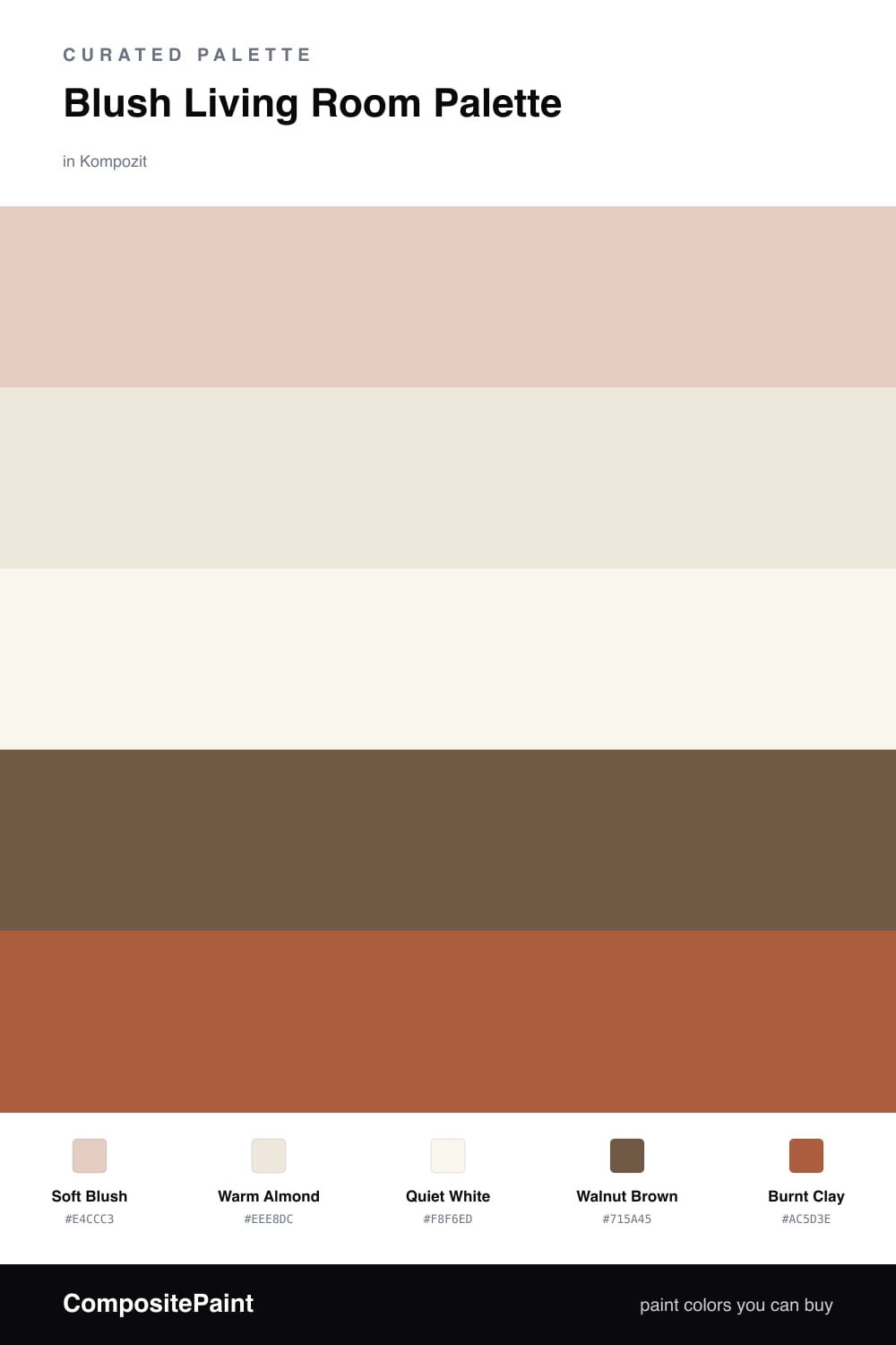
A blush living room should feel like late afternoon light on a plaster wall, soft, warm, and a little hazy. This palette leans on a soft blush for the walls, the kind with a clay undertone that turns almost beige in shade and glows pink when the sun comes through. It is the color you want to sink into after a long day.
Around it I set a warm almond for built-ins and the larger furniture, with a quiet white on the trim and ceiling so the blush has somewhere clean to land. Walnut brown in the floors and a coffee table or shelf does the grounding work, keeping all that softness from floating away.
Then one deeper note: burnt clay, earthy and a touch red, on the sofa or a pair of chairs. It is the 2026 warmth that makes the whole room feel layered and cocooning. Use it on one big piece and let the blush stay the star.
Buy These Colors
Each color matched to the closest real paint in every brand, by ΔE2000. Kompozit first; take any SKU to the store — these mix on demand.
Questions
Ground it. The walnut wood tones and burnt clay accent here pull the blush toward warm and grown-up rather than nursery pink. A soft blush with a clay or brown undertone, not a clean candy pink, is what keeps it feeling like a room and not a cake.
Keep burnt clay on one thing the eye can rest on, like the sofa, a pair of armchairs, or a throw and cushion mix. Used on much more than about one-fifth of the room it stops reading as an accent and starts competing with the blush.
Similar Palettes
Closest schemes by color — not by label.