Greige Dining Room Palette — Morning Greige & Walnut Dawn
A warm five-color dining room scheme led by soft greige walls, balanced by a creamy backdrop, a clean trim white, walnut wood, and a deep clay accent — every color matched to real paint you can buy.
By David Chen · Formulation Lead & Resident Chemist
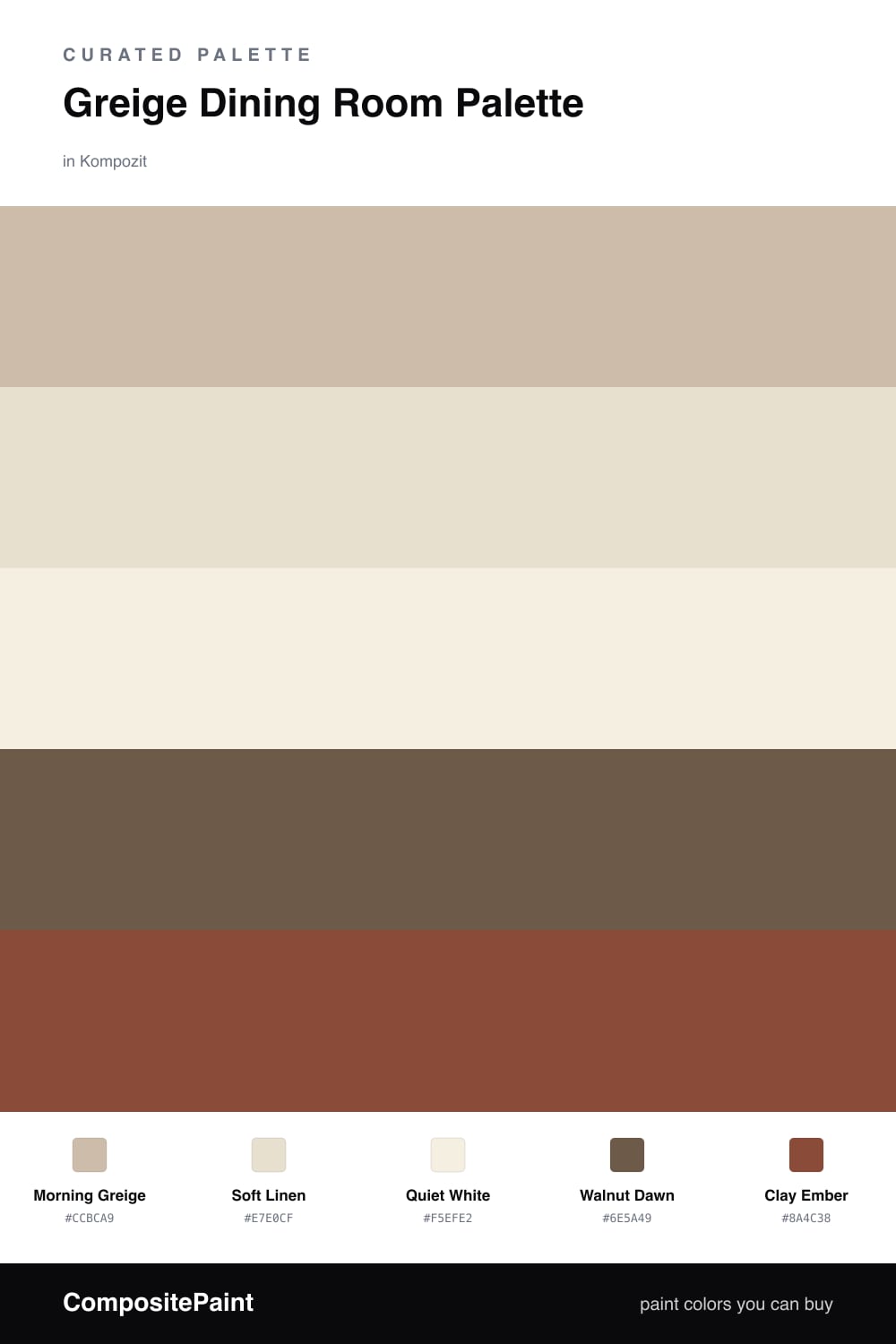
Greige is the quiet workhorse of a dining room, and Morning Greige is the kind of shade that shifts gently through the day. In the morning it leans soft and gray, and by dinner the warm undertone wakes up and glows against candlelight.
I kept the supporting cast close in temperature so nothing fights. Soft Linen on a sideboard or built-ins reads a touch creamier than the walls, while Quiet White keeps the trim and ceiling crisp without going stark. Think of it like seasoning — present, but never the loudest thing on the plate.
The depth comes from the wood and one accent. Walnut Dawn in the table or flooring grounds the space, and a little Clay Ember in chairs, ceramics, or art gives the room its 2026 warmth. Use that clay sparingly, roughly one-fifth of the palette, and the whole scheme stays easy to live with.
Buy These Colors
Each color matched to the closest real paint in every brand, by ΔE2000. Kompozit first; take any SKU to the store — these mix on demand.
Questions
Greige is a blend of gray and beige, so it reads warm under candlelight yet stays calm in daylight. That flexibility flatters skin tones and food, which makes a long dinner feel inviting rather than washed out.
Lean on contrast in the woodwork and one accent. Pair the greige walls with walnut floors or a table, then add small clay-toned touches in chairs or art so your eye has somewhere warm to land.
Similar Palettes
Closest schemes by color — not by label.