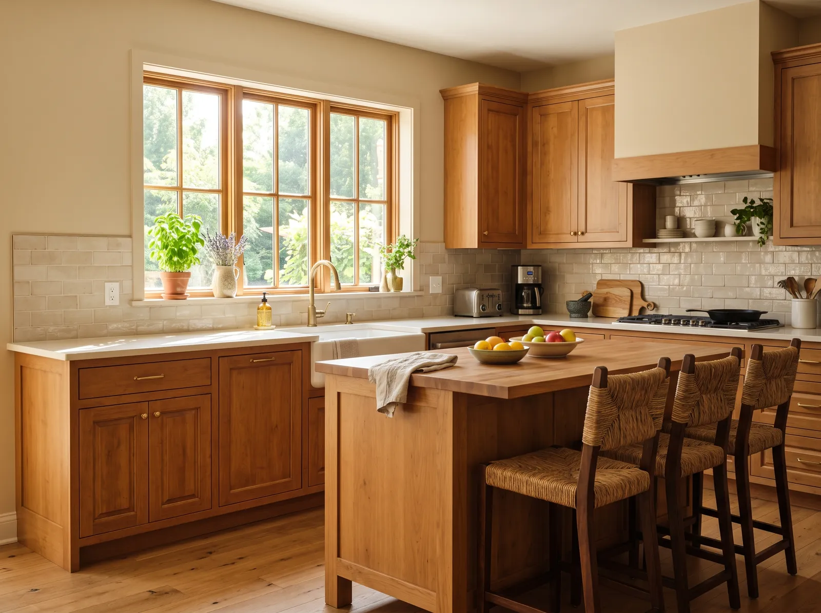
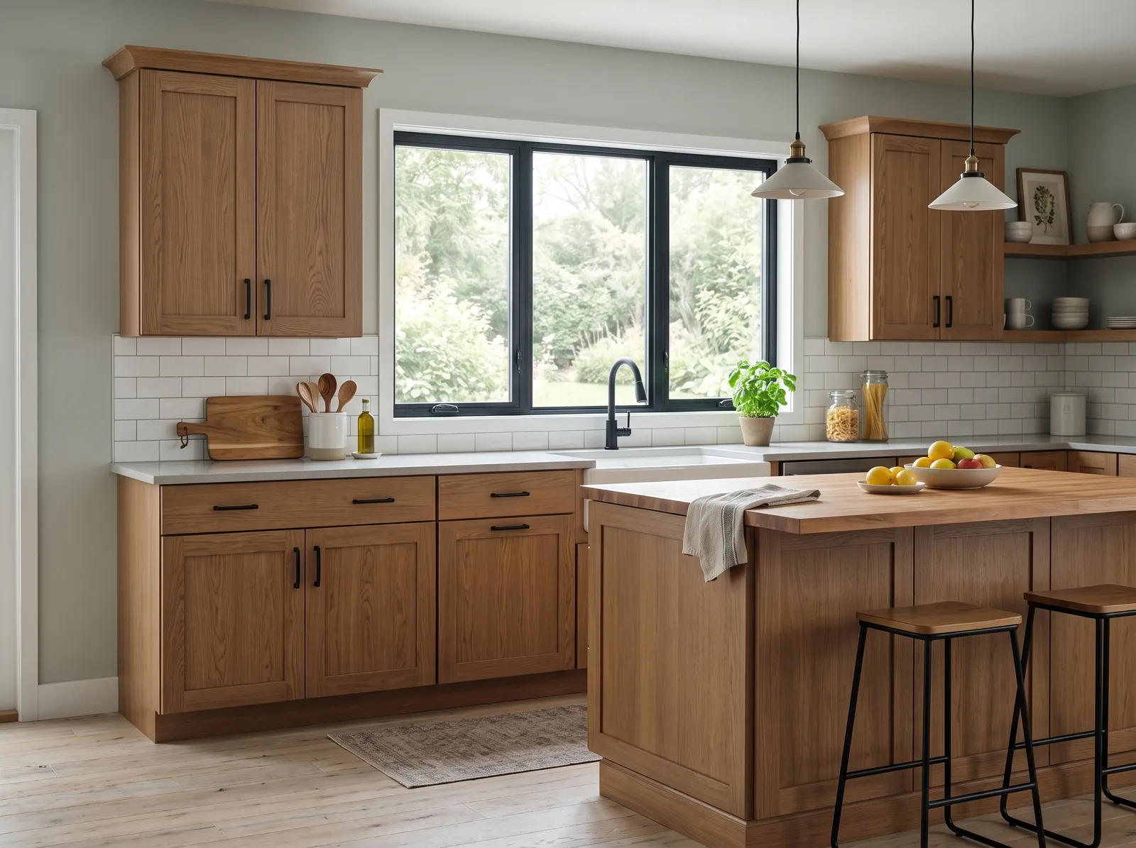
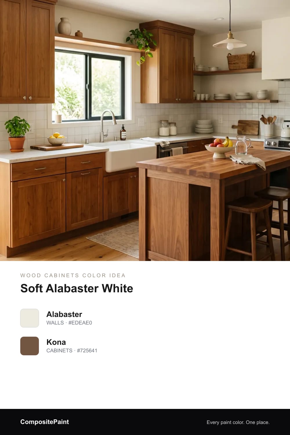
1. Soft Alabaster White
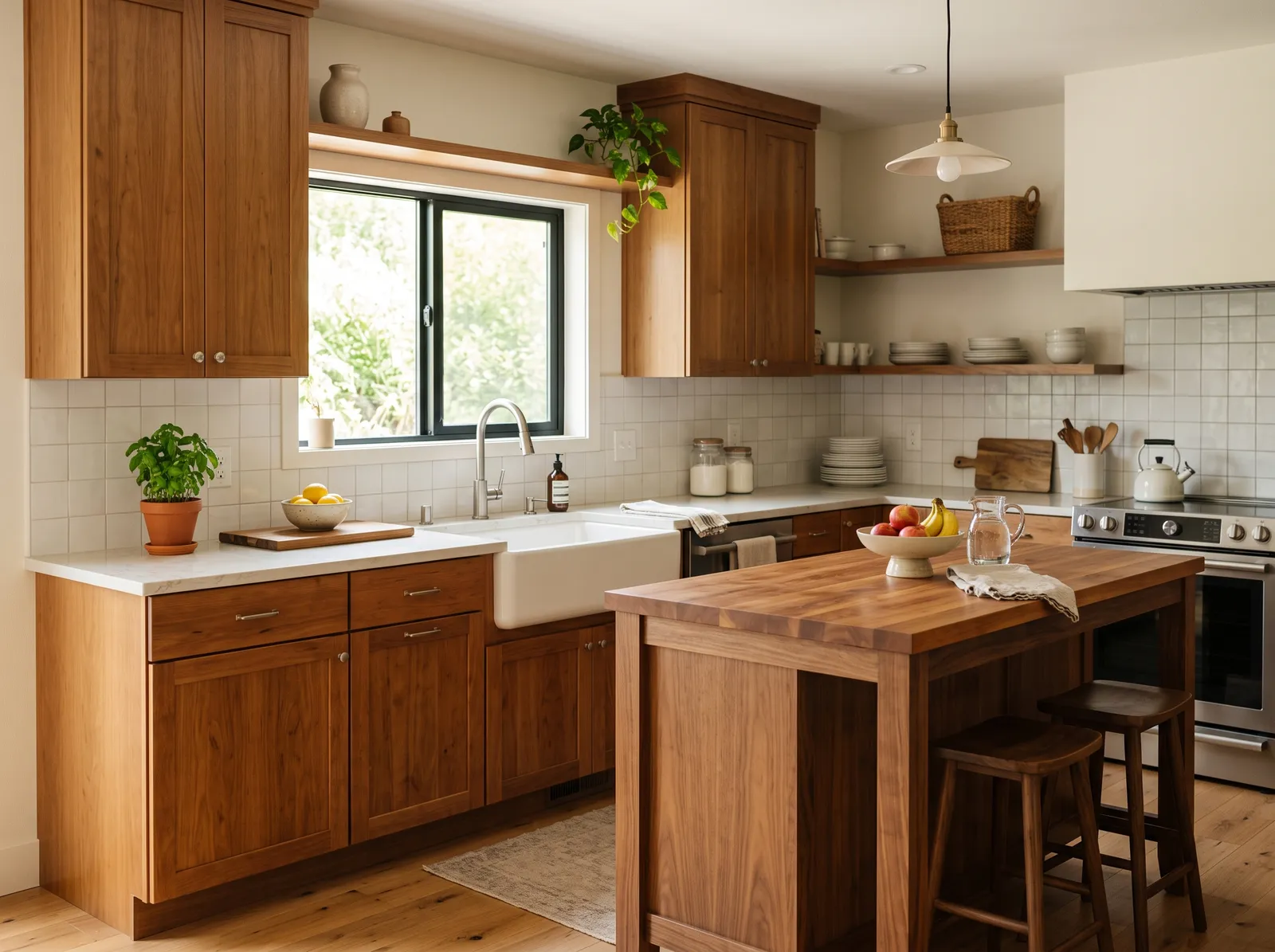
A warm, creamy white that lets honey and walnut wood feel rich and cozy without ever looking yellow.
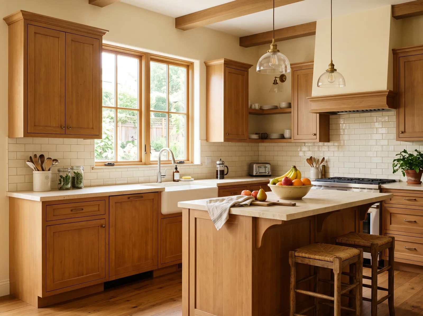
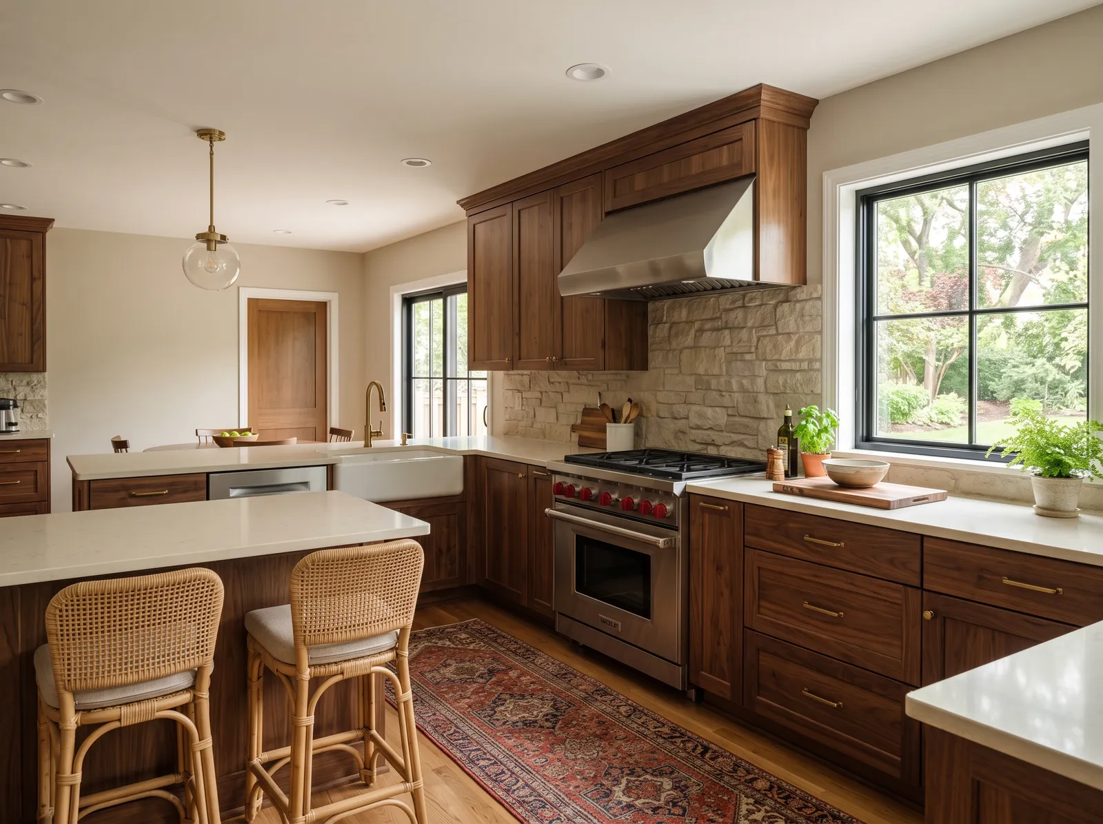
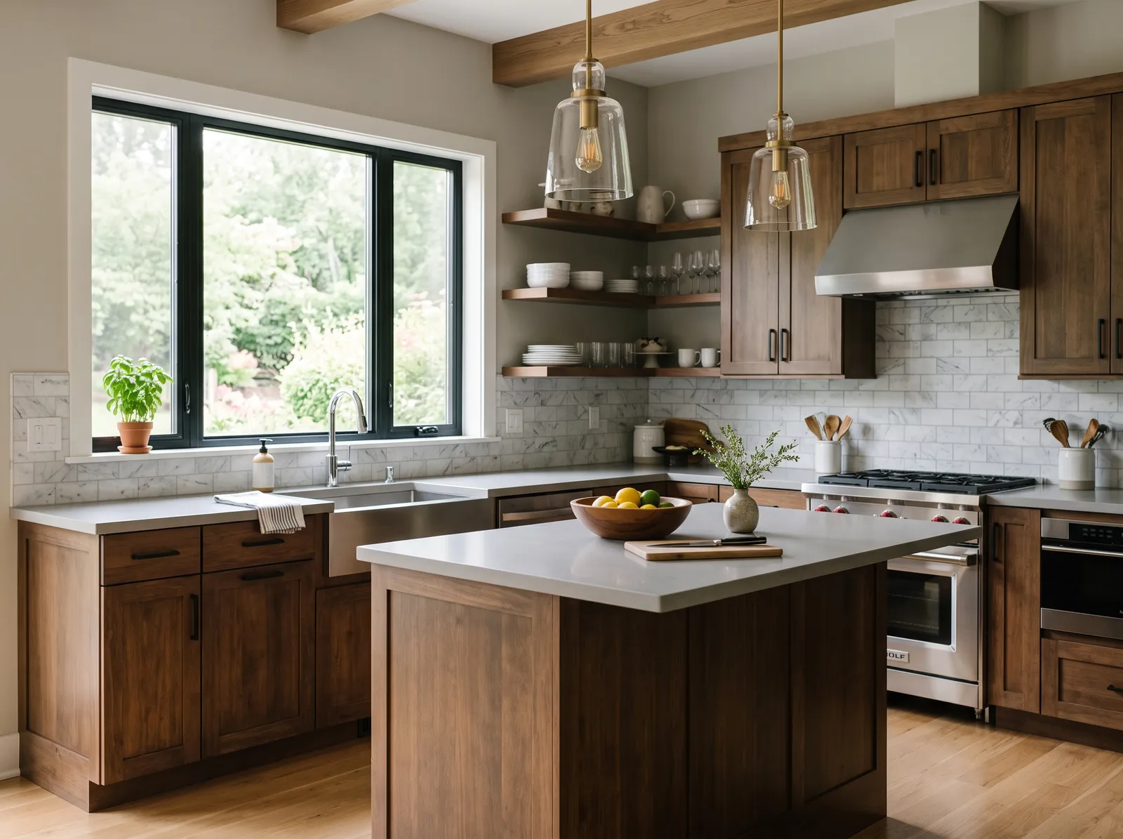
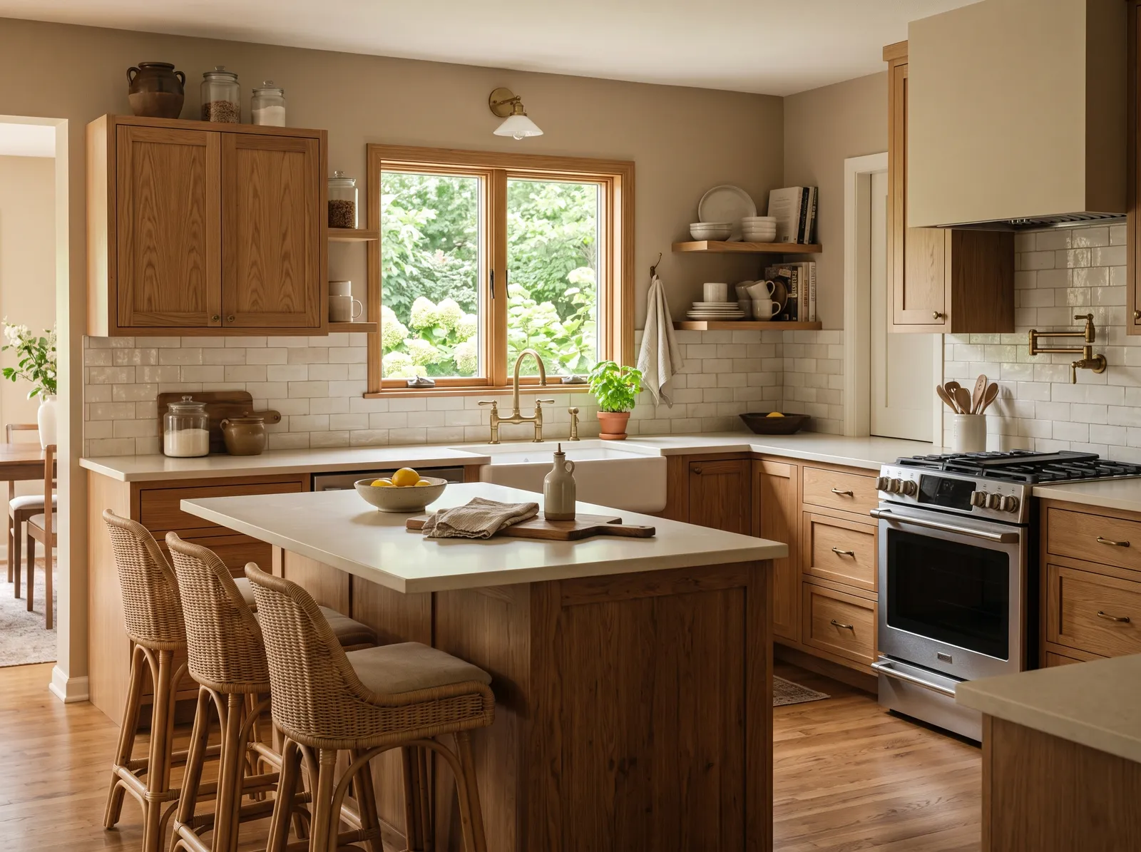
Brown and wood cabinets bring so much warmth to a kitchen, and the right wall color lets that warmth glow instead of go flat. Below are twelve wall colors that flatter honey, medium, and walnut wood, from soft whites to gentle greens and easy blues. Browse the looks, picture them with your own cabinets, and pick the one that feels like home.
By Jessica Williams · Color Stylist
A warm, creamy white that lets honey and walnut wood feel rich and cozy without ever looking yellow.
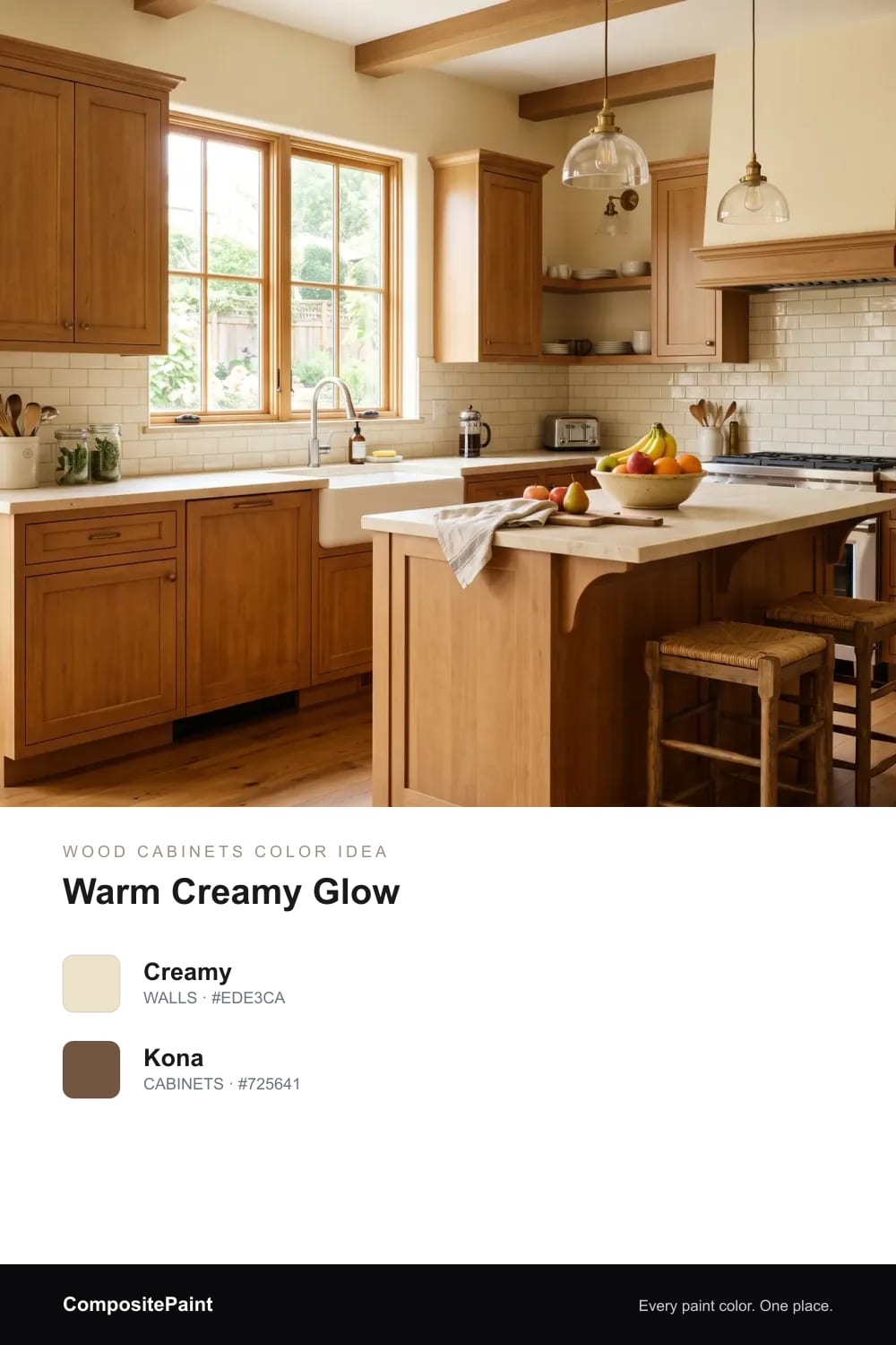
A buttery cream that wraps wood cabinets in a soft, golden light, like late afternoon sun in the room.
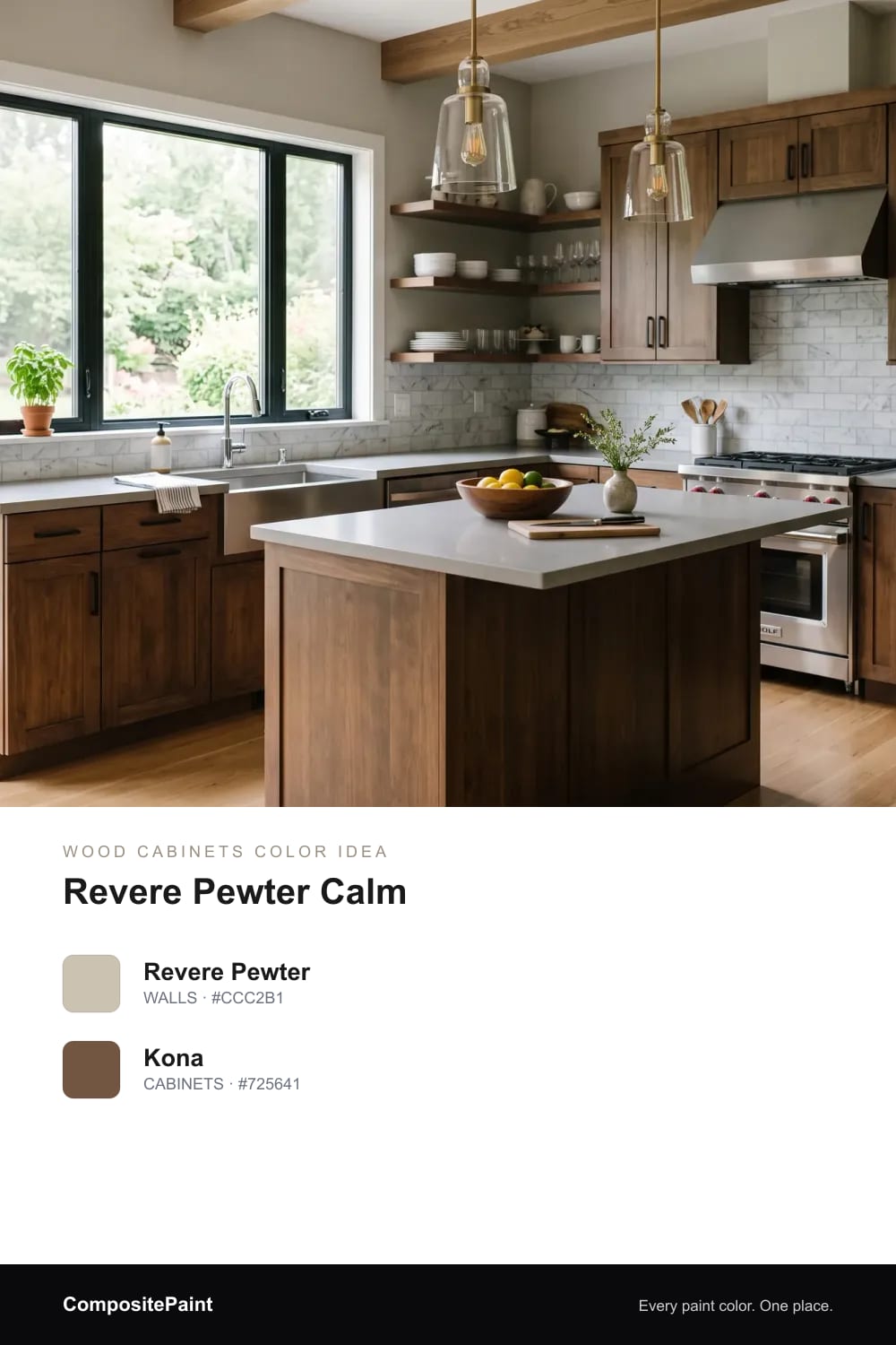
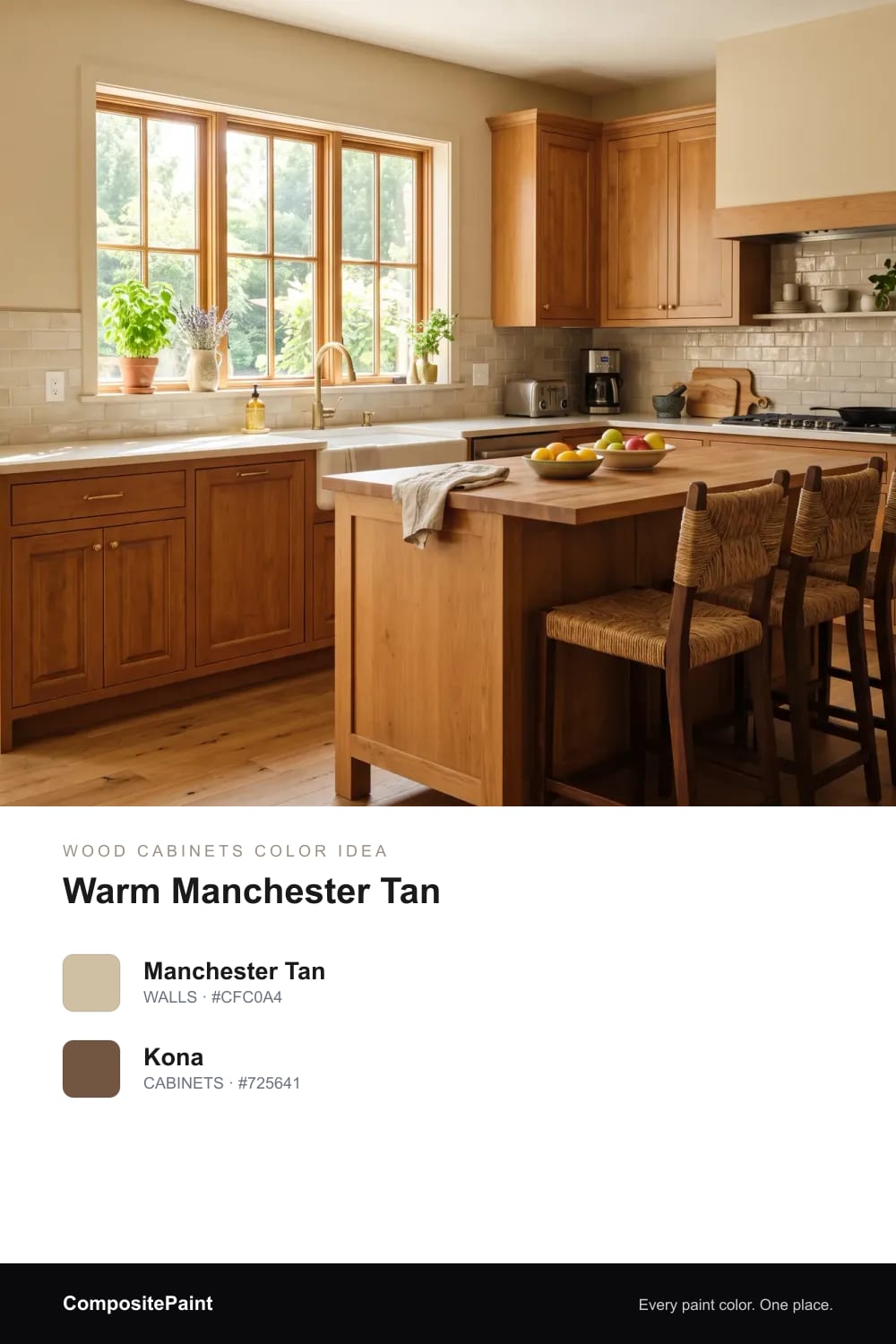
A balanced greige that sits quietly behind wood cabinets and makes the whole kitchen feel calm and pulled together.
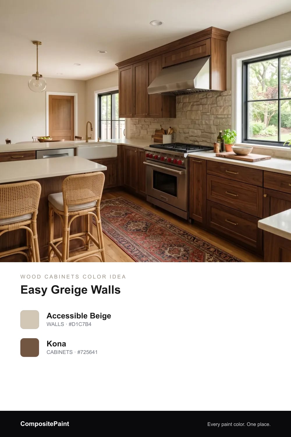
A gentle gray-beige that cools the room just enough, so warm wood cabinets feel grounded instead of orange.
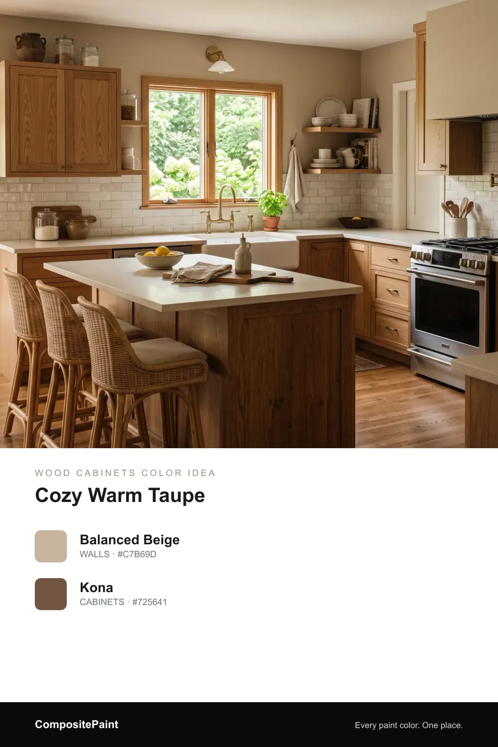
A soft tan that echoes the wood and gives the kitchen a quiet, sandy warmth from floor to ceiling.
A deeper, hug-you taupe that adds richness around wood cabinets and makes a kitchen feel snug and lived-in.
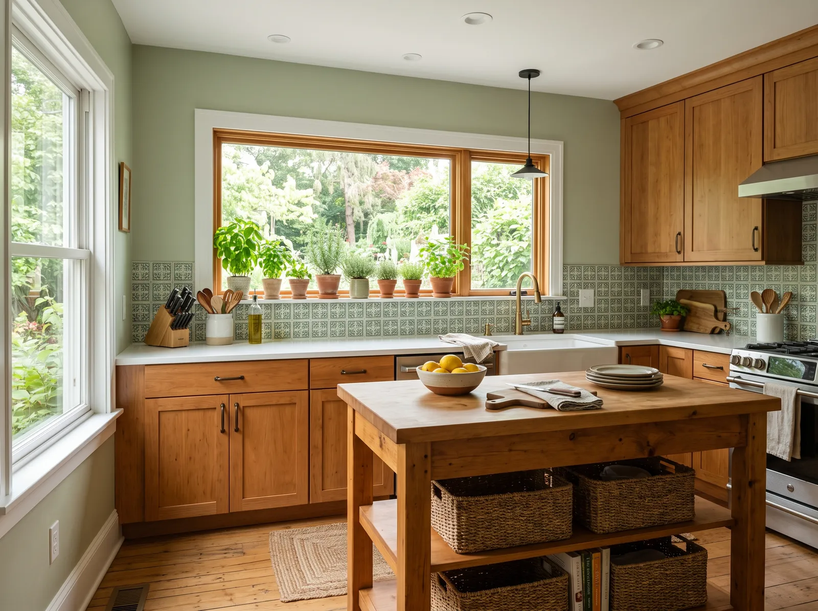
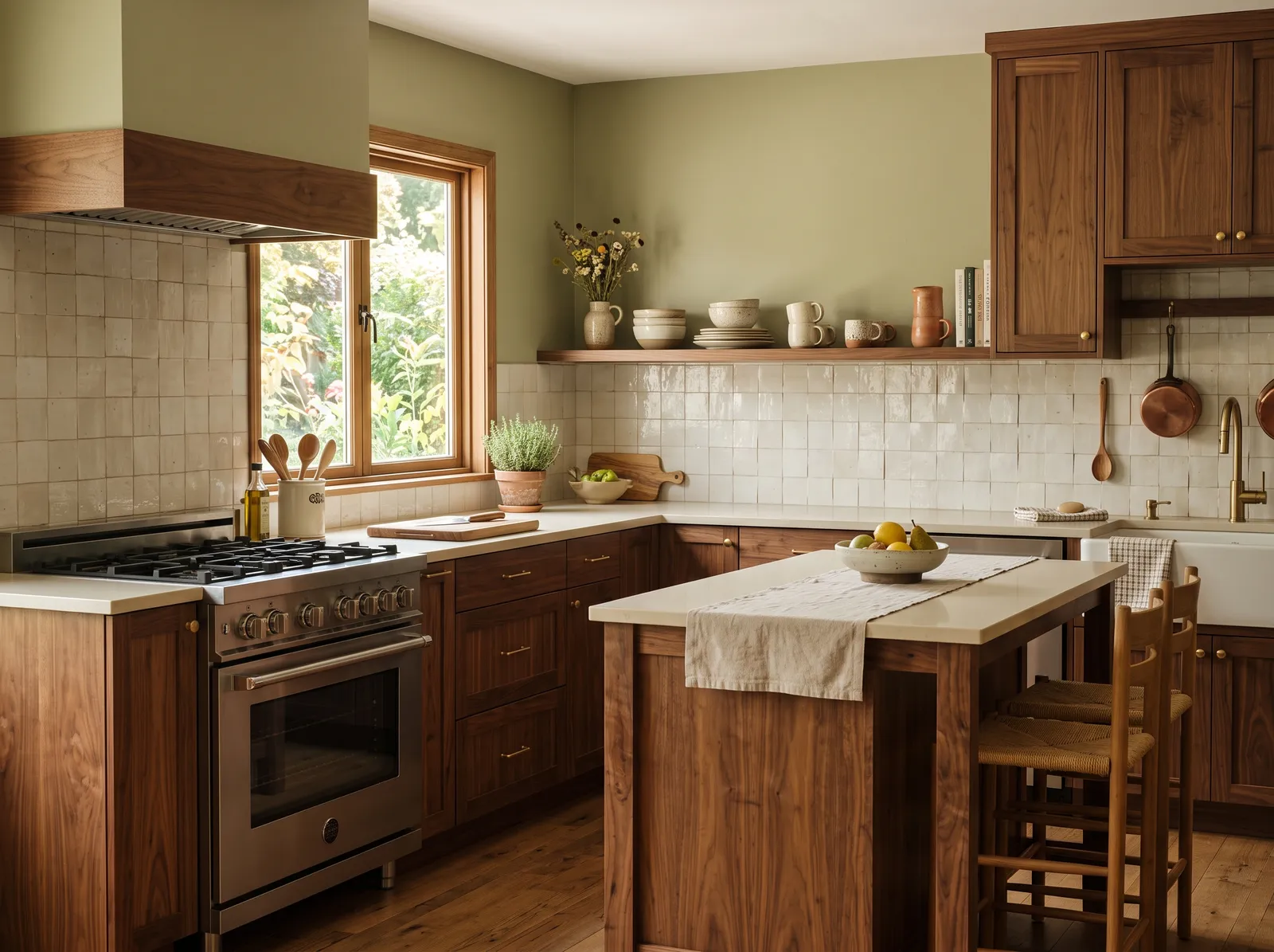
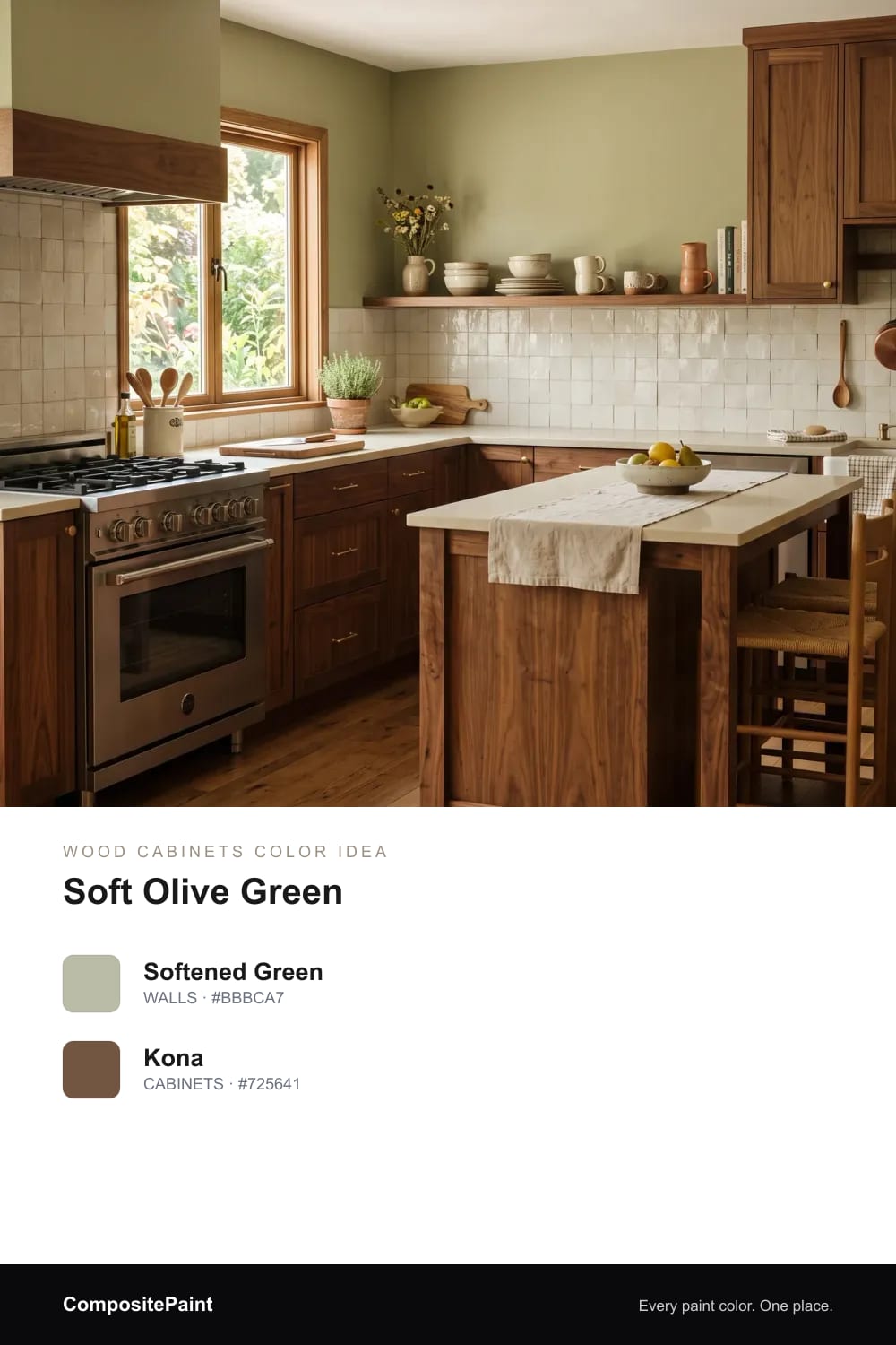
A soft sage that brings a touch of the garden inside and makes warm wood cabinets look fresh and natural.
A muted olive-green that leans earthy and warm, the kind of green that feels right at home next to brown wood.
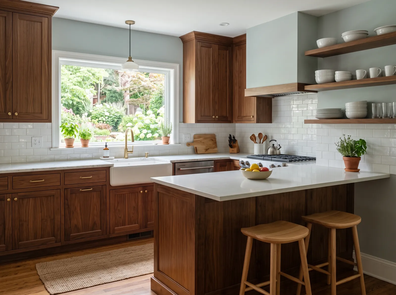
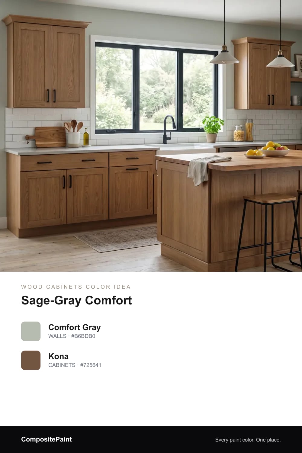
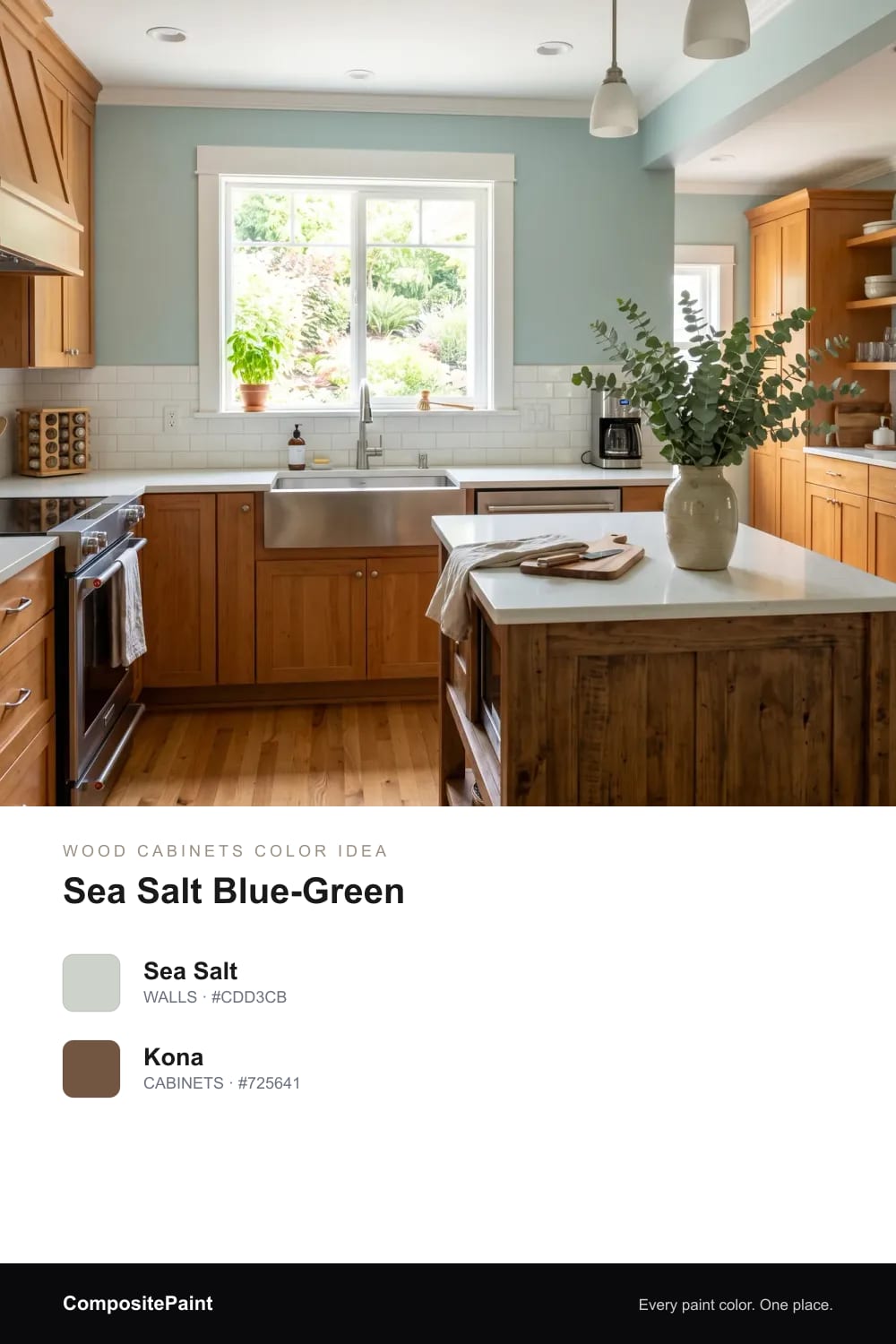
A soft green-gray that reads relaxed and a little spa-like, cooling the room so warm wood looks balanced and calm.
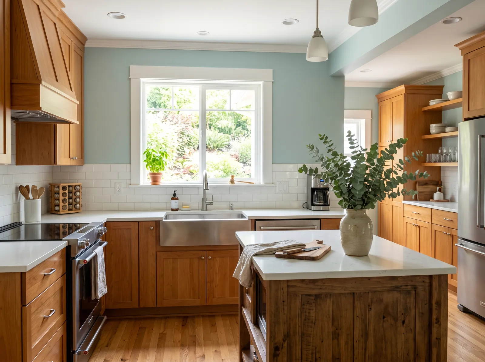
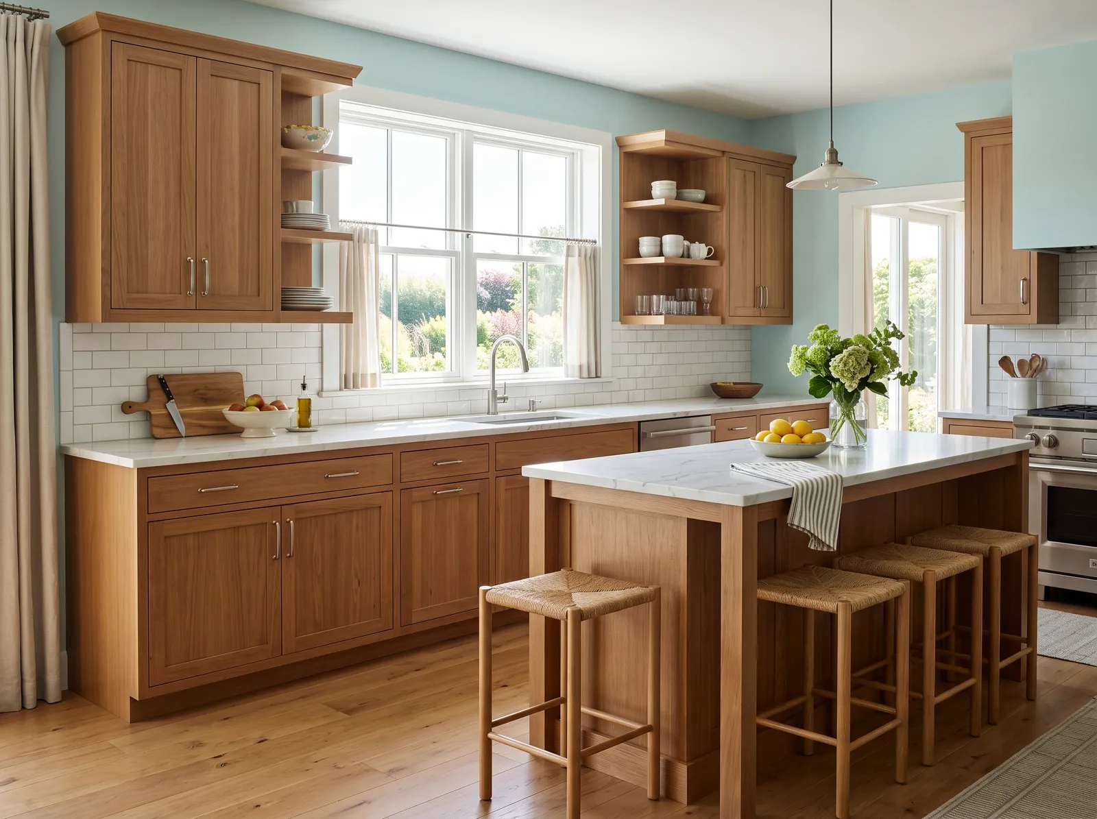
A soft, watery blue-green that shifts with the light and adds a cool, easy breath of air around warm wood.
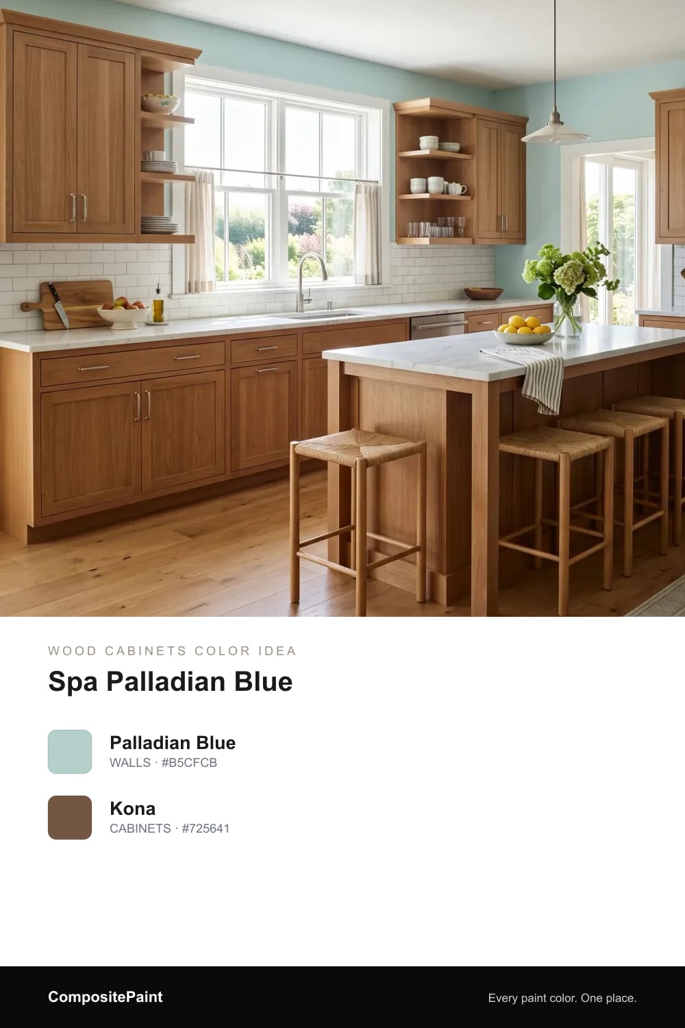
A gentle aqua-blue that feels clean and restful, giving wood cabinets a fresh, coastal kind of calm.
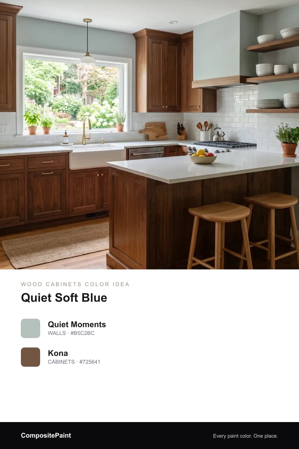
A muted gray-blue that stays soft and grown-up, an easy way to add a little color while wood cabinets stay the star.
Upload a photo of your wood cabinets and the visualizer paints your walls in any of these colors — in seconds.
UPLOAD YOUR PHOTO →Wood cabinets already carry a lot of color. They have warmth, grain, and a tone all their own, so your wall color is really there to support them, not compete. The right wall makes the wood look richer; the wrong one can make it look orange, dull, or dated.
The trick is balance. Warm woods love walls that are either soft and warm to match them, or gently cool to settle them down. Once you find that balance, the whole kitchen feels calm and finished, and your cabinets look like a choice instead of a leftover.
A warm white or soft cream is the easiest, safest path with brown and wood cabinets. It keeps the room bright and open while letting the wood glow. Skip the icy, blue-white shades; next to warm wood they can look stark and a little cold.
Reach for whites with a soft, creamy base instead. They feel sunny in the morning and cozy at night, and they make honey, oak, and walnut all look their best. If your kitchen gets a lot of light, a clean cream adds warmth; if it is already warm and bright, a soft white keeps it fresh.
Green and wood are a natural pair, the same way they are in a forest. Soft sage and muted olive bring the outdoors in and make warm wood look fresh and grounded at the same time. They are calm, easy to live with, and forgiving in changing light.
Keep the green gentle and a little gray rather than bright or minty. A soft sage feels timeless next to brown cabinets, while a deeper olive adds a cozy, earthy mood. Both let the wood stay warm without fighting it.
Blue is the cool color that brown wood loves most, because warm and cool sit opposite each other and quietly balance out. A soft blue-green or gentle gray-blue adds a breath of fresh air and keeps a wood kitchen from feeling too heavy or brown.
Stay in the muted, grayed-down range rather than a bright, saturated blue. A watery blue-green feels light and coastal, while a soft gray-blue feels calm and grown-up. Either one lets the wood stay warm while the room feels a little cooler and more open.
Your wood tone changes which walls look best. Honey and golden oak run warm and yellow, so they shine next to soft whites, creams, sage, and watery blues that cool things down just enough. Very warm walls can push honey wood toward orange, so a slightly cooler wall often helps.
Darker walnut and espresso woods are richer and a little cooler, so they can handle deeper greiges, taupes, and soft blues without feeling washed out. A good test: hold a paint sample right against your cabinet in daylight and at night, and watch whether the wood looks warmer and richer or yellow and tired.
Your counters and backsplash are part of the color story too. Creamy quartz, soft white marble looks, and light stone all bridge brown cabinets and lighter walls beautifully, keeping the room feeling open. Very dark counters look dramatic but can make a wood kitchen feel heavier, so balance them with a lighter wall.
For the backsplash, simple and light usually wins. A white or soft tile keeps the focus on the wood and lets your wall color breathe. If you want a little personality, a handmade or zellige tile in a soft tone adds texture without pulling attention away from the cabinets.
Kitchens get splashes, steam, and sticky fingers, so finish matters as much as color. For the walls, an eggshell or satin finish is the sweet spot. It wipes clean easily and has just a soft, gentle glow, so it hides little bumps while standing up to daily life.
Flat or matte can look lovely but is harder to clean near the stove and sink, so save it for ceilings. On trim and doors, step up to a semi-gloss; it is tougher and easy to wipe, and the slight shine frames your wood cabinets nicely.
Soft, warm neutrals are the easiest match, like a creamy white, a soft greige, or a warm taupe. If you want a little color, gentle sage green and soft blue both flatter brown wood without fighting it. Stay away from icy, blue-white shades, which can make warm wood look orange.
Cooler, muted walls update wood cabinets fast. A soft greige, a sage-gray, or a gentle gray-blue calms the yellow in the wood and feels current. Pairing those walls with light counters and simple hardware makes the whole kitchen look fresh and intentional.
Yes, as long as the gray has a little warmth in it. A pure cool gray can clash with warm wood and look flat, so reach for a greige or a green-gray instead. Those soft, warm-leaning grays settle the wood down and keep the room feeling cozy, not cold.
Honey oak runs warm and golden, so it loves soft whites, creams, sage, and watery blues that cool it down a touch. Darker walnut is richer and can carry deeper colors, like a warm taupe, a soft olive, or a gray-blue. Always test the sample against your cabinet in real light first.
Light, creamy counters work almost every time, like a soft white quartz or a marble look. They keep the kitchen open and let the wood be the star. Darker counters look dramatic but feel heavier, so balance them with a lighter wall and a light backsplash.
An eggshell or satin finish is best for kitchen walls because it wipes clean and has just a soft glow. Save flat or matte for the ceiling, where it does not get touched as much. Use a tougher semi-gloss on trim and doors so they hold up to daily wear.