CP

Winter Color Palette — Winter Pine

A cool, quiet five-color scheme built from frost blue, silver grey, deep pine green and snow white, with every color matched to real paint you can buy.

By Jessica Williams · Color Stylist & Interior Editor

Deep Pine
Dominant
Kompozit Atlantic Waves · 0473
#264243
LRV 5
Evergreen Shade
Secondary
Kompozit Plateau · 0704
#49665A
LRV 12
Snow White
Base
Kompozit Cyprus Spring · 0411
#F2F2EA
LRV 88
Silver Grey
Support
Kompozit Sacred Spring · 0510
#C7CBCE
LRV 59
Frost Blue
Accent
Kompozit Dancing in the Rain · 0644
#ABC5D6
LRV 53
View palette in

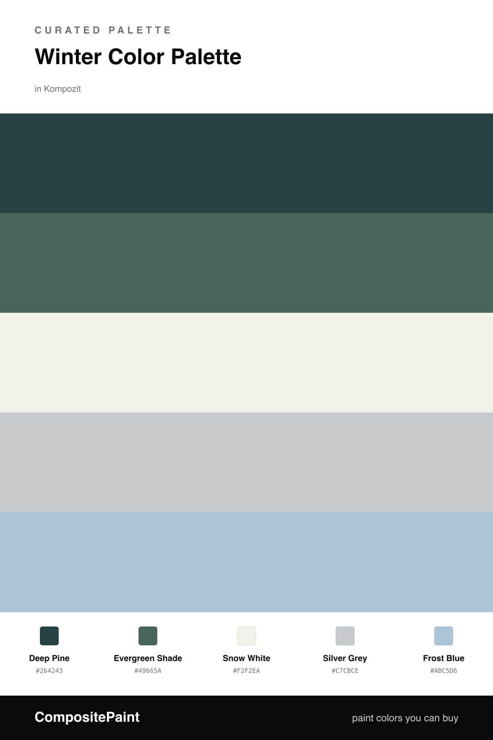
There is a particular hush to winter light, and this palette is built to hold it. Deep Pine leads as the dominant color, a green so dark it almost passes for charcoal until the sun catches it, and Evergreen Shade steps in just behind it with a softer, more forgiving version of the same forest tone.

Against that depth, Snow White opens everything back up and Silver Grey bridges the two, cool and quiet without tipping into steel. A little Frost Blue is the accent that makes the whole scheme feel like a clear morning after snow — use it sparingly, on a single piece or a trim detail.

For 2026 the move is to keep the greens grounded and a touch muted rather than glossy, letting the white and grey do most of the breathing room. Pine leads, the neutrals carry the calm, and that one breath of frost blue keeps it feeling fresh instead of somber.

Buy These Colors

Each color matched to the closest real paint in every brand, by ΔE2000. Kompozit first; take any SKU to the store — these mix on demand.

Deep Pine
#2C3E36 · LRV 4 · Dominant
Kompozit Atlantic Waves · 0473 ΔE 5.53
Backdrop After Hours · BD-AH ΔE 6.99
Behr Black Swan · 710F-7 ΔE 1.84
Benjamin Moore Salamander · 2050-10 ΔE 5.04
Clare Blackish · PNT100-DP-54 ΔE 11.45
Dunn-Edwards Black · DEA187 ΔE 11.54
Farrow & Ball Pitch Black · No. 256 ΔE 11.82
Magnolia Home Moments · JG-150 ΔE 16.04
PPG / Glidden Black Magic · 1001-7 ΔE 11.7
Sherwin-Williams Roycroft Bottle Green · SW 2847 ΔE 1.84
Valspar Aged Pine · 6011-5 ΔE 4.64
Evergreen Shade
#4A6356 · LRV 11 · Secondary
Kompozit Plateau · 0704 ΔE 1.54
Backdrop We Three Kings · BD-WK ΔE 19.44
Behr Congo · PPU11-20 ΔE 2.13
Benjamin Moore Under the Sea · 693 ΔE 1.34
Clare Deep Dive · PNT100-MD-40 ΔE 10.55
Dunn-Edwards Pine Haven · DE5713 ΔE 1.07
Farrow & Ball Inchyra Blue · No. 289 ΔE 8.84
Magnolia Home Regal Leaf · JG-72 ΔE 4.53
PPG / Glidden Still Searching · 13-31 ΔE 3.2
Sherwin-Williams Kale Green · SW 6460 ΔE 3.62
Valspar Grand Prix · 8003-38F ΔE 5.36
Snow White
#F2F4F3 · LRV 90 · Base
Kompozit Cyprus Spring · 0411 ΔE 3.37
Backdrop Tabula Rasa · BD-TR ΔE 4.7
Behr New House White · RD-W10 ΔE 1.59
Benjamin Moore Distant Gray · 2124-70 ΔE 1.03
Clare Timeless · PNT100-LT-04 ΔE 3.4
Dunn-Edwards Lighthouse · DEW385 ΔE 0.82
Farrow & Ball Wimborne White · No. 239 ΔE 4.91
Magnolia Home True White · JG-21 ΔE 2
PPG / Glidden Delicate White · 1001-1 ΔE 1.56
Sherwin-Williams High Reflective White · SW 7757 ΔE 2.54
Valspar Tell Me a Secret · 8007-2B ΔE 1.27
Silver Grey
#C4CBCC · LRV 59 · Support
Kompozit Sacred Spring · 0510 ΔE 2.02
Backdrop Real Real · BD-RR ΔE 9.45
Behr Burnished Metal · UL260-17 ΔE 1.91
Benjamin Moore Pelican Gray · 1612 ΔE 0.93
Clare Grayish · PNT100-LT-10 ΔE 3.45
Dunn-Edwards Bay of Hope · DE6331 ΔE 2.99
Farrow & Ball Calluna · No. 270 ΔE 6.73
Magnolia Home Wedding Band · JG-12 ΔE 4.1
PPG / Glidden Babbling Brook · 1144-3 ΔE 4.65
Sherwin-Williams Gray Screen · SW 7071 ΔE 1.35
Valspar Milky Way · 8004-37B ΔE 2.05
Frost Blue
#A7C2CE · LRV 51 · Accent
Kompozit Dancing in the Rain · 0644 ΔE 2.55
Backdrop Lost in the 80s · BD-LO ΔE 1.56
Behr Stargazer · N510-3 ΔE 2.34
Benjamin Moore Mediterranean Sky · 1662 ΔE 0.72
Clare Cloud Watching · PNT100-MD-73 ΔE 3.72
Dunn-Edwards Peace River · DE5800 ΔE 1.67
Farrow & Ball Blue Ground · No. 210 ΔE 5.71
Magnolia Home It Is Well · JG-76 ΔE 4.83
PPG / Glidden Graceful · 1152-3 ΔE 1.64
Sherwin-Williams Agua Fría · SW 9053 ΔE 4.61
Valspar Drenched · T632 ΔE 0.99

Questions

Where should the deep pine go in a room?

Treat it as your anchor on the surface you want to feel grounded, like a feature wall, a built-in, or cabinetry. It reads almost charcoal in low winter light and softens to a clear green when the sun comes through, so give it a wall that gets both.

Will this palette feel too cold to live with?

It stays calm rather than icy because the green carries warmth that pure greys lack. Lean on the snow white and silver grey across most of the space, then let the frost blue appear in small doses so the cool notes feel chosen instead of chilly.

Similar Palettes

Closest schemes by color — not by label.