CP

Winter Color Palette — Winter Marsh

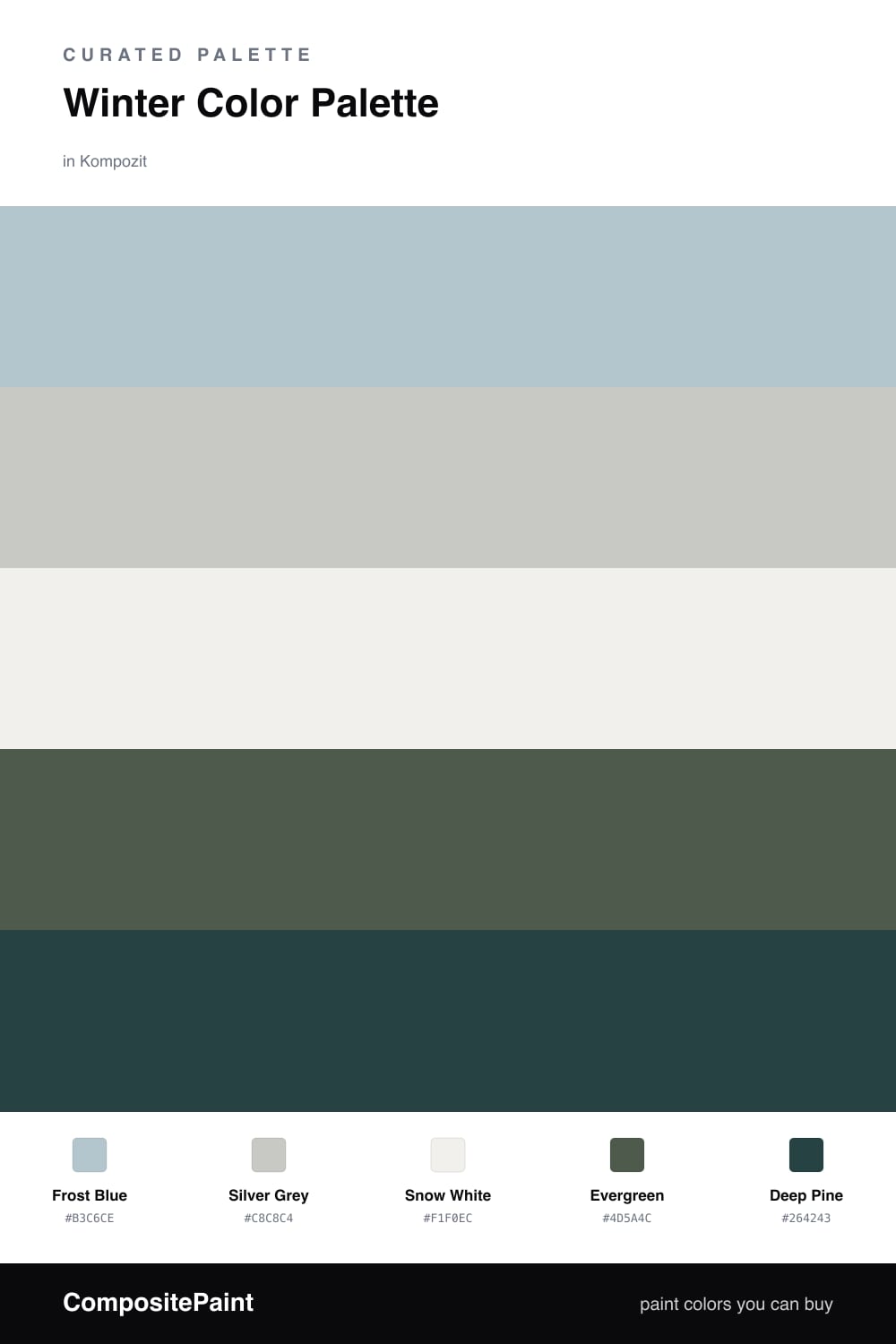
A quiet five-color winter scheme of frost blue, silver grey, evergreen, deep pine, and snow white, every color matched to real paint you can buy.

By Jessica Williams · Color Stylist & Interior Editor

Frost Blue
Dominant
Kompozit Star Mist · 0630
#B3C6CE
LRV 54
Silver Grey
Secondary
Kompozit Snowglory · 0531
#C8C8C4
LRV 58
Snow White
Base
Kompozit White Shoulders · 1265
#F1F0EC
LRV 87
Evergreen
Support
Kompozit Pleasant Hill · 0459
#4D5A4C
LRV 9
Deep Pine
Accent
Kompozit Atlantic Waves · 0473
#264243
LRV 5
View palette in

This is the palette of a still winter morning, when the air is sharp and everything outside reads in soft, cool tones. Frost Blue leads, a pale wash with just enough grey to feel like breath on a cold window, and Silver Grey sits beside it to keep things quiet and contemporary.

Snow White opens the whole scheme up like fresh light on snow, giving your eye somewhere to rest. Against all that softness, Evergreen brings the first real depth, the color of pine needles half-buried in frost.

Save Deep Pine for the smallest moments, a door, a frame, a single piece of furniture. It anchors the cool palette and keeps it from drifting too pale, the way dark trees give a winter landscape its edge.

Buy These Colors

Each color matched to the closest real paint in every brand, by ΔE2000. Kompozit first; take any SKU to the store — these mix on demand.

Frost Blue
#B7C7CE · LRV 55 · Dominant
Kompozit Star Mist · 0630 ΔE 1.1
Backdrop Lost in the 80s · BD-LO ΔE 5.04
Behr English Hollyhock · HDC-CT-16A ΔE 2.2
Benjamin Moore Instinct · AF-575 ΔE 3.32
Clare Summer Friday · PNT100-LT-37 ΔE 2.81
Dunn-Edwards Bay of Hope · DE6331 ΔE 2.56
Farrow & Ball Parma Gray · No. 27 ΔE 2.2
Magnolia Home Vibrant Horizon · JG-88 ΔE 4.83
PPG / Glidden Blue Dolphin · 1041-4 ΔE 3.7
Sherwin-Williams Sleepy Hollow · SW 9145 ΔE 0.82
Valspar Lighthouse Shadows · 4008-3B ΔE 0.88
Silver Grey
#C6C8C5 · LRV 57 · Secondary
Kompozit Snowglory · 0531 ΔE 1.03
Backdrop Real Real · BD-RR ΔE 6.98
Behr Burnished Metal · UL260-17 ΔE 1.17
Benjamin Moore Silver Chain · 1472 ΔE 1.27
Clare Grayish · PNT100-LT-10 ΔE 3.53
Dunn-Edwards Ice Gray · DEC790 ΔE 2.6
Farrow & Ball Pavilion Gray · No. 242 ΔE 3.75
Magnolia Home Wedding Band · JG-12 ΔE 2.37
PPG / Glidden Solitary State · 1009-3 ΔE 0.58
Sherwin-Williams Tinsmith · SW 7657 ΔE 0.79
Valspar Filtered Shade · 4003-1B ΔE 2.09
Snow White
#F2F1EC · LRV 88 · Base
Kompozit White Shoulders · 1265 ΔE 0.53
Backdrop Tabula Rasa · BD-TR ΔE 2.68
Behr Nano White · HDC-MD-06 ΔE 0.81
Benjamin Moore Super White · OC-152 ΔE 1
Clare Wing It · PNT100-LT-24 ΔE 3.27
Dunn-Edwards Fossil · DE6225 ΔE 0.98
Farrow & Ball Wimborne White · No. 239 ΔE 2.78
Magnolia Home Silos White · JG-107 ΔE 1.04
PPG / Glidden Delicate White · 1001-1 ΔE 1
Sherwin-Williams Extra White · SW 7006 ΔE 1.11
Valspar Santa's Beard · 8007-6E ΔE 0.21
Evergreen
#3E5A4C · LRV 9 · Support
Kompozit Pleasant Hill · 0459 ΔE 5.34
Backdrop North End · BD-NE ΔE 5.45
Behr Alpine · QE-40 ΔE 1.94
Benjamin Moore Gondola Ride · 602 ΔE 2.41
Clare Blackest · PNT100-DP-55 ΔE 15.94
Dunn-Edwards Woodlawn Green · DEC779 ΔE 1.47
Farrow & Ball Studio Green · No. 93 ΔE 10.87
Magnolia Home Regal Leaf · JG-72 ΔE 5.56
PPG / Glidden Royal Hunter Green · 1133-7 ΔE 1.44
Sherwin-Williams Billiard Green · SW 16 ΔE 3.26
Valspar Canadian Fir · 5004-4C ΔE 2.51
Deep Pine
#243A30 · LRV 4 · Accent
Kompozit Atlantic Waves · 0473 ΔE 6.61
Backdrop After Hours · BD-AH ΔE 9.23
Behr Thorny Branch · S-H-780 ΔE 6.35
Benjamin Moore Essex Green · HC-188 ΔE 2.94
Clare Blackish · PNT100-DP-54 ΔE 13.68
Dunn-Edwards Black · DEA187 ΔE 13.45
Farrow & Ball Pitch Black · No. 256 ΔE 13.69
Magnolia Home Blackboard · JG-05 ΔE 14.16
PPG / Glidden Black Magic · 1001-7 ΔE 13.8
Sherwin-Williams Rookwood Shutter Green · SW 2809 ΔE 6.76
Valspar Aged Pine · 6011-5 ΔE 5.86

Questions

Why do these winter colors feel so calm together?

They share a cool, muted undertone, so nothing fights for attention. The frost blue and greys hush the room while the two greens add depth without warmth.

How much of the green should I use?

Keep it small. Let the frost blue and snow white carry most of the space, then bring in evergreen and deep pine as roughly one-fifth of the palette for grounding.

Similar Palettes

Closest schemes by color — not by label.