CP

Winter Color Palette — Frost Horizon

A quiet five-color winter scheme of frost blue, silver grey, deep pine, and snow white, balanced for a calm cool-toned space — every color matched to real paint you can buy.

By Emily Roberts · DIY Editor & First-Timer's Guide

Frost Blue
Dominant
Kompozit Dancing in the Rain · 0644
#ABC5D6
LRV 53
Silver Grey
Secondary
Kompozit Paternoster · 0546
#C7C7C6
LRV 57
Snow White
Base
Kompozit Sugar Dust · 0011
#F8F6ED
LRV 92
Evergreen
Support
Kompozit Pleasant Hill · 0459
#4D5A4C
LRV 9
Deep Pine
Accent
Kompozit Silent Sea · 0515
#2A2B2C
LRV 2
View palette in

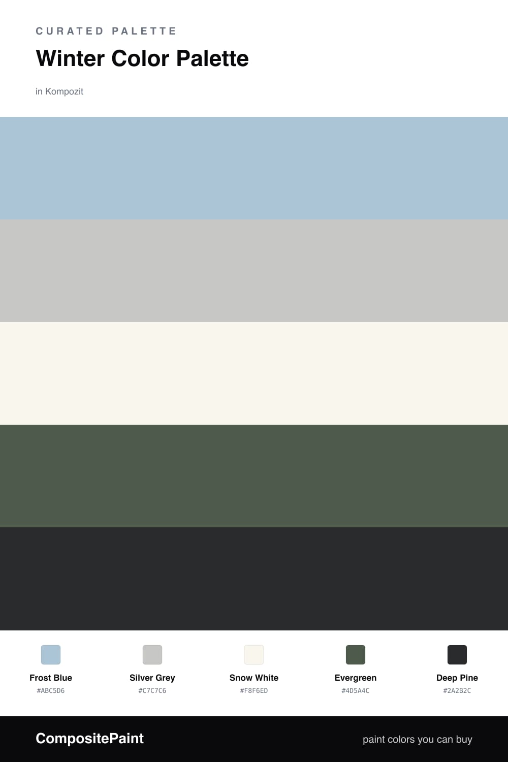
This is the palette I reach for when I want a room to feel like a still, snowy morning. Frost Blue leads the way as a soft, hazy color that feels like light coming through a frosted window, and Silver Grey sits right beside it to keep things grounded and quiet.

Snow White is your base — a clean, slightly warm white that brightens everything without going stark. Then Evergreen and Deep Pine bring the cozy contrast, like trees against a pale winter sky. Use them in small doses, on a single wall, cabinetry, or trim.

If you are nervous a cool palette will feel chilly, you are not alone — it is the question I hear most. The fix is easy. Add warm wood tones and soft textures, and this scheme turns calm and inviting instead of cold. It is a fresh, modern look that still feels restful.

Buy These Colors

Each color matched to the closest real paint in every brand, by ΔE2000. Kompozit first; take any SKU to the store — these mix on demand.

Frost Blue
#AEC4D1 · LRV 53 · Dominant
Kompozit Dancing in the Rain · 0644 ΔE 1.63
Backdrop Lost in the 80s · BD-LO ΔE 2.42
Behr Opal Waters · MQ5-50 ΔE 0.46
Benjamin Moore Sea View · 836 ΔE 0.97
Clare Summer Friday · PNT100-LT-37 ΔE 4.17
Dunn-Edwards Blue Spruce · DE5772 ΔE 4.58
Farrow & Ball Parma Gray · No. 27 ΔE 3.71
Magnolia Home It Is Well · JG-76 ΔE 5.89
PPG / Glidden Twinkle · 1154-4 ΔE 1.07
Sherwin-Williams Honest Blue · SW 6520 ΔE 0.91
Valspar Ruffled Feathers · V109-3 ΔE 1.8
Silver Grey
#C3C8CB · LRV 57 · Secondary
Kompozit Paternoster · 0546 ΔE 2.83
Backdrop Real Real · BD-RR ΔE 10.09
Behr Paparazzi Flash · MQ5-18 ΔE 2.79
Benjamin Moore Porringer Gray · 2121-40 ΔE 0
Clare Grayish · PNT100-LT-10 ΔE 4.98
Dunn-Edwards Silver Polish · DE6374 ΔE 2.57
Farrow & Ball Calluna · No. 270 ΔE 5.28
Magnolia Home Cement Pots · JG-93 ΔE 2.62
PPG / Glidden Solitary State · 1009-3 ΔE 3.18
Sherwin-Williams Gray Screen · SW 7071 ΔE 1.64
Valspar Gravity · 4005-1B ΔE 1.29
Snow White
#F4F6F5 · LRV 92 · Base
Kompozit Sugar Dust · 0011 ΔE 3.89
Backdrop Tabula Rasa · BD-TR ΔE 4.76
Behr Luster White · W-B-600 ΔE 1
Benjamin Moore Chantilly Lace · 2121-70 ΔE 2.02
Clare Fresh Kicks · PNT100-LT-03 ΔE 1.35
Dunn-Edwards Cascading White · DEW394 ΔE 2.54
Farrow & Ball All White · No. 2005 ΔE 2.62
Magnolia Home True White · JG-21 ΔE 1.97
PPG / Glidden Delicate White · 1001-1 ΔE 1.71
Sherwin-Williams High Reflective White · SW 7757 ΔE 2.47
Valspar New Ream · V148 ΔE 2.03
Evergreen
#3F5A4E · LRV 9 · Support
Kompozit Pleasant Hill · 0459 ΔE 5.09
Backdrop North End · BD-NE ΔE 5.4
Behr Alpine · QE-40 ΔE 1.64
Benjamin Moore Garden Cucumber · 644 ΔE 1.71
Clare Blackest · PNT100-DP-55 ΔE 15.27
Dunn-Edwards Woodlawn Green · DEC779 ΔE 0.6
Farrow & Ball Studio Green · No. 93 ΔE 10.24
Magnolia Home Regal Leaf · JG-72 ΔE 5
PPG / Glidden Royal Hunter Green · 1133-7 ΔE 2.22
Sherwin-Williams Billiard Green · SW 16 ΔE 2.7
Valspar Canadian Fir · 5004-4C ΔE 1.57
Deep Pine
#23332B · LRV 3 · Accent
Kompozit Silent Sea · 0515 ΔE 10.38
Backdrop Hocus Pocus · BD-HP ΔE 13.4
Behr Black Suede · S-H-790 ΔE 4.77
Benjamin Moore Essex Green · HC-188 ΔE 1.1
Clare Blackish · PNT100-DP-54 ΔE 12.74
Dunn-Edwards Black · DEA187 ΔE 11.62
Farrow & Ball Pitch Black · No. 256 ΔE 11.78
Magnolia Home Blackboard · JG-05 ΔE 12.17
PPG / Glidden Black Magic · 1001-7 ΔE 12.34
Sherwin-Williams Tricorn Black · SW 6258 ΔE 10.78
Valspar Fait Accompli · V141-6 ΔE 5.33

Questions

Why do these cool colors work together?

They all share a soft blue-green undertone, so they read as one quiet family. The pale frost blue and snow white keep things bright while the greens add just enough depth.

How do I keep a cool palette from feeling cold?

Lean on the warmer creamy white and add natural texture — think wood, wool, and linen. Those touches warm the room without changing a single paint color.

Similar Palettes

Closest schemes by color — not by label.