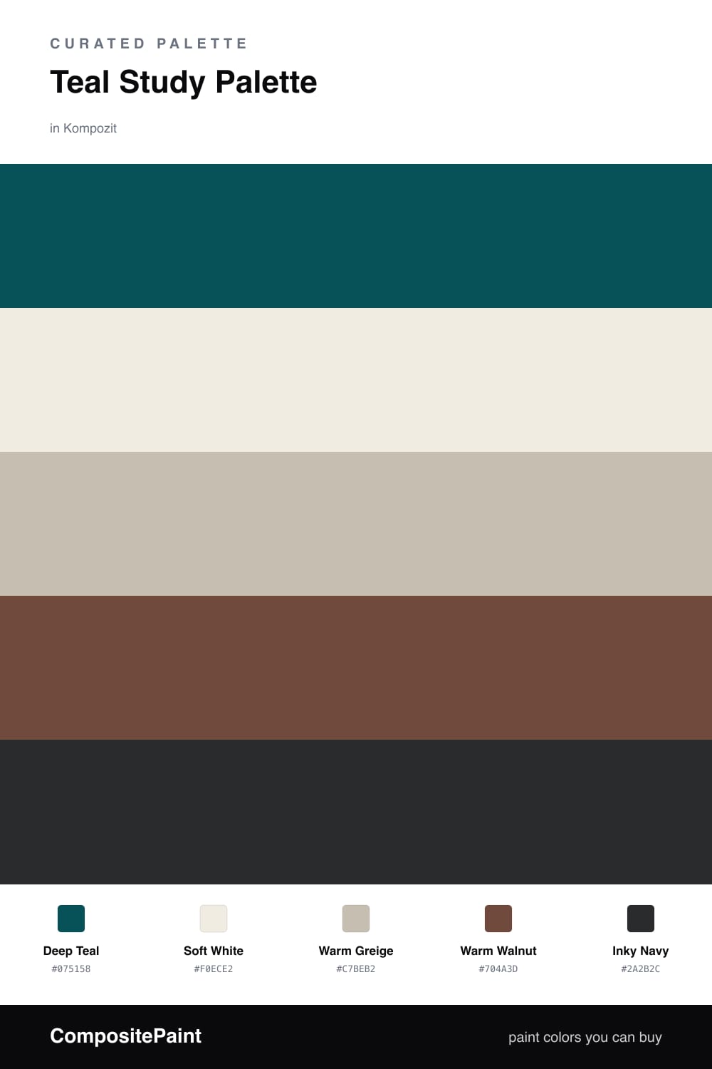
Teal Study Palette — Deep Teal & Warm Walnut
A focused five-color study scheme led by deep teal walls, grounded by greige and warm walnut with a soft white trim and an inky accent — every color matched to real paint you can buy.
By Maya Patel · Reviews Editor & Product Tester
A study is the one room where I want the walls to do some of the thinking for me. Deep Teal is my pick for that job — it is quiet and grounded, the kind of color that pulls your shoulders down and your focus in. On the main walls it sets a calm, contemporary mood without tipping into either cold blue or pushy green.
Around it I keep things warm and unfussy. Soft White on the trim and ceiling stops the teal from closing in, and Warm Greige on built-in cabinets or a desk surround bridges the two so nothing feels stark. Warm Walnut carries the wood and flooring, adding the cozy weight a working room needs.
For the accent I reach for Inky Navy in small doses — a chair, a shelf back, a lamp base. It deepens the teal and gives the scheme a crisp edge. Let the teal lead, keep the navy to a fifth of the room, and the whole study stays sharp instead of heavy.
Buy These Colors
Each color matched to the closest real paint in every brand, by ΔE2000. Kompozit first; take any SKU to the store — these mix on demand.
Questions
Teal is calm and a little serious, which is exactly what a work space wants. It reads as restful without going sleepy, so it helps you settle in and concentrate.
Not if you balance them. The soft white trim and ceiling lift the space, while the greige and walnut warm it up, so the teal feels enveloping rather than gloomy.
Similar Palettes
Closest schemes by color — not by label.