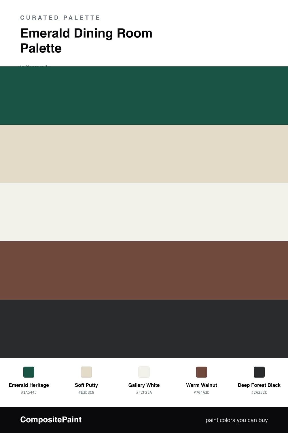
Emerald Dining Room Palette — Emerald Heritage & Warm Walnut
A rich five-color dining room scheme led by deep emerald green, softened with warm putty and crisp white, grounded by walnut wood and a near-black accent — every color matched to real paint you can buy.
By Emily Roberts · DIY Editor & First-Timer's Guide
Emerald is having a real moment right now, and the dining room is the perfect place to try it. You do not live in this room all day, so you can be braver here than you might be in a kitchen or hallway. Emerald Heritage on the walls gives you that deep, jewel-like green that looks expensive and feels calm once the lamps come on.
To keep it from going too gloomy, I lean on light around it. Soft Putty on a built-in or sideboard adds a warm, gentle contrast, and Gallery White on the trim and ceiling keeps the edges crisp and the room feeling taller. Warm Walnut floors and table tie the green to something natural and grounding.
For the finishing touch, a near-black Deep Forest Black shows up in small doses — think a light fixture, picture frames, or chair legs. It sharpens the whole scheme without fighting the emerald. Use the green generously, the white freely, and the black sparingly, and you get a dining room that feels rich and current without trying too hard.
Buy These Colors
Each color matched to the closest real paint in every brand, by ΔE2000. Kompozit first; take any SKU to the store — these mix on demand.
Questions
Not at all. A dining room is one of the best places for a deep color because you mostly use it in the evening, when rich green feels warm and a little dramatic by candle and lamplight.
Balance is everything here. Let the emerald lead on the walls, then lift it with plenty of crisp white on the trim and ceiling and warm wood underfoot, so the dark green reads cozy rather than closed in.
Similar Palettes
Closest schemes by color — not by label.