Blue Peacock
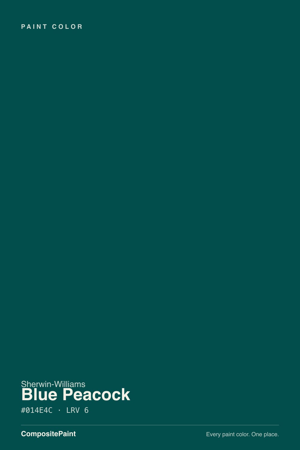
SW 64 · #014E4C · LRV 6 — cool blue-green tone, very dark — reads black in most rooms.
- 1Blue Peacock6
- 2Hidden Gem14
- 3Van Courtland Blue31
What Color Is Blue Peacock, Really?
Blue Peacock SW 64 is a very dark teal. Its hex value #014E4C sits at hue 178, right on the line between blue and green, and the saturation runs near 97 percent, so the pigment itself is strong. What keeps that strength in check is the lightness. At LRV 6 the color reflects almost no light, which puts it in the near-black band, so on a full wall it reads as a deep, inky color first and a teal second.
People choose it when they want a dark room that is not simply black or navy. Because the underlying color is so saturated, Blue Peacock keeps a visible blue-green cast where daylight or a lamp lands on it, so a dining room, study, or powder room painted in it feels enclosed rather than flat. It does the same job in small doses on cabinetry and front doors, where a near-black with real color holds up against wood and stone.
The catch is that an LRV of 6 removes almost all bounced light. In a room with one small window the teal collapses into black for most of the day, and you only see the green during a few hours of direct sun. Sheen matters more than usual too, since a flat finish absorbs what little light there is while satin gives the color a chance to show. Paint a large sample board and move it around the room before committing.
Blue Peacock is a cool blue-green. At hue 178 it sits almost exactly between the two families, so it is neither a navy nor a forest green, and which one you notice depends on what is beside it. Next to a true navy it looks green. Next to a warm green it looks blue. Next to black it clearly reads as a color rather than a neutral.
The near 97 percent saturation means the undertone is not shy. It is the very low LRV of 6 that hides it. In shadow the wall goes almost neutral dark; where a lamp or a sunbeam hits, the teal returns and can look surprisingly vivid.
Check it against your hard finishes before you buy. Green-veined stone, warm oak, and brass each pull something different out of it, and a cool gray tile can make the whole wall read colder than the chip led you to expect.
Best Rooms and Uses for Blue Peacock
This is a color for rooms you want to feel enclosed. Dining rooms, studies, libraries, powder rooms, and bedrooms all take it well, because at LRV 6 the walls step back and the furniture, art, and lighting come forward. In a large open living space it can feel heavy on every wall, so many people use it on a single wall, a fireplace surround, or built-in shelving instead.
Cabinetry is its other strong use. On a kitchen island or a run of lower cabinets it behaves like a near-black with a color secret, and it sits easily with wood counters and warm metals.
Outside it works as a front door, shutter, or window sash color against a light body. On a full exterior body it is very dark, which means more heat absorption and less forgiveness on surface flaws, so it suits smaller or shaded elevations best.
How Lighting Changes Blue Peacock
An LRV of 6 means the color returns almost no light to the room, so the light source decides whether you see teal or black. North-facing rooms get cool, flat daylight, which favors the blue side and keeps the color quiet and close to charcoal. South-facing rooms get enough direct sun to expose the saturation, and in the middle of the day the green becomes obvious on the sunlit wall.
East rooms show the color briefly in the morning and then let it fall dark. West rooms stay flat until late afternoon, when low sun can make it glow.
Bulbs do the rest. Warm 2700K light pushes it toward green and softens the edge. Cooler 4000K light keeps the blue forward and can make the room feel colder. Because so little light comes back off the walls, plan for more lamps and more layers of light than you would with a mid-tone.
Most complaints about Blue Peacock are a light mismatch. Upload a photo of your actual room and see it on your walls — then ask for the same wall in north light or evening lamps before you buy a single sample.
Need It From Another Brand?
Any paint counter can custom-tint Sherwin-Williams SW 64 directly. If you would rather stay in one brand's own deck, these are the closest stock matches, measured as ΔE2000. Under 2 is a difference you will not see on the wall.
| Brand | Closest color | ΔE | LRV | |
|---|---|---|---|---|
| Benjamin Moore | Sherwood Forest2048-10 · Benjamin Moore | 1.0 | 7 | Color page → |
| Valspar | Cathedral ViewV103-6 · Valspar | 2.5 | 5 | Color page → |
| HGTV Home by Sherwin-Williams | Bucolic GreenHGSW 2301 · HGTV Home by Sherwin-Williams | 3.3 | 5 | Color page → |
| Dunn-Edwards | Deep PineDEA180 · Dunn-Edwards | 4.7 | 5 | Color page → |
| Hirshfield's | Blue Period0690 · Hirshfield's | 4.8 | 9 | Color page → |
| Kompozit | Blue Period0690 · Kompozit | 4.8 | 7 | Color page → |
Similar Sherwin-Williams Colors
The nearest shades to Blue Peacock within Sherwin-Williams's own range, ranked by perceptual color distance — useful when you want the same look a touch lighter, darker, or warmer.
WCAG 2.1: AA is 4.5 : 1 for normal text, 3 : 1 for large text, AAA is 7 : 1.
Blue Peacock vs Similar Colors
Cape Verde SW 6482 at LRV 7 and Bridgeport SW 2940 at LRV 7 are the nearest neighbors in the line. Both are a shade lighter and slightly cleaner on the green side, and the gap is small enough that you should sample all three rather than choose from chips. Country Squire SW 6475 at LRV 5 drops most of the blue and becomes a dark green, while Blue Hill SW 2939 at LRV 5 and Moscow Midnight SW 9142 both move toward slate blue.
Across brands, Benjamin Moore Sherwood Forest 2048-10 at LRV 7 sits a deltaE of 1.01 away, which is visually identical in normal room light. Valspar Cathedral View V103-6 at LRV 5 is 2.51 away and HGTV Home by Sherwin-Williams Bucolic Green HGSW 2301 at LRV 5 is 3.34 away, so both are very close but worth sampling first. Dunn-Edwards Deep Pine DEA180 at 4.68 and Blue Period 0690 from Kompozit and from Hirshfield's at 4.81 are close but visibly different side by side.
Colors That Go With Blue Peacock
A color this dark needs light around it. Clean white trim gives the sharpest edge and stops the teal from spreading, while a warmer white softens the contrast and reads more traditional. Either way, keep trim in a separate color rather than painting it out, because at LRV 6 painted-out trim erases the architecture of the room.
For a second dark elsewhere in the house, stay in the same family instead of fighting it. Hunt Club SW 6468 at LRV 6 is a greener version at the same depth, and Blue Hill SW 2939 at LRV 5 leans further blue, so either can carry an adjacent room without a jarring switch. Country Squire SW 6475 at LRV 5 is the deep green option if you want the teal to look bluer by comparison.
Natural materials do the rest. White oak, walnut, rattan, unglazed terracotta, and brass or aged bronze all warm it up, while chrome and cool gray tile push it colder.
Coordinated palette
Generated by hue-rotating #014E4C in HSL space. Pair Blue Peacock with one accent and one neutral — the swatches below are starting points, not final picks.
Blue Peacock FAQ
Is Blue Peacock blue or green?
It is both. At hue 178 Blue Peacock sits on the border between blue and green, which is why it is classed as a teal. Whichever side you see depends on the light and the neighbors: beside a navy it looks green, beside a warm green it looks blue.
What LRV is Blue Peacock?
Blue Peacock has an LRV of 6. Light reflectance value runs from 0 for black to 100 for pure white, so 6 places it in the near-black band. It absorbs nearly all the light that hits it and returns very little to the room, which is why it reads as a dark color rather than a bright teal.
Does Blue Peacock work in a dark room?
It can, but only if you accept the result. With an LRV of 6 the color will not brighten anything, and in a room with little daylight the teal mostly reads as black. That suits a study, powder room, or dining room you want to feel enclosed. If you need the room to feel open, this is the wrong depth.
What white trim goes with Blue Peacock?
A clean, bright white gives the crispest line against an LRV 6 wall and keeps the architecture visible. A softer, warmer white lowers the contrast and reads more traditional, which suits older houses. Avoid painting trim in the same color, because at this depth the moldings disappear entirely.
Is Blue Peacock good for cabinets and front doors?
Yes, and small areas are where its saturation of about 97 percent pays off. On a kitchen island, lower cabinets, or a front door it behaves like a near-black with visible blue-green color in direct light. It pairs easily with wood, brass, and aged bronze, and it hides everyday wear better than a mid-tone.
What is the closest Benjamin Moore color to Blue Peacock?
Sherwood Forest 2048-10 at LRV 7 is the closest match in the data, a deltaE of 1.01 from Blue Peacock's #014E4C. That difference is visually identical in normal room light. Sheen and base formula still change the look, so brush out a sample of whichever one you buy.
Have you painted with Blue Peacock?
Rate it — one tap helps the next reader decide.
Ask a Question