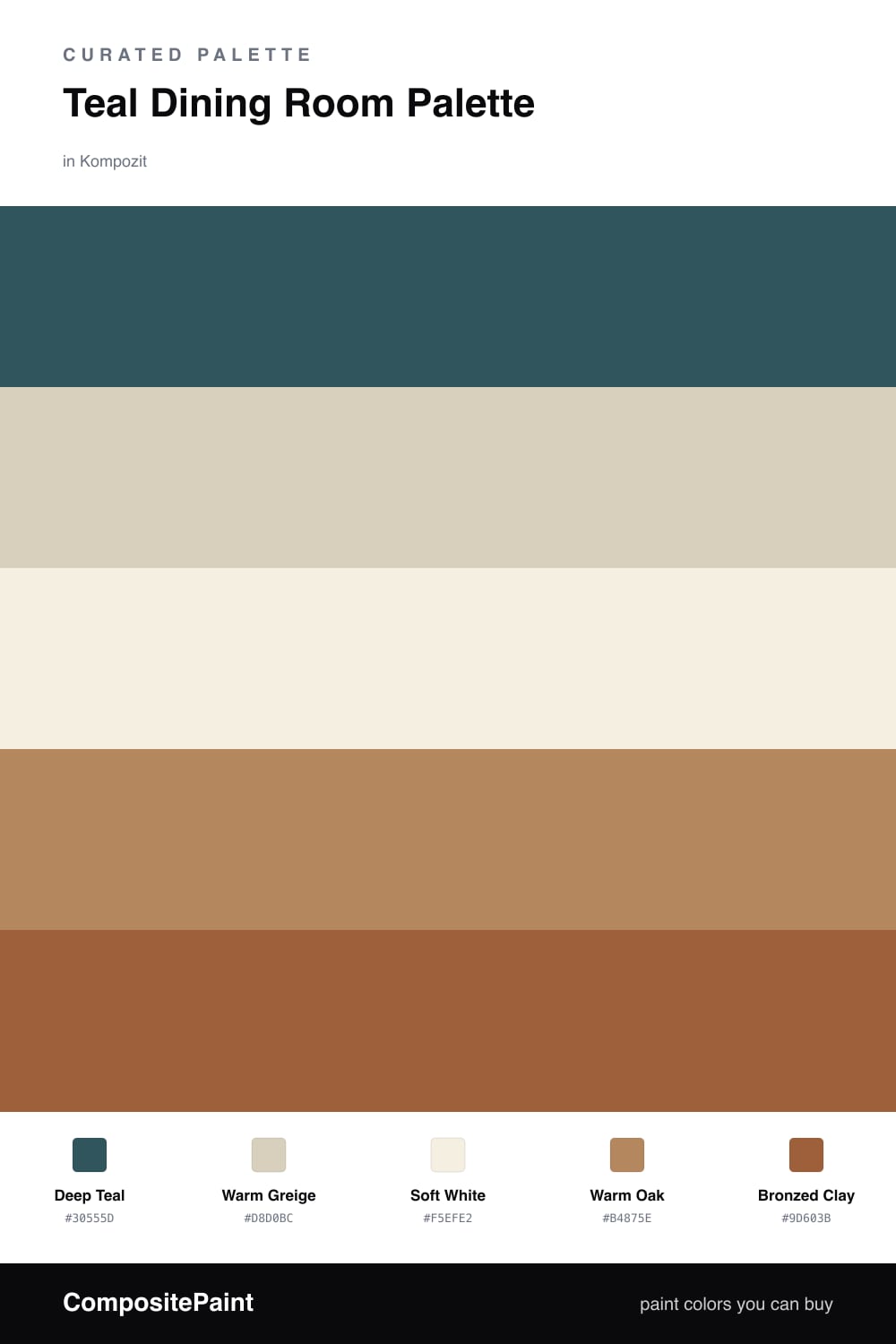
Teal Dining Room Palette — Deep Teal & Warm Oak
A five-color dining room scheme led by a deep teal wall, balanced by a soft greige base, crisp white trim, warm oak, and a bronzed accent — every color matched to real paint you can buy.
By David Chen · Formulation Lead & Resident Chemist
Teal is one of those colors that behaves differently in a dining room than anywhere else. Most rooms get their main use in daylight, but a dining room earns its keep at night, under warm bulbs and candles — and that is exactly when a deep teal stops being moody and starts glowing. The Deep Teal here is the anchor — saturated enough to feel intentional, but with enough gray in it to stay grown-up rather than tropical.
Around it, I keep the supporting cast quiet and warm. Warm Greige softens any built-ins or a buffet so they do not fight the walls, Soft White on the trim and ceiling gives your eye a place to rest, and Warm Oak brings in the honey tone of a real wood table or floor. That oak is doing the heavy lifting on temperature — it is the warm hand on teal’s cool shoulder.
The last move is the spark. Bronzed Clay shows up in small doses — a runner, ceramics, a band of chairs — and because it sits across the wheel from teal, it makes the whole room read deliberate. Use the teal on roughly two-thirds of what you see and let everything else play support, and this scheme lands firmly in 2026 territory — rich, warm, and easy to live with.
Buy These Colors
Each color matched to the closest real paint in every brand, by ΔE2000. Kompozit first; take any SKU to the store — these mix on demand.
Questions
Teal sits between blue and green, so it reads calm like blue but warm like green. In a room where people gather after dark, that mix feels rich under lamplight instead of cold, and it flatters food, wood, and skin tones alike.
It makes the room feel cozier, not smaller — think of it as a warm shell rather than a shrinking box. Pair it with soft white trim and a ceiling that catches the light, and the deep wall reads intimate and intentional rather than cramped.
Similar Palettes
Closest schemes by color — not by label.