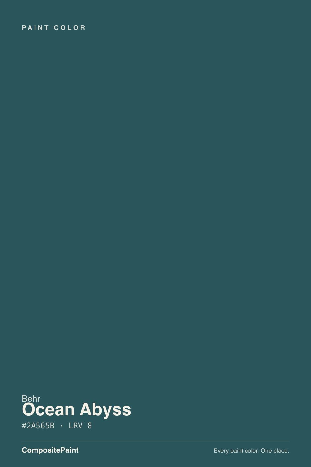
Ocean Abyss
Behr's deep nautical teal, reviewed honestly: the light where it truly reads teal, the light where it collapses to solid black, and what to pair it with instead of guessing.

Jessica has spec'd whites and neutrals for more than 300 rooms and keeps a sample wall of painted drawdowns in her studio. Every color review is checked against real reader rooms in the comments and re-tested when a formula changes. About the testing process →
- 1Deep Space3
- 2Ocean Abyss8
- 3Hidden Gem14
- 4Van Courtland Blue31
The Fast Verdict
Ocean Abyss is what happens when Behr takes a deep blue-green teal and grays it down until it edges into black. In full daylight it stays teal — moody, nautical, unmistakably a color. Drop the light and it stops arguing: at LRV 8 it reads as a flat near-black wall, which is exactly why Behr sells it as a cabinet, door and trim enamel first and a whole-wall color second. Treat it like a dark accent, not a safe neutral, and it earns its Color-of-the-Month spotlight.
Kitchen islands and cabinets · a front door with real approach light · small, bright powder rooms · built-ins and accent walls in well-lit rooms
You're painting all four walls of a small or windowless room · you're picking sight-unseen from a photo or listing · your trim is staying a stark cool white · you want one color that reads the same in every room
- A real saturated blue-green teal — not a black pretending to be moody
- Sold as a cabinet, door and trim enamel, so the sheen and durability match the job
- Small, bright rooms take the depth beautifully — powder baths, entries, islands
- Interior/exterior rated, so the same color carries from cabinets to a front door
- Reads current and sophisticated without chasing a Color-of-the-Year trend
- LRV 8 means it goes flat and near-black in anything but strong light
- Photographs and listing photos routinely flatten it to solid black
- Wrong for all four walls of a small or windowless room
- Needs a genuinely warm white partner, or it reads cold and inky
What Color Is Ocean Abyss, Really?
A deep, saturated blue-green teal with enough gray mixed in to keep it from reading as a beach color — Behr's own marketing calls it a nautical hue for relaxed, sophisticated spaces, and that is an honest description, not overselling. It has never been a Color of the Year pick; Behr has featured it as an October Color of the Month instead, and it is sold specifically as a Behr Premium Cabinet, Door & Trim enamel as well as a Behr Marquee interior/exterior finish — a strong hint from the maker itself that this color is built for accents, not entire rooms.
At LRV 8 it sits at the dark end of the deck, in the same range as true blacks like SW Iron Ore (LRV 6) and BM Hale Navy (LRV 6). That low a number means the paint reflects almost nothing back: in strong daylight the blue-green comes through clearly, but pull the light down and the color collapses toward black. Behr's own styling guidance limits full-wall use to bright rooms and points it instead toward accent walls, doors and molding — that is not caution for caution's sake, it is the physics of a color this dark.
Undertone in one line: blue-green teal with a cool gray cast — never a true black, never a warm navy. The gap between what the paint actually is and how it photographs is the single most repeated theme in coverage of this color: in person, under real light, it is a distinct dark teal; in a listing photo or a dim phone shot, it is routinely mistaken for solid black. If your sample looks black on camera, that is the camera, not a bad batch.
Where It Shines
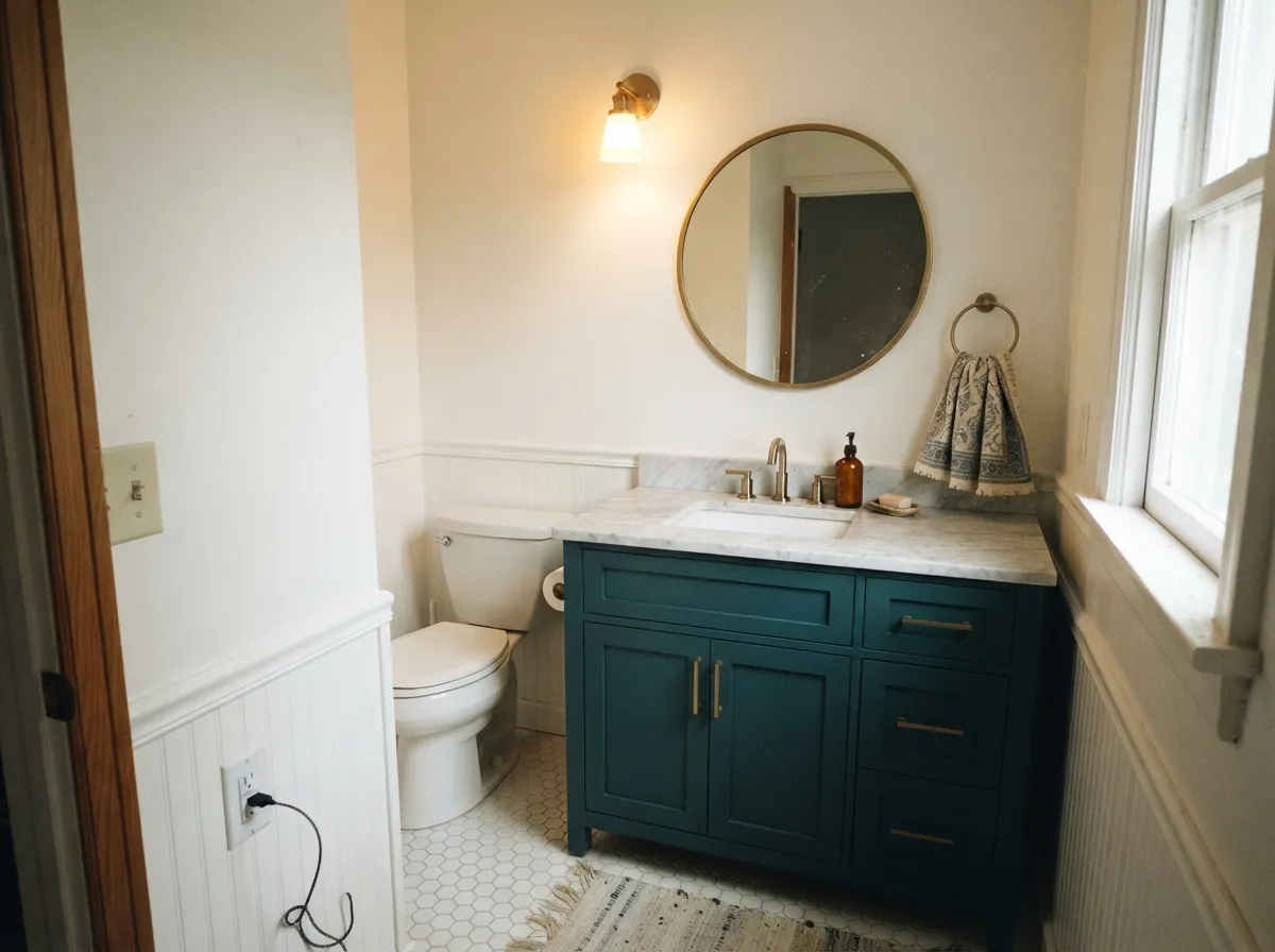
Give it a well-lit room and a job it was built for — a kitchen island, a front door with real approach light, a small saturated powder room — and it looks expensive and deliberate. Behr's own styling pick for the trim next to it is Whisper White, a warm cabinet white, and that pairing is worth copying: a stark cool white makes Ocean Abyss go flat and inky, while a warm white lets the teal stay visible right up to the edge.

Where It Fails
Almost every disappointed story about Ocean Abyss comes from asking a very dark, very saturated color to do a job it was not built for. All three are avoidable before you buy the can.
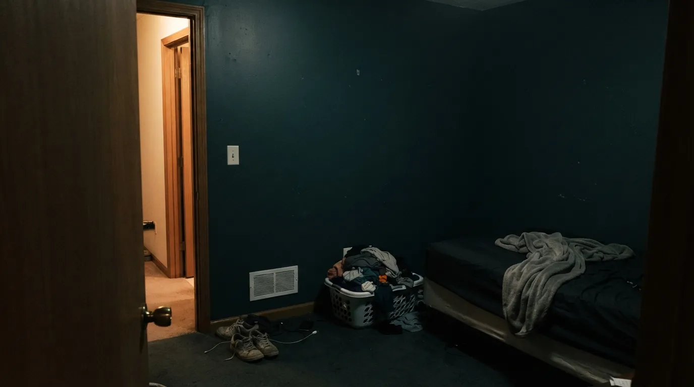
At LRV 8 the color needs light to bounce off of. Paint every wall of a windowless bathroom or a north-facing back bedroom and it goes flat, near-black, and the room feels smaller, not moodier. Behr's own guidance keeps whole-wall use to bright rooms for a reason — use it as an accent instead.
Cameras and listing photos flatten deep, saturated teals harder than the eye does — this is the most common complaint about Ocean Abyss online, and it is not a paint defect. In person, under real light, it reads as a distinct blue-green; in a phone photo or a real-estate listing, it routinely reads as a plain black wall. Sample it in the room, not on a screen.
Pair it with a blue-white or a builder's bright white and the whole wall goes cold and inky — two cool colors compound each other. Behr's own pairing pick is Whisper White, a warm cabinet white; a warm neutral keeps the teal reading as color instead of void.
Room by Room
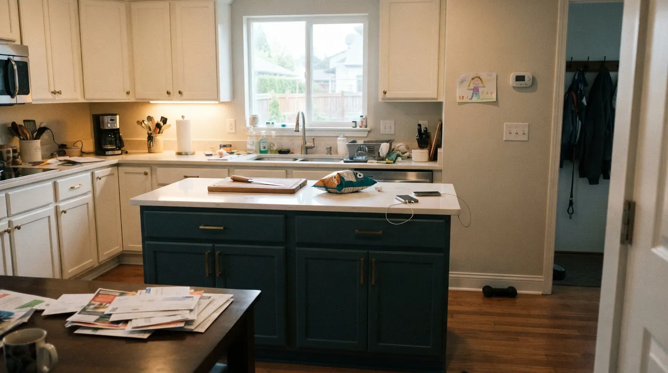
This is exactly what the paint is formulated for — Behr sells it as a cabinet, door and trim enamel. On a single island under warm perimeter cabinets and brass hardware it reads as a deliberate, expensive color choice. Satin enamel wipes clean; keep the rest of the kitchen light.
The same can that goes on cabinets is rated for exterior doors, and a front door usually gets more direct light than an interior wall ever will. Pair it with a light or white siding and it reads as a confident, current teal-navy rather than a plain black door.
Small rooms take deep color well, and a powder room with a window or a strong overhead fixture is the classic place to spend this kind of saturation. Skip it in a truly windowless half-bath with only a fan light — that's the one small room where it goes flat.
One wall, in a room with real daylight from another direction, can carry it beautifully behind a sofa or a media unit. In a dim, single-window living room it competes with Hale Navy and Iron Ore for "looks like a black wall" and loses the teal identity that makes it worth choosing over an actual black.
At LRV 8 a full bedroom in this color leans hard on warm lamp light at night to avoid feeling like a cave. It can work as a headboard wall with a bright ceiling fixture and warm bedding, but four walls in a dim bedroom is asking a lot of one color.
Bookshelves, a built-in desk wall, or wainscoting under a lighter wall color let the teal show as a considered material choice rather than a whole-room gamble. Brass or warm wood nearby keeps it from reading cold.
Your Light Is the Risk
Strong direct light is where the blue-green fully commits — deep and saturated, unmistakably teal rather than black.
Without real light to bounce off of, LRV 8 collapses toward flat black. This is the single biggest source of disappointment with the color.
Morning east light keeps it cooler and grayer; west afternoon sun pulls a little more blue-green forward before the room goes dim again.
Warm 2700K bulbs keep an edge of teal visible after dark; cool white LEDs push it further toward flat black-navy — pick warm bulbs for this color specifically.
Most complaints about Ocean Abyss are a light mismatch. Upload a photo of your actual room and see it on your walls — then ask for the same wall in north light or evening lamps before you buy a single sample.
Need It From Another Brand?
Any paint counter can custom-tint Behr MQ6-01 directly. If you would rather stay in one brand's own deck, these are the closest stock matches, measured as ΔE2000. Under 2 is a difference you will not see on the wall.
| Brand | Closest color | ΔE | LRV | |
|---|---|---|---|---|
| Benjamin Moore | Deep Sea Green735 · Benjamin Moore | 2.1 | 9 | Color page → |
| Valspar | ZephyrT604 · Valspar | 3.2 | 8.8 | Color page → |
| PPG / Glidden | Deep EmeraldPPG1148-7 · PPG / Glidden | 1.9 | 8 | Color page → |
| Glidden | Deep EmeraldPPG1148-7 · Glidden | 1.9 | 8 | Color page → |
| Dutch Boy | Petrol Blue234-7DB · Dutch Boy | 3.9 | 9 | Color page → |
| Dunn-Edwards | Encore TealDEA182 · Dunn-Edwards | 3.9 | 7 | Color page → |
Similar Behr Colors
The nearest shades to Ocean Abyss within Behr's own range, ranked by perceptual color distance — useful when you want the same look a touch lighter, darker, or warmer.
WCAG 2.1: AA is 4.5 : 1 for normal text, 3 : 1 for large text, AAA is 7 : 1.
Ocean Abyss vs the Colors You're Also Considering
Every Ocean Abyss sample board has the same rivals on it. The numbers show the real lightness gap — then it comes down to which risk you would rather live with.
Pick this for the greener, moodier, more nautical-teal version of a very dark blue.
Sherwin-Williams SW 6244 · LRV 4NavalPick this if you want a color that reads unmistakably blue at any LRV — Naval holds its navy identity where Ocean Abyss can go black.
Pick this when you want the deepest, most saturated version Behr makes in this family.
Behr N430-6A · LRV 14Hidden GemPick this for a lighter, more forgiving version of the same teal-green family — at LRV 14 it survives dim rooms Ocean Abyss can't.
Behr lists this color under two SKU forms, MQ6-01 and MQ6-1, both at LRV 8; they are the same color. Among true neighbors, Teal Forest 510F-7 at LRV 8 with hex #2A5757 is the greener choice, Petro Blue QE-47 at LRV 8 with hex #2C5861 leans bluer, and Submarine Gray N470-7 at LRV 8 with hex #36525B is noticeably grayer and less colorful. Terrace Teal PPF-56 and Out To Sea S450-7A, both LRV 9, are slightly lighter and more saturated.
Across brands, PPG and Glidden Deep Emerald PPG1148-7 at LRV 8 is a deltaE of 1.92 and Benjamin Moore Deep Sea Green 735 at LRV 9 is 2.06, both close enough to look identical or near-identical in normal room light, though the Benjamin Moore option is worth sampling first.
Valspar Zephyr T604 at LRV 8.8 is 3.23, and Dutch Boy Petrol Blue 234-7DB at LRV 9 is 3.94 and Magnolia Home Under The Stars JG-82 at LRV 8 is 4.07, both close but visibly different side by side.
Ocean Abyss Coordinating Colors
The rule for coordinating with Ocean Abyss is simple: warm, not cool. A warm white keeps the teal visible right up to the trim line; a cool or blue-white pushes the whole wall toward flat and inky. These are the partners that keep it reading as color, not void:
Ocean Abyss's Real Story: A Color of the Month, Not a Color of the Year
Ocean Abyss has never been named a Color of the Year by Behr or anyone else. Its real credential is smaller and more honest: Behr has spotlighted it as an October Color of the Month, styled around "relaxed, sophisticated spaces" and a nautical mood board of sandy neutrals and crisp whites. That is a real, verifiable nod — just a quieter one than the marketing language around most trend colors implies.
The more telling fact is where Behr actually sells it: as a Behr Premium Cabinet, Door & Trim enamel and a Behr Marquee interior/exterior finish, not primarily as a wall-and-ceiling color. The company is, in effect, telling you how to use it before you even open the can — a hardworking accent color, not a whole-house statement.
Ocean Abyss With Wood Tones and Metal Hardware
Warm wood is this color's easiest partner: white oak, walnut and butcher block all sit comfortably against a blue-green this deep, and the contrast between warm wood grain and cool teal is part of why it reads "nautical" rather than simply dark. Unlacquered or antique brass hardware is the classic finish here — it warms the cabinet or door the same way a warm white trim does.
Where it gets harder is stone: cool gray quartz or gray-veined marble next to Ocean Abyss doubles down on cool, and the pairing can read harsh rather than sophisticated. Warmer stone — a creamy quartz, a beige-veined marble — gives the color something to soften against instead of compete with.
Three Ready Palettes Built on Ocean Abyss
A color is never alone on the wall. These are complete combinations in the 60-30-10 pattern, with the reason each one holds together. Every one opens in the visualizer.
One saturated color earns its keep on a single piece of furniture-scale cabinetry, while a warm white keeps the rest of the kitchen bright enough to bounce light back at it. Matte black window frames or hardware add one more dark note without doubling down on the teal.
Try this palette in your roomA light body and a warm trim white let the door carry all the color; approach light on most porches is stronger than any interior wall gets, which is exactly the condition this paint needs to read as teal instead of black.
Try this palette in your roomA small, bright powder room is the classic place to spend a color this saturated — Alabaster keeps the rest of the walls glowing, and a near-black mirror frame ties the vanity to the room without adding a second loud color.
Try this palette in your roomOcean Abyss FAQ
Is Ocean Abyss black or teal?
Teal — a deep, gray-cast blue-green — but at LRV 8 it needs real light to prove it. In strong daylight it's unmistakably a color; in a dim room or a photo it is routinely mistaken for plain black. That gap between the can and the camera is the color's whole reputation.
What white goes with Ocean Abyss?
A warm white, not a stark cool one. Behr's own styling pick is Whisper White, a warm cabinet white; Alabaster or Simply White work the same way. A blue-white or builder's bright white makes the teal read cold and flat instead of rich.
Is it good for a kitchen island?
Yes — it's exactly what the paint is formulated for. Behr sells Ocean Abyss as a cabinet, door and trim enamel, so a single island under lighter perimeter cabinets is the classic, low-risk way to use it.
Can I paint a front door with it?
Yes. The same finish is rated interior/exterior, and a front door usually gets more direct light than most interior walls, which plays to the color's strength instead of its weakness.
How many coats does it need?
Plan on two full coats over a similar mid-to-dark color, and a gray-tinted primer plus extra coats if you're covering a pale wall — a color this dark and saturated always asks for more paint than a mid-tone would.
Why does it look black in my photos but not on the chip?
Cameras compress dark, saturated colors harder than your eye does, and phone photos especially lose the blue-green the moment the light drops. It's the most common complaint about this color online, and it isn't a defect — sample it in the actual room, in the actual light, before trusting a screen.
Have you painted with Ocean Abyss?
Rate it — one tap helps the next reader decide.
Ask a Question