Rose Color Palette — Rose & Sage Field
A soft five-color scheme led by dusty rose with sage, warm white, and greige neutrals plus a deep plum accent — every color matched to real paint you can buy.
By Emily Roberts · DIY Editor & First-Timer's Guide
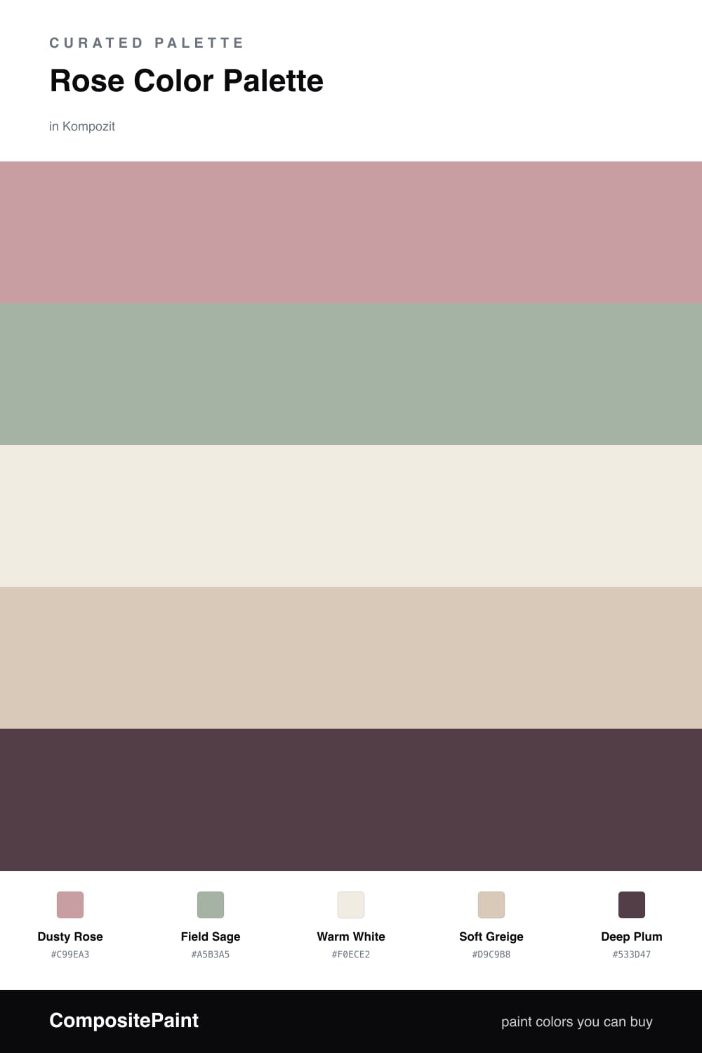
Rose is having a real moment right now, and this is the easy, grown-up way to use it. Dusty Rose leads the whole scheme — it is soft and a little muted, so it reads cozy instead of sweet. That muted quality is the trick. A pure pink can feel loud, but a rose with a touch of gray in it settles right into a room.
Next to it, Field Sage does the quiet heavy lifting. It cools the rose down and keeps everything feeling like a calm garden rather than a candy shop. Warm White and Soft Greige fill in the spaces between, so your eye gets places to rest. Think of them as the breathing room that lets the rose and sage shine.
Then comes Deep Plum, and you only need a little. A small dose of this rich, shadowy shade grounds the softer colors and gives the palette some backbone. Use it on one accent — a throw, a frame, a single painted door — and the whole scheme suddenly feels intentional and modern.
Buy These Colors
Each color matched to the closest real paint in every brand, by ΔE2000. Kompozit first; take any SKU to the store — these mix on demand.
Questions
Rose and sage sit near opposite sides of the color wheel, so they balance each other instead of competing. The rose feels warm and the sage feels cool, and that gentle push-pull is what makes the combo look fresh rather than fussy.
Let rose lead — think roughly two-thirds of what you see. Use sage as the steady supporting color, lean on the warm white and greige to keep things calm, and save the deep plum for small touches like a chair or a piece of art.
Similar Palettes
Closest schemes by color — not by label.