CP

Rose Living Room Palette — Soft Rose & Deep Wine

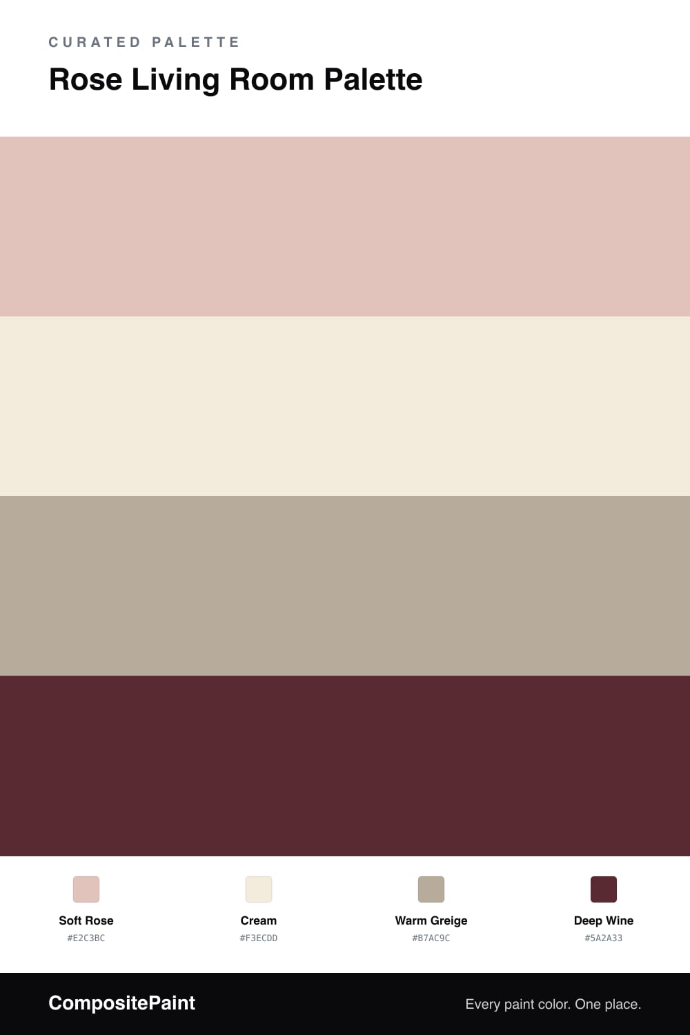
A warm, layered 4-color scheme for a living room: soft rose walls, creamy trim, a grounding greige, and a deep wine accent for richness. Every color matched to real paint you can buy.

By Jessica Williams · Color Stylist & Interior Editor

A rose living room can feel romantic without tipping into sweet, and the trick is keeping the pink dusty and grounding it well. This scheme opens with a soft rose on the walls — a muted, slightly gray pink that stays warm and easy to live with in any light.

A cream trim and ceiling frame it gently, softer than a stark white so the whole room feels cozy. Warm greige does the heavy lifting on floors, a rug, or wood furniture, giving the rose a solid, neutral base that keeps it from floating.

Then a deep wine accent brings the richness — a velvet chair, pillows, or a run of shelving. Used in small doses it deepens the rose and makes the room feel collected rather than pastel. Rose leads, the neutrals carry the space, and wine adds the depth that makes it sing.

View palette in
Soft Rose
Walls
Behr Cinnamon Tea · S200-2
#DFC1B8
LRV 57
Cream
Trim & Ceiling
Rodda Buttermilk · CA001
#F4EDDE
LRV 85
Warm Greige
Wood & Floors
Glidden Desert Dune · PPG1023-4
#B5AB9C
LRV 41
Deep Wine
Accent
Behr Cimarron · BXC-69
#592831
LRV 4

Buy These Colors

Each color matched to the closest real paint in every brand, by ΔE2000. Tap a swatch for its full guide or + to save it — take any SKU to the store, they mix on demand.

Soft Rose
#E2C3BC · LRV 59 · Walls
Sherwin-Williams · SW 70 · ΔE 2.26
Behr · S200-2 · ΔE 1.21
Benjamin Moore · 2092-60 · ΔE 1.84
Valspar · 8003-4B · ΔE 2.28
PPG / Glidden · PPG1057-3 · ΔE 1.75
Glidden · PPG1057-3 · ΔE 2.03
Dutch Boy · 304-2DB · ΔE 1.98
HGTV Home by Sherwin-Williams · HGSW 3047 · ΔE 4.7
Dunn-Edwards · DE6080 · ΔE 1.44
Magnolia Home · JG-26 · ΔE 2.2
Farrow & Ball · NO. 311 · ΔE 7.34
Diamond Vogel · 0118 · ΔE 2.05
Hirshfield's · 0069 · ΔE 1.94
Rodda · CA061 · ΔE 8.33
C2 Paint · BD10 · ΔE 2.45
Clare · PNT100-LT-60 · ΔE 3.36
Portola Paints · ANGEL'S LANDING · ΔE 6.32
Annie Sloan · OLD OCHRE · ΔE 12.67
Backdrop · BD-BG · ΔE 3.47
Rust-Oleum · 285142 · ΔE 4.41
Kompozit · 0069 · ΔE 1.94
Cream
#F3ECDD · LRV 84 · Trim & Ceiling
Sherwin-Williams · SW 7116 · ΔE 1.68
Behr · 710C-1 · ΔE 1.18
Benjamin Moore · 2162-70 · ΔE 0.91
Valspar · 7002-5 · ΔE 0.93
PPG / Glidden · PPG1203-1 · ΔE 0.55
Glidden · PPG1203-1 · ΔE 0.41
Dutch Boy · 118-1DB · ΔE 1.13
HGTV Home by Sherwin-Williams · HGSW 4055 · ΔE 1.68
Dunn-Edwards · DEW339 · ΔE 0.52
Magnolia Home · JG-33 · ΔE 1.68
Farrow & Ball · NO. 2003 · ΔE 1.69
Diamond Vogel · 0005 · ΔE 0.77
Hirshfield's · 0005 · ΔE 0.91
Rodda · CA001 · ΔE 0.21
C2 Paint · C2-868 · ΔE 1.47
Clare · PNT100-LT-62 · ΔE 2.19
Portola Paints · CASA FORMA · ΔE 1.08
Annie Sloan · OLD OCHRE · ΔE 10.45
Backdrop · BD-JA · ΔE 2.71
Rust-Oleum · 329598 · ΔE 3.64
Kompozit · 0005 · ΔE 0.91
Warm Greige
#B7AC9C · LRV 42 · Wood & Floors
Sherwin-Williams · SW 6073 · ΔE 2.13
Behr · HDC-NT-20G · ΔE 1.8
Benjamin Moore · 997 · ΔE 1.1
Valspar · 6006-1C · ΔE 1.37
PPG / Glidden · PPG14-27 · ΔE 1.71
Glidden · PPG1023-4 · ΔE 0.61
Dutch Boy · 421-3DB · ΔE 2.6
HGTV Home by Sherwin-Williams · HGSW 2475 · ΔE 2.13
Dunn-Edwards · DET696 · ΔE 3.16
Magnolia Home · JG-157 · ΔE 1.94
Farrow & Ball · NO. 5 · ΔE 2.89
Diamond Vogel · H107 · ΔE 1.64
Hirshfield's · H0107 · ΔE 0.88
Rodda · CA080 · ΔE 1.34
C2 Paint · C2-812 · ΔE 1.83
Clare · PNT100-MD-48 · ΔE 8.3
Portola Paints · HAVANA · ΔE 7.14
Annie Sloan · PALOMA · ΔE 7.45
Backdrop · BD-LF · ΔE 9.71
Rust-Oleum · 371674 · ΔE 8.29
Kompozit · 0189 · ΔE 2.67
Deep Wine
#5A2A33 · LRV 4 · Accent
Sherwin-Williams · SW 2901 · ΔE 3.58
Behr · BXC-69 · ΔE 0.6
Benjamin Moore · CSP-450 · ΔE 4.05
Valspar · P041 · ΔE 2.05
PPG / Glidden · PPG1048-7 · ΔE 7.21
Glidden · 85RR 05/082 · ΔE 9
Dutch Boy · 302-7DB · ΔE 0.89
HGTV Home by Sherwin-Williams · HGSW 3411 · ΔE 6.29
Dunn-Edwards · DET400 · ΔE 5.47
Magnolia Home · JG-29 · ΔE 5.92
Farrow & Ball · NO. 9918 · ΔE 14.08
Diamond Vogel · H067 · ΔE 9.13
Hirshfield's · H0065 · ΔE 8.74
Rodda · R114 · ΔE 13.94
C2 Paint · BD63 · ΔE 1.97
Clare · PNT100-DP-54 · ΔE 20.26
Portola Paints · DANCING SHOES · ΔE 10.27
Annie Sloan · BURGUNDY · ΔE 4.54
Backdrop · BD-IT · ΔE 15.39
Rust-Oleum · 285144 · ΔE 22.4
Kompozit · 1215 · ΔE 10.85

Questions

is soft rose too feminine for a shared living room?

At this dusty depth it reads more like a warm blush neutral than a true pink. Paired with greige and a deep wine anchor, it feels layered and calm rather than overtly sweet, so it works in a shared space.

where should the deep wine go?

Keep it small and intentional — a velvet armchair, throw pillows, a single painted alcove, or built-in shelving. On a large wall it will overpower the soft rose, so let it punctuate rather than dominate.

KEEP EXPLORING

Similar Palettes

Closest schemes by color — not by label.