CP

Red Pastel Color Palette — Mossfield Blush

A soft five-color scheme pairing a true red with a powdery pink pastel, grounded by sage moss and warm neutrals — every color matched to real paint you can buy.

By Emily Roberts · DIY Editor & First-Timer's Guide

Powder Blush
Dominant
Kompozit Rose Shadow · 0082
#F4D6D6
LRV 72
Brick Red
Secondary
Kompozit Unmatched Beauty · 1110
#B12D35
LRV 11
Mossy Sage
Base
Kompozit Cactus Valley · 0752
#88976B
LRV 28
Warm Linen
Support
Kompozit Hint of Vanilla · 0001
#EEE8DC
LRV 81
Soft Charcoal
Accent
Kompozit Black Licorice · 0529
#3A3B3B
LRV 4
View palette in

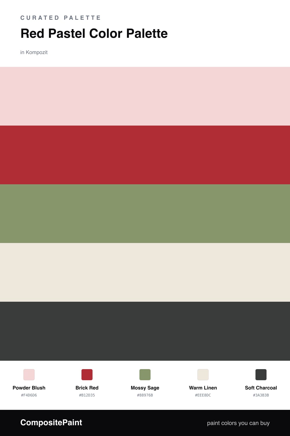
Here is the thing about pairing a soft pink with a real red — most people are scared to try it, and they really do not need to be. Powder Blush does the heavy lifting on most of your walls, keeping everything light and easy, while Brick Red comes in for one bold moment. That contrast is what makes the room feel intentional instead of sweet.

The quiet hero is Mossy Sage. A dusty green like this is having a real moment in 2026, and it grounds the warm pinks so the whole scheme feels lived-in rather than girly. Put it on a piece you want to last — cabinets, a bench, the trim.

Warm Linen is your breathing room, the soft off-white that lets your eye rest between the colors, and Soft Charcoal is the little bit of weight at the end — think a lamp base, a frame, or a single drawer pull. Start with the blush, sprinkle the red, and let the moss and neutrals hold it all together.

Buy These Colors

Each color matched to the closest real paint in every brand, by ΔE2000. Kompozit first; take any SKU to the store — these mix on demand.

Powder Blush
#F2D4D2 · LRV 71 · Dominant
Kompozit Rose Shadow · 0082 ΔE 1
Backdrop Cookies & Cream · BD-CC ΔE 15.77
Behr Resort Sunrise · M180-2 ΔE 2.02
Benjamin Moore Tippy Toes · 1282 ΔE 0.64
Clare Baby Soft · PNT100-LT-25 ΔE 4.74
Dunn-Edwards Tan Whirl · DE6086 ΔE 3.81
Farrow & Ball Pink Ground · No. 202 ΔE 6.78
Magnolia Home Dutch Tulip · JG-34 ΔE 10.3
PPG / Glidden Lady Pink · 1187-2 ΔE 1.02
Sherwin-Williams Alyssum · SW 6589 ΔE 1.74
Valspar Gentle Kiss · V080-1 ΔE 2.25
Brick Red
#B23A33 · LRV 13 · Secondary
Kompozit Unmatched Beauty · 1110 ΔE 3.73
Backdrop Bahaus · BD-BH ΔE 3.71
Behr Winter Poinsettia · HDC-WR14-10 ΔE 3.33
Benjamin Moore Million Dollar Red · 2003-10 ΔE 1.54
Clare Sriracha · PNT100-DP-29 ΔE 9.81
Dunn-Edwards Glitzy Red · DEA153 ΔE 1.86
Farrow & Ball Rectory Red · No. 217 ΔE 8.22
Magnolia Home Hopscotch · JG-31 ΔE 1.73
PPG / Glidden Red Gumball · 1187-7 ΔE 4.09
Sherwin-Williams Red Tomato · SW 6607 ΔE 3.65
Valspar Oh So Red · 1009-1 ΔE 2.55
Mossy Sage
#8C9874 · LRV 29 · Base
Kompozit Cactus Valley · 0752 ΔE 2.42
Backdrop Anita · BD-AN ΔE 15.51
Behr Carriage Door · 770D-5 ΔE 1.34
Benjamin Moore Land of Liberty · 440 ΔE 1.05
Clare Shade · PNT100-MD-14 ΔE 12.35
Dunn-Edwards Fair Spring · DE6264 ΔE 4.91
Farrow & Ball Yeabridge Green · No. 287 ΔE 3.5
Magnolia Home Countryside · JG-52 ΔE 6.52
PPG / Glidden Hemlock · 1125-5 ΔE 3.65
Sherwin-Williams Lemon Verbena · SW 7726 ΔE 6.63
Valspar Leafy Rise · 5007-4A ΔE 2.28
Warm Linen
#EEE7DA · LRV 80 · Support
Kompozit Hint of Vanilla · 0001 ΔE 0.56
Backdrop Don't Eat the Yellow Snow · BD-DS ΔE 4.2
Behr Exclusive Ivory · HDC-MD-11 ΔE 1.19
Benjamin Moore White Down · 970 ΔE 1.55
Clare Like Buttah · PNT100-LT-62 ΔE 2.24
Dunn-Edwards Ball of String · DE6190 ΔE 0.84
Farrow & Ball James White · No. 2010 ΔE 2.56
Magnolia Home Antique Rose · JG-23 ΔE 0.52
PPG / Glidden Edelweiss · 14-23 ΔE 1.13
Sherwin-Williams Creamy · SW 7012 ΔE 0.22
Valspar Dover White · 7007-1 ΔE 0.43
Soft Charcoal
#3A3733 · LRV 4 · Accent
Kompozit Black Licorice · 0529 ΔE 3.38
Backdrop After Hours · BD-AH ΔE 5.81
Behr Bitter Chocolate · 790B-7 ΔE 2.27
Benjamin Moore Black Beauty · 2128-10 ΔE 1.92
Clare Blackish · PNT100-DP-54 ΔE 5.42
Dunn-Edwards Black · DEA187 ΔE 2.81
Farrow & Ball Pitch Black · No. 256 ΔE 2.03
Magnolia Home Moments · JG-150 ΔE 3.75
PPG / Glidden Black Magic · 1001-7 ΔE 3.92
Sherwin-Williams Greenblack · SW 6994 ΔE 4.12
Valspar Fired Earth · 6011-1 ΔE 1.38

Questions

Will a real red and a pastel pink fight each other on the wall?

Not when one stays small. The pastel blush carries the room and the brick red shows up in just one spot — a door, a shelf, a single wall — so they read as the same family instead of two rivals.

Where should the moss green go?

Think of it as the grown-up in the group. Mossy sage calms the pink and red down, so use it on something steady like cabinets, a console, or trim rather than scattering it everywhere.

Similar Palettes

Closest schemes by color — not by label.