CP

Red Pastel Color Palette — Cedar Blush

A warm five-color scheme pairing a true brick red with a soft blush pink, grounded by cedar taupe and cream — every color matched to real paint you can buy.

By Emily Roberts · DIY Editor & First-Timer's Guide

Brick Red
Dominant
Kompozit Siren · 1117
#A22E34
LRV 10
Blush Pink
Secondary
Kompozit Satin Slipper · 0117
#F1D7D1
LRV 72
Cedar Taupe
Base
Kompozit Sultry Castle · 0562
#948D84
LRV 27
Soft Cream
Support
Kompozit Nilla Vanilla · 0003
#F1EBE0
LRV 83
Warm Espresso
Accent
Kompozit Silent Sea · 0515
#2A2B2C
LRV 2
View palette in

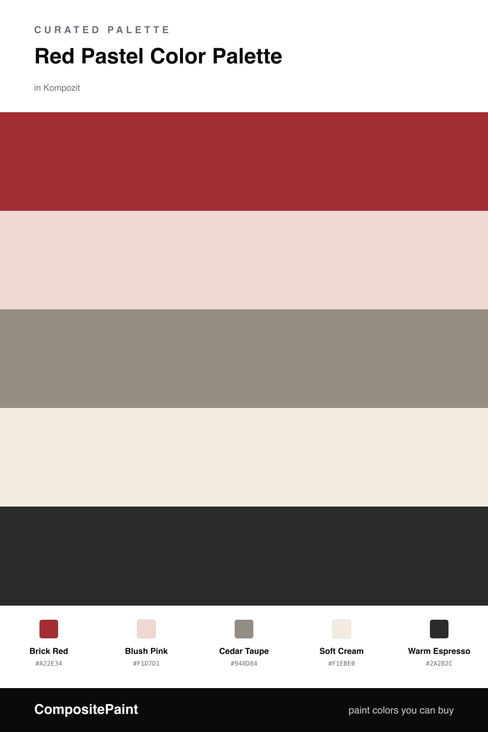
Here is the thing about red — it gets a bad rap for being loud, but paired with the right soft pink it turns cozy and grown-up. This scheme leans on a true Brick Red as the star and a gentle Blush Pink as its quieter echo.

In between sits Cedar Taupe, a warm earthy neutral that keeps everything feeling natural, and a Soft Cream that lets the whole room breathe. A touch of Warm Espresso on a frame or a chair leg grounds it all so the palette has somewhere to land.

If you are nervous about red, start small. Paint one wall or even just a door in the brick tone, wrap the rest in cream and taupe, and bring in the blush through textiles. It is a soft, lived-in look that feels very 2026 — warm without trying too hard.

Buy These Colors

Each color matched to the closest real paint in every brand, by ΔE2000. Kompozit first; take any SKU to the store — these mix on demand.

Brick Red
#A23A33 · LRV 11 · Dominant
Kompozit Siren · 1117 ΔE 3.6
Backdrop Bahaus · BD-BH ΔE 2.5
Behr Bijou Red · UL110-16 ΔE 2.65
Benjamin Moore Smoldering Red · 2007-10 ΔE 2.02
Clare Vintage · PNT100-DP-67 ΔE 11.6
Dunn-Edwards Scarlet Past · DEA150 ΔE 3.15
Farrow & Ball Incarnadine · No. 248 ΔE 4.44
Magnolia Home Brave And Bold · JG-32 ΔE 2.66
PPG / Glidden Burning Bush · 1057-7 ΔE 2.84
Sherwin-Williams Rave Red · SW 6608 ΔE 0.31
Valspar Cinnamon Sunset · V008-3 ΔE 4.31
Blush Pink
#F3D7D2 · LRV 72 · Secondary
Kompozit Satin Slipper · 0117 ΔE 0.92
Backdrop Cookies & Cream · BD-CC ΔE 14.08
Behr Stolen Kiss · MQ3-34 ΔE 2.56
Benjamin Moore Dream Whip · 2174-60 ΔE 0.49
Clare Baby Soft · PNT100-LT-25 ΔE 3.61
Dunn-Edwards Tan Whirl · DE6086 ΔE 2.17
Farrow & Ball Pink Ground · No. 202 ΔE 5.16
Magnolia Home Dutch Tulip · JG-34 ΔE 8.65
PPG / Glidden Scented Valentine · 1187-1 ΔE 1.08
Sherwin-Williams Alyssum · SW 6589 ΔE 3.19
Valspar Awe · 8002-9A ΔE 1.6
Cedar Taupe
#9C8675 · LRV 25 · Base
Kompozit Sultry Castle · 0562 ΔE 6.9
Backdrop Hartford · BD-HF ΔE 15.42
Behr Earthnut · PPU5-16 ΔE 0.78
Benjamin Moore Woodacres · 1020 ΔE 0.96
Clare Dirty Chai · PNT100-DP-52 ΔE 6.46
Dunn-Edwards Cobblestone Path · DE6068 ΔE 1.74
Farrow & Ball Mouse's Back · No. 40 ΔE 3.41
Magnolia Home Reclaimed Wood · JG-124 ΔE 7.81
PPG / Glidden Ranch Mink · 1075-5 ΔE 3.3
Sherwin-Williams Dusted Truffle · SW 9083 ΔE 1.77
Valspar Stone Manor · 6006-2A ΔE 3.41
Soft Cream
#F1EADD · LRV 83 · Support
Kompozit Nilla Vanilla · 0003 ΔE 0.87
Backdrop Jane · BD-JA ΔE 2.45
Behr Papier Blanc · HDC-NT-08 ΔE 1.4
Benjamin Moore Collector's Item · AF-45 ΔE 0.43
Clare Like Buttah · PNT100-LT-62 ΔE 2.37
Dunn-Edwards Abstract White · DE6232 ΔE 1.44
Farrow & Ball James White · No. 2010 ΔE 2.58
Magnolia Home Pearly Cotton · JG-33 ΔE 2.22
PPG / Glidden Vanilla Tan · 1202-1 ΔE 0.79
Sherwin-Williams Classic Light Buff · SW 50 ΔE 0.76
Valspar Statuesque · 7002-5 ΔE 1.24
Warm Espresso
#3A2E29 · LRV 3 · Accent
Kompozit Silent Sea · 0515 ΔE 8.22
Backdrop After Hours · BD-AH ΔE 12.06
Behr Bitter Chocolate · 790B-7 ΔE 4.37
Benjamin Moore Wenge · AF-180 ΔE 2.72
Clare Blackish · PNT100-DP-54 ΔE 9.91
Dunn-Edwards Black · DEA187 ΔE 7.35
Farrow & Ball Pitch Black · No. 256 ΔE 6.6
Magnolia Home Moments · JG-150 ΔE 2.96
PPG / Glidden Black Magic · 1001-7 ΔE 8.38
Sherwin-Williams Raisin · SW 7630 ΔE 4.71
Valspar Noblesse Oblige · 8004-2G ΔE 4.1

Questions

Why does a bold red work with a soft pastel pink?

They are really the same color family at two different strengths, so they feel related instead of clashing. The blush softens the red, and the red gives the blush something to lean on.

How much red should I actually use?

Let the red lead but keep it to roughly one-third of the room. Use the cream and taupe across the big surfaces, then let blush and espresso play their small parts.

Similar Palettes

Closest schemes by color — not by label.