CP

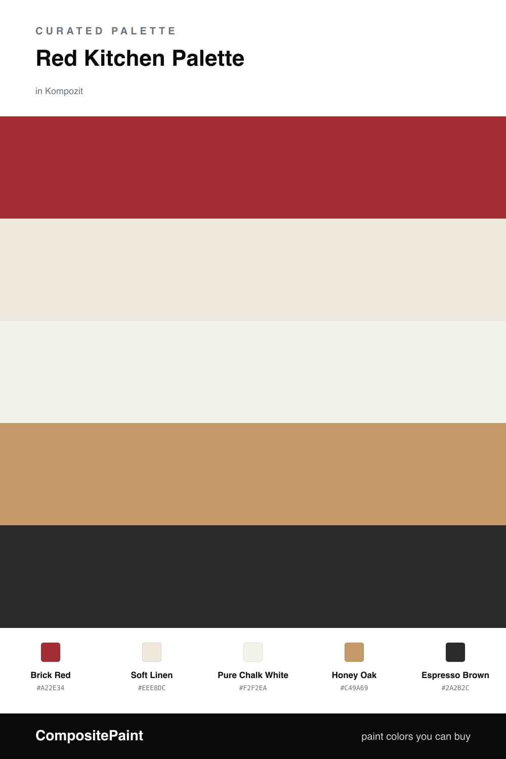
Red Kitchen Palette — Brick Red & Soft Linen

A warm five-color kitchen scheme led by a rich brick red, balanced by soft linen walls, crisp white trim, oak wood tones, and a deep espresso accent — every color matched to real paint you can buy.

By Jessica Williams · Color Stylist & Interior Editor

Brick Red
Dominant
Kompozit Siren · 1117
#A22E34
LRV 10
Soft Linen
Base
Kompozit Hint of Vanilla · 0001
#EEE8DC
LRV 81
Pure Chalk White
Support
Kompozit Cyprus Spring · 0411
#F2F2EA
LRV 88
Honey Oak
Secondary
Kompozit Back to Basics · 0255
#C49A69
LRV 36
Espresso Brown
Accent
Kompozit Silent Sea · 0515
#2A2B2C
LRV 2
View palette in

Red is the most appetizing color you can bring into a kitchen, and Brick Red is the version I trust to do it without shouting. It has a clay-warm depth that feels like a well-seasoned pan, perfect on lower cabinets or an island where you want the eye to land.

Around it, Soft Linen keeps the walls breathing and Pure Chalk White crisps up the trim and ceiling so the red has room to glow. Honey Oak ties in real wood — open shelving, a butcher block, a floor — and bridges the warmth between the two.

Save Espresso Brown for the small grounding moments — a counter stool, cabinet hardware, a pendant cord. It anchors all that warmth so the whole kitchen feels cozy and current rather than heavy.

Buy These Colors

Each color matched to the closest real paint in every brand, by ΔE2000. Kompozit first; take any SKU to the store — these mix on demand.

Brick Red
#9E3B2E · LRV 11 · Dominant
Kompozit Siren · 1117 ΔE 5.24
Backdrop Punk Rock · BD-PR ΔE 4.64
Behr Fire Cracker · PPU2-16 ΔE 2.9
Benjamin Moore Merlot Red · 2006-10 ΔE 0.95
Clare Vintage · PNT100-DP-67 ΔE 11.84
Dunn-Edwards Scarlet Past · DEA150 ΔE 5.05
Farrow & Ball Incarnadine · No. 248 ΔE 6
Magnolia Home Brave And Bold · JG-32 ΔE 3.25
PPG / Glidden Burning Bush · 1057-7 ΔE 4.43
Sherwin-Williams Chinese Red · SW 57 ΔE 1.16
Valspar Cinnamon Sunset · V008-3 ΔE 2.63
Soft Linen
#EFE7D7 · LRV 80 · Base
Kompozit Hint of Vanilla · 0001 ΔE 1.65
Backdrop Don't Eat the Yellow Snow · BD-DS ΔE 3.1
Behr Rye Flour · HDC-FL13-5 ΔE 1.36
Benjamin Moore Navajo White · 947 ΔE 1.09
Clare Like Buttah · PNT100-LT-62 ΔE 1.36
Dunn-Edwards Ball of String · DE6190 ΔE 0.48
Farrow & Ball James White · No. 2010 ΔE 2.13
Magnolia Home Carter Crème · JG-16 ΔE 1.09
PPG / Glidden Edelweiss · 14-23 ΔE 0.93
Sherwin-Williams Restful White · SW 7563 ΔE 1.19
Valspar Double Scoop · V176 ΔE 0.52
Pure Chalk White
#F6F3EC · LRV 90 · Support
Kompozit Cyprus Spring · 0411 ΔE 1.71
Backdrop Tabula Rasa · BD-TR ΔE 2.04
Behr Whisper White · HDC-MD-08 ΔE 0.58
Benjamin Moore Opulence · 879 ΔE 0.99
Clare Timeless · PNT100-LT-04 ΔE 1.25
Dunn-Edwards Droplets · DEW381 ΔE 0.97
Farrow & Ball Wimborne White · No. 239 ΔE 1.74
Magnolia Home True White · JG-21 ΔE 2.01
PPG / Glidden Delicate White · 1001-1 ΔE 2.15
Sherwin-Williams High Reflective White · SW 7757 ΔE 1.6
Valspar Ivory Keys · 8007-4A ΔE 0.95
Honey Oak
#C19A6B · LRV 36 · Secondary
Kompozit Back to Basics · 0255 ΔE 0.88
Backdrop Carry the Two · BD-CT ΔE 11.34
Behr Ground Cumin · UL180-24 ΔE 2.84
Benjamin Moore Sandy Valley · 1112 ΔE 1.16
Clare Good as Gold · PNT100-DP-59 ΔE 3.04
Dunn-Edwards New Cork · DE6180 ΔE 3.45
Farrow & Ball India Yellow · No. 66 ΔE 4.95
Magnolia Home Juniper Tree · JG-166 ΔE 10.63
PPG / Glidden Welcome Home · 1092-5 ΔE 1.53
Sherwin-Williams Lanyard · SW 7680 ΔE 2.36
Valspar Western Wear · M139 ΔE 1.19
Espresso Brown
#3A2A21 · LRV 3 · Accent
Kompozit Silent Sea · 0515 ΔE 10.64
Backdrop Hocus Pocus · BD-HP ΔE 12.41
Behr Bitter Chocolate · 790B-7 ΔE 7.18
Benjamin Moore Wenge · AF-180 ΔE 4.29
Clare Blackish · PNT100-DP-54 ΔE 12.31
Dunn-Edwards Black · DEA187 ΔE 10.12
Farrow & Ball Pitch Black · No. 256 ΔE 9.33
Magnolia Home Moments · JG-150 ΔE 5.57
PPG / Glidden Black Magic · 1001-7 ΔE 11.07
Sherwin-Williams Raisin · SW 7630 ΔE 6.61
Valspar Noblesse Oblige · 8004-2G ΔE 6.21

Questions

Where should the red go in a red kitchen?

Put the brick red on the surface you want to lead — usually the lower cabinets or an island — and keep the walls soft linen. That gives you a warm, confident red without the room feeling closed in.

Will a red kitchen feel dated?

Not if you reach for a grounded brick red instead of a bright fire-engine tone. Paired with warm oak and espresso, this version reads earthy and current rather than retro.

Similar Palettes

Closest schemes by color — not by label.