CP

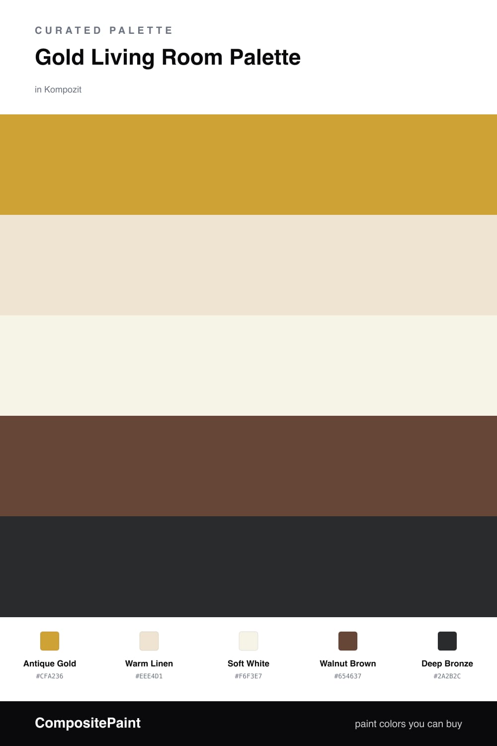
Gold Living Room Palette — Antique Gold & Warm Linen

A warm five-color living room scheme led by soft antique gold, layered with linen, crisp white, walnut, and a deep bronze accent — every color matched to real paint you can buy.

By Emily Roberts · DIY Editor & First-Timer's Guide

Antique Gold
Walls
Kompozit Sin City · 0816
#CFA236
LRV 39
Warm Linen
Trim & Ceiling
Kompozit Tawny Daylilly · 0327
#EEE4D1
LRV 78
Soft White
Cabinets or Vanity
Kompozit Rapture's Light · 1020
#F6F3E7
LRV 89
Walnut Brown
Wood & Floors
Kompozit Hideaway · 0137
#654637
LRV 7
Deep Bronze
Accent
Kompozit Silent Sea · 0515
#2A2B2C
LRV 2
View palette in

Gold gets a bad reputation for feeling fussy, but a soft, muted version is one of the coziest things you can put in a living room. Antique Gold on the walls glows in afternoon light and feels warm without going loud or shiny, which is exactly the direction rooms are leaning in 2026.

To keep it from feeling heavy, I lean on Warm Linen for the trim and Soft White on the ceiling and any built-ins. Those two quiet neutrals give your eyes a place to rest and make the gold look intentional instead of overwhelming.

Then bring in wood. Walnut Brown floors or furniture ground the whole space, and a little Deep Bronze in your accents — think a lamp, a frame, or a single moody wall — adds the bit of depth that makes the room feel finished and grown-up.

Buy These Colors

Each color matched to the closest real paint in every brand, by ΔE2000. Kompozit first; take any SKU to the store — these mix on demand.

Antique Gold
#C9A24B · LRV 39 · Walls
Kompozit Sin City · 0816 ΔE 2.89
Backdrop Carry the Two · BD-CT ΔE 16.22
Behr Ginger Jar · M300-5 ΔE 1.88
Benjamin Moore French Quarter Gold · 287 ΔE 1.98
Clare Good as Gold · PNT100-DP-59 ΔE 6.02
Dunn-Edwards Chipmunk · DE5376 ΔE 2.08
Farrow & Ball India Yellow · No. 66 ΔE 4.31
Magnolia Home Bright Days · JG-45 ΔE 6.3
PPG / Glidden Golden Field · 1107-7 ΔE 1.55
Sherwin-Williams Alchemy · SW 6395 ΔE 2.87
Valspar Excitable · V055-4 ΔE 0.63
Warm Linen
#EDE3CF · LRV 77 · Trim & Ceiling
Kompozit Tawny Daylilly · 0327 ΔE 0.46
Backdrop Don't Eat the Yellow Snow · BD-DS ΔE 2.43
Behr Antique White · 23 ΔE 1.45
Benjamin Moore Sparkling Wine · 949 ΔE 0.51
Clare Like Buttah · PNT100-LT-62 ΔE 1.32
Dunn-Edwards Navajo White · DEC772 ΔE 1.59
Farrow & Ball Dimity · No. 2008 ΔE 1.89
Magnolia Home Soft Landing · JG-17 ΔE 1.55
PPG / Glidden Morocco Sand · 1096-2 ΔE 1.39
Sherwin-Williams Casa Blanca · SW 7571 ΔE 1.23
Valspar Honey Moon · 8003-22A ΔE 1.49
Soft White
#F7F3EA · LRV 90 · Cabinets or Vanity
Kompozit Rapture's Light · 1020 ΔE 1.55
Backdrop Tabula Rasa · BD-TR ΔE 1.55
Behr White Flour · OR-W10 ΔE 0.58
Benjamin Moore Mountain Peak White · 2148-70 ΔE 1.24
Clare Timeless · PNT100-LT-04 ΔE 1.45
Dunn-Edwards Powdered · DEW316 ΔE 1.45
Farrow & Ball Wimborne White · No. 239 ΔE 0.9
Magnolia Home True White · JG-21 ΔE 2.71
PPG / Glidden Delicate White · 1001-1 ΔE 2.95
Sherwin-Williams Roman Column · SW 7562 ΔE 2.18
Valspar Ivory Keys · 8007-4A ΔE 0.52
Walnut Brown
#6B4A2E · LRV 8 · Wood & Floors
Kompozit Hideaway · 0137 ΔE 5.44
Backdrop It's a Date · BD-IT ΔE 5.86
Behr Wooden Cabin · 290F-7 ΔE 3.71
Benjamin Moore Mocha Madness · 2100-10 ΔE 5.68
Clare Vintage · PNT100-DP-67 ΔE 13.92
Dunn-Edwards Chaps · DE6049 ΔE 7.53
Farrow & Ball Preference Red · No. 297 ΔE 15.97
Magnolia Home Mountain Currant · JG-171 ΔE 8.74
PPG / Glidden Bird House Brown · 1072-7 ΔE 6.41
Sherwin-Williams Sturdy Brown · SW 6097 ΔE 0.68
Valspar Hickory Chips · M247 ΔE 1.35
Deep Bronze
#3A2E1E · LRV 3 · Accent
Kompozit Silent Sea · 0515 ΔE 11.14
Backdrop After Hours · BD-AH ΔE 12.55
Behr Bitter Chocolate · 790B-7 ΔE 8.09
Benjamin Moore Wenge · AF-180 ΔE 8.87
Clare Blackish · PNT100-DP-54 ΔE 11.72
Dunn-Edwards Black · DEA187 ΔE 10.39
Farrow & Ball Pitch Black · No. 256 ΔE 9.54
Magnolia Home Moments · JG-150 ΔE 7.02
PPG / Glidden Black Magic · 1001-7 ΔE 11.17
Sherwin-Williams Polished Mahogany · SW 2838 ΔE 11.52
Valspar Noblesse Oblige · 8004-2G ΔE 10.54

Questions

Will gold walls make my living room feel too dark?

Not with this soft, muted gold. It reads more like warm honey than bright metal, so it keeps the room cozy and full of light rather than heavy. The linen trim and soft white ceiling lift everything up.

How much of each color should I use?

Let the gold lead on your main walls, keep the whites on trim and ceiling, and save the bronze for small touches like a lamp base, a frame, or one accent wall. A rough 60/30/10 split keeps it calm.

Similar Palettes

Closest schemes by color — not by label.