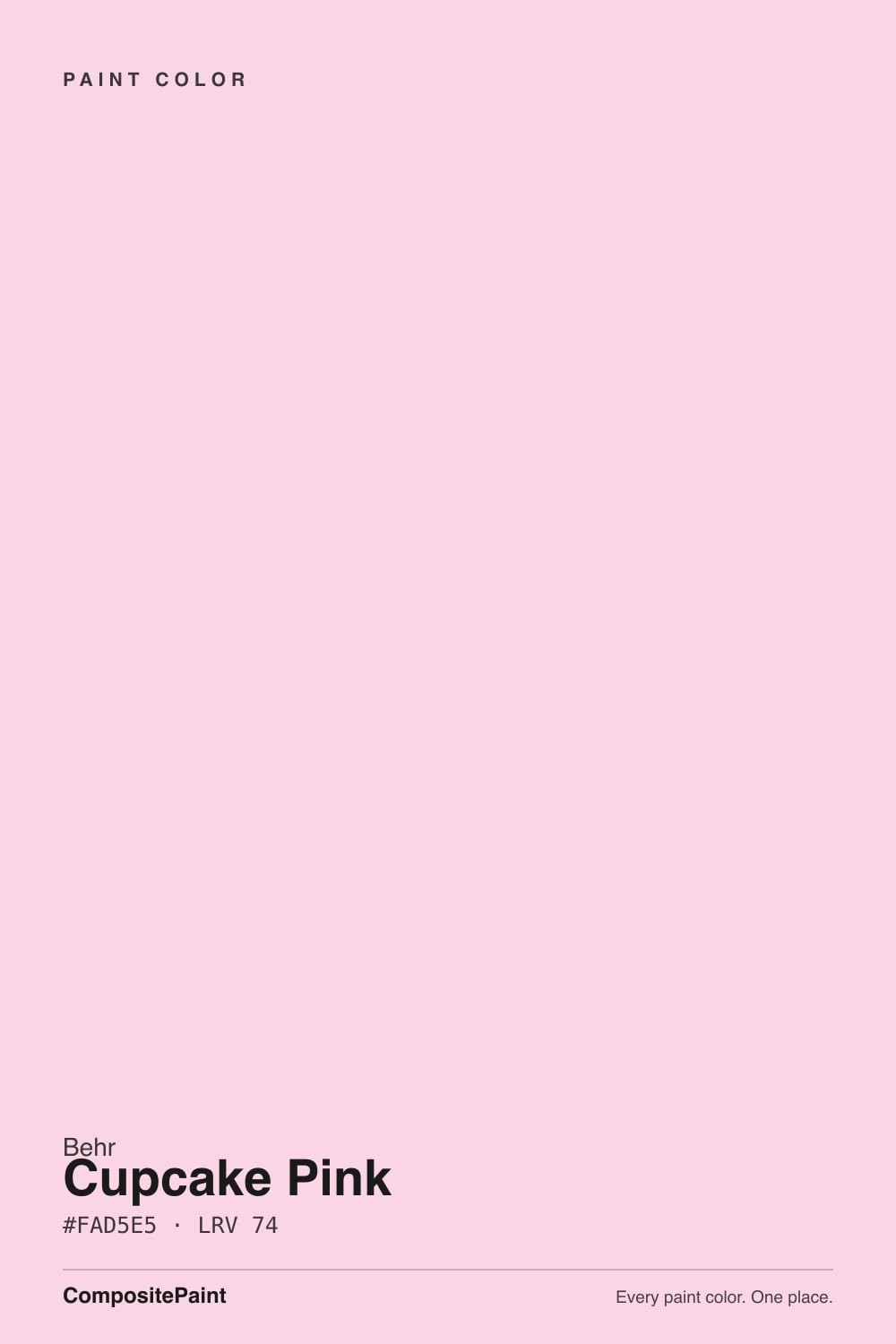
Cupcake Pink
The nursery blush everyone reaches for on Pinterest, reviewed honestly: why it looks louder on the wall than the chip, and the doses where it actually behaves.

Jessica has spec'd whites and neutrals for more than 300 rooms and keeps a sample wall of painted drawdowns in her studio. Every color review is checked against real reader rooms in the comments and re-tested when a formula changes. About the testing process →
- 1Pale Cherry Blossom61
- 2Romance66
- 3Cupcake Pink73
- 4Pink Bliss82
- 5Ballerina Gown87
The Fast Verdict
Cupcake Pink is a pale, warm blush with a real peach lean — soft on the chip, but at LRV 73 it bounces a lot of light around a room, and that light comes back tinted. Wrap all four walls in strong sun and the color reads noticeably louder and more orange than the sample; keep it to a nursery, a powder room, or one accent surface with a white trim break and it does exactly the sweet, airy job it was made for.
Nurseries and small kids' rooms · powder rooms and vanities · one accent wall or a single furniture piece · south or east rooms with real daylight
You want it wall-to-wall in a big, bright, sun-flooded room · your room is north-facing and stays dim most of the day · your trim and floors are already warm honey-orange wood · you want a true pink with no peach in it
- Genuinely soft, warm blush that avoids a cartoonish or candy-sweet look in small doses
- LRV 73 keeps nurseries and small baths feeling bright and airy, not closed-in
- Behr's own coordinating palette (Swiss Coffee, Whisper White, Silver Drop, Dolphin Fin) makes pairing easy
- A classic, calm nursery and kids'-room color with real staying power
- Real daylight brings out a genuinely pretty peach glow
- Notoriously high color bounce — four walls in strong sun read louder and more orange than the chip
- Goes flat and grayish-dusty in a dim, north-facing room
- Amplifies against honey-orange wood floors and trim instead of softening them
- Can read as too sweet or too young outside a nursery, bath, or accent-scale use
What Color Is Cupcake Pink, Really?
A pale warm blush built on a peach base — that peach is the whole character. Behr's own color guide leans into it, pairing Cupcake Pink with warm neutrals like almond cream and spiced coral rather than the cool grays that usually flank a pink. It is not a bubblegum pink and it is not a true rose; it sits closer to the inside of a seashell, and it reads warmer the longer you look at it.
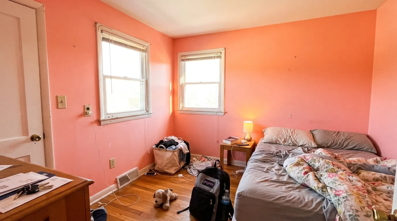
At LRV 73 it is a genuinely light, reflective color — close in brightness to a soft off-white, not a saturated accent shade. That is also its one real trap: pale, warm colors with high LRVs bounce a lot of light between opposing walls, and each bounce picks up a little more of the paint's own tint. In a small room with strong daylight from two directions, Cupcake Pink can compound on itself and read distinctly more saturated and more orange-pink than the paper chip ever suggested — a known trait of this color, not a bad batch or bad light.
Undertone in one line: peach first, pink second, never a cool or bluish rose. If your sample looks flatter and grayer than expected, that is cool north light muting the peach; if it looks almost coral, that is strong sun and the color-bounce effect doing exactly what this color is known to do.
Where It Shines
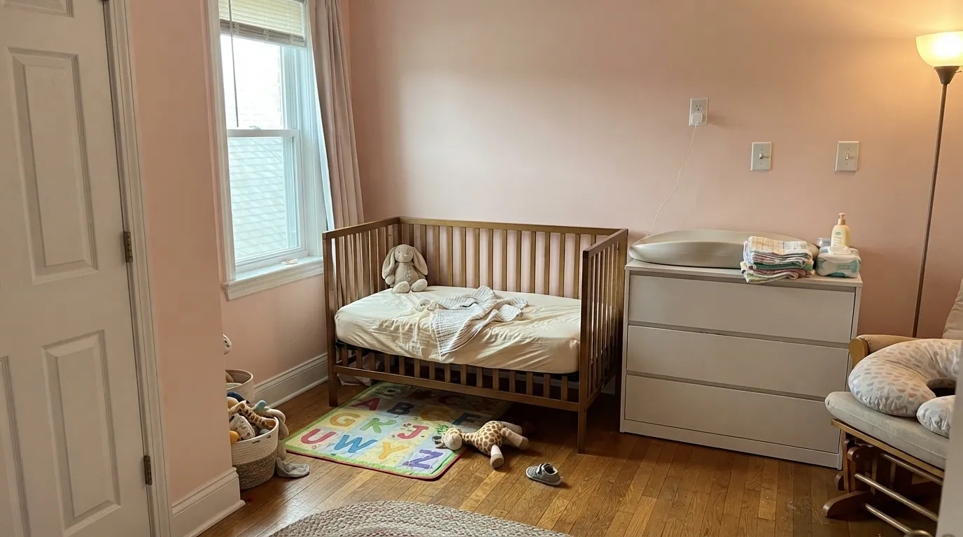
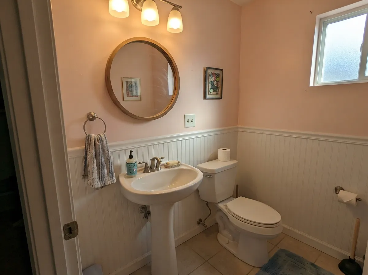
This color is built for small, well-lit doses, not a whole sunny house. A nursery or a child's bedroom with real daylight is its home turf — soft enough to be calming, warm enough to avoid the cold, clinical feel a pale gray nursery can get. Its second job is the small commitment: a powder room, a bathroom vanity, one accent wall, or a single painted dresser, where a crisp white trim or wainscoting physically breaks up the wall-to-wall bounce and keeps the blush from turning into a peach glow. Give it Swiss Coffee or Whisper White trim and a warm greige like Dolphin Fin nearby, and it looks intentional and gently vintage rather than sugary.
Where It Fails
Almost every disappointed review of Cupcake Pink traces back to one of three predictable setups. None of them are the paint failing — they are the paint doing exactly what a pale, warm, high-LRV pink does in that specific situation.
This color has notoriously high color bounce: wrap all four walls in strong daylight and the reflected light keeps re-tinting itself, pushing the blush toward a much louder, more saturated peach than the chip promised. The fix isn't a different paint — it's breaking the loop. White wainscoting, a white ceiling, or stopping the color at one accent wall interrupts the bounce before it compounds.
Cool daylight strips the peach out and leaves a flat, slightly dusty pink that some readers describe as grayish or washed-out. The color did not fail; the light did. Add warm 2700K lamps or accept it will read quieter than the swatch in this room.
Golden oak and orange-stained trim sit close to Cupcake Pink on the color wheel, and warm-on-warm here means everything amplifies together — the floor looks more orange, the walls look more peach, and the room loses the soft, powdery quality that makes this color work. Pale or whitewashed oak, or a painted white floor, keeps the blush reading gentle.
Room by Room
Warm and soft without the sugary cartoon-pink look. Eggshell on the walls, white trim in semi-gloss, and it reads calm even at nap time. Skip it if the room gets strong afternoon sun on two walls — that's exactly where the color-bounce effect shows up worst.
A small, enclosed room is the ideal size for this color: enough wall to show the blush, not enough square footage for the bounce to run away with it. Pair with a white or muted-gray vanity and it looks like a deliberate, slightly vintage choice rather than a theme.
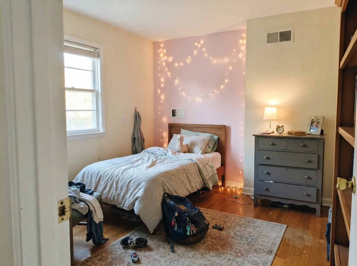
Works well for a guest room or an adult bedroom that wants a gentle color without going full millennial-pink, as long as trim stays a soft white and the bulbs run warm at night. In a north-facing bedroom, expect it to read closer to dusty rose than the peachy blush on the chip.
One wall, a dresser, a headboard, or a vanity gives you the color without betting the whole room on its bounce behavior. Surround it with a warm off-white like Swiss Coffee and it looks curated instead of committed.
Behr's own pairing guide steers this color toward nurseries and baths, not kitchens, and for good reason: kitchen lighting tends to be bright and mixed, which is the exact combination that makes the peach lean loudest. If you love it here, keep it to a small hutch or pantry door, not the whole room.
Full outdoor sun is a much stronger version of the indoor color-bounce problem — the peach will read bright and candy-like against siding, which is rarely the effect anyone wants from the street. This is an interior color.
Your Light Is the Risk
Real morning-to-midday sun brings the peach forward without pushing it orange — the soft blush the swatch promises, kept airy by the high LRV.
Cool, indirect daylight drains the peach out and leaves a flat, dusty, slightly grayish pink. Sample it in the actual room before committing.
Warmest and most peach-forward at morning or golden-hour sun; flatter and paler through the middle of the day. Most owners read this as the color 'coming alive' at certain hours, not misbehaving.
2700K lamps push it rosy and cozy at night. Cool white LEDs flatten it toward a pale, slightly gray pink — swap the bulbs before you second-guess the paint.
Most complaints about Cupcake Pink are a light mismatch. Upload a photo of your actual room and see it on your walls — then ask for the same wall in north light or evening lamps before you buy a single sample.
Need It From Another Brand?
Any paint counter can custom-tint Behr M160-1 directly. If you would rather stay in one brand's own deck, these are the closest stock matches, measured as ΔE2000. Under 2 is a difference you will not see on the wall.
| Brand | Closest color | ΔE | LRV | |
|---|---|---|---|---|
| Sherwin-Williams | AngelicSW 6602 · Sherwin-Williams | 2.7 | 75 | Color page → |
| Benjamin Moore | Fond Memory2088-70 · Benjamin Moore | 0.5 | 73 | Color page → |
| Valspar | Scarlet Butter8002-10A · Valspar | 1.4 | 74 | Color page → |
| PPG / Glidden | Pink SangriaPPG1189-2 · PPG / Glidden | 1.3 | 74 | Color page → |
| Glidden | Scented ValentinePPG1187-1 · Glidden | 1.7 | 74 | Color page → |
| Dutch Boy | Pink Halite104-2DB · Dutch Boy | 1.6 | 75 | Color page → |
Similar Behr Colors
The nearest shades to Cupcake Pink within Behr's own range, ranked by perceptual color distance — useful when you want the same look a touch lighter, darker, or warmer.
WCAG 2.1: AA is 4.5 : 1 for normal text, 3 : 1 for large text, AAA is 7 : 1.
Cupcake Pink vs the Colors You're Also Considering
Every Cupcake Pink sample board has the same rivals on it. The numbers show the real lightness gap — then it comes down to which risk you would rather live with.
Pick this when you want a pink you can actually see across the room — Pink Bliss goes nearly invisible where Cupcake Pink holds its blush.
Benjamin Moore 2093-70 · LRV 82Pink BlissPick this for an even paler, almost-whispered pink wash — it can disappear into white in bright daylight.
Pick this when you actually want pink to read as pink on the wall, not as a mystery neutral.
Benjamin Moore 2102-70 · LRV 76First LightPick this if you want a color that reads as a warm off-white nine days out of ten and only flashes pink in certain light.
Pick this for the lighter, sweeter nursery version — Vintage Tea Rose is nearly twice as deep and can read brown in low light.
Behr HDC-CT-07A · LRV 47Vintage Tea RosePick this for a deeper, muted, grown-up rose that behaves more like a neutral than a nursery pink.
Pick this for the pale, airy nursery version — Pink Shadow is a full step darker and reads more like a wall color than a wash.
Sherwin-Williams SW 0070 · LRV 50Pink ShadowPick this for that same peach lean at a usable mid-depth that can carry a whole accent wall without the color-bounce risk.
Within Behr, Pale Shrimp 160A-2 (#FDD8E8, LRV 76) and Pink Parfait 170A-1 (#FDD9E6, LRV 76) are marginally lighter, and Pink Elephant M170-1 (#FAD2DE, LRV 72) is slightly deeper and a shade warmer. All are close enough that the choice comes down to how much pink you want on a full wall.
Across brands, Diamond Vogel Summer Cosmos 1120 (#F8D2E0, LRV 71) has a deltaE of 1.01 and Dunn-Edwards Ballerina DE5036 (#FED5E9, LRV 69) is 1.62, so both are visually identical to Cupcake Pink in normal room light. Kompozit Summer Cosmos 1120 (#FAD1E0, LRV 71) at 1.36 falls in the same group.
Valspar Utterly Pink 1003-2C (#F8D9E3, LRV 75) at 2.75 and Benjamin Moore Ribbon Pink 2087-60 (#FAD4DB, LRV 73) at 3.28 are very close, but sample first. Sherwin-Williams Priscilla SW 6575 (#F1D3DA, LRV 71) at 3.92 is close but visibly different side by side, reading duskier.
Cupcake Pink Coordinating Colors
Behr built this color's own pairing guide around warm neutrals, and it shows: soft whites keep it airy, muted warm grays give it modern contrast, and warm greiges ground it without competing for attention. These are the partners Behr itself points to:
A Color-of-the-Month Pick, Not a Trend Chaser
Behr has featured Cupcake Pink as a Color of the Month pick, and the reason it earns that spotlight is its restraint: it's part of the broader blush and dusty-pink revival, but staying pale keeps it from reading like the saturated 'millennial pink' of a decade ago. It reads more like a light wash than a statement color, which is exactly why it works in a nursery or a powder room and less well as the loud centerpiece of an open-plan living space.
That same paleness is what makes the color-bounce behavior worth knowing about before you buy: a light, warm color with an LRV in the mid-70s reflects a lot of light, and in a small room that light keeps recirculating and picking up more color each pass. It's the tradeoff for a color this bright and this soft at the same time.
Cupcake Pink With Wood Tones and Floors
Pale or whitewashed oak is the easy, safe pairing — it keeps the whole room feeling light and doesn't push the peach in either direction. Walnut and espresso furniture pieces work as grounding accents in a nursery or accent-wall setup, giving the blush something deeper to sit against.
Honey-toned builder oak is the pairing to test carefully. Warm orange wood and this color's peach base sit close together on the wheel, and warm-on-warm here doesn't cancel out — it compounds, pushing the floor more orange and the wall more peach at the same time. A large light-colored rug between the two, or a whitewash on the floor, keeps the room from feeling like it's all one overheated color.
Three Ready Palettes Built on Cupcake Pink
A color is never alone on the wall. These are complete combinations in the 60-30-10 pattern, with the reason each one holds together. Every one opens in the visualizer.
Straight from Behr's own coordinating guide: Whisper White on the trim breaks up the wall-to-wall color bounce, and Dolphin Fin's warm greige grounds the room without fighting the peach.
Try this palette in your roomWhite wainscoting physically interrupts the light bouncing wall-to-wall, which is the real fix for this color's saturation problem in a small room. Toasty Gray on the door adds one grounded, warm-neutral note so the room doesn't read all-pastel.
Try this palette in your roomKeeping the pink to one plane stops it from bouncing off itself. Swiss Coffee's warmth doesn't fight the peach, and Silver Drop trim adds a quiet, modern edge instead of stark white contrast.
Try this palette in your roomCupcake Pink FAQ
Is Cupcake Pink more pink or more peach?
Peach first. Behr's own pairing guide leans it toward warm neutrals and corals rather than cool pinks, and that peach base is what gives the color its bounce behavior — the warmer the light, the more it shows.
Can I paint a whole room in Cupcake Pink?
You can, but a small room in strong daylight is the one setup where this color surprises people — the light bounces between the walls and re-saturates, reading noticeably more orange-peach than the chip. Break it up with white trim, a white ceiling, or wainscoting, or keep it to one accent wall.
What trim white goes with Cupcake Pink?
A soft, warm white — Whisper White or Swiss Coffee, both from Behr's own deck. A stark cool white can make the blush look slightly dingy by contrast; a warm white keeps the handoff soft.
Will it look washed out in a north-facing room?
Yes, expect it to read flatter and dustier than the sample — cool daylight strips out the peach. It's still usable there, just quieter; add warm 2700K lamps to bring some of the blush back at night.
Does it work with wood floors?
Pale or whitewashed oak and walnut work well and let the blush stay soft. Honey-orange builder oak is the one real clash — warm-on-warm amplifies both the floor's orange and the wall's peach instead of balancing them.
Is it too young for an adult bedroom?
Not if you keep the trim white and the sheen matte-to-eggshell — it reads as a gentle blush, not a kid's-room pink. It leans younger mainly when it's paired with saturated pastels or used at full-room scale in bright sun.
Have you painted with Cupcake Pink?
Rate it — one tap helps the next reader decide.
Ask a Question