Pink Sea Salt
The gray-veiled nursery pink reviewed honestly: where it stays a hushed mineral blush, the light that turns it peachy-orange, and what to pick instead.

Jessica has spec'd whites and neutrals for more than 300 rooms and keeps a sample wall of painted drawdowns in her studio. Every color review is checked against real reader rooms in the comments and re-tested when a formula changes. About the testing process →
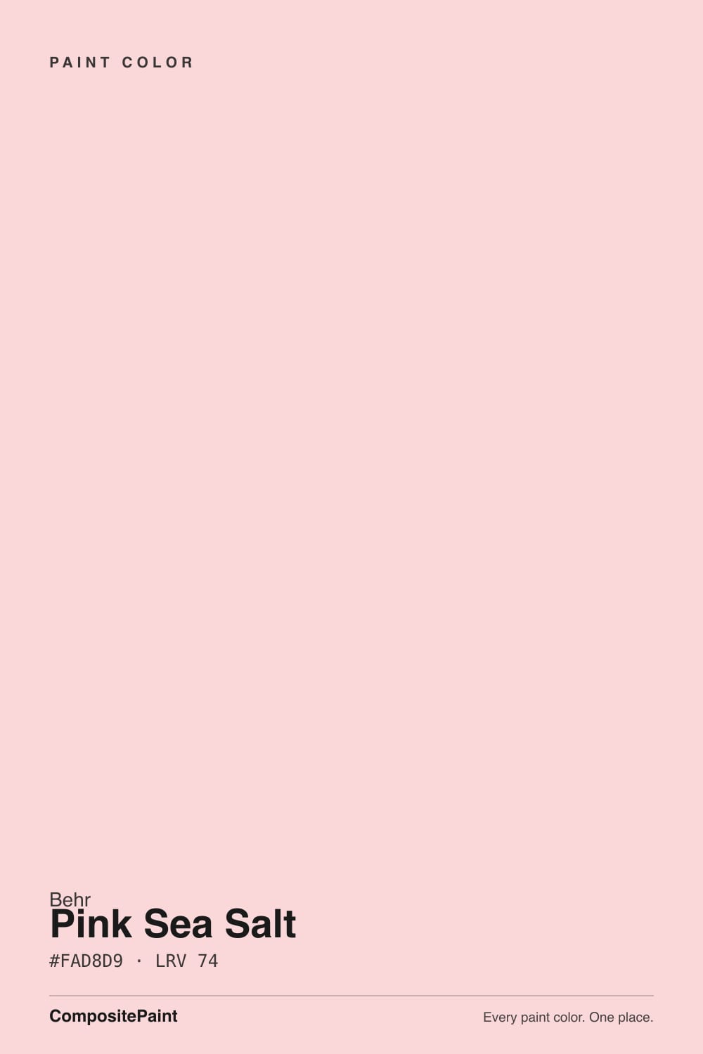
- 1Pale Cherry Blossom61
- 2Romance66
- 3Pink Sea Salt74
- 4Pink Bliss82
- 5Ballerina Gown87
The Fast Verdict
Pink Sea Salt is Behr's answer to the person who wants pink but is nervous about pink: a pale, gray-veiled blush that Behr itself calls a "mineral pink," pitched squarely at nurseries that don't want to commit to a gender. In flat, cool light it reads as a hushed almost-neutral. Give it real afternoon sun or a warm bulb and the yellow-red base underneath wakes up, and the wall reads distinctly peachy-orange instead of pink. It's a genuinely useful small-room and ceiling color — just don't buy it expecting it to stay this quiet in every room.
Nurseries that want to stay gender-neutral · a primary bedroom ceiling or single feature wall · powder rooms and small baths · anyone who wants a whisper of pink, not a statement
You want a true, committed pink (this one apologizes for itself in daylight) · the room gets strong afternoon or west sun · you're pairing it with honey oak or golden wood tones · you're painting four full walls in a large, bright room
- Genuinely pale and gray-veiled — reads as a whisper of pink, not candy
- Marketed and built for gender-neutral nurseries, and it earns that use
- A real, designer-verified ceiling color when walls stay a plain white
- LRV 74 keeps small, low-light rooms from feeling closed in
- Grown-up enough to outlast the nursery years into a kid's room
- Warm afternoon sun and incandescent bulbs pull it distinctly peachy-orange
- Fights honey oak and golden wood instead of softening it
- Loses its quiet, mineral effect once it covers four walls in a bright room
- So close to Behr's own Cupcake Pink and Stolen Kiss that picking between them at the counter is genuinely hard — bring all three chips home
What Color Is Pink Sea Salt, Really?
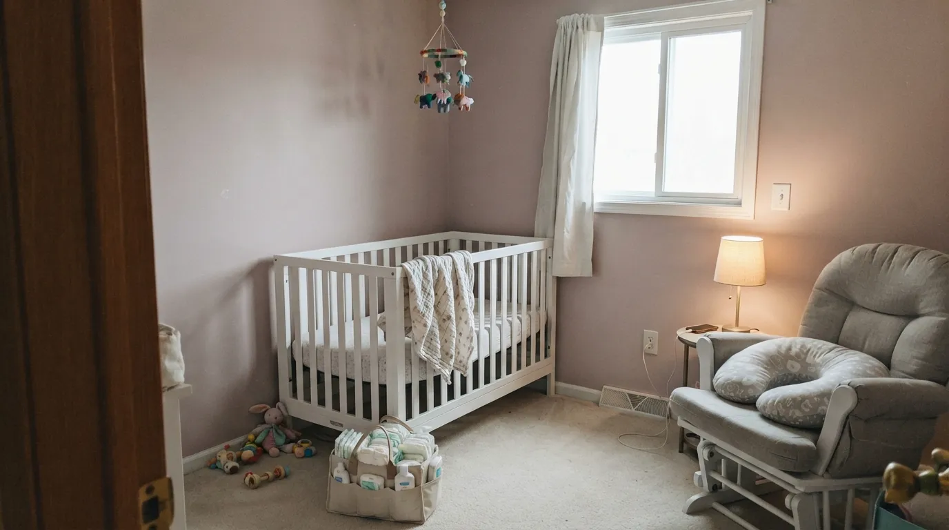
Pink Sea Salt is what Behr calls a "mineral pink" — a muted blush built to read as calm and gray-tinted rather than sweet or candy-colored. That framing is deliberate: Behr markets it specifically for nurseries as a soft, gender-neutral alternative to a traditional pastel pink, and the LRV of 74 backs that up — this is a genuinely pale, light-reflecting color, not a saturated statement pink.
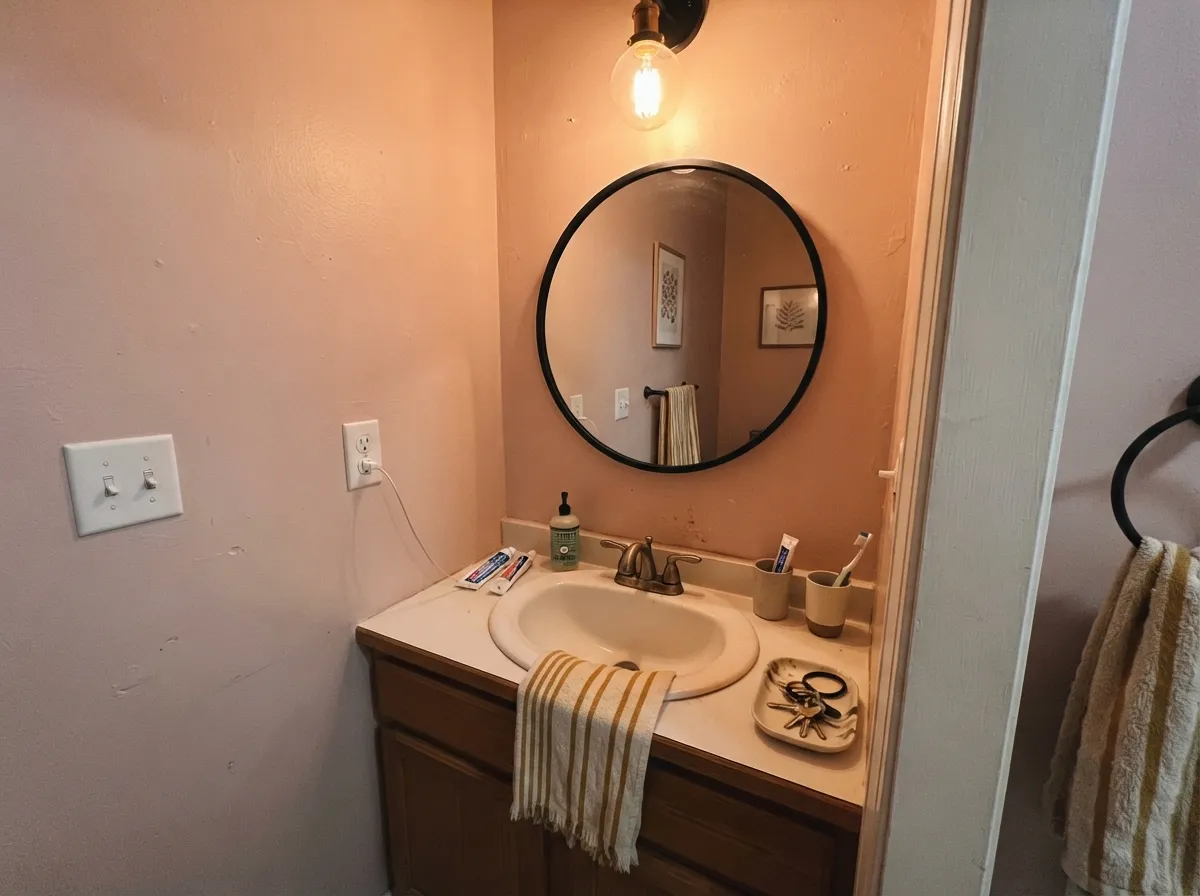
The catch is the base underneath the gray veil. Color reference data reads Pink Sea Salt as sitting in the warm, yellow-red family, and that warmth is exactly what surfaces the moment the light turns warm too — direct sun, incandescent bulbs, or a room full of honey-toned wood. The gray keeps it quiet in flat or cool light; the yellow-red wakes up and pulls it toward peach the rest of the time. Both readings are the same paint being honest about the room, not a defect.
Undertone in one line: a warm pink-peach with a gray hand brake — cool, diffuse light keeps the brake on; warm light and warm materials release it. If your sample looks distinctly orange in a west-facing room at 5pm, that is the paint working exactly as its chemistry predicts, not a bad batch.
Where It Shines
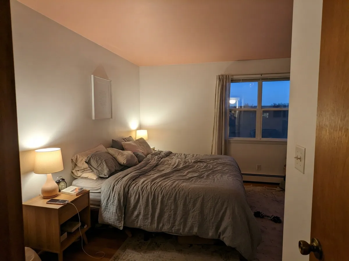
This is a small-dose, calm-light color, and its best-known real-world use proves it: Behr's own "Colorfully Behr" design series, styled by Leanne Ford, put Pink Sea Salt on a bedroom ceiling rather than the walls — walls stayed a separate pale pink, trim went crisp Ultra Pure White. Overhead, in a single plane, the color reads sophisticated and barely-there instead of sugary. That's the move to copy: a ceiling, a nursery, a powder room, or one wall in diffuse light, where the gray stays in charge and the pink stays a whisper.
Where It Fails
Nearly every disappointed reaction to Pink Sea Salt traces back to one of three situations, and all three follow directly from its warm, yellow-red base. None of them are a bad can of paint — but if your room matches one, sample big before you commit a whole nursery to it.
The gray veil is a daylight trick, and strong warm sun burns straight through it. Readers chasing a "soft pink nursery" in a bright west-facing room report the walls looking distinctly orange or peachy by late afternoon — the same undertone that reads calm at 10am reads different at 5pm. Test the sample at both times before painting.
Two warm, yellow-leaning surfaces amplify each other. Against golden builder oak floors or oak trim, Pink Sea Salt's peach side comes forward and the combination reads sunburnt rather than soft. Pale white oak, walnut, or painted white trim keep the color in its quieter lane.
Behr's own near-twin, Cupcake Pink, is famous on this site for getting "loud fast on four walls," and Pink Sea Salt shares the same LRV and nearly the same hex. Wrap a big, sunny room in it and the mineral-quiet effect that works on a ceiling or in a small nursery disappears — it just reads as a pink room. Keep it to one surface or one small room.
Room by Room
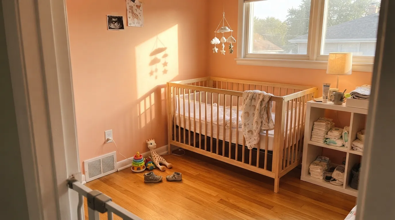
Genuinely gender-neutral at this LRV and this muted a blush — Behr built the color for exactly this use. Keep bulbs neutral-to-cool if you want the gray to stay in charge; warm 2700K nursery lamps will nudge it toward peach at night, which most parents find cozy rather than a problem.
The Leanne Ford move: paint the ceiling, keep the walls a plain warm white. One overhead plane of color reads custom and calm instead of "pink bedroom." A full four-wall bedroom works too, but only with real daylight control and a white trim to keep it from tipping peachy.
Small, mostly artificially-lit rooms are where the gray veil holds up best. Pair with a near-black mirror frame or fixtures so the room reads intentional rather than accidental pink.
Works past infancy as a genuinely grown-up pale blush rather than a baby color, especially with white or black furniture. Swap it out only if the room gets strong afternoon sun and the family wants a color that reads the same all day.
These rooms usually mix daylight exposures across one open space, so the wall will read gray-pink by one window and peachy-orange by another. That inconsistency is the opposite of what this color is good at.
Kitchens run warm task lighting and often sit next to wood cabinetry and brass — exactly the conditions that pull Pink Sea Salt toward orange. It is not built for this room; pick a true warm white or a committed pink instead.
Your Light Is the Risk
The gray stays in charge and the color holds its hushed, mineral read all day — the calmest version of this paint.
The warm yellow-red base wakes up and the wall reads distinctly peachy-orange, not pink. Sample at 5pm, not just at noon.
A north room keeps the gray dominant all day; a south room runs noticeably warmer and pinker by mid-afternoon. Same can, two different rooms.
Warm 2700K bulbs tip it toward peach at night — cozy in a nursery, less welcome in a powder room. Cool LEDs hold it closer to a muted blush-gray.
Most complaints about Pink Sea Salt are a light mismatch. Upload a photo of your actual room and see it on your walls — then ask for the same wall in north light or evening lamps before you buy a single sample.
Need It From Another Brand?
Any paint counter can custom-tint Behr M190-1 directly. If you would rather stay in one brand's own deck, these are the closest stock matches, measured as ΔE2000. Under 2 is a difference you will not see on the wall.
| Brand | Closest color | ΔE | LRV | |
|---|---|---|---|---|
| Sherwin-Williams | OrganzaSW 6637 · Sherwin-Williams | 4.0 | 76 | Color page → |
| Benjamin Moore | Soft Shell015 · Benjamin Moore | 1.4 | 73 | Color page → |
| Valspar | Cape Sands2004-6C · Valspar | 2.0 | 74.3 | Color page → |
| PPG / Glidden | Melon IcePPG1196-2 · PPG / Glidden | 0.9 | 72 | Color page → |
| Glidden | Melon Ice10YY 78/146 · Glidden | 1.1 | 78 | Color page → |
| Dutch Boy | Soft Pink107-2DB · Dutch Boy | 0.5 | 73 | Color page → |
Similar Behr Colors
The nearest shades to Pink Sea Salt within Behr's own range, ranked by perceptual color distance — useful when you want the same look a touch lighter, darker, or warmer.
WCAG 2.1: AA is 4.5 : 1 for normal text, 3 : 1 for large text, AAA is 7 : 1.
Pink Sea Salt vs the Colors You're Also Considering
Every Pink Sea Salt sample board has the same rivals on it. The numbers show the real lightness gap — then it comes down to which risk you would rather live with.
Pick this for the more gray, more mineral, more grown-up read of essentially the same color.
Behr M160-1 · LRV 73Cupcake PinkPick this if you're leaning into the nursery-pink identity — it's the more overtly "pink" of Behr's near-twin pale blushes.
Pick this when you want the pink to actually register as pink, not disappear into white.
Benjamin Moore 2102-70 · LRV 76First LightPick this if you want it to read as a warm off-white first and a pink only up close.
Pink Sea Salt Coordinating Colors
The rule for coordinating with Pink Sea Salt: true whites and cool-to-neutral accents keep it calm; warm creams and golden wood push it toward peach. It pairs best with crisp white trim, muted sage for gender-neutral rooms, and near-black for small-room contrast. These are the partners that keep it in its intended lane:
The Ceiling Trick: How Designers Actually Use Pink Sea Salt
The color's most visible real-world use isn't a wall at all. Behr's own "Colorfully Behr" editorial series paired designer Leanne Ford with Pink Sea Salt for a bedroom project, and she put it overhead — on the ceiling — rather than across all four walls, keeping the walls in a separate pale pink and the trim in a crisp Ultra Pure White.
The logic holds up on any budget: a single plane of a warm, gray-veiled color reads as a deliberate design choice, not a commitment. It's also the lowest-risk way to test whether your room's light turns the color pink or peach, since a ceiling gets less direct sun exposure than a west-facing wall — paint it there first if you're on the fence about the color for a full room.
Pink Sea Salt With Wood Tones and Metals
Wood is where this color's warm base either gets grounded or gets amplified. Pale white oak, ash, and painted white furniture keep Pink Sea Salt in its quiet, gray-toned lane. Walnut and other cool-leaning darker woods work too, reading as a deliberate warm-and-cool contrast rather than a fight.
Golden, honey-toned oak is the pairing to avoid — both surfaces are warm and yellow-leaning, so they push each other further toward orange instead of settling into a shared warmth. Metals follow a similar logic: brushed brass and warm gold read as intentional and cohesive; polished chrome and cool nickel read slightly at odds with the wall, though neither is a dealbreaker in a small room like a powder bath.
Three Ready Palettes Built on Pink Sea Salt
A color is never alone on the wall. These are complete combinations in the 60-30-10 pattern, with the reason each one holds together. Every one opens in the visualizer.
A crisp white keeps the pink from reading sugary, and one piece of furniture in a muted sage keeps the room genuinely gender-neutral instead of just "light pink with white trim."
Try this palette in your roomThe designer-tested move: one overhead plane of color reads custom and calm, not "pink bedroom." Keeping the walls a true white lets the ceiling carry all the warmth without the room tipping peachy.
Try this palette in your roomA small, mostly artificial-light room is where the gray in Pink Sea Salt holds up best, and a near-black frame keeps the whole thing reading deliberate instead of accidental.
Try this palette in your roomPink Sea Salt FAQ
Is Pink Sea Salt pink or peach?
Both, depending on the light. Behr builds it as a gray-veiled "mineral pink," and in cool or diffuse light that gray keeps it reading as a hushed blush. But the base underneath is a warm yellow-red, so direct sun, incandescent bulbs, or warm wood pull it toward peach-orange. It is not a stable, single-read color — plan for it to move.
Is it a good nursery color?
Yes, and it's marketed for exactly that: pale enough and gray enough to work as a genuinely gender-neutral choice. The one caution is a bright, west-facing nursery, where the same paint will read noticeably warmer and pinker by late afternoon than it did on the sample chip.
Does it work with honey oak or golden wood floors?
Not well. Golden, yellow-leaning wood amplifies the peach side of this color instead of grounding it, and the combination can read sunburnt. Pale white oak, walnut, or painted white trim keep Pink Sea Salt in its quieter, grayer lane.
What trim white goes with Pink Sea Salt?
A clean, true white — Ultra Pure White or Whisper White — rather than a warm cream. Two warm colors sitting next to each other fight instead of framing, and a warm trim makes the wall look muddier, not softer.
How is Pink Sea Salt different from Behr's Cupcake Pink or Stolen Kiss?
Barely, on paper — the three sit within a couple of LRV points and a few hex digits of each other. Cupcake Pink is the more overtly nursery-pink of the group and gets loud fast on four walls; Stolen Kiss behaves like a neutral until real sun hits it. Pink Sea Salt markets itself as the grayest, most "mineral" of the three. In practice they are close enough that the honest advice is to bring home all the samples you're considering and test them in your own light rather than trust the names.
Can I paint just the ceiling in Pink Sea Salt?
Yes — it's a real, designer-used move, not a workaround. Behr's own "Colorfully Behr" series, styled by Leanne Ford, put Pink Sea Salt on a bedroom ceiling with the walls in a separate pale pink and the trim in Ultra Pure White. One overhead plane of color reads sophisticated instead of sugary, and it's a lower-commitment way to try the color than four walls.
Have you painted with Pink Sea Salt?
Rate it — one tap helps the next reader decide.
Ask a Question