Dream Whip
The pastel pink that keeps its cool, reviewed honestly: the light where it glows, the light that bleaches it away, and what to pair it with so it never reads as a nursery color by accident.

Jessica has spec'd whites and neutrals for more than 300 rooms and keeps a sample wall of painted drawdowns in her studio. Every color review is checked against real reader rooms in the comments and re-tested when a formula changes. About the testing process →
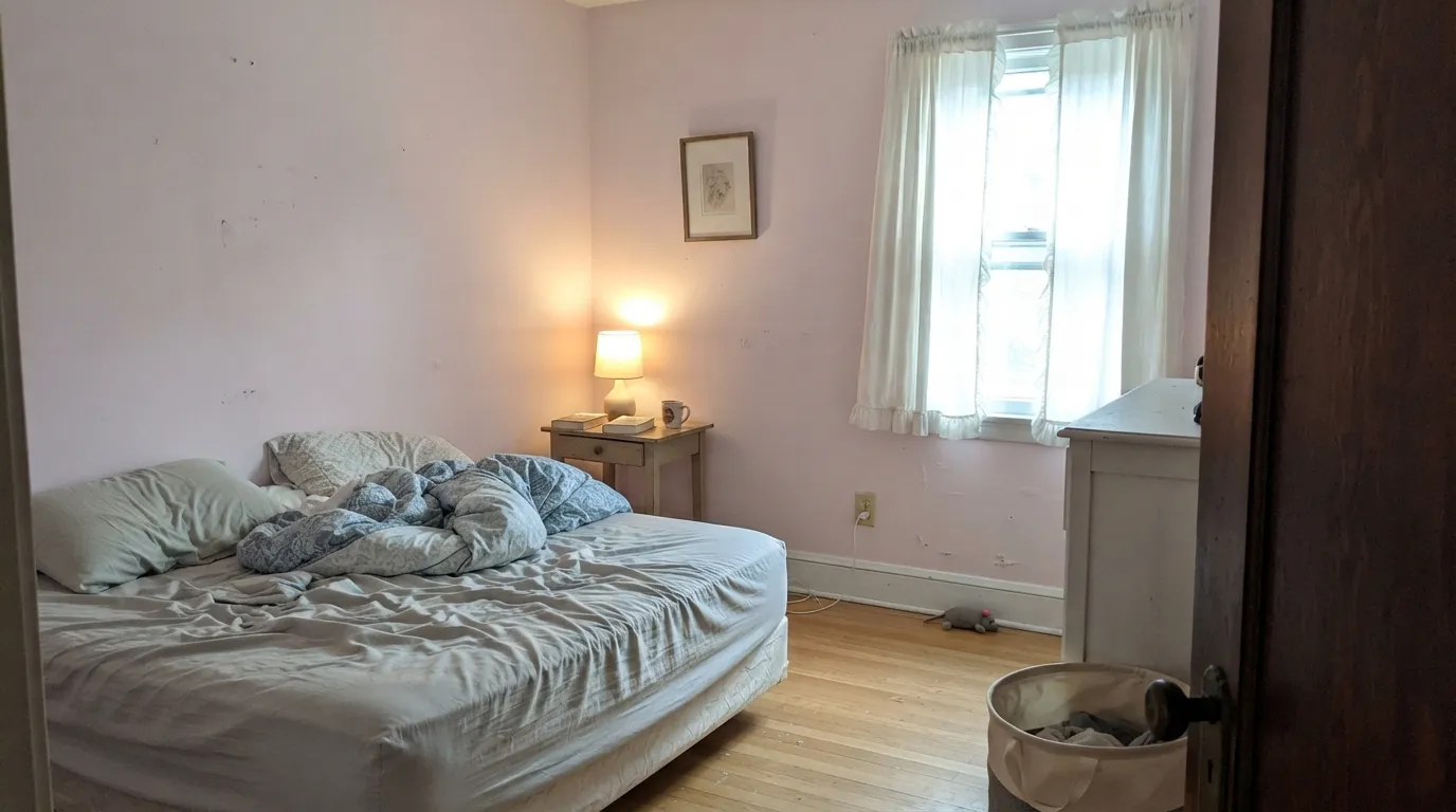
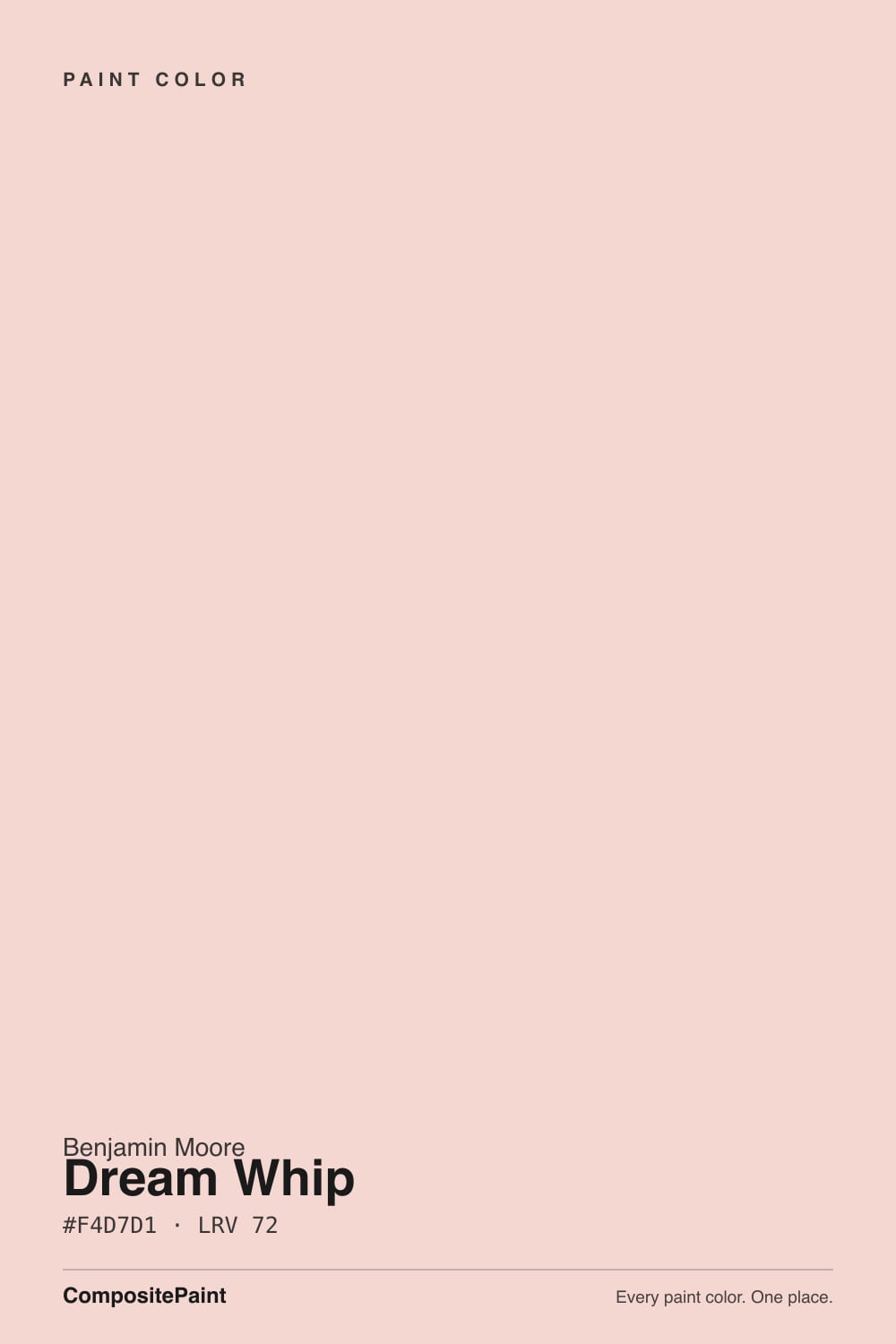
- 1Pale Cherry Blossom61
- 2Romance66
- 3Dream Whip72
- 4Verbena77
- 5Pink Bliss82
The Fast Verdict
Dream Whip is what happens when you take a pale pink and refuse to let it go peachy. The cool cast is the whole point — no salmon, no bubblegum, just a soft, whipped-cream blush that reads grown-up instead of sugary. At LRV 72 it holds real color without shouting, which makes it the easiest way to bring pink into a room without committing to "a pink room."
Bedrooms and nurseries with real daylight · powder rooms and bathroom vanities with cool-neutral tile · dining rooms that want a soft blush glow · anyone who wants pink without going full bubblegum
Your room floods with strong direct south sun and you want the color to actually stay visible · your floors are honey oak or gold-toned wood · you're pairing it with stark bright white trim · you specifically want a warm, peachy pink
- A genuinely soft, grown-up pink — never tips into bubblegum or salmon
- The cool cast keeps it from turning peachy under most daylight
- Holds more visible color than the palest pastels without going loud
- Pairs beautifully with white oak, walnut, brass, and cool-neutral tile
- A forgiving, low-risk way to try pink for the first time
- Strong direct sun can wash it toward near-white, same as any pale pastel
- Honey oak and gold-toned wood pull it toward chalky and mismatched
- Reads cold and washed next to a stark, bright white trim
- Not enough saturation for anyone who wants a true statement pink
What Color Is Dream Whip, Really?
Dream Whip is a pale, cool-leaning pink — closer to the powdery side of the family than to peach or salmon. The name gives away the idea: a dollop of something whipped and airy with the barest tint of raspberry stirred in, not a full-strength strawberry. Where a warmer Benjamin Moore pink like First Light leans toward a blush that could almost pass as a warm off-white, Dream Whip keeps its cool cast in most light, which is exactly what keeps it reading as pink instead of cream from across the room.
At LRV 72 it sits in the lighter half of the deck's pink lineup — well past the pastel-to-neutral border, but a clear notch below the near-white territory of Pink Bliss at LRV 82. That gap is the useful part: Pink Bliss can wash to almost nothing in a bright room, but Dream Whip's slightly cooler, slightly denser base gives it just enough weight to hold its color in ordinary daylight, while staying soft enough that it never turns into a statement wall.
Undertone in one line: cool pink first, with none of the orange or peach most drugstore pinks carry. That cool base is also its one real demand — it wants cool-neutral or grayed-warm company, not gold. Put it near true honey-toned wood or a lot of brassy-yellow decor and the two temperatures argue; put it near white oak, walnut, or a warm-but-grayed white like White Dove, and it settles in as a genuinely soft, grown-up pink instead of a kid's-room default.
Where It Shines
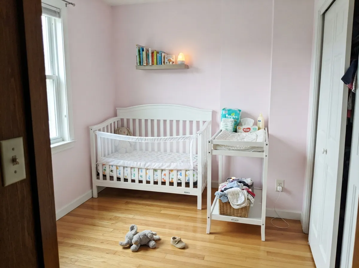
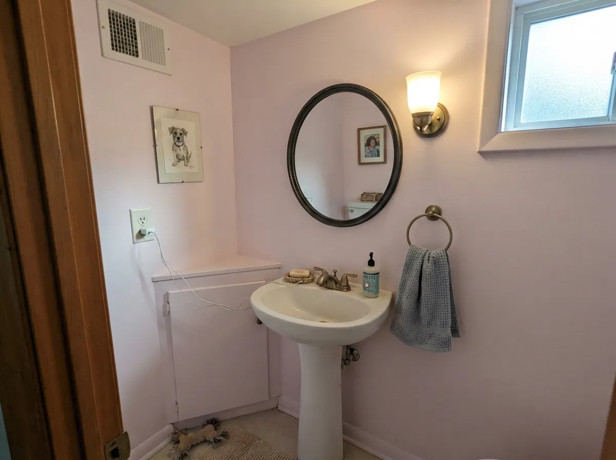
Give it bright, indirect daylight and a room willing to lean soft rather than crisp, and Dream Whip is close to unbeatable. Bedrooms are its natural home — it is calming without going flat or beige. Nurseries are its second home, especially paired with a muted sage for the classic gender-neutral combo. Its third life is the small, deliberate room: a powder room or a bathroom vanity, where a near-black mirror frame and brass hardware turn the pastel from sweet into designed.
Where It Fails
Almost every disappointed review of a pale, cool pastel like this comes down to one of three predictable situations, and none of them are the paint's fault. If your room matches one, this is not your pink — no amount of extra coats fixes it.
At LRV 72 it is already pale. Hit it with strong midday south sun and it can bleach toward a near-white the wall barely registers as pink at all. If you want the color to stay visible all day, this is not the light for it — or plan on it reading as a whisper, not a wall.
The cool cast is the whole appeal, but it argues with warm gold undertones — the wood pulls more orange, the wall pulls more chalky and dusty, and neither side wins. White oak, walnut, or a big rug between the two solves it; honey oak straight against Dream Whip usually does not.
Pair it with a cold, blue-white trim (Chantilly Lace or Extra White territory) and the trim wins the fight — Dream Whip reads washed and slightly dirty by comparison. A warmer, grayed-down white like White Dove keeps the pastel looking intentional instead of faded.
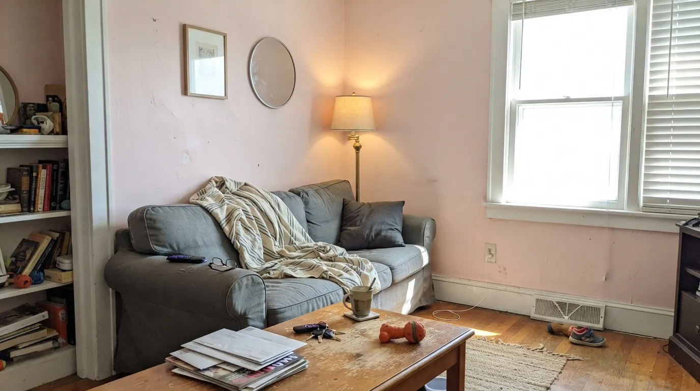
Room by Room
Calming without tipping into flat or beige. With cream or white bedding and soft daylight, it reads restful rather than "pink room." Eggshell hides texture and keeps the color from looking chalky.
Gentle enough to avoid full bubblegum, and it pairs beautifully with a muted sage for the classic gender-neutral nursery combo. Skip it if the floor is golden oak.
Cool-cast pink loves cool-white or gray tile and brass hardware. Warm beige tile or gold-flecked countertops fight it the same way honey oak does.
Works beautifully in a small-to-medium room, but needs a darker anchor — a charcoal-greige buffet or chairs — or it starts to feel like a candy shop by the second course.
In a bright, well-lit living room it is a genuinely soft backdrop. In a dim or north-facing one it can look undecided — neither pink nor white — until you add warm lamps.
Full outdoor sun washes a pale pastel even further, and a cool pink on siding tends to read dated rather than romantic. Keep this one indoors.
Your Light Is the Risk
This is where the cool cast reads cleanest — a soft, dreamy blush with no wash-out and no peach creeping in.
Already pale at LRV 72, full midday sun can bleach it toward a near-white the wall barely registers as pink.
Morning and evening sun nudge it warmer for an hour or two; midday it settles back to its cool, powdery default.
2700K lamps push it gently toward a cozy peach-salmon; cool white LEDs keep it flatter and a touch gray. Swap the bulb before you swap the paint.
Most complaints about Dream Whip are a light mismatch. Upload a photo of your actual room and see it on your walls — then ask for the same wall in north light or evening lamps before you buy a single sample.
Need It From Another Brand?
Any paint counter can custom-tint Benjamin Moore 2174-60 directly. If you would rather stay in one brand's own deck, these are the closest stock matches, measured as ΔE2000. Under 2 is a difference you will not see on the wall.
| Brand | Closest color | ΔE | LRV | |
|---|---|---|---|---|
| Sherwin-Williams | AlyssumSW 6589 · Sherwin-Williams | 3.6 | 71 | Color page → |
| Behr | Cupcake PinkM160-1 · Behr | 0.4 | 73 | Color page → |
| Valspar | Awe8002-9A · Valspar | 1.7 | 73 | Color page → |
| PPG / Glidden | Scented ValentinePPG1187-1 · PPG / Glidden | 1.4 | 73 | Color page → |
| Glidden | Scented ValentinePPG1187-1 · Glidden | 1.5 | 74 | Color page → |
| Dutch Boy | Petunia Pink204-1DB · Dutch Boy | 1.0 | 71 | Color page → |
Similar Benjamin Moore Colors
The nearest shades to Dream Whip within Benjamin Moore's own range, ranked by perceptual color distance — useful when you want the same look a touch lighter, darker, or warmer.
WCAG 2.1: AA is 4.5 : 1 for normal text, 3 : 1 for large text, AAA is 7 : 1.
Dream Whip vs the Colors You're Also Considering
Every Dream Whip sample board has the same rivals on it. The numbers show the real lightness gap — then it comes down to which risk you would rather live with.
Pick this when you want the color to read unmistakably pink, not just a blush-tinted white.
Benjamin Moore 2102-70 · LRV 76First LightPick this if you want the warmer, creamier pink that behaves almost like an off-white — First Light leans beige where Dream Whip stays candy-cool.
Pick this when Pink Bliss tested too pale on your wall and you want the same softness with slightly more presence.
Benjamin Moore 2093-70 · LRV 82Pink BlissPick this for an even sheerer, barely-there pink that's easy to lose in a bright room — the safest possible dose of color.
Dream Whip Coordinating Colors
The rule for coordinating with Dream Whip: stay cool-neutral to warm-but-grayed, and keep true gold-toned wood at arm's length. It pairs beautifully with sage greens, near-black accents, and grayed-down charcoals, all of which keep the pastel from feeling like a kid's room. These are the partners that keep showing up in rooms that work:
Dream Whip and the Millennial-Pink Family
Pale, cool-cast pinks like this one are commonly grouped under the "millennial pink" umbrella that took over design boards in the late 2010s — the powdery, grayed-down pink that reads sophisticated instead of childish. Dream Whip fits that family closely: it is cool rather than peachy, and light enough to act like a neutral in the right room.
Whether that makes it a safe long-term choice or a color you will want to replace in a decade is genuinely unclear — no paint color has a guaranteed shelf life, and pale pinks in particular go in and out of favor faster than true neutrals. What keeps Dream Whip from feeling dated in the meantime is exactly what keeps it out of a full magazine spread: it is quiet enough to read as a soft neutral first and a trend color second.
Dream Whip With Wood Tones and Floors
This decision is made at the floor, not the paint store. White oak, walnut, and gray-washed wood are Dream Whip's best friends — their cooler or neutral undertone lets the pink stay clean and doesn't pull it toward chalky. Cream or gray carpet is fine either way.
The one honest no is gold: true honey oak, orange-stained trim, or heavy brassy-yellow decor. Warm gold and cool pink sit on opposite sides of the color wheel, so each side amplifies the other's flaws instead of complementing it — the floor looks more orange, the wall looks dustier. If the honey oak floor is staying, put a large rug between it and this paint, or pick a warmer pink like First Light instead.
Three Ready Palettes Built on Dream Whip
A color is never alone on the wall. These are complete combinations in the 60-30-10 pattern, with the reason each one holds together. Every one opens in the visualizer.
Sage and blush is the classic gender-neutral nursery pairing, and both colors ask for the same thing: real daylight. Give the room a window and neither one goes flat.
Try this palette in your roomA near-black frame keeps a pastel powder room from tipping sweet into saccharine. Brass hardware and a marble-look counter finish the argument.
Try this palette in your roomCharcoal-greige furniture roots the pastel wall so the room reads sophisticated blush at dinner, not nursery pink at breakfast.
Try this palette in your roomDream Whip FAQ
Is Dream Whip a warm or cool pink?
Cool. It carries none of the peach or orange that most drugstore pinks have — it stays closer to raspberry-in-cream than salmon. If you want a warmer, more off-white-adjacent pink, look at First Light instead.
Is it good for a nursery?
Yes, especially paired with a muted sage like October Mist for the classic gender-neutral look. The one thing to check first is the floor — golden honey oak fights the cool cast and can leave both looking off.
What trim white goes with Dream Whip?
A warm, slightly grayed-down white like White Dove. A stark, bright-blue white (Chantilly Lace or Extra White territory) makes the pastel look washed and a little dirty by comparison — the same mistake that trips up most pale pinks.
Will Dream Whip look too pink on the walls?
Not usually — at LRV 72 it is one of the softer pinks in the deck, and most readers find it reads as a gentle blush rather than a full pink room. If you want even less color, Pink Bliss is a full step paler; if this still tests too pale in your room, that is the more common surprise.
Does it work with honey oak floors?
Not well. Gold-toned wood pulls warm while Dream Whip stays cool, and the two undertones argue — the floor reads more orange, the wall reads chalkier. White oak, walnut, or a large rug between the two both work better.
Dream Whip vs Pink Bliss vs First Light — which should I pick?
Pink Bliss is the sheerest and safest, easy to lose in a bright room. First Light is the warmest, closest to an off-white with a blush cast. Dream Whip sits between them: cooler and more visibly pink than either, without going loud.
Have you painted with Dream Whip?
Rate it — one tap helps the next reader decide.
Ask a Question