CP

Red Pastel Color Palette — Red Pastel Horizon

A soft five-color scheme pairing a true brick red with a blush pink pastel, grounded by warm white, greige, and slate — every color matched to real paint you can buy.

By Maya Patel · Reviews Editor & Product Tester

Blush Pastel
Dominant
Kompozit Satin Slipper · 0117
#F1D7D1
LRV 72
Brick Red
Secondary
Kompozit Moonrose · 1103
#A53F48
LRV 12
Warm White
Base
Kompozit Bunny Cake · 0012
#F5EFE2
LRV 87
Soft Greige
Support
Kompozit Ivory Ridge · 0182
#D9C9B8
LRV 60
Slate Charcoal
Accent
Kompozit Black Licorice · 0529
#3A3B3B
LRV 4
View palette in

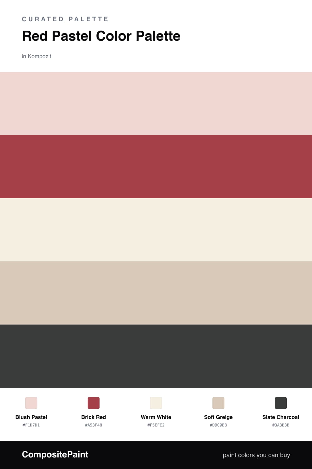
Red and pastel can fight each other fast, so this scheme makes them relatives instead of rivals. A pale Blush Pastel does the heavy lifting on the walls, and a grounded Brick Red shows up only where you want the eye to land. Because they share the same warm base, the room feels intentional, not loud.

The quiet work happens in the middle. Warm White keeps everything fresh and stops the pinks from turning sweet, while Soft Greige adds a little earthiness so the palette feels current rather than nursery. A touch of Slate Charcoal on a frame or a lamp gives the whole thing a spine.

This is a great 2026 read on warm minimalism — pink that grew up. Lead with the blush, drop the brick red in small, deliberate moments, and let the neutrals breathe between them.

Buy These Colors

Each color matched to the closest real paint in every brand, by ΔE2000. Kompozit first; take any SKU to the store — these mix on demand.

Blush Pastel
#F2D2CE · LRV 69 · Dominant
Kompozit Satin Slipper · 0117 ΔE 2.52
Backdrop Cookies & Cream · BD-CC ΔE 15.63
Behr Conch Shell · S200-1 ΔE 3.33
Benjamin Moore Tippy Toes · 1282 ΔE 0.92
Clare Neutral Territory · PNT100-LT-20 ΔE 10.1
Dunn-Edwards Short and Sweet · DE6023 ΔE 2.75
Farrow & Ball Pink Ground · No. 202 ΔE 6.33
Magnolia Home Dutch Tulip · JG-34 ΔE 10.18
PPG / Glidden Lady Pink · 1187-2 ΔE 0.59
Sherwin-Williams Comical Coral · SW 6876 ΔE 2.16
Valspar Delicate Pink Rose · 1008-6C ΔE 1.44
Brick Red
#A8403A · LRV 12 · Secondary
Kompozit Moonrose · 1103 ΔE 5.37
Backdrop Bahaus · BD-BH ΔE 3.37
Behr Colorful Leaves · M190-7 ΔE 2.33
Benjamin Moore King's Red · CW-335 ΔE 0.97
Clare Big Apple · PNT100-DP-30 ΔE 9.88
Dunn-Edwards Red Revival · DEA154 ΔE 1.47
Farrow & Ball Incarnadine · No. 248 ΔE 3.62
Magnolia Home Hopscotch · JG-31 ΔE 0.82
PPG / Glidden Rum Punch · 1190-7 ΔE 0.86
Sherwin-Williams Tanager · SW 6601 ΔE 2.02
Valspar Red Ochre · 2011-4 ΔE 1.7
Warm White
#F4EEE6 · LRV 86 · Base
Kompozit Bunny Cake · 0012 ΔE 2.28
Backdrop Jane · BD-JA ΔE 2.49
Behr Flurries · HDC-WR14-1 ΔE 0.52
Benjamin Moore Alabaster · 876 ΔE 1.41
Clare Wing It · PNT100-LT-24 ΔE 1.34
Dunn-Edwards Light Beige · DE6211 ΔE 0.54
Farrow & Ball Pointing · No. 2003 ΔE 2.75
Magnolia Home Silos White · JG-107 ΔE 1.9
PPG / Glidden Cow's Milk · 1053-1 ΔE 1.04
Sherwin-Williams Arcade White · SW 7100 ΔE 0.55
Valspar Wooly Lamb · V156 ΔE 0.55
Soft Greige
#D6CABA · LRV 60 · Support
Kompozit Ivory Ridge · 0182 ΔE 1.75
Backdrop Real Real · BD-RR ΔE 2.84
Behr Almond Wisp · PPU5-12 ΔE 0.44
Benjamin Moore Litchfield Gray · HC-78 ΔE 0.5
Clare Flatiron · PNT100-LT-17 ΔE 2.14
Dunn-Edwards Dry Creek · DE6122 ΔE 2.26
Farrow & Ball Cornforth White · No. 228 ΔE 3.7
Magnolia Home Plaster · JG-156 ΔE 1.6
PPG / Glidden In The Buff · 1019-2 ΔE 1.69
Sherwin-Williams Lightweight Beige · SW 6092 ΔE 2.81
Valspar Desert Fortress · 2008-10B ΔE 1.75
Slate Charcoal
#3A3735 · LRV 4 · Accent
Kompozit Black Licorice · 0529 ΔE 2.81
Backdrop After Hours · BD-AH ΔE 6.22
Behr Bitter Chocolate · 790B-7 ΔE 1.52
Benjamin Moore Black Beauty · 2128-10 ΔE 0.8
Clare Blackish · PNT100-DP-54 ΔE 5.3
Dunn-Edwards Black · DEA187 ΔE 1.84
Farrow & Ball Pitch Black · No. 256 ΔE 1
Magnolia Home Moments · JG-150 ΔE 3.51
PPG / Glidden Black Magic · 1001-7 ΔE 3.28
Sherwin-Williams Greenblack · SW 6994 ΔE 3.79
Valspar Fired Earth · 6011-1 ΔE 2.08

Questions

Why do a red and a pastel pink work together?

They are the same hue at two different strengths, so the pairing reads as one idea rather than a clash. The pale blush carries the walls while the deeper brick red adds the punch, and that built-in family link is what keeps it calm.

How much of the strong red should I actually use?

Keep it small. Let the blush pastel lead at roughly four-fifths of the space and treat the brick red as a one-fifth accent on a door, a chair, or trim, with the neutrals filling the gaps.

Similar Palettes

Closest schemes by color — not by label.