CP

Red Pastel Color Palette — Flax & Ember

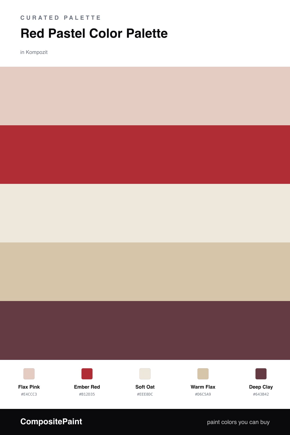
A warm five-color scheme pairing a true brick red with a soft pastel pink, grounded by flax, oat, and a deep clay accent — every color matched to real paint you can buy.

By Emily Roberts · DIY Editor & First-Timer's Guide

Flax Pink
Dominant
Kompozit Pout · 0125
#E4CCC3
LRV 64
Ember Red
Secondary
Kompozit Unmatched Beauty · 1110
#B12D35
LRV 11
Soft Oat
Base
Kompozit Hint of Vanilla · 0001
#EEE8DC
LRV 81
Warm Flax
Support
Kompozit Garden Country · 0279
#D6C5A9
LRV 57
Deep Clay
Accent
Kompozit Kung Fu · 0109
#643B42
LRV 6
View palette in

This is a red palette that never feels heavy. Flax Pink leads — a soft, barely-there blush that reads as a warm neutral on a big wall — and that is what makes the bolder reds feel safe to use. If pink makes you nervous, this is the gentle way in.

The real character comes from Ember Red, a grounded brick tone you bring in small. Pair it with Soft Oat as your clean base and Warm Flax as a slightly deeper supporting layer, so the whole room has a sun-warmed, lived-in feeling rather than a flat one.

Finish with Deep Clay on the smallest things — trim, a frame, a lamp base. It is the dark anchor that keeps all the soft warmth from floating away, and it leans into the cozy, earthy direction a lot of 2026 rooms are headed.

Buy These Colors

Each color matched to the closest real paint in every brand, by ΔE2000. Kompozit first; take any SKU to the store — these mix on demand.

Flax Pink
#EBCFC8 · LRV 66 · Dominant
Kompozit Pout · 0125 ΔE 2.15
Backdrop August · BD-AU ΔE 4.81
Behr Soft Shoe · MQ3-37 ΔE 4.95
Benjamin Moore Rose Accent · 1177 ΔE 2.66
Clare Neutral Territory · PNT100-LT-20 ΔE 8.03
Dunn-Edwards Short and Sweet · DE6023 ΔE 4.1
Farrow & Ball Calamine · No. 230 ΔE 2.42
Magnolia Home Ella Rose · JG-24 ΔE 3.98
PPG / Glidden Cameo Peach · 1058-2 ΔE 0.46
Sherwin-Williams Rosy Outlook · SW 6316 ΔE 1.94
Valspar Rosy Glow · 1008-8C ΔE 0.96
Ember Red
#A8392E · LRV 11 · Secondary
Kompozit Unmatched Beauty · 1110 ΔE 4.58
Backdrop Bahaus · BD-BH ΔE 3.45
Behr Colorful Leaves · M190-7 ΔE 1.5
Benjamin Moore Smoldering Red · 2007-10 ΔE 1.07
Clare Big Apple · PNT100-DP-30 ΔE 12.16
Dunn-Edwards Red Ink · DEA151 ΔE 3.69
Farrow & Ball Incarnadine · No. 248 ΔE 6.12
Magnolia Home Hopscotch · JG-31 ΔE 2.35
PPG / Glidden Rum Punch · 1190-7 ΔE 2.73
Sherwin-Williams Tanager · SW 6601 ΔE 2.49
Valspar Cinnamon Sunset · V008-3 ΔE 3.02
Soft Oat
#F1E9DC · LRV 82 · Base
Kompozit Hint of Vanilla · 0001 ΔE 0.96
Backdrop Jane · BD-JA ΔE 2.9
Behr Clay Dust · N250-1 ΔE 1.69
Benjamin Moore Collector's Item · AF-45 ΔE 0.78
Clare Like Buttah · PNT100-LT-62 ΔE 2.13
Dunn-Edwards Ball of String · DE6190 ΔE 0.9
Farrow & Ball James White · No. 2010 ΔE 2.98
Magnolia Home Antique Rose · JG-23 ΔE 1.03
PPG / Glidden Vanilla Tan · 1202-1 ΔE 0.45
Sherwin-Williams Classic Light Buff · SW 50 ΔE 1.22
Valspar Shell White · 7007-12 ΔE 1.43
Warm Flax
#D9C7AC · LRV 59 · Support
Kompozit Garden Country · 0279 ΔE 0.89
Backdrop August · BD-AU ΔE 7.58
Behr Sand Motif · PPU4-13 ΔE 2.03
Benjamin Moore Cocoa Sand · 1122 ΔE 1.85
Clare Meet Cute · PNT100-LT-60 ΔE 8.59
Dunn-Edwards Cliff's View · DEC720 ΔE 2.62
Farrow & Ball Savage Ground · No. 213 ΔE 1.04
Magnolia Home Plaster · JG-156 ΔE 3.91
PPG / Glidden Armadillo · 14-17 ΔE 1.54
Sherwin-Williams Tres Naturale · SW 9101 ΔE 1.55
Valspar Café Au Lait · M118 ΔE 1.28
Deep Clay
#5A3A33 · LRV 5 · Accent
Kompozit Kung Fu · 0109 ΔE 7.29
Backdrop It's a Date · BD-IT ΔE 6.43
Behr Chocolate Sprinkle · S-G-750 ΔE 1.66
Benjamin Moore Raphael · CC-2 ΔE 2.09
Clare Blackish · PNT100-DP-54 ΔE 14.64
Dunn-Edwards Northern Territory · DEA158 ΔE 5.13
Farrow & Ball Brinjal · No. 222 ΔE 6.9
Magnolia Home Moody Fig · JG-155 ΔE 6.56
PPG / Glidden Dark Granite · 1005-7 ΔE 9.29
Sherwin-Williams Fiery Brown · SW 6055 ΔE 1.73
Valspar Roasted Coffee · 2009-10 ΔE 3.51

Questions

Why does a pastel pink work next to a strong red?

They come from the same warm family, so they feel related instead of clashing. The pale flax pink keeps things gentle, and the deeper ember red gives the room a little backbone without taking over.

How much of the bold red should I actually use?

Keep it small — think one wall, a door, or a few pieces. Let the soft pink and the oat neutral do most of the work, and the red will feel like a warm spark rather than a shout.

Similar Palettes

Closest schemes by color — not by label.