Red Pastel Color Palette — Cocoa Blush
A soft five-color scheme pairing a warm true red with a tender pastel blush, grounded by cocoa brown and gentle neutrals — every color matched to real paint you can buy.
By Jessica Williams · Color Stylist & Interior Editor
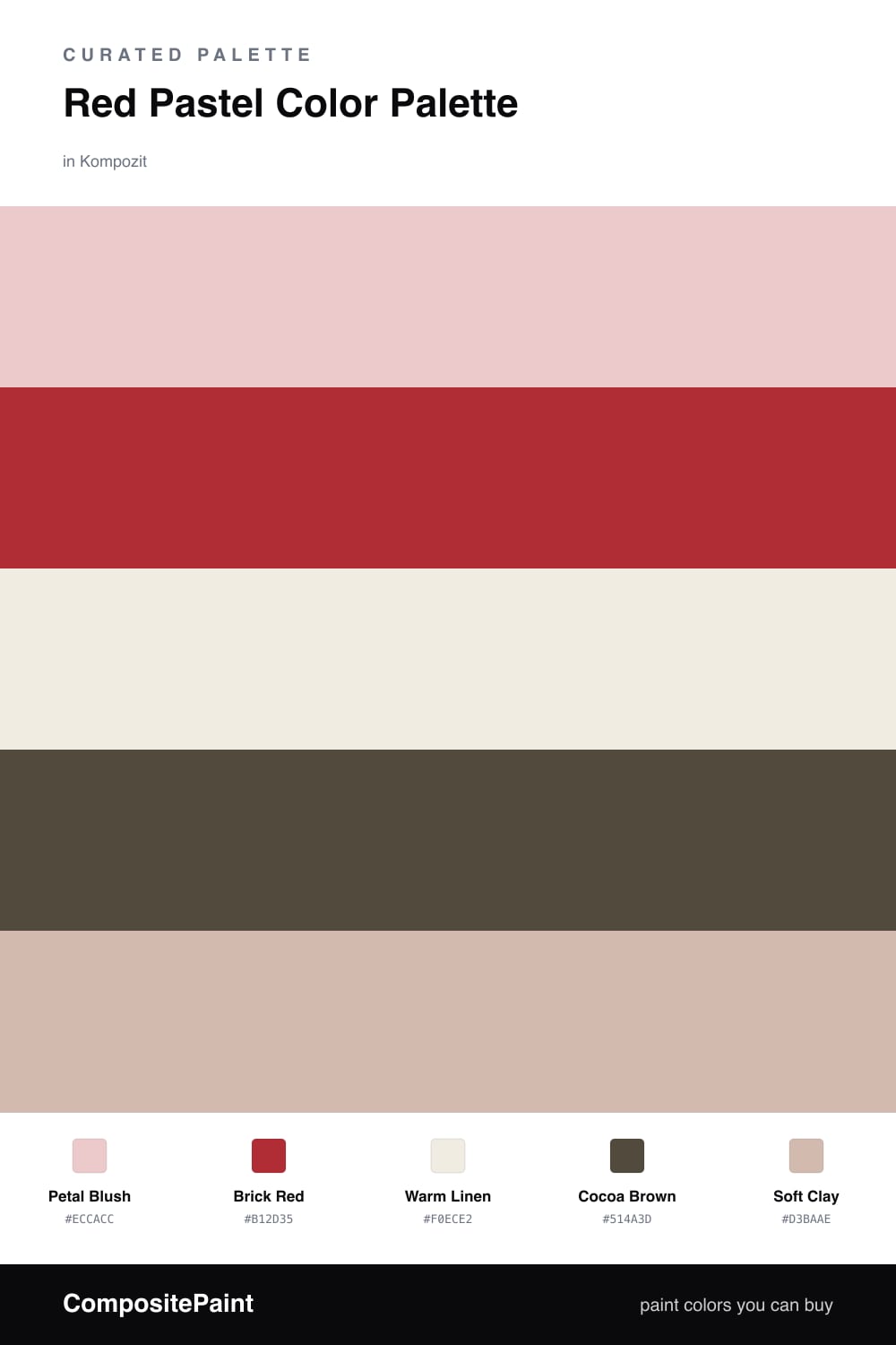
Red can feel loud, but it does not have to be. This scheme starts with Petal Blush, a tender pastel that carries all the warmth of red with none of the volume, and lets it spread across the largest surfaces so the whole space feels soft and lived-in.
Then comes the spark. Brick Red is a true, slightly dusty red that gives the palette its confidence, used in small doses so it reads as warm rather than hot. Warm Linen sits between the two as a quiet base, and Cocoa Brown grounds everything with a cozy, contemporary depth that keeps the pinks from turning sugary.
Soft Clay is the bridge — a muted peachy neutral that ties the blush to the brown and makes the whole scheme feel collected, like it came together slowly over time. Lean on the blush, let the red be the moment, and let the cocoa do the grounding.
Buy These Colors
Each color matched to the closest real paint in every brand, by ΔE2000. Kompozit first; take any SKU to the store — these mix on demand.
Questions
They share the same warm root, so the soft blush reads like a quieter version of the red. The red gives the scheme backbone while the blush keeps it gentle, and the cocoa brown keeps both feeling grounded rather than sweet.
Let the blush cover the big calm surfaces, then bring in the red and cocoa in smaller doses — a chair, a frame, a stripe of trim. Roughly a 70/30 lean toward the soft tones keeps it grown-up.
Similar Palettes
Closest schemes by color — not by label.