CP

Red Pastel Color Palette — Coral Tide

A soft-meets-bold four-color scheme pairing a true cherry red with a gentle pastel coral, balanced by warm white and clay, every color matched to real paint you can buy.

By Emily Roberts · DIY Editor & First-Timer's Guide

Pastel Coral
Dominant
Kompozit Pinkathon · 0061
#F1BDBA
LRV 59
Cherry Red
Secondary
Kompozit Chuckles · 1089
#BF413A
LRV 15
Warm White
Base
Kompozit Cyprus Spring · 0411
#F2F2EA
LRV 88
Soft Clay
Support
Kompozit Cave Painting · 0147
#D3BAAE
LRV 52
Deep Plum Brown
Accent
Kompozit Film Noir · 0144
#473933
LRV 5
View palette in

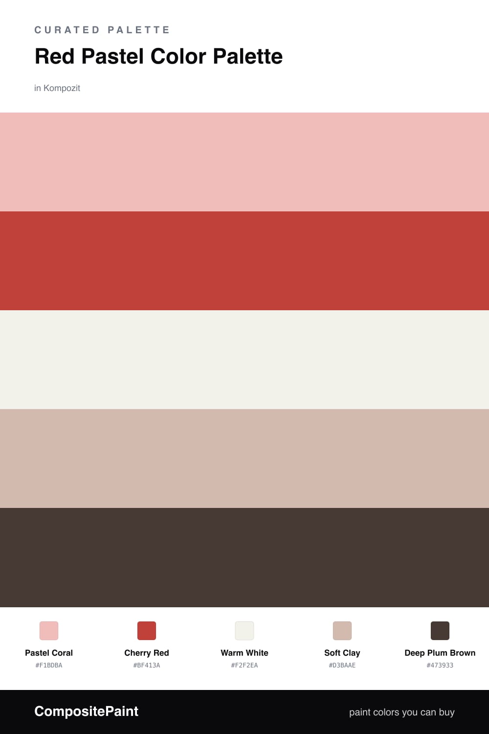
Think of this one as red with the volume turned way down, then one bright note turned back up. Pastel Coral is the star here. It is soft, warm, and easy to live with, the kind of pinky-red that feels modern and a little bit sweet without going babyish.

The fun comes from the contrast. A real Cherry Red wakes everything up, but you only need a touch of it, maybe a door, a chair, or a few cushions. Between them sits a clean Warm White and a grounding Soft Clay, two quiet neutrals that give your eyes a place to rest.

If you want the look to feel current for 2026, finish it with a small dose of Deep Plum Brown. It is dark enough to anchor the soft colors and stop the whole scheme from floating away. Start with the pastel on your walls, layer in the clay and white, and save the cherry and plum for the details.

Buy These Colors

Each color matched to the closest real paint in every brand, by ΔE2000. Kompozit first; take any SKU to the store — these mix on demand.

Pastel Coral
#F2C2BB · LRV 61 · Dominant
Kompozit Pinkathon · 0061 ΔE 2.19
Backdrop August · BD-AU ΔE 8.31
Behr Flamingo Feather · M180-3 ΔE 2.02
Benjamin Moore Salmon Berry · 2089-50 ΔE 0.83
Clare Rosé Season · PNT100-LT-27 ΔE 3.19
Dunn-Edwards Rustique · DE5149 ΔE 2.63
Farrow & Ball Nancy's Blushes · No. 278 ΔE 4.17
Magnolia Home Cabbage Rose · JG-26 ΔE 3.87
PPG / Glidden Peach Ash · 1191-3 ΔE 1.71
Sherwin-Williams Bella Pink · SW 6596 ΔE 2.41
Valspar Pink Cashmere · 8002-9B ΔE 1.06
Cherry Red
#C0392B · LRV 14 · Secondary
Kompozit Chuckles · 1089 ΔE 3.23
Backdrop Bahaus · BD-BH ΔE 7.2
Behr Deep Fire · M180-7 ΔE 0.96
Benjamin Moore Tomato Tango · CSP-1145 ΔE 1.18
Clare Sriracha · PNT100-DP-29 ΔE 9.73
Dunn-Edwards Hot Jazz · DEA107 ΔE 4.35
Farrow & Ball Blazer · No. 212 ΔE 6.35
Magnolia Home Vine Ripened Tomato · JG-25 ΔE 7.88
PPG / Glidden Teaberry Blossom · 1189-7 ΔE 4.78
Sherwin-Williams Stop · SW 6869 ΔE 2.93
Valspar Scarlet Tanager · M212 ΔE 1.71
Warm White
#F6F1EA · LRV 88 · Base
Kompozit Cyprus Spring · 0411 ΔE 2.67
Backdrop Tabula Rasa · BD-TR ΔE 2.71
Behr White Flour · OR-W10 ΔE 1.42
Benjamin Moore Opulence · 879 ΔE 1.15
Clare Wing It · PNT100-LT-24 ΔE 1.46
Dunn-Edwards Fossil · DE6225 ΔE 0.96
Farrow & Ball Wimborne White · No. 239 ΔE 2.09
Magnolia Home Silos White · JG-107 ΔE 1.6
PPG / Glidden Delicate White · 1001-1 ΔE 2.93
Sherwin-Williams White Flour · SW 7102 ΔE 1.49
Valspar Santa's Beard · 8007-6E ΔE 1.94
Soft Clay
#D9B8A6 · LRV 52 · Support
Kompozit Cave Painting · 0147 ΔE 3.04
Backdrop Boy Meets Girl · BD-BG ΔE 3.65
Behr One To Remember · MQ1-23 ΔE 1.08
Benjamin Moore Groundhog Day · 1166 ΔE 2.07
Clare Meet Cute · PNT100-LT-60 ΔE 3.97
Dunn-Edwards Kraft Paper · DE6109 ΔE 3.26
Farrow & Ball Oxford Stone · No. 264 ΔE 6.47
Magnolia Home Solid Wood · JG-109 ΔE 9.33
PPG / Glidden Cinnamon Ice · 1071-4 ΔE 1.27
Sherwin-Williams Classic Sand · SW 56 ΔE 2.71
Valspar Milk Toast · 3001-10B ΔE 3.1
Deep Plum Brown
#4A2E2C · LRV 4 · Accent
Kompozit Film Noir · 0144 ΔE 7.53
Backdrop After Hours · BD-AH ΔE 19.41
Behr Spiceberry · S-G-780 ΔE 3.29
Benjamin Moore Caponata · AF-650 ΔE 3.94
Clare Blackish · PNT100-DP-54 ΔE 14.9
Dunn-Edwards Black · DEA187 ΔE 13.26
Farrow & Ball Pitch Black · No. 256 ΔE 12.78
Magnolia Home Moments · JG-150 ΔE 9.28
PPG / Glidden Black Magic · 1001-7 ΔE 13.65
Sherwin-Williams Rojo Marrón · SW 9182 ΔE 2.77
Valspar Thoroughfare · 8004-6G ΔE 3.31

Questions

Will a bold red feel like too much next to soft pastels?

Not if you let the pastel lead and keep the red small. Here the gentle coral covers the big surfaces and the cherry red shows up in just a few spots, so it reads as a happy spark instead of a shout.

What kind of room suits this palette?

It loves light. Bright, sunny spaces let the pastel coral glow and keep the warm white feeling fresh, while the deep plum brown adds a little weight so the look stays grown-up.

Similar Palettes

Closest schemes by color — not by label.