CP

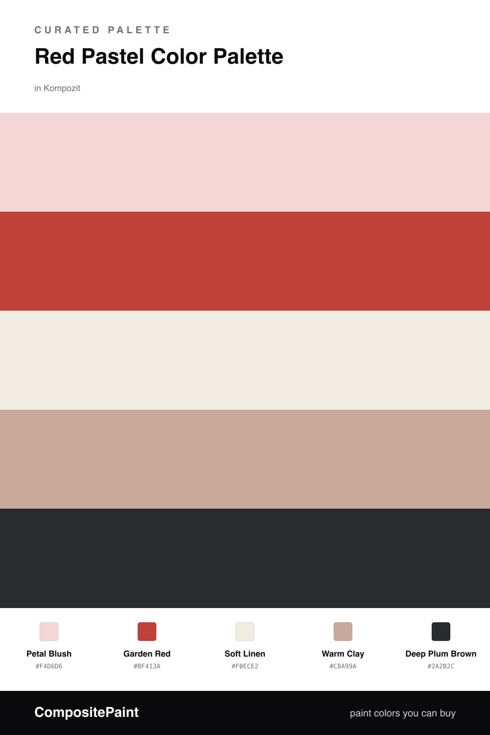
Red Pastel Color Palette — Blush Bloom

A soft five-color scheme built around a true red and a gentle blush pastel, balanced by warm whites and a grounding clay — every color matched to real paint you can buy.

By David Chen · Formulation Lead & Resident Chemist

Petal Blush
Dominant
Kompozit Rose Shadow · 0082
#F4D6D6
LRV 72
Garden Red
Secondary
Kompozit Chuckles · 1089
#BF413A
LRV 15
Soft Linen
Base
Kompozit Queen Anne's Lace · 0558
#F0ECE2
LRV 84
Warm Clay
Support
Kompozit Oak Plank · 0148
#C8A99A
LRV 43
Deep Plum Brown
Accent
Kompozit Silent Sea · 0515
#2A2B2C
LRV 2
View palette in

Think of this palette as a single red stretched across a long dial. Petal Blush is that red turned almost all the way down — soft, airy, and easy to live with — so it does the heavy lifting on your main walls. Garden Red is the same family with the volume up, and you only need a little of it.

The two warm neutrals keep the whole thing honest. Soft Linen is a creamy off-white that stops the blush from reading sweet, and Warm Clay adds an earthy, slightly contemporary middle tone that links the pale and the bold. It is the color that makes the scheme feel current rather than nursery-soft.

Finish with Deep Plum Brown in small doses — a frame, a handle, a lamp base. It gives your eye somewhere firm to land and makes both the blush and the red look richer by contrast. Lead with the soft tones, season with the red, and let the dark notes anchor it.

Buy These Colors

Each color matched to the closest real paint in every brand, by ΔE2000. Kompozit first; take any SKU to the store — these mix on demand.

Petal Blush
#F2D3D1 · LRV 70 · Dominant
Kompozit Rose Shadow · 0082 ΔE 1.1
Backdrop Cookies & Cream · BD-CC ΔE 16.05
Behr Conch Shell · S200-1 ΔE 3.67
Benjamin Moore Tippy Toes · 1282 ΔE 0.31
Clare Baby Soft · PNT100-LT-25 ΔE 5.09
Dunn-Edwards Short and Sweet · DE6023 ΔE 1.94
Farrow & Ball Pink Ground · No. 202 ΔE 6.96
Magnolia Home Dutch Tulip · JG-34 ΔE 10.57
PPG / Glidden Lady Pink · 1187-2 ΔE 0.71
Sherwin-Williams Charming Pink · SW 6309 ΔE 1.62
Valspar Gentle Kiss · V080-1 ΔE 2.47
Garden Red
#C43D3A · LRV 15 · Secondary
Kompozit Chuckles · 1089 ΔE 1.14
Backdrop Bahaus · BD-BH ΔE 6.92
Behr Deep Fire · M180-7 ΔE 2.74
Benjamin Moore Strawberry Red · 2003-20 ΔE 0.98
Clare Sriracha · PNT100-DP-29 ΔE 7.55
Dunn-Edwards Red Icon · DEA104 ΔE 3.88
Farrow & Ball Blazer · No. 212 ΔE 4.19
Magnolia Home Vine Ripened Tomato · JG-25 ΔE 4.97
PPG / Glidden Calypso Berry · 1185-7 ΔE 5.69
Sherwin-Williams Stop · SW 6869 ΔE 0.9
Valspar Scarlet Tanager · M212 ΔE 2.22
Soft Linen
#F4EDE4 · LRV 85 · Base
Kompozit Queen Anne's Lace · 0558 ΔE 1.75
Backdrop Jane · BD-JA ΔE 2.69
Behr Flurries · HDC-WR14-1 ΔE 0.91
Benjamin Moore Fondant · AF-255 ΔE 1.78
Clare Wing It · PNT100-LT-24 ΔE 1.43
Dunn-Edwards Tea Biscuit · DE6120 ΔE 1.36
Farrow & Ball Pointing · No. 2003 ΔE 2.56
Magnolia Home Silos White · JG-107 ΔE 2.36
PPG / Glidden Cow's Milk · 1053-1 ΔE 1.4
Sherwin-Williams Westhighland White · SW 7566 ΔE 1.58
Valspar Dove White · 7002-7 ΔE 1.24
Warm Clay
#C9A491 · LRV 41 · Support
Kompozit Oak Plank · 0148 ΔE 2.38
Backdrop Rosita · BD-RO ΔE 6.13
Behr Riviera Clay · UL130-8 ΔE 3.77
Benjamin Moore Ipanema · AF-245 ΔE 2.4
Clare Subrosa · PNT100-MD-76 ΔE 5.14
Dunn-Edwards Moenkopi Tan · DEC704 ΔE 1.33
Farrow & Ball Cinder Rose · No. 246 ΔE 9.23
Magnolia Home Rosy Pink · JG-154 ΔE 3.69
PPG / Glidden Just Rosey · 1061-4 ΔE 2.52
Sherwin-Williams Sandbank · SW 6052 ΔE 2.64
Valspar Emery Board · V084-3 ΔE 2.9
Deep Plum Brown
#3A2A2C · LRV 3 · Accent
Kompozit Silent Sea · 0515 ΔE 10
Backdrop Hocus Pocus · BD-HP ΔE 10.37
Behr Double Espresso · BNC-21 ΔE 3.63
Benjamin Moore Velvet Cloak · CSP-480 ΔE 2.83
Clare Blackish · PNT100-DP-54 ΔE 12.51
Dunn-Edwards Black · DEA187 ΔE 9.55
Farrow & Ball Pitch Black · No. 256 ΔE 9.15
Magnolia Home Blackboard · JG-05 ΔE 10.85
PPG / Glidden Black Magic · 1001-7 ΔE 10.52
Sherwin-Williams Raisin · SW 7630 ΔE 1.01
Valspar Noblesse Oblige · 8004-2G ΔE 1.89

Questions

Why does a pale pastel work next to a strong red?

They are the same hue family at two different strengths. The blush is red with most of its saturation drained out, so the eye reads them as related rather than clashing — one is a whisper, the other a statement.

How much of the strong red should I actually use?

Keep it small. Let the blush and the warm whites carry the room, then bring in the red on one wall, a door, or a single piece, roughly a one-fifth share, with the clay and plum brown grounding everything.

Similar Palettes

Closest schemes by color — not by label.