CP

Purple & Grey Color Palette — Lavender Stone

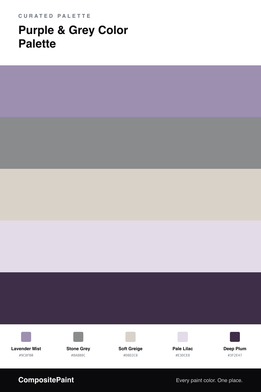
A soft four-color scheme pairing a muted lavender purple with cool stone grey, balanced by warm greige and a plum accent — every color matched to real paint you can buy.

By David Chen · Formulation Lead & Resident Chemist

Lavender and grey is one of those pairings that feels almost weightless. The trick is to keep the purple honest. Lavender Mist is a lavender with a lot of grey already mixed in, so it behaves like a soft neutral with just enough color to feel intentional rather than plain.

Next to it, Stone Grey does the quiet, structural work, and Soft Greige warms the room a half-step so the whole scheme never tips cold. Pale Lilac is the lightest note, a near-white wash you can use on ceilings or trim to carry the purple through without shouting it.

For 2026 the move is restraint with one deep moment. Deep Plum is that moment — a near-black purple you spend sparingly on a single door, a built-in, or a band of cabinetry. Lead with the lavender, lean on the greys, and let the plum land last.

View palette in
Lavender Mist
Dominant
Valspar Iris Blossom · 1001-5C
#A091B3
LRV 31
Stone Grey
Secondary
Farrow & Ball Plummett · No. 272
#8C8E8D
LRV 27
Soft Greige
Base
Diamond Vogel Mossy Shade · 0195
#DAD3C9
LRV 66
Pale Lilac
Support
Benjamin Moore Sugarplum · 1394
#E3DCE8
LRV 73
Deep Plum
Accent
Benjamin Moore Exotic Purple · 2071-10
#43334D
LRV 4

Buy These Colors

Each color matched to the closest real paint in every brand, by ΔE2000. Tap a swatch for its full guide or + to save it — take any SKU to the store, they mix on demand.

Lavender Mist
#9C8FB0 · LRV 30 · Dominant
Sherwin-Williams · SW 6823 · ΔE 3.54
Behr · MQ5-33 · ΔE 4.49
Benjamin Moore · 1405 · ΔE 3
Valspar · 1001-5C · ΔE 1.07
PPG / Glidden · PPG1175-5 · ΔE 1.54
Glidden · PPG1175-5 · ΔE 2.01
Dutch Boy · 142-5DB · ΔE 5.78
HGTV Home by Sherwin-Williams · HGSW 1413 · ΔE 3.54
Dunn-Edwards · DE5927 · ΔE 6.6
Magnolia Home · JG-94 · ΔE 16.97
Farrow & Ball · NO. G11 · ΔE 14.73
Diamond Vogel · 1248 · ΔE 4.83
Hirshfield's · 1283 · ΔE 4.98
Rodda · R093 · ΔE 17.18
C2 Paint · C2-781 · ΔE 5.99
Clare · PNT100-LT-32 · ΔE 10.55
Portola Paints · TWIN PEAKS · ΔE 16.66
Annie Sloan · GREEK BLUE · ΔE 18.46
Backdrop · BD-PW · ΔE 18.27
Rust-Oleum · 391446 · ΔE 18.76
Kompozit · 1283 · ΔE 4.98
Stone Grey
#8A8B8C · LRV 26 · Secondary
Sherwin-Williams · SW 9156 · ΔE 5.05
Behr · PMD-73 · ΔE 2.02
Benjamin Moore · 1601 · ΔE 2.04
Valspar · M259 · ΔE 3.12
PPG / Glidden · PPG1010-5 · ΔE 2.32
Glidden · 30BB 26/025 · ΔE 2.29
Dutch Boy · 436-5DB · ΔE 2.1
HGTV Home by Sherwin-Williams · HGSW 3394 · ΔE 5.05
Dunn-Edwards · DEGR74 · ΔE 2.33
Magnolia Home · JG-95 · ΔE 3
Farrow & Ball · NO. 272 · ΔE 1.71
Diamond Vogel · 0527 · ΔE 2.98
Hirshfield's · 0491 · ΔE 7.34
Rodda · CA200 · ΔE 1.79
C2 Paint · C2-953 · ΔE 1.99
Clare · PNT100-MD-14 · ΔE 4.54
Portola Paints · VOODOO · ΔE 5.76
Annie Sloan · GREEK BLUE · ΔE 12.49
Backdrop · BD-PW · ΔE 7.29
Rust-Oleum · 391446 · ΔE 5.76
Kompozit · 0491 · ΔE 7.34
Soft Greige
#D8D2C8 · LRV 65 · Base
Sherwin-Williams · SW 9566 · ΔE 1.13
Behr · T16-19 · ΔE 0.62
Benjamin Moore · CW-710 · ΔE 1.07
Valspar · 8006-2B · ΔE 1.13
PPG / Glidden · PPG14-30 · ΔE 1.44
Glidden · PPG14-30 · ΔE 1.4
Dutch Boy · 405-1DB · ΔE 1.74
HGTV Home by Sherwin-Williams · HGSW 4019 · ΔE 2.36
Dunn-Edwards · DEGR06 · ΔE 1.17
Magnolia Home · JG-55 · ΔE 3.44
Farrow & Ball · NO. 241 · ΔE 0.83
Diamond Vogel · 0195 · ΔE 0.58
Hirshfield's · 0195 · ΔE 1.4
Rodda · R025 · ΔE 0.71
C2 Paint · C2-994 · ΔE 1.13
Clare · PNT100-LT-18 · ΔE 1.85
Portola Paints · SAN FERNANDO · ΔE 1.43
Annie Sloan · OLD OCHRE · ΔE 8.91
Backdrop · BD-RR · ΔE 3.03
Rust-Oleum · 285142 · ΔE 9.19
Kompozit · 0195 · ΔE 1.4
Pale Lilac
#E3DCE8 · LRV 73 · Support
Sherwin-Williams · SW 6834 · ΔE 1.43
Behr · N120-2 · ΔE 1.27
Benjamin Moore · 1394 · ΔE 0
Valspar · 4002-9A · ΔE 1.27
PPG / Glidden · PPG1176-2 · ΔE 0.88
Glidden · 03RB 58/148 · ΔE 0.94
Dutch Boy · 246-1DB · ΔE 1.43
HGTV Home by Sherwin-Williams · HGSW 1437 · ΔE 1.43
Dunn-Edwards · DE5959 · ΔE 2.52
Magnolia Home · JG-119 · ΔE 11.4
Farrow & Ball · NO. 2006 · ΔE 7.5
Diamond Vogel · 1238 · ΔE 2.1
Hirshfield's · 1238 · ΔE 2.1
Rodda · CA181 · ΔE 9.82
C2 Paint · C2-803 · ΔE 5.5
Clare · PNT100-LT-25 · ΔE 7.87
Portola Paints · GEM · ΔE 11.87
Annie Sloan · OLD OCHRE · ΔE 19.54
Backdrop · BD-CC · ΔE 17.17
Rust-Oleum · 285142 · ΔE 7.95
Kompozit · 1238 · ΔE 2.1
Deep Plum
#3F2E47 · LRV 3 · Accent
Sherwin-Williams · SW 6559 · ΔE 4.12
Behr · 680F-7 · ΔE 3.08
Benjamin Moore · 2071-10 · ΔE 1.65
Valspar · M215 · ΔE 4.64
PPG / Glidden · PPG0995-7 · ΔE 15.88
Glidden · 00NN 05/000 · ΔE 14.56
Dutch Boy · 344-7DB · ΔE 6
HGTV Home by Sherwin-Williams · HGSW 2411 · ΔE 6.03
Dunn-Edwards · DEA185 · ΔE 11.67
Magnolia Home · JG-05 · ΔE 13.93
Farrow & Ball · NO. W24 · ΔE 9.58
Diamond Vogel · H101 · ΔE 15.31
Hirshfield's · 1229 · ΔE 9.04
Rodda · CA210 · ΔE 12.54
C2 Paint · BD42 · ΔE 7.34
Clare · PNT100-DP-54 · ΔE 17.65
Portola Paints · DANCING SHOES · ΔE 4.23
Annie Sloan · NAPOLEONIC BLUE · ΔE 12.37
Backdrop · BD-LC · ΔE 11.66
Rust-Oleum · 285144 · ΔE 16.5
Kompozit · 1229 · ΔE 9.04

Questions

how do I keep lavender from reading too purple or sweet?

Pull the purple toward grey, the way Lavender Mist does here, and surround it with true neutrals like Stone Grey and Soft Greige. The grey drains the candy out of the lavender and leaves a quiet, grown-up purple.

which color should I use the most of?

Let Lavender Mist lead on the largest surfaces, with Stone Grey as the steady partner, roughly a 60/40 split. Keep Deep Plum to small doses on a door or trim so it reads as a punctuation mark, not a second main color.

KEEP EXPLORING

Similar Palettes

Closest schemes by color — not by label.