Purple & Grey Color Palette — Slate Dusk
A soft four-color scheme pairing a dusky amethyst purple with cool slate grey, settled by warm greige and a near-black accent — every color matched to real paint you can buy.
By Jessica Williams · Color Stylist & Interior Editor
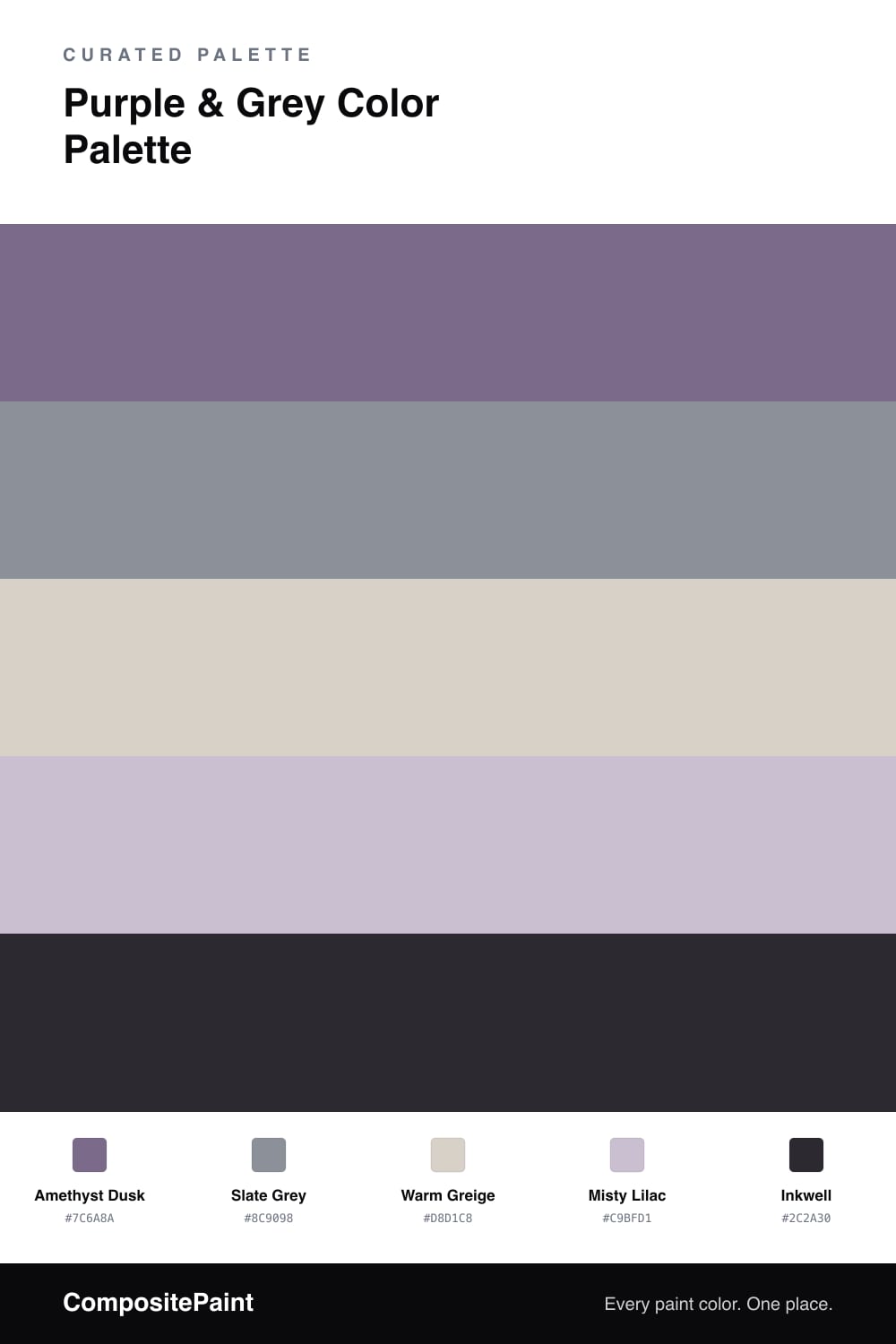
Purple and grey is the pairing I keep coming back to when a space needs to feel hushed but still has a pulse. This scheme leans on Amethyst Dusk, a grey-violet that feels more like twilight than lavender, with a cool Slate Grey running alongside it to keep things grounded and modern.
Warm Greige is the quiet base here, a soft beige-grey that warms the cool tones and lets your eye rest, while Misty Lilac bridges the purple and grey so nothing feels abrupt. The whole thing reads soft and a little moody, very of-the-moment for 2026.
When you want contrast, bring in Inkwell, a near-black with a faint violet cast. Use it sparingly on a frame or a single fixture, and it sharpens the dreaminess without breaking the calm.
Buy These Colors
Each color matched to the closest real paint in every brand, by ΔE2000. Tap a swatch for its full guide or + to save it — take any SKU to the store, they mix on demand.
Questions
Reach for the warmer members of each family. Amethyst Dusk leans grey-violet rather than icy lavender, and the Warm Greige base carries a soft beige undertone that takes the chill off, so the whole scheme reads calm instead of clinical.
Let Amethyst Dusk lead and spread Warm Greige across the largest quiet surfaces. Keep Slate Grey and Misty Lilac as the mid-tone support, then save Inkwell for one small grounding moment so the softness has an edge.
Similar Palettes
Closest schemes by color — not by label.