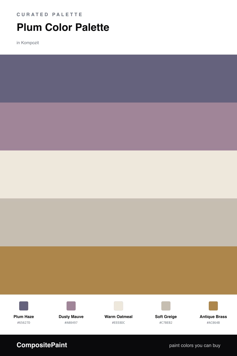
Plum Color Palette — Plum Haze
A soft five-color scheme led by hazy plum, warmed with greige and oatmeal and lifted by a single brass accent — every color matched to real paint you can buy.
By Jessica Williams · Color Stylist & Interior Editor
Plum can tip into drama fast, so here I pulled it back into something hazier and more wearable. Plum Haze leads the scheme as a soft, grayed purple that feels more like dusk light than a bold statement, and it sets a calm, contemporary mood.
Dusty Mauve echoes it a shade lighter, while Warm Oatmeal and Soft Greige keep everything grounded and breathable. These warm neutrals stop the plum from feeling cold or moody, and they let it stretch across a large surface without overwhelming the eye.
The one spark is Antique Brass, a warm metallic note that flatters plum the way gold flatters wine. Keep it to small doses and let the plum carry the room.
Buy These Colors
Each color matched to the closest real paint in every brand, by ΔE2000. Kompozit first; take any SKU to the store — these mix on demand.
Questions
The plum is muted and a little grayed, so it reads as a soft haze rather than a saturated purple. Surrounding it with oatmeal and greige keeps the whole scheme quiet and easy to live with.
Let plum lead at roughly two-thirds of the space, keep dusty mauve and the neutrals as the steady middle, and save the brass for small touches like hardware or a frame.
Similar Palettes
Closest schemes by color — not by label.