CP

Rose Kitchen Palette — Dawn Rose & Warm Linen

A soft five-color kitchen scheme led by dusty dawn rose, balanced by warm linen, a crisp ceiling white, oak-toned wood, and a deep clay accent — every color matched to real paint you can buy.

By Emily Roberts · DIY Editor & First-Timer's Guide

Dawn Rose
Walls
Kompozit Sauterne · 0126
#D7BBB3
LRV 53
Warm Linen
Trim & Ceiling
Kompozit Hint of Vanilla · 0001
#EEE8DC
LRV 81
Blush Cream
Cabinets
Kompozit White Meadow · 1055
#F2E7DE
LRV 81
Soft Oak
Wood & Floors
Kompozit Blonde Shell · 0170
#BE9673
LRV 34
Deep Clay
Accent
Kompozit Emperor's Robe · 0074
#7B4940
LRV 9
View palette in

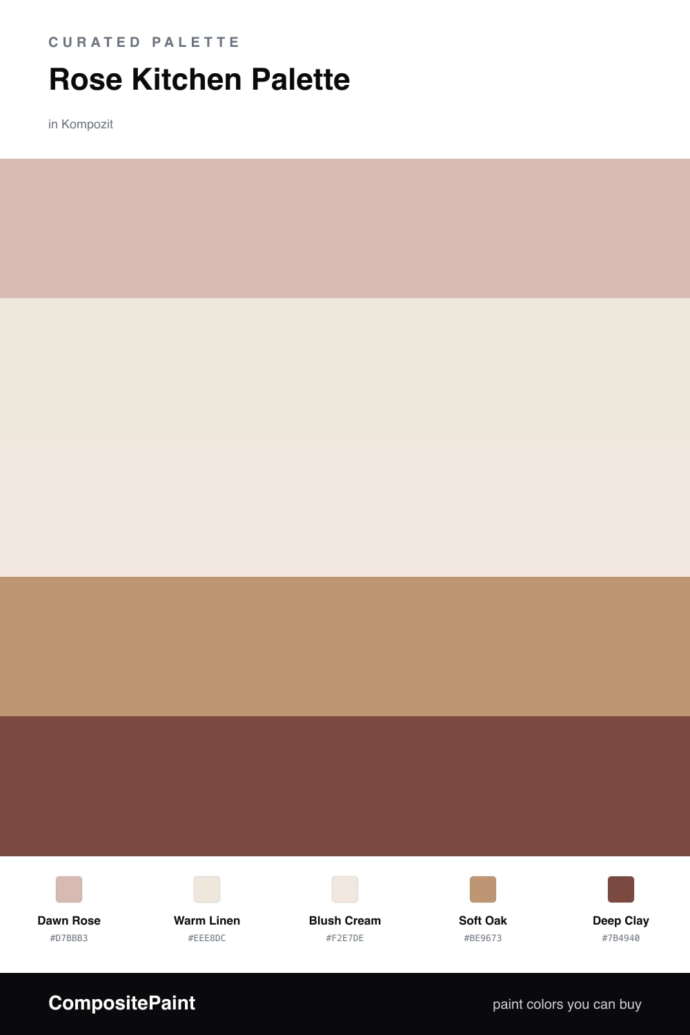
This is the kitchen for slow mornings. Dawn Rose leads on the walls, a soft dusty pink that catches early light and feels warm without ever turning sweet or loud. Think of it as a rose that behaves like a neutral.

Around it, Warm Linen keeps the trim and ceiling quiet, while Blush Cream on the cabinets stays a hair lighter so they feel fresh and clean. Soft Oak brings in the natural warmth of wood floors or a butcher-block counter, and it is the piece that makes the rose feel grounded instead of pastel.

For the spark, Deep Clay does the heavy lifting in small doses — an island base, open shelves, or a band of lower cabinets. It is the 2026 move of pairing soft pink with a rich earthy brown, and it gives the whole room a little weight so the rose has something to lean on.

Buy These Colors

Each color matched to the closest real paint in every brand, by ΔE2000. Kompozit first; take any SKU to the store — these mix on demand.

Dawn Rose
#D9B6AE · LRV 51 · Walls
Kompozit Sauterne · 0126 ΔE 2.49
Backdrop Boy Meets Girl · BD-BG ΔE 3.32
Behr Sedona Pink · S190-3 ΔE 1.66
Benjamin Moore Desert Rose · 2094-50 ΔE 1.23
Clare Greige · PNT100-LT-13 ΔE 9.29
Dunn-Edwards Pencil Eraser · DE6024 ΔE 5.25
Farrow & Ball Elephant's Breath · No. 229 ΔE 9.47
Magnolia Home Cinnamon Sugar · JG-133 ΔE 9.46
PPG / Glidden Rose Hip · 1055-3 ΔE 2.33
Sherwin-Williams Appleblossom · SW 76 ΔE 3.24
Valspar Sunset Curtains · 1007-10B ΔE 1.97
Warm Linen
#EFE6D8 · LRV 80 · Trim & Ceiling
Kompozit Hint of Vanilla · 0001 ΔE 1.44
Backdrop Don't Eat the Yellow Snow · BD-DS ΔE 4.18
Behr Exclusive Ivory · HDC-MD-11 ΔE 1.24
Benjamin Moore Navajo White · 947 ΔE 2.22
Clare Like Buttah · PNT100-LT-62 ΔE 1.57
Dunn-Edwards Finest Silk · DE6127 ΔE 1.44
Farrow & Ball James White · No. 2010 ΔE 3.12
Magnolia Home Antique Rose · JG-23 ΔE 1.41
PPG / Glidden Pearl · 1087-2 ΔE 1.19
Sherwin-Williams Futon · SW 7101 ΔE 1.32
Valspar Antique White · 7002-20 ΔE 0.49
Blush Cream
#F3E4DC · LRV 80 · Cabinets
Kompozit White Meadow · 1055 ΔE 2.07
Backdrop Jane · BD-JA ΔE 6.81
Behr Chamois Cloth · W-F-110 ΔE 1.94
Benjamin Moore Early Sunset · 2096-70 ΔE 1.32
Clare Like Buttah · PNT100-LT-62 ΔE 5.65
Dunn-Edwards Faded Light · DE6078 ΔE 1.51
Farrow & Ball Dimity · No. 2008 ΔE 4.86
Magnolia Home Antique Rose · JG-23 ΔE 5.65
PPG / Glidden Aubergine · 1064-1 ΔE 0.52
Sherwin-Williams Intimate White · SW 6322 ΔE 0.83
Valspar Pinkwash · V081-1 ΔE 0.8
Soft Oak
#B89370 · LRV 32 · Wood & Floors
Kompozit Blonde Shell · 0170 ΔE 1.51
Backdrop Anita · BD-AN ΔE 8.03
Behr Baguette · MQ2-15 ΔE 1.92
Benjamin Moore Autumn Leaf · 1131 ΔE 1.1
Clare Good as Gold · PNT100-DP-59 ΔE 6.77
Dunn-Edwards Colorado Trail · DE6117 ΔE 1.68
Farrow & Ball Dead Salmon · No. 28 ΔE 7.37
Magnolia Home Antiquing · JG-128 ΔE 11.4
PPG / Glidden Tudor Beige · 16-17 ΔE 1.31
Sherwin-Williams Soft Fawn · SW 9097 ΔE 2.42
Valspar Changing Seasons · 3001-9C ΔE 2.37
Deep Clay
#7A4A3C · LRV 9 · Accent
Kompozit Emperor's Robe · 0074 ΔE 2.3
Backdrop Buenos Aires · BD-BA ΔE 10.39
Behr Royal Liqueur · PPU2-19 ΔE 1.65
Benjamin Moore Harvest Brown · 2104-30 ΔE 2.32
Clare Vintage · PNT100-DP-67 ΔE 5.97
Dunn-Edwards Cellar Door · DEA157 ΔE 2.49
Farrow & Ball Preference Red · No. 297 ΔE 9.08
Magnolia Home Mountain Currant · JG-171 ΔE 6.15
PPG / Glidden Antique Mahogany · 16-08 ΔE 2.01
Sherwin-Williams Red Barn · SW 7591 ΔE 3.31
Valspar Watusi · M152 ΔE 1.75

Questions

Is rose too bold for a whole kitchen?

Not when it is a soft, dusty rose like this one. It reads almost like a warm neutral on the walls and feels calm in morning light, so the room stays easy to live in.

What finish should I use in a kitchen?

Go with a washable matte or eggshell on the walls and a satin or semi-gloss on cabinets and trim. These wipe clean and stand up to splashes near the stove and sink.

Similar Palettes

Closest schemes by color — not by label.