CP

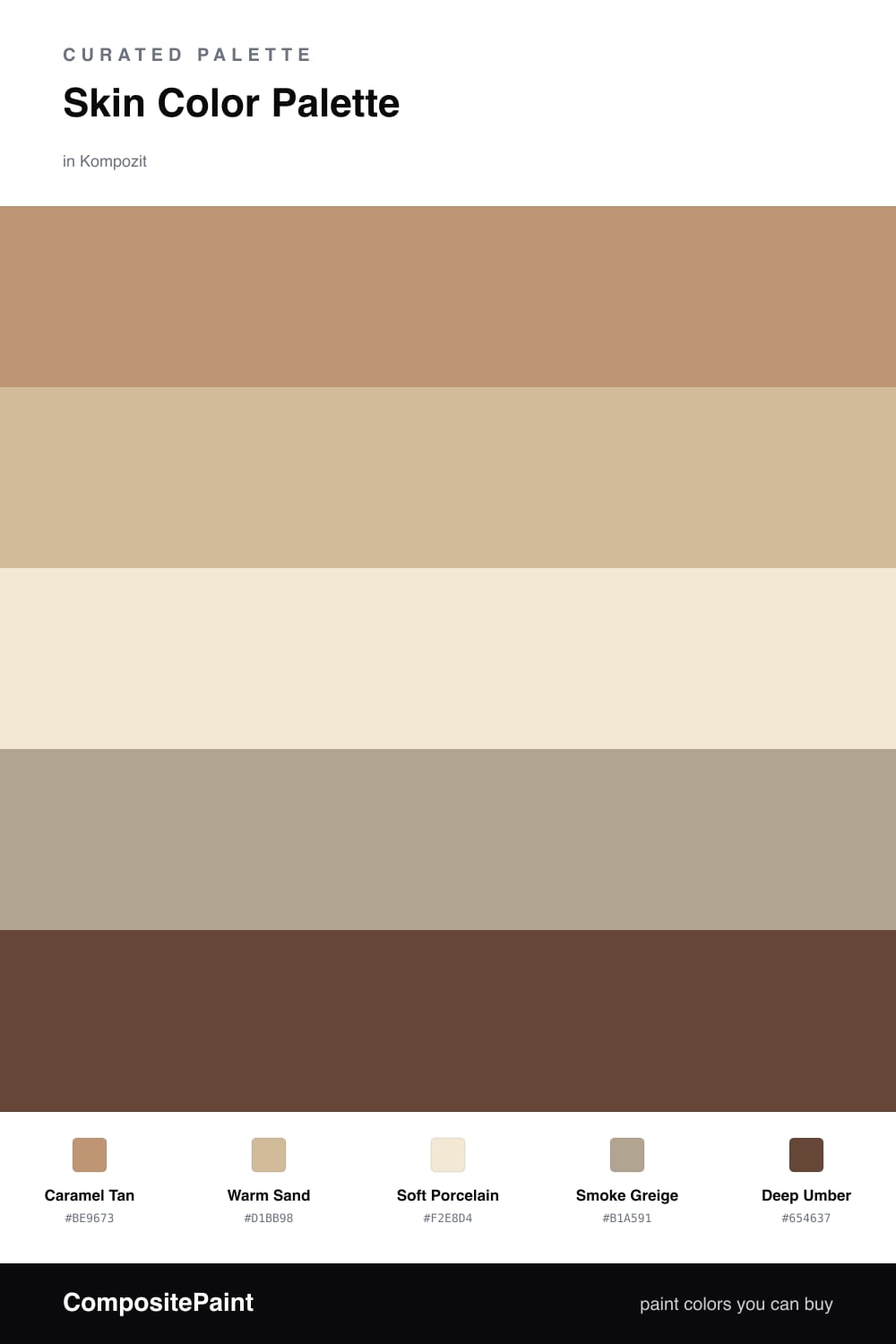
Skin Color Palette — Soft Smoke

A warm five-color scheme of porcelain, tan, caramel and deep umber softened by a smoky neutral — every color matched to real paint you can buy.

By David Chen · Formulation Lead & Resident Chemist

Caramel Tan
Dominant
Kompozit Blonde Shell · 0170
#BE9673
LRV 34
Warm Sand
Secondary
Kompozit October Harvest · 0266
#D1BB98
LRV 51
Soft Porcelain
Base
Kompozit Eugenia · 0285
#F2E8D4
LRV 81
Smoke Greige
Support
Kompozit Sedge · 0226
#B1A591
LRV 38
Deep Umber
Accent
Kompozit Hideaway · 0137
#654637
LRV 7
View palette in

Skin tones are some of the most forgiving colors to live with, because they carry the same warmth our eyes already trust. This scheme runs on a soft Caramel Tan as the lead, with Warm Sand stepping in a shade lighter so the two never compete.

A pale Soft Porcelain opens everything up and keeps the room feeling clean, while Smoke Greige adds that quiet, slightly cooled-down haze that makes a nude palette feel current rather than beige. Think of it as the gray smoke drifting through warm light.

For 2026 I would let the Deep Umber do the heavy lifting in small doses — a door, a frame, a single piece of furniture. One dark anchor is all this palette needs to feel grounded and intentional.

Buy These Colors

Each color matched to the closest real paint in every brand, by ΔE2000. Kompozit first; take any SKU to the store — these mix on demand.

Caramel Tan
#C39169 · LRV 33 · Dominant
Kompozit Blonde Shell · 0170 ΔE 2.87
Backdrop Anita · BD-AN ΔE 11.23
Behr Burnished Caramel · HDC-CL-15 ΔE 1.66
Benjamin Moore Desert Beach · 1104 ΔE 3.24
Clare Good as Gold · PNT100-DP-59 ΔE 7.96
Dunn-Edwards Sonora Shade · DE5263 ΔE 2.05
Farrow & Ball India Yellow · No. 66 ΔE 8.72
Magnolia Home Vintage Crown · JG-152 ΔE 6.99
PPG / Glidden Burning Sand · 16-03 ΔE 1.31
Sherwin-Williams Eastlake Gold · SW 9 ΔE 1.6
Valspar Desert Carnation · 2005-7C ΔE 3.59
Warm Sand
#D8B894 · LRV 51 · Secondary
Kompozit October Harvest · 0266 ΔE 3.7
Backdrop Boy Meets Girl · BD-BG ΔE 10.23
Behr Dusty Gold · S260-3 ΔE 2
Benjamin Moore Lingerie · AF-200 ΔE 1.45
Clare Greige · PNT100-LT-13 ΔE 11.66
Dunn-Edwards Friar Tuck · DEC714 ΔE 1.34
Farrow & Ball Cord · No. 16 ΔE 5.58
Magnolia Home Cottage Feel · JG-40 ΔE 6.17
PPG / Glidden Nutmeg Glow · 1080-3 ΔE 0.76
Sherwin-Williams Bagel · SW 6114 ΔE 1.35
Valspar Sandstone Cliff · 8003-19C ΔE 1.48
Soft Porcelain
#F3E7D8 · LRV 81 · Base
Kompozit Eugenia · 0285 ΔE 2.62
Backdrop Don't Eat the Yellow Snow · BD-DS ΔE 4.66
Behr Spooky Ghost · HDC-FL14-1 ΔE 0.48
Benjamin Moore Candle White · 2164-70 ΔE 1.66
Clare Like Buttah · PNT100-LT-62 ΔE 1.57
Dunn-Edwards Alabaster · DEW310 ΔE 1.36
Farrow & Ball James White · No. 2010 ΔE 4.27
Magnolia Home Antique Rose · JG-23 ΔE 2.69
PPG / Glidden Parchment Paper · 1095-1 ΔE 1.67
Sherwin-Williams Crisp Linen · SW 6378 ΔE 1.18
Valspar Grow · 8003-25A ΔE 1.96
Smoke Greige
#B5A491 · LRV 38 · Support
Kompozit Sedge · 0226 ΔE 2.68
Backdrop Carry the Two · BD-CT ΔE 4.33
Behr Safari Vest · PPU7-22 ΔE 2.46
Benjamin Moore Rocky Beach · CSP-190 ΔE 2.68
Clare Subrosa · PNT100-MD-76 ΔE 12.68
Dunn-Edwards Hickory · DEC759 ΔE 1.73
Farrow & Ball London Stone · No. 6 ΔE 0.85
Magnolia Home Rustic Oak · JG-110 ΔE 2.45
PPG / Glidden El Capitan · 1020-4 ΔE 1.5
Sherwin-Williams Stone Lion · SW 7507 ΔE 0.97
Valspar Fashion District · V132-4 ΔE 1.68
Deep Umber
#5A4334 · LRV 6 · Accent
Kompozit Hideaway · 0137 ΔE 3.72
Backdrop It's a Date · BD-IT ΔE 0.61
Behr Breakfast Blend · 280F-7 ΔE 2.62
Benjamin Moore Deep Taupe · 2111-10 ΔE 0.48
Clare Blackish · PNT100-DP-54 ΔE 11.66
Dunn-Edwards Northern Territory · DEA158 ΔE 3.02
Farrow & Ball Mahogany · No. 36 ΔE 7.34
Magnolia Home Wooded Acres · JG-122 ΔE 6.44
PPG / Glidden Racy Raisin · 16-24 ΔE 5.81
Sherwin-Williams Van Dyke Brown · SW 7041 ΔE 3.04
Valspar Piano Brown · 1004-9A ΔE 5.27

Questions

Why do these skin-tone colors work together?

They are all built from the same warm earthy base, just lightened or deepened. Because they share that undertone, the eye reads them as one calm family rather than five separate colors.

How do I keep a nude palette from looking flat?

Lean on contrast in value. Let the pale porcelain carry the big surfaces, use caramel and sand at mid-strength, then drop in the deep umber as a small accent so the whole scheme has somewhere dark to rest.

Similar Palettes

Closest schemes by color — not by label.