Sage Color Palette — Sage at Dusk
A calm five-color sage scheme that pairs soft green with warm neutrals and one quiet plum accent, every color matched to real paint you can buy.
By Emily Roberts · DIY Editor & First-Timer's Guide
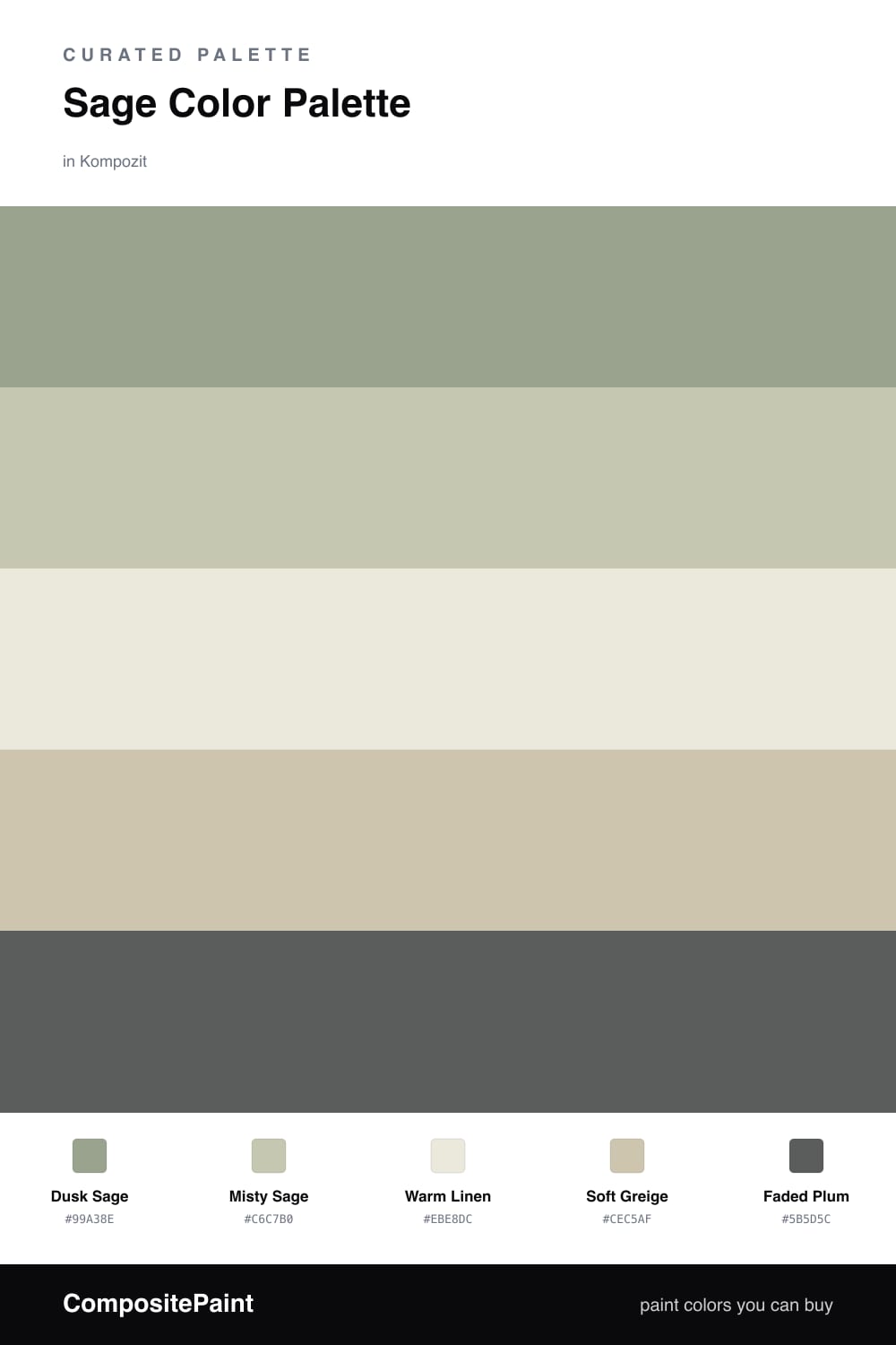
Sage is the color I reach for when someone wants a room that feels calm the second they walk in. This scheme leans on a soft, slightly grayed Dusk Sage as the lead, with a lighter Misty Sage layered just beside it so the green feels like it has depth instead of one flat note.
The neutrals do the gentle work here. Warm Linen keeps the whole thing from feeling cold, and Soft Greige bridges the green and the cream so nothing fights for attention. If sage on its own ever feels a little sleepy, this is the trick that keeps it grounded and current.
Then there is the one surprise — a dusty Faded Plum that I love for 2026. Used in small doses, a throw, a frame, a single painted nook, it wakes the sage up without breaking the quiet. Keep it to a fifth of the room and it stays elegant.
Buy These Colors
Each color matched to the closest real paint in every brand, by ΔE2000. Kompozit first; take any SKU to the store — these mix on demand.
Questions
Sage is a muted green with a touch of gray, so it reads soft and natural instead of bright. That low contrast is what makes a room feel restful rather than busy.
Let the two sages lead on your big surfaces, keep the linen and greige as your quiet backdrop, and save the plum for small touches like a chair or a vase.
Similar Palettes
Closest schemes by color — not by label.