CP

Mauve Color Palette — Mauve Meadow

A soft five-color scheme led by dusty mauve, balanced with warm greige, soft white, and a sage accent — every color matched to real paint you can buy.

By Maya Patel · Reviews Editor & Product Tester

Dusty Mauve
Dominant
Kompozit Cut Heather · 1303
#9E909E
LRV 30
Muted Plum
Secondary
Kompozit Majestic Plum · 1214
#806173
LRV 14
Soft White
Base
Kompozit Little Pinky · 1174
#F4EDEC
LRV 86
Warm Greige
Support
Kompozit Place of Dust · 0539
#C6C3C0
LRV 55
Quiet Sage
Accent
Kompozit Big Fish · 0435
#99A38E
LRV 35
View palette in

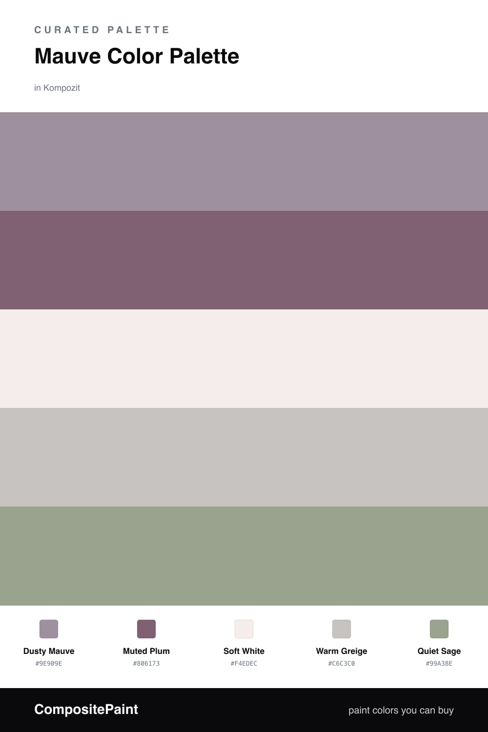
Mauve is having a real moment in 2026, and this palette shows why it earns the lead. Dusty Mauve carries the whole scheme — it is a grayed purple that feels warm and modern rather than girly. A deeper Muted Plum backs it up for contrast on cabinets, a feature wall, or upholstery.

The neutrals do the quiet work. Soft White keeps everything light and airy, and Warm Greige bridges the gap so the mauve never floats on its own. These two are the calm middle that lets the color breathe.

The one move I would not skip is Quiet Sage. It is the single accent here, and it is what keeps the palette from going too soft and sleepy. Used in small amounts, that gentle green reads fresh against all the dusty tones and pulls the whole room together.

Buy These Colors

Each color matched to the closest real paint in every brand, by ΔE2000. Kompozit first; take any SKU to the store — these mix on demand.

Dusty Mauve
#A88B95 · LRV 29 · Dominant
Kompozit Cut Heather · 1303 ΔE 5.59
Backdrop Anita · BD-AN ΔE 16.02
Behr Warm Comfort · 190F-4 ΔE 4.21
Benjamin Moore Mulberry Wine · 1251 ΔE 3.91
Clare Shade · PNT100-MD-14 ΔE 17.13
Dunn-Edwards Ash Hollow · DE6046 ΔE 5.95
Farrow & Ball Charleston Gray · No. 243 ΔE 12.98
Magnolia Home Homebody · JG-136 ΔE 10.8
PPG / Glidden Gothic Amethyst · 1046-5 ΔE 1.91
Sherwin-Williams Thistle · SW 6283 ΔE 1.29
Valspar Mellow Mauve · 1004-7C ΔE 2.28
Muted Plum
#7E6373 · LRV 15 · Secondary
Kompozit Majestic Plum · 1214 ΔE 1.46
Backdrop Mom Jeans · BD-MJ ΔE 22.15
Behr Smoked Mulberry · MQ1-38 ΔE 3.72
Benjamin Moore Bonne Nuit · AF-635 ΔE 4.65
Clare Prince · PNT100-DP-33 ΔE 5.64
Dunn-Edwards Amazing Amethyst · DE6013 ΔE 5.56
Farrow & Ball London Clay · No. 244 ΔE 11.85
Magnolia Home Salvaged · JG-147 ΔE 12.33
PPG / Glidden Grape Jelly · 1177-6 ΔE 3.76
Sherwin-Williams Grape Harvest · SW 6285 ΔE 3.8
Valspar Purple Sunset · 8003-2F ΔE 0.87
Soft White
#F2ECE9 · LRV 85 · Base
Kompozit Little Pinky · 1174 ΔE 1.3
Backdrop Jane · BD-JA ΔE 4.52
Behr Tailors Chalk · N170-1 ΔE 0.94
Benjamin Moore Pink Essence · 881 ΔE 0.21
Clare Classic · PNT100-LT-12 ΔE 2.96
Dunn-Edwards Baby's Breath · DEW342 ΔE 1.05
Farrow & Ball Wevet · No. 273 ΔE 0.89
Magnolia Home Silos White · JG-107 ΔE 3.3
PPG / Glidden Summer Lily · 1191-1 ΔE 0.99
Sherwin-Williams Ibis White · SW 7000 ΔE 1.55
Valspar Bistro White · 7006-4 ΔE 2.47
Warm Greige
#CDC1B8 · LRV 55 · Support
Kompozit Place of Dust · 0539 ΔE 4.38
Backdrop Boy Meets Girl · BD-BG ΔE 9.52
Behr Windrift Beige · N190-3 ΔE 0.55
Benjamin Moore Alphano Beige · 989 ΔE 2.27
Clare Motor City · PNT100-LT-09 ΔE 6.78
Dunn-Edwards Wafting Gray · DE6031 ΔE 4.11
Farrow & Ball Elephant's Breath · No. 229 ΔE 1.44
Magnolia Home Anatolian · JG-127 ΔE 3.21
PPG / Glidden Whippet · 1020-3 ΔE 1.34
Sherwin-Williams Twilight Gray · SW 54 ΔE 1.85
Valspar Windmill · 8005-10C ΔE 0.58
Quiet Sage
#9AA68C · LRV 36 · Accent
Kompozit Big Fish · 0435 ΔE 2.02
Backdrop Le Freak · BD-LF ΔE 3.08
Behr Clary Sage · PPU11-07 ΔE 2.32
Benjamin Moore Greenwich Village · 445 ΔE 2.24
Clare OMGreen · PNT100-MD-58 ΔE 5.04
Dunn-Edwards Meadowood · DEC777 ΔE 3.61
Farrow & Ball Breakfast Room Green · No. 81 ΔE 2.2
Magnolia Home Clean Slate · JG-75 ΔE 6.16
PPG / Glidden Edamame · 1030-4 ΔE 2.01
Sherwin-Williams Coastal Plain · SW 6192 ΔE 3.58
Valspar Bushel · T617 ΔE 1.89

Questions

Why does mauve work as the lead color?

Mauve is a grayed-down purple, so it reads soft and grown-up instead of sweet. That muted quality lets it carry a whole room without feeling like too much, while the neutrals around it keep things calm.

How do I keep this palette from feeling flat?

Add the sage accent in small doses — a chair, a stem of greenery, a piece of art. The green is the one cool, fresh note that stops all the warm dusty tones from blending into one soft blur.

Similar Palettes

Closest schemes by color — not by label.