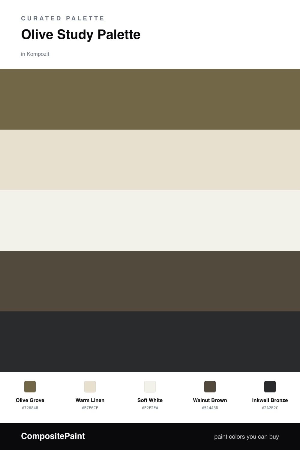
Olive Study Palette — Olive Grove & Inkwell Bronze
A grounded five-color study scheme led by soft olive, layered with warm linen, crisp white, walnut wood, and a deep bronze accent — every color matched to real paint you can buy.
By Jessica Williams · Color Stylist & Interior Editor
A study should feel like a slow exhale, and Olive Grove does exactly that on the walls. It is olive softened with grey, so it holds its color in lamplight without ever shouting. Against it, Warm Linen on the trim and ceiling keeps the room from closing in, while Soft White on built-in cabinets or a vanity adds a clean, contemporary edge.
The warmth comes from wood. Walnut Brown is the tone I reach for on floors, a desk, or open shelving, and it makes the olive feel rooted rather than decorative. It is the bridge that ties the green to the rest of the room.
For the spark, I keep Inkwell Bronze small — a lamp base, a frame, a strip of leather, or the inside of a bookshelf. That deep, almost-black brown gives the eye somewhere to land and makes everything else look more considered. Lead with olive, lighten with the neutrals, and let the bronze do its quiet work.
Buy These Colors
Each color matched to the closest real paint in every brand, by ΔE2000. Kompozit first; take any SKU to the store — these mix on demand.
Questions
Olive is a quiet, grounded color that sits between green and brown, so it calms the eye without going flat. In a room built for reading and focus it reads as steady and warm rather than cold or busy.
Let olive lead on the walls and keep it roughly two-thirds of what you see. Use the linen and white to lighten the trim and shelving, the walnut for furniture and floors, and just a touch of bronze for the spark.
Similar Palettes
Closest schemes by color — not by label.