CP

Mustard Color Palette — Mustard Dusk

A warm five-color scheme led by golden mustard, softened with greige and cream and grounded by a deep ink accent — every color matched to real paint you can buy.

By David Chen · Formulation Lead & Resident Chemist

Golden Mustard
Dominant
Kompozit Yellow Shout · 0935
#D19932
LRV 37
Dusty Ochre
Secondary
Kompozit Unforgettably Gold · 0900
#AE8245
LRV 25
Soft Greige
Base
Kompozit Pebblebrook · 0224
#D8D0BC
LRV 63
Warm Cream
Support
Kompozit Twill · 0014
#F0E8D3
LRV 81
Deep Ink
Accent
Kompozit Silent Sea · 0515
#2A2B2C
LRV 2
View palette in

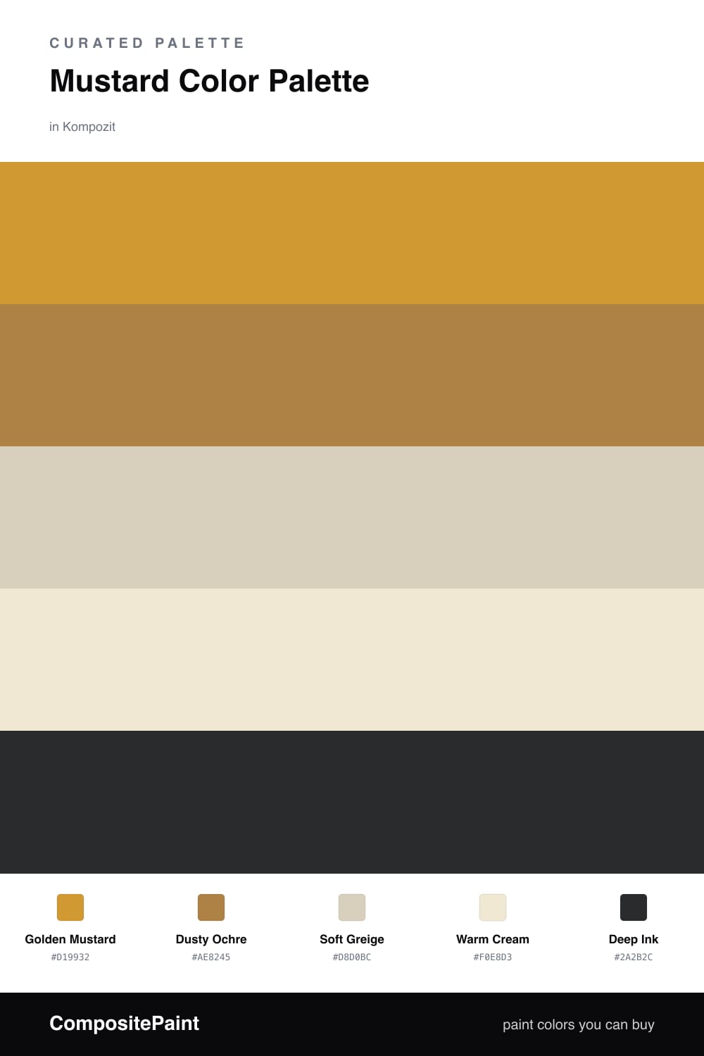
Think of mustard as yellow that has spent time in the sun and picked up a little brown along the way. That bit of earth is what makes Golden Mustard so easy to live with, and it is the clear lead here. A close cousin, Dusty Ochre, sits just beside it and adds depth, the way a second coat deepens the first.

To keep all that warmth from feeling heavy, I lean on two quiet neutrals. Soft Greige and Warm Cream act like a slow exhale between the golds, giving your eye somewhere calm to land. They share the same warm undertone as the mustards, so nothing fights.

Then comes the small, sharp note — Deep Ink, almost black but soft enough to feel current for 2026. Use it sparingly, on a frame or a fixture, and it pulls the whole scheme into focus the way a single dark line finishes a sketch.

Buy These Colors

Each color matched to the closest real paint in every brand, by ΔE2000. Kompozit first; take any SKU to the store — these mix on demand.

Golden Mustard
#C89A3C · LRV 36 · Dominant
Kompozit Yellow Shout · 0935 ΔE 2.65
Backdrop Carry the Two · BD-CT ΔE 17.35
Behr Solid Gold · M280-6 ΔE 2.55
Benjamin Moore Fields of Gold · 203 ΔE 0.8
Clare Good as Gold · PNT100-DP-59 ΔE 6.98
Dunn-Edwards Roman Gold · DE5356 ΔE 2.43
Farrow & Ball India Yellow · No. 66 ΔE 4.41
Magnolia Home Bright Days · JG-45 ΔE 8.96
PPG / Glidden Golden Field · 1107-7 ΔE 2.66
Sherwin-Williams Crispy Gold · SW 6699 ΔE 1.54
Valspar Ripe Banana · 8001-22G ΔE 1.54
Dusty Ochre
#B07D3A · LRV 24 · Secondary
Kompozit Unforgettably Gold · 0900 ΔE 2.33
Backdrop Old Soul · BD-OS ΔE 17.49
Behr Golden Rice · S290-6 ΔE 1.96
Benjamin Moore Caramel Corn · 2160-10 ΔE 1.02
Clare Fire Sign · PNT100-DP-74 ΔE 15.86
Dunn-Edwards Walnut Shell · DE5363 ΔE 3.66
Farrow & Ball Red Earth · No. 64 ΔE 16.85
Magnolia Home Vintage Crown · JG-152 ΔE 7.2
PPG / Glidden Brown Basket · 16-15 ΔE 2.61
Sherwin-Williams Butterscotch · SW 6377 ΔE 2.01
Valspar Lion's Slumber · V091-4 ΔE 2.13
Soft Greige
#D9D0C1 · LRV 64 · Base
Kompozit Pebblebrook · 0224 ΔE 2.29
Backdrop Real Real · BD-RR ΔE 1.57
Behr Aged Beige · PPU7-09 ΔE 0.58
Benjamin Moore Cedar Key · 982 ΔE 0.48
Clare Turbinado · PNT100-LT-21 ΔE 1.45
Dunn-Edwards Fine Grain · DE6213 ΔE 0.49
Farrow & Ball Shaded White · No. 201 ΔE 1.56
Magnolia Home Stoneware Pieces · JG-55 ΔE 4.29
PPG / Glidden Cool Concrete · 1023-2 ΔE 0
Sherwin-Williams Grecian Ivory · SW 7541 ΔE 0.9
Valspar Perfect Crust · T555 ΔE 0.5
Warm Cream
#EFE7D6 · LRV 80 · Support
Kompozit Twill · 0014 ΔE 1.57
Backdrop Don't Eat the Yellow Snow · BD-DS ΔE 2.7
Behr Rye Flour · HDC-FL13-5 ΔE 1.35
Benjamin Moore Navajo White · 947 ΔE 0.73
Clare Like Buttah · PNT100-LT-62 ΔE 1.35
Dunn-Edwards Rice Bowl · DE6170 ΔE 0.9
Farrow & Ball James White · No. 2010 ΔE 1.96
Magnolia Home Carter Crème · JG-16 ΔE 0.73
PPG / Glidden Elegant Ivory · 1081-1 ΔE 1.67
Sherwin-Williams Restful White · SW 7563 ΔE 0.98
Valspar Double Scoop · V176 ΔE 0.76
Deep Ink
#2B2A28 · LRV 2 · Accent
Kompozit Silent Sea · 0515 ΔE 2.25
Backdrop Hocus Pocus · BD-HP ΔE 5.8
Behr Beluga · 770F-7 ΔE 5.86
Benjamin Moore Black · PM-9 ΔE 2.31
Clare Blackish · PNT100-DP-54 ΔE 9.42
Dunn-Edwards Black · DEA187 ΔE 5.38
Farrow & Ball Pitch Black · No. 256 ΔE 5.02
Magnolia Home Blackboard · JG-05 ΔE 6.16
PPG / Glidden Black Magic · 1001-7 ΔE 7.29
Sherwin-Williams Tricorn Black · SW 6258 ΔE 2.63
Valspar Dark Kettle Black · 4011-2 ΔE 3.48

Questions

Why does mustard work as a lead color?

Mustard is a low-key yellow with brown in it, so it reads warm and grounded instead of loud. That muted quality lets it carry a whole room without tiring the eye, which is why it leads here.

How much mustard is too much?

Aim for roughly two-thirds mustard tones and one-third neutrals, then add the deep ink in small doses only. The cream and greige give your eye a place to rest so the gold never feels heavy.

Similar Palettes

Closest schemes by color — not by label.