Japandi Living Room Palette — Warm Greige & Soft Black
A calm, balanced 4-color scheme for Japandi living rooms: warm greige walls, a creamy relief, a soft black accent, and natural wood tan throughout. Every color matched to real paint you can buy.
By Jessica Williams · Color Stylist & Interior Editor
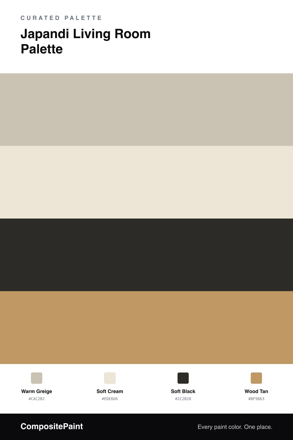
Japandi blends Japanese restraint with Scandinavian warmth, and this palette lives right in that calm middle ground. Warm greige wraps the walls in a soft, earthy neutral — quiet enough to feel minimal, warm enough to feel welcoming. It sets the serene tone the whole style depends on.
A soft cream on the trim and ceiling keeps everything light and airy without the hard edge of a bright white. The real character comes from wood tan, shown off in low furniture, a simple bench, or wide flooring, bringing the natural, handmade feel that defines Japandi.
A soft black adds quiet contrast through thin frames, a table base, or a single ceramic piece. Used sparingly, it gives the eye a place to rest. Let greige lead, wood warm, and black draw the quiet lines that hold it all together.
Buy These Colors
Each color matched to the closest real paint in every brand, by ΔE2000. Tap a swatch for its full guide or + to save it — take any SKU to the store, they mix on demand.
Questions
The warmth and the natural materials. Japandi keeps the calm, pared-back feel of minimalism but adds soft, organic tones like this warm greige and honest wood, so the room feels grounded and human rather than stark.
Keep it to slim, intentional lines — a low table base, frames, or a single ceramic piece. In Japandi the black is quiet contrast, not a statement, so a thin edge here and there is all the room needs.
Similar Palettes
Closest schemes by color — not by label.