CP

Mauve Color Palette — Mauve Canyon

A soft five-color scheme led by warm mauve, layered with greige, oat, and a slate accent — every color matched to real paint you can buy.

By David Chen · Formulation Lead & Resident Chemist

Canyon Mauve
Dominant
Kompozit Punch of Pink · 0113
#B68692
LRV 29
Dusty Rosewood
Secondary
Kompozit Charming Violet · 1221
#8C7281
LRV 19
Warm Oat
Base
Kompozit Clover Honey · 0271
#EBE0D1
LRV 76
Soft Greige
Support
Kompozit Hearthstone · 0567
#C7BEB2
LRV 52
Slate Plum
Accent
Kompozit Eleanor Ann · 1229
#40373E
LRV 4
View palette in

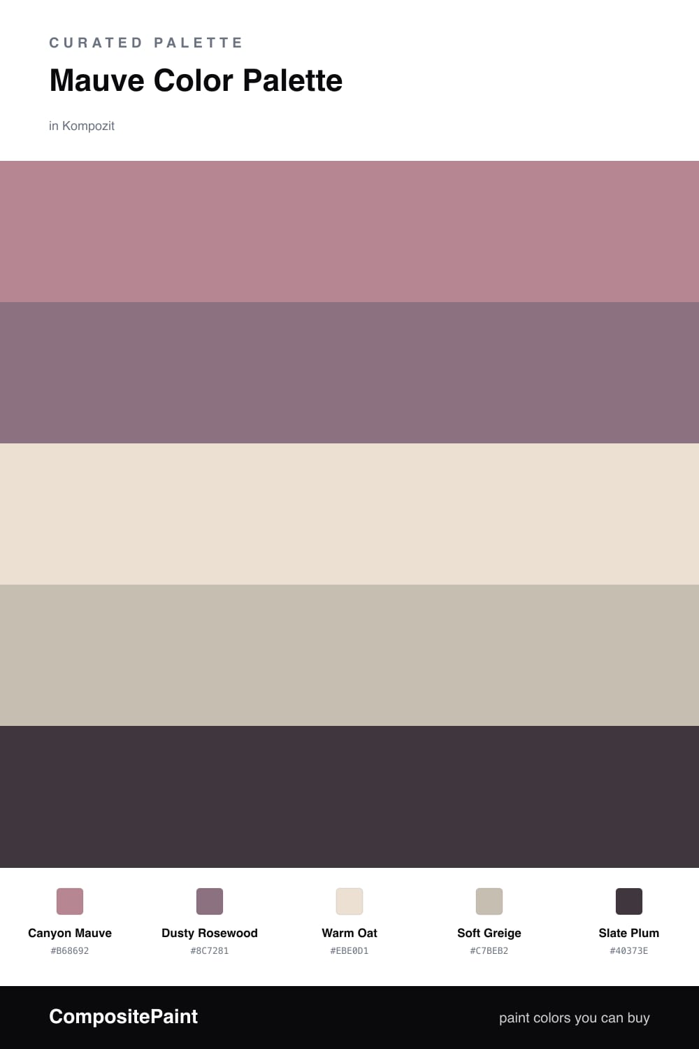
Mauve is one of those colors that behaves like a chameleon. It is a purple that has been quieted down with gray, so it shifts warm or cool depending on what sits next to it. In this scheme I let Canyon Mauve lead, with Dusty Rosewood as a deeper version of the same family for contrast that never clashes.

The neutrals do the patient work here. Warm Oat keeps the walls light and airy, while Soft Greige bridges the gap between the mauve tones and the oat so nothing feels like an abrupt jump. Think of it as a slow gradient rather than five separate blocks of color.

For 2026 the move is restraint, so use Slate Plum sparingly. A single dark moment — cabinet hardware, a window frame, a leggy side table — gives the eye somewhere to land and makes the soft mauves feel intentional instead of washed out.

Buy These Colors

Each color matched to the closest real paint in every brand, by ΔE2000. Kompozit first; take any SKU to the store — these mix on demand.

Canyon Mauve
#A98A93 · LRV 29 · Dominant
Kompozit Punch of Pink · 0113 ΔE 4.79
Backdrop Anita · BD-AN ΔE 15.98
Behr Warm Comfort · 190F-4 ΔE 3.64
Benjamin Moore Mulberry Wine · 1251 ΔE 3.79
Clare Shade · PNT100-MD-14 ΔE 17.46
Dunn-Edwards Ash Hollow · DE6046 ΔE 5.74
Farrow & Ball Sulking Room Pink · No. 295 ΔE 6.51
Magnolia Home Homebody · JG-136 ΔE 10.93
PPG / Glidden Coffee Rose · 1048-5 ΔE 2.14
Sherwin-Williams Thistle · SW 6283 ΔE 1.95
Valspar Mellow Mauve · 1004-7C ΔE 2.33
Dusty Rosewood
#8F6E76 · LRV 18 · Secondary
Kompozit Charming Violet · 1221 ΔE 3.92
Backdrop Hartford · BD-HF ΔE 25.17
Behr Hickory Stick · 120F-5 ΔE 2.03
Benjamin Moore Aplomb · AF-625 ΔE 2.23
Clare Big Apple · PNT100-DP-30 ΔE 9.74
Dunn-Edwards Eclectic Plum · DE6047 ΔE 7.07
Farrow & Ball Brassica · No. 271 ΔE 8.94
Magnolia Home Elemental · JG-129 ΔE 12.26
PPG / Glidden Chocolate Sparkle · 1048-6 ΔE 2.4
Sherwin-Williams Rose Brocade · SW 4 ΔE 4.46
Valspar Tragic Juliet · T512 ΔE 2.83
Warm Oat
#EAE0D4 · LRV 76 · Base
Kompozit Clover Honey · 0271 ΔE 1.23
Backdrop Cookies & Cream · BD-CC ΔE 5.25
Behr Creme Fraiche · S240-1 ΔE 0.87
Benjamin Moore French Macaroon · CSP-335 ΔE 2.42
Clare On Point · PNT100-LT-11 ΔE 3.33
Dunn-Edwards Crisp Muslin · DE6212 ΔE 1.39
Farrow & Ball Slipper Satin · No. 2004 ΔE 1.95
Magnolia Home Soft Linen · JG-108 ΔE 1.58
PPG / Glidden Moroccan Moonlight · 1074-2 ΔE 0
Sherwin-Williams Porcelain · SW 53 ΔE 0.52
Valspar Riviera Dune · 2008-10C ΔE 0.48
Soft Greige
#C9BDB1 · LRV 52 · Support
Kompozit Hearthstone · 0567 ΔE 1.49
Backdrop Boy Meets Girl · BD-BG ΔE 10.2
Behr Creamy Mushroom · PPU5-13 ΔE 0.85
Benjamin Moore Hampshire Taupe · 990 ΔE 0.85
Clare Greige · PNT100-LT-13 ΔE 3.06
Dunn-Edwards Birchwood · DEC752 ΔE 2.46
Farrow & Ball Elephant's Breath · No. 229 ΔE 0.74
Magnolia Home Cinnamon Sugar · JG-133 ΔE 1.44
PPG / Glidden Ashen · 1023-3 ΔE 1.32
Sherwin-Williams Skyline Steel · SW 1015 ΔE 2.52
Valspar Dust Bunny · 2005-10B ΔE 3.11
Slate Plum
#41383F · LRV 4 · Accent
Kompozit Eleanor Ann · 1229 ΔE 0.33
Backdrop After Hours · BD-AH ΔE 12.68
Behr Bear Rug · S-G-790 ΔE 3.78
Benjamin Moore Dark Basalt · 2072-10 ΔE 0.93
Clare Blackish · PNT100-DP-54 ΔE 9
Dunn-Edwards Black · DEA187 ΔE 6.72
Farrow & Ball Pitch Black · No. 256 ΔE 6.84
Magnolia Home Moments · JG-150 ΔE 6.75
PPG / Glidden Black Magic · 1001-7 ΔE 6.98
Sherwin-Williams Bohemian Black · SW 6988 ΔE 3.1
Valspar Black Currant · 8004-1G ΔE 2.64

Questions

Why does mauve work with these neutrals?

Mauve is a gray-softened purple, so it already carries a neutral undertone. Pairing it with warm oat and greige lets the mauve read as the color story while the neutrals keep it grounded and calm.

How much mauve should I actually use?

Let mauve lead at roughly two-thirds of the space, with the neutrals filling the rest and the slate plum used only in small doses — a door, a frame, or one piece of furniture.

Similar Palettes

Closest schemes by color — not by label.