CP

Rose Color Palette — Quiet Rose Stone

A soft five-color scheme led by dusty rose and grounded in warm stone neutrals with a deep plum accent — every color matched to real paint you can buy.

By Jessica Williams · Color Stylist & Interior Editor

Dusty Rose
Dominant
Kompozit Calliope · 0044
#C89A8D
LRV 37
Muted Mauve
Secondary
Kompozit Notice Me · 0072
#BA8686
LRV 29
Warm Stone
Base
Kompozit Venetian Wall · 0544
#E3DCD6
LRV 72
Soft Greige
Support
Kompozit Hearthstone · 0567
#C7BEB2
LRV 52
Deep Plum
Accent
Kompozit Purple Shadow · 1215
#493843
LRV 5
View palette in

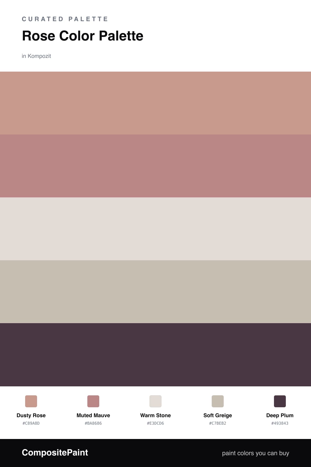
Rose is having a quiet moment in 2026, and this is the grown-up version of it. Dusty Rose leads the whole scheme — soft, a little dusky, the kind of pink that feels warm rather than sweet. Muted Mauve sits just beside it, a half-shade deeper, so the rose has somewhere to go without ever turning bold.

Underneath it all, Warm Stone and Soft Greige are the steadying neutrals. They keep the rose feeling calm and lived-in, like worn linen and plaster, and they let you use the color generously without it taking over the room.

The spark here is Deep Plum — a near-aubergine that grounds everything and makes the rose look richer by contrast. Use it sparingly, on a single piece or a small detail, and let the soft palette around it breathe.

Buy These Colors

Each color matched to the closest real paint in every brand, by ΔE2000. Kompozit first; take any SKU to the store — these mix on demand.

Dusty Rose
#C99A92 · LRV 38 · Dominant
Kompozit Calliope · 0044 ΔE 2.21
Backdrop Rosita · BD-RO ΔE 2.4
Behr Artifact · 210F-5 ΔE 2.52
Benjamin Moore Palmetto Pink · 1188 ΔE 2.65
Clare Subrosa · PNT100-MD-76 ΔE 2.19
Dunn-Edwards Musk · DE6088 ΔE 2.8
Farrow & Ball Cinder Rose · No. 246 ΔE 5.64
Magnolia Home Rustic Oak · JG-110 ΔE 13.68
PPG / Glidden Pepperberry · 1055-4 ΔE 2.81
Sherwin-Williams Cabbage Rose · SW 3 ΔE 4.19
Valspar Naked Clay · 1008-10A ΔE 4.8
Muted Mauve
#B98A82 · LRV 30 · Secondary
Kompozit Notice Me · 0072 ΔE 3.7
Backdrop Anita · BD-AN ΔE 13.77
Behr Ginger Rose · PPU2-09 ΔE 4.26
Benjamin Moore Foxy Brown · 1181 ΔE 3.77
Clare Pink Sky · PNT100-MD-28 ΔE 4.26
Dunn-Edwards Revival Rose · DEC701 ΔE 2.52
Farrow & Ball Charleston Gray · No. 243 ΔE 12.96
Magnolia Home Homebody · JG-136 ΔE 12
PPG / Glidden Cappucino Bombe · 1061-5 ΔE 2.36
Sherwin-Williams Roycroft Rose · SW 34 ΔE 3.3
Valspar Cherry Taupe · 1005-10A ΔE 3.58
Warm Stone
#E4DAD0 · LRV 71 · Base
Kompozit Venetian Wall · 0544 ΔE 1.99
Backdrop Cookies & Cream · BD-CC ΔE 6.07
Behr Vintage Linen · PPU7-16 ΔE 2.82
Benjamin Moore Cocoa Butter · 1023 ΔE 1.41
Clare No Filter · PNT100-LT-19 ΔE 4.04
Dunn-Edwards Gallery Gray · DE6072 ΔE 2.1
Farrow & Ball Ammonite · No. 274 ΔE 2.43
Magnolia Home Locally Sown · JG-112 ΔE 3.46
PPG / Glidden Malted Milk · 1073-2 ΔE 2.15
Sherwin-Williams Gauzy White · SW 6035 ΔE 1.42
Valspar March Breeze · 1001-10C ΔE 0.23
Soft Greige
#C9BEB0 · LRV 52 · Support
Kompozit Hearthstone · 0567 ΔE 1.04
Backdrop Boy Meets Girl · BD-BG ΔE 11.16
Behr Creamy Mushroom · PPU5-13 ΔE 0.99
Benjamin Moore Ashen Tan · 996 ΔE 0.45
Clare Greige · PNT100-LT-13 ΔE 4.05
Dunn-Edwards Birchwood · DEC752 ΔE 1.73
Farrow & Ball Elephant's Breath · No. 229 ΔE 1.67
Magnolia Home Cinnamon Sugar · JG-133 ΔE 2.5
PPG / Glidden Ashen · 1023-3 ΔE 0.56
Sherwin-Williams Skyline Steel · SW 1015 ΔE 1.86
Valspar Feathers of a Dove · M111 ΔE 3.13
Deep Plum
#4A3640 · LRV 4 · Accent
Kompozit Purple Shadow · 1215 ΔE 1.44
Backdrop After Hours · BD-AH ΔE 18.03
Behr Mahogany Spice · BNC-31 ΔE 1.93
Benjamin Moore Dark Purple · 2073-10 ΔE 0.92
Clare Blackish · PNT100-DP-54 ΔE 13.2
Dunn-Edwards Preserve · DEA193 ΔE 5.42
Farrow & Ball Pitch Black · No. 256 ΔE 11.43
Magnolia Home Plum Suede · JG-102 ΔE 3.07
PPG / Glidden Black Magic · 1001-7 ΔE 11.55
Sherwin-Williams Merlot · SW 2704 ΔE 4.28
Valspar Virtuoso · M215 ΔE 3.8

Questions

Why do these colors work together?

They all share a soft, slightly grey undertone, so the rose, the stone neutrals, and the plum read as one warm family instead of competing. The deep plum gives your eye a place to rest.

How do I balance them in a room?

Let the dusty rose lead on the biggest surfaces and keep the plum to small doses — think a roughly 70/30 split, with the stone and greige neutrals doing the calm work in between.

Similar Palettes

Closest schemes by color — not by label.