CP

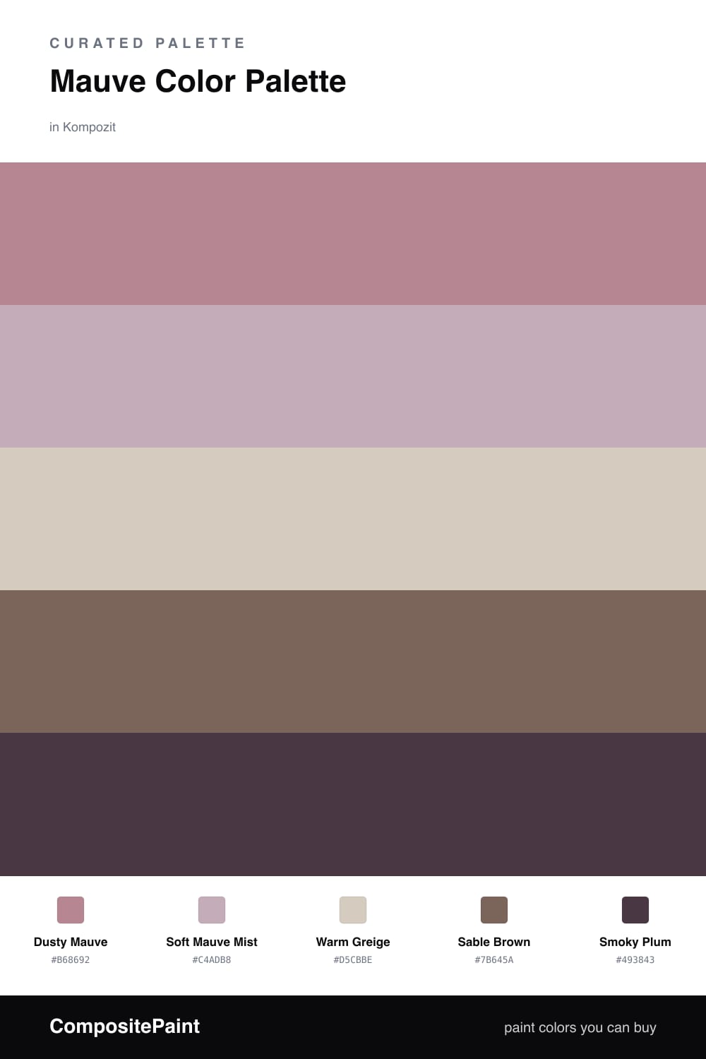
Mauve Color Palette — Sable Dusk

A soft five-color scheme led by dusty mauve and grounded by warm sable and greige, with a smoky plum accent — every color matched to real paint you can buy.

By David Chen · Formulation Lead & Resident Chemist

Dusty Mauve
Dominant
Kompozit Punch of Pink · 0113
#B68692
LRV 29
Soft Mauve Mist
Secondary
Kompozit Desireé · 1219
#C4ADB8
LRV 45
Warm Greige
Base
Kompozit Awakening · 0560
#D5CBBE
LRV 61
Sable Brown
Support
Kompozit Ranch House · 0142
#7B645A
LRV 14
Smoky Plum
Accent
Kompozit Purple Shadow · 1215
#493843
LRV 5
View palette in

Mauve is one of those colors that feels both vintage and very current at once, and in 2026 it reads as quiet and grown-up rather than sweet. This scheme keeps it firmly in charge. Dusty Mauve leads, with Soft Mauve Mist as a lighter echo so the color has room to breathe across a wall and a ceiling.

Think of mauve as a purple that has been walked through a dusty room. That bit of gray and brown in it is exactly why Warm Greige and Sable Brown slide in so naturally as the base and support. They share the same warm undertone, so nothing clashes.

For the spark, Smoky Plum deepens the whole story without shouting. Use it in small doses on a door, a frame, or trim, and let the two mauves and the warm neutrals carry the room.

Buy These Colors

Each color matched to the closest real paint in every brand, by ΔE2000. Kompozit first; take any SKU to the store — these mix on demand.

Dusty Mauve
#A98A95 · LRV 29 · Dominant
Kompozit Punch of Pink · 0113 ΔE 4.73
Backdrop Anita · BD-AN ΔE 16.7
Behr Warm Comfort · 190F-4 ΔE 3.53
Benjamin Moore Mulberry Wine · 1251 ΔE 4.46
Clare Shade · PNT100-MD-14 ΔE 17.89
Dunn-Edwards Ash Hollow · DE6046 ΔE 6.48
Farrow & Ball Sulking Room Pink · No. 295 ΔE 7.24
Magnolia Home Homebody · JG-136 ΔE 11.49
PPG / Glidden Gothic Amethyst · 1046-5 ΔE 2.62
Sherwin-Williams Thistle · SW 6283 ΔE 1.54
Valspar Mellow Mauve · 1004-7C ΔE 2.73
Soft Mauve Mist
#C7B0B6 · LRV 47 · Secondary
Kompozit Desireé · 1219 ΔE 2.2
Backdrop Rosita · BD-RO ΔE 9.66
Behr Vintage Charm · N160-3 ΔE 2.33
Benjamin Moore Victorian Mauve · 2114-50 ΔE 4.45
Clare Greige · PNT100-LT-13 ΔE 8.76
Dunn-Edwards Young Fawn · DE6038 ΔE 4.75
Farrow & Ball Dove Tale · No. 267 ΔE 8.72
Magnolia Home Sunday Stroll · JG-19 ΔE 12.86
PPG / Glidden Jack Rabbit · 1014-4 ΔE 5.04
Sherwin-Williams Chaise Mauve · SW 6016 ΔE 3.97
Valspar Mediterranean Sunset · V078-3 ΔE 2.01
Warm Greige
#D8CCBF · LRV 62 · Base
Kompozit Awakening · 0560 ΔE 1.03
Backdrop Real Real · BD-RR ΔE 3.59
Behr Granite Dust · MQ3-6 ΔE 1.32
Benjamin Moore Rocking Chair · CSP-400 ΔE 1.03
Clare Flatiron · PNT100-LT-17 ΔE 1.41
Dunn-Edwards Porous Stone · DE6220 ΔE 3.44
Farrow & Ball Cornforth White · No. 228 ΔE 2.99
Magnolia Home Plaster · JG-156 ΔE 2.91
PPG / Glidden Bermuda Sand · 1074-3 ΔE 1.67
Sherwin-Williams Reticence · SW 6064 ΔE 1.47
Valspar Rabbit's Foot · 8004-9B ΔE 1.27
Sable Brown
#7E6A5C · LRV 16 · Support
Kompozit Ranch House · 0142 ΔE 3.46
Backdrop Buenos Aires · BD-BA ΔE 5.86
Behr Chalet · QE-23 ΔE 1.17
Benjamin Moore Fallen Timber · 994 ΔE 2.75
Clare Coffee Date · PNT100-DP-53 ΔE 5.66
Dunn-Edwards Bannister Brown · DE6069 ΔE 0.66
Farrow & Ball London Clay · No. 244 ΔE 4.02
Magnolia Home Elemental · JG-129 ΔE 2.84
PPG / Glidden Warrior · 1076-6 ΔE 1.05
Sherwin-Williams Quartersawn Oak · SW 2836 ΔE 3.47
Valspar Gateway Arch · 8005-10F ΔE 2.44
Smoky Plum
#4A3640 · LRV 4 · Accent
Kompozit Purple Shadow · 1215 ΔE 1.44
Backdrop After Hours · BD-AH ΔE 18.03
Behr Mahogany Spice · BNC-31 ΔE 1.93
Benjamin Moore Dark Purple · 2073-10 ΔE 0.92
Clare Blackish · PNT100-DP-54 ΔE 13.2
Dunn-Edwards Preserve · DEA193 ΔE 5.42
Farrow & Ball Pitch Black · No. 256 ΔE 11.43
Magnolia Home Plum Suede · JG-102 ΔE 3.07
PPG / Glidden Black Magic · 1001-7 ΔE 11.55
Sherwin-Williams Merlot · SW 2704 ΔE 4.28
Valspar Virtuoso · M215 ΔE 3.8

Questions

Why does mauve work with brown neutrals?

Mauve is really a grayed-down purple with a touch of brown already mixed in, so it shares a warm base with sable and greige. That shared warmth is why they sit together so easily instead of fighting.

How much mauve should I actually use?

Let it lead at roughly two-thirds of the space, with the neutrals filling most of the rest and the smoky plum saved for small details. That keeps the mauve clearly in charge without going flat.

Similar Palettes

Closest schemes by color — not by label.