CP

Fall Color Palette — Fall Haze

A warm five-color autumn scheme of burnt orange, maple red, ochre, olive, and deep brown that feels like late-October light, every color matched to real paint you can buy.

By Jessica Williams · Color Stylist & Interior Editor

Burnt Orange
Dominant
Kompozit Orange Ballad · 1019
#B56D41
LRV 21
Maple Red
Secondary
Kompozit April Love · 1061
#8B3D2F
LRV 9
Warm Ochre
Base
Kompozit Cat's Eye Marble · 0906
#D6A75D
LRV 43
Olive Grove
Support
Kompozit Old School · 0410
#686945
LRV 13
Deep Brown
Accent
Kompozit Silent Sea · 0515
#2A2B2C
LRV 2
View palette in

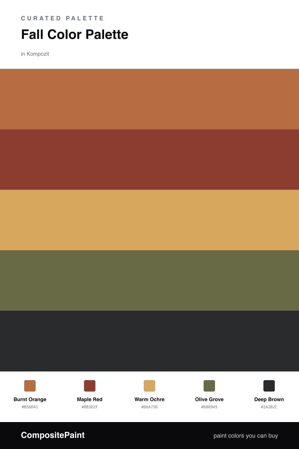
This is the palette I reach for when the light goes low and gold in late afternoon. Burnt Orange leads the way, that hazy, dusty kind of orange you see on a maple at the edge of dropping its leaves, and Maple Red deepens it with a little more weight and shadow.

Underneath them, Warm Ochre acts as the quiet base, the color of dry grass and afternoon sun. It lets the bolder shades breathe instead of competing. A muted Olive Grove brings in the woodsy, slightly faded green that keeps the whole thing from tipping too sweet.

For 2026 I like grounding all that warmth with Deep Brown used sparingly — a doorframe, a shelf, a single chair. It reads softer and more lived-in than black, and it makes every warm tone above it glow a shade richer.

Buy These Colors

Each color matched to the closest real paint in every brand, by ΔE2000. Kompozit first; take any SKU to the store — these mix on demand.

Burnt Orange
#C16A36 · LRV 22 · Dominant
Kompozit Orange Ballad · 1019 ΔE 3.08
Backdrop Old Soul · BD-OS ΔE 24.66
Behr Chai Spice · 260D-6 ΔE 0.89
Benjamin Moore Caramel Latte · 2166-20 ΔE 2.09
Clare Fire Sign · PNT100-DP-74 ΔE 6.29
Dunn-Edwards Desert Spice · DE5202 ΔE 1.65
Farrow & Ball Charlotte's Locks · No. 268 ΔE 7.92
Magnolia Home Work Worn Wood · JG-35 ΔE 5.67
PPG / Glidden Sesame Crunch · 1198-7 ΔE 0.26
Sherwin-Williams Determined Orange · SW 6635 ΔE 2.74
Valspar Adobe Dusk · M145 ΔE 1.86
Maple Red
#8E3B2E · LRV 9 · Secondary
Kompozit April Love · 1061 ΔE 0.9
Backdrop Punk Rock · BD-PR ΔE 5.81
Behr Firebrick · 210D-7 ΔE 2.64
Benjamin Moore Copper Clay · 2172-10 ΔE 2.39
Clare Vintage · PNT100-DP-67 ΔE 9.93
Dunn-Edwards Deep Crimson · DEA152 ΔE 3.99
Farrow & Ball Incarnadine · No. 248 ΔE 6.75
Magnolia Home Create · JG-28 ΔE 8.23
PPG / Glidden Brick Dust · 1056-7 ΔE 5.04
Sherwin-Williams Bolero · SW 7600 ΔE 2.79
Valspar Decadent Red · 2002-5A ΔE 0.57
Warm Ochre
#D9A75A · LRV 43 · Base
Kompozit Cat's Eye Marble · 0906 ΔE 0.83
Backdrop Eames · BD-EA ΔE 8.63
Behr Cake Spice · M250-4 ΔE 3.35
Benjamin Moore Bryant Gold · HC-7 ΔE 1.2
Clare Good as Gold · PNT100-DP-59 ΔE 5.85
Dunn-Edwards Brown Wood · DE5368 ΔE 1.45
Farrow & Ball India Yellow · No. 66 ΔE 3.23
Magnolia Home Bright Days · JG-45 ΔE 6.46
PPG / Glidden Butterscotch Bliss · 1106-5 ΔE 2.54
Sherwin-Williams Anjou Pear · SW 6381 ΔE 3.16
Valspar Safari Sun · 3004-5B ΔE 3.24
Olive Grove
#6E6B3F · LRV 14 · Support
Kompozit Old School · 0410 ΔE 2.94
Backdrop Buenos Aires · BD-BA ΔE 15.02
Behr Portsmouth Olive · HDC-CL-20 ΔE 1.65
Benjamin Moore Guacamole · 2144-10 ΔE 3.65
Clare Daily Greens · PNT100-DP-61 ΔE 9.83
Dunn-Edwards Dill Pickle · DE5573 ΔE 6.4
Farrow & Ball Bancha · No. 298 ΔE 3.36
Magnolia Home Landscape · JG-49 ΔE 3.17
PPG / Glidden Sphagnum Moss · 1111-7 ΔE 3.7
Sherwin-Williams Relentless Olive · SW 6425 ΔE 2.76
Valspar Vineyard View · 8003-27F ΔE 2
Deep Brown
#3A2A20 · LRV 3 · Accent
Kompozit Silent Sea · 0515 ΔE 10.84
Backdrop Hocus Pocus · BD-HP ΔE 12.7
Behr Bitter Chocolate · 790B-7 ΔE 7.4
Benjamin Moore Wenge · AF-180 ΔE 4.86
Clare Blackish · PNT100-DP-54 ΔE 12.42
Dunn-Edwards Black · DEA187 ΔE 10.32
Farrow & Ball Pitch Black · No. 256 ΔE 9.52
Magnolia Home Moments · JG-150 ΔE 5.8
PPG / Glidden Black Magic · 1001-7 ΔE 11.26
Sherwin-Williams Polished Mahogany · SW 2838 ΔE 6.79
Valspar Noblesse Oblige · 8004-2G ΔE 6.77

Questions

Why do these warm autumn colors work together?

They all share the same earthy, sun-faded undertone, so they read as one mood rather than five separate shades. Burnt orange and maple red carry the warmth while olive and deep brown keep it grounded.

How do I keep a room this warm from feeling heavy?

Let the soft ochre do most of the work on the walls and save the maple red and deep brown for smaller moments — trim, a door, or a single piece of furniture.

Similar Palettes

Closest schemes by color — not by label.