CP

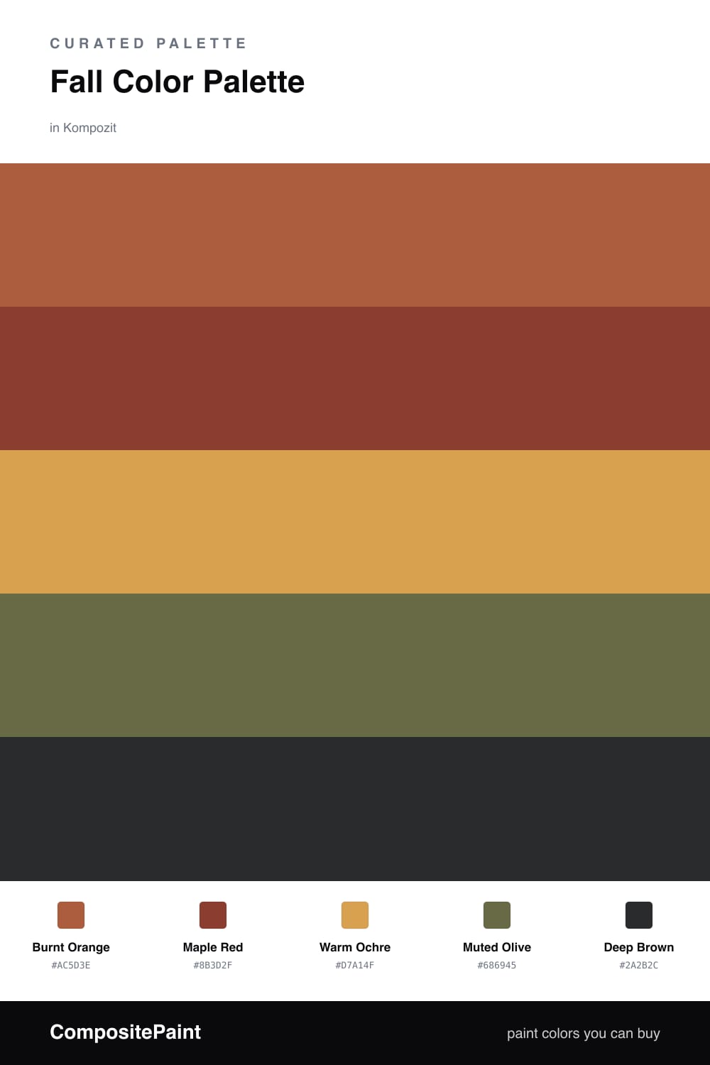
Fall Color Palette — Harbor at Harvest

A warm five-color autumn scheme built on burnt orange and maple red, softened with ochre and olive and grounded by deep brown — every color matched to real paint you can buy.

By Emily Roberts · DIY Editor & First-Timer's Guide

Burnt Orange
Dominant
Kompozit Pretty Parasol · 1039
#AC5D3E
LRV 17
Maple Red
Secondary
Kompozit April Love · 1061
#8B3D2F
LRV 9
Warm Ochre
Base
Kompozit Angel Food Cake · 0913
#D7A14F
LRV 41
Muted Olive
Support
Kompozit Old School · 0410
#686945
LRV 13
Deep Brown
Accent
Kompozit Silent Sea · 0515
#2A2B2C
LRV 2
View palette in

There is something about fall that makes you want to wrap a room in warmth, and this palette does exactly that. Burnt Orange leads the way, that lived-in pumpkin tone that feels cozy without going loud, while Maple Red deepens the mood like the last leaves hanging on.

Warm Ochre is your breathing room here. It softens the two reds so the whole thing feels relaxed instead of intense, and it plays beautifully as a wall color if you want the season to surround you. Muted Olive is the unexpected friend in the group, a calm earthy green that keeps the palette feeling current rather than costume-y.

Finally, Deep Brown does the grounding. Think of it for a console, a door, or a frame, just enough to anchor all that warmth. This is a scheme that leans into the slow, layered, slightly moody feeling 2026 interiors are reaching for.

Buy These Colors

Each color matched to the closest real paint in every brand, by ΔE2000. Kompozit first; take any SKU to the store — these mix on demand.

Burnt Orange
#B85C2E · LRV 18 · Dominant
Kompozit Pretty Parasol · 1039 ΔE 4.36
Backdrop Bahaus · BD-BH ΔE 16.5
Behr Jack O Lantern · M220-7 ΔE 2.88
Benjamin Moore Gold Rush · 2166-10 ΔE 3.65
Clare Sriracha · PNT100-DP-29 ΔE 12.03
Dunn-Edwards Georgia Clay · DE5181 ΔE 4.82
Farrow & Ball Blazer · No. 212 ΔE 12.12
Magnolia Home Work Worn Wood · JG-35 ΔE 6.33
PPG / Glidden Tabasco · 1192-7 ΔE 4.7
Sherwin-Williams Husky Orange · SW 6636 ΔE 3.4
Valspar Storybook Sundown · V010-3 ΔE 3.59
Maple Red
#8E3B2C · LRV 9 · Secondary
Kompozit April Love · 1061 ΔE 1.01
Backdrop Punk Rock · BD-PR ΔE 6.28
Behr Firebrick · 210D-7 ΔE 3.31
Benjamin Moore Copper Clay · 2172-10 ΔE 2.18
Clare Vintage · PNT100-DP-67 ΔE 10.36
Dunn-Edwards Deep Crimson · DEA152 ΔE 4.62
Farrow & Ball Incarnadine · No. 248 ΔE 7.33
Magnolia Home Create · JG-28 ΔE 8.92
PPG / Glidden Brick Dust · 1056-7 ΔE 5.63
Sherwin-Williams Bolero · SW 7600 ΔE 3.49
Valspar Decadent Red · 2002-5A ΔE 1.21
Warm Ochre
#D7A24B · LRV 41 · Base
Kompozit Angel Food Cake · 0913 ΔE 1.03
Backdrop Rosita · BD-RO ΔE 21.86
Behr Solar Fusion · UL150-3 ΔE 2.59
Benjamin Moore Buttercup · 2154-30 ΔE 0.42
Clare Good as Gold · PNT100-DP-59 ΔE 6.74
Dunn-Edwards Chipmunk · DE5376 ΔE 2.11
Farrow & Ball India Yellow · No. 66 ΔE 3.52
Magnolia Home Bright Days · JG-45 ΔE 7.82
PPG / Glidden Curry Sauce · 1210-7 ΔE 3.82
Sherwin-Williams Ceremonial Gold · SW 6382 ΔE 3.94
Valspar Golden Tiger · V052-4 ΔE 2.76
Muted Olive
#6E6B3E · LRV 14 · Support
Kompozit Old School · 0410 ΔE 3.13
Backdrop Buenos Aires · BD-BA ΔE 15.08
Behr Portsmouth Olive · HDC-CL-20 ΔE 1.86
Benjamin Moore Guacamole · 2144-10 ΔE 3.78
Clare Daily Greens · PNT100-DP-61 ΔE 9.98
Dunn-Edwards Dill Pickle · DE5573 ΔE 6.44
Farrow & Ball Bancha · No. 298 ΔE 3.56
Magnolia Home Landscape · JG-49 ΔE 3.4
PPG / Glidden Sphagnum Moss · 1111-7 ΔE 3.7
Sherwin-Williams Relentless Olive · SW 6425 ΔE 2.63
Valspar Vineyard View · 8003-27F ΔE 2.14
Deep Brown
#3A2A20 · LRV 3 · Accent
Kompozit Silent Sea · 0515 ΔE 10.84
Backdrop Hocus Pocus · BD-HP ΔE 12.7
Behr Bitter Chocolate · 790B-7 ΔE 7.4
Benjamin Moore Wenge · AF-180 ΔE 4.86
Clare Blackish · PNT100-DP-54 ΔE 12.42
Dunn-Edwards Black · DEA187 ΔE 10.32
Farrow & Ball Pitch Black · No. 256 ΔE 9.52
Magnolia Home Moments · JG-150 ΔE 5.8
PPG / Glidden Black Magic · 1001-7 ΔE 11.26
Sherwin-Williams Polished Mahogany · SW 2838 ΔE 6.79
Valspar Noblesse Oblige · 8004-2G ΔE 6.77

Questions

Why do these autumn colors work together?

They all share a warm, earthy undertone, so they feel like one family pulled straight from a fall walk. The ochre keeps the deeper shades from feeling heavy, and the brown gives everything a place to land.

How much of each color should I use?

Let the burnt orange lead and use the maple red as its partner in smaller doses. Keep the ochre as your soft middle, the olive as a quiet supporting note, and the deep brown only for grounding edges.

Similar Palettes

Closest schemes by color — not by label.