Fall Color Palette — Maple Meadow
A warm five-color autumn scheme built on burnt orange and maple red, grounded by ochre, olive, and deep brown — every color matched to real paint you can buy.
By Maya Patel · Reviews Editor & Product Tester
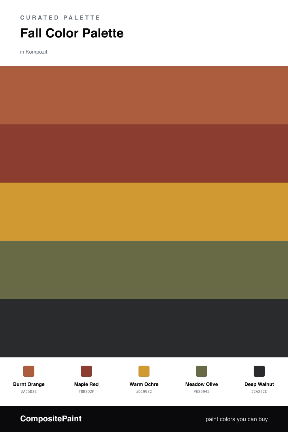
This is the autumn palette I keep coming back to, and for good reason. Burnt Orange carries the whole scheme with that sun-warmed, late-October glow, while Maple Red adds the deeper, slightly smoky note that makes it feel grown-up rather than seasonal-craft.
Warm Ochre is the quiet workhorse here. It bridges the brighter shades and gives your eye a place to rest, and Meadow Olive brings in just enough green to feel current and a little unexpected for 2026.
Finish with Deep Walnut in small doses — a trim line, a single piece of furniture, a frame. It grounds the warmth without dimming it, and that restraint is what separates a rich fall room from a muddy one.
Buy These Colors
Each color matched to the closest real paint in every brand, by ΔE2000. Kompozit first; take any SKU to the store — these mix on demand.
Questions
They all share warm earthy undertones, so they read as one harmonious family instead of competing. The olive cools things just enough to keep the oranges and reds from feeling heavy.
Let burnt orange lead on the largest surface, then weave in maple red and ochre on smaller features. Use deep walnut sparingly for contrast so the warmth stays the star.
Similar Palettes
Closest schemes by color — not by label.