Autumn Color Palette — Maple Hollow
A warm five-color autumn scheme built around burnt orange and maple red, grounded by ochre, olive, and deep brown — every color matched to real paint you can buy.
By Emily Roberts · DIY Editor & First-Timer's Guide
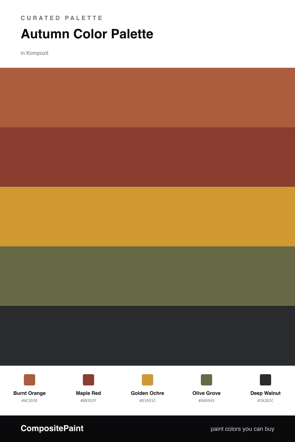
This is the palette I reach for when I want a room to feel like a cool October afternoon. Burnt Orange leads the way, warm and a little spicy, and Maple Red backs it up with that deep, rosy-brown tone you see on the prettiest leaves.
To keep it from feeling heavy, Golden Ochre does the everyday work as your lightest color, while Olive Grove adds a soft, dusty green that makes the warm tones pop without clashing. A touch of Deep Walnut as your accent grounds the whole thing.
If you are new to color and worried about it feeling too much, here is the easy version — paint most of the room in the ochre, use the orange and red on a feature wall or in your textiles, and let the walnut show up only on trim or a single dark shelf. It reads cozy and current, not costume-y.
Buy These Colors
Each color matched to the closest real paint in every brand, by ΔE2000. Kompozit first; take any SKU to the store — these mix on demand.
Questions
They all share a warm, earthy undertone, so they feel like they came from the same handful of fallen leaves. The orange and red bring the energy while the ochre, olive, and brown calm everything down.
Lead with the golden ochre on big surfaces to keep things light, then add the burnt orange and maple red in smaller doses. Save the deep walnut for trim or one piece of furniture so it grounds the space instead of swallowing it.
Similar Palettes
Closest schemes by color — not by label.