Autumn Color Palette — Clay & Ember
A warm five-color autumn scheme built on burnt orange and maple red, softened with ochre and grounded by deep brown — every color matched to real paint you can buy.
By Jessica Williams · Color Stylist & Interior Editor
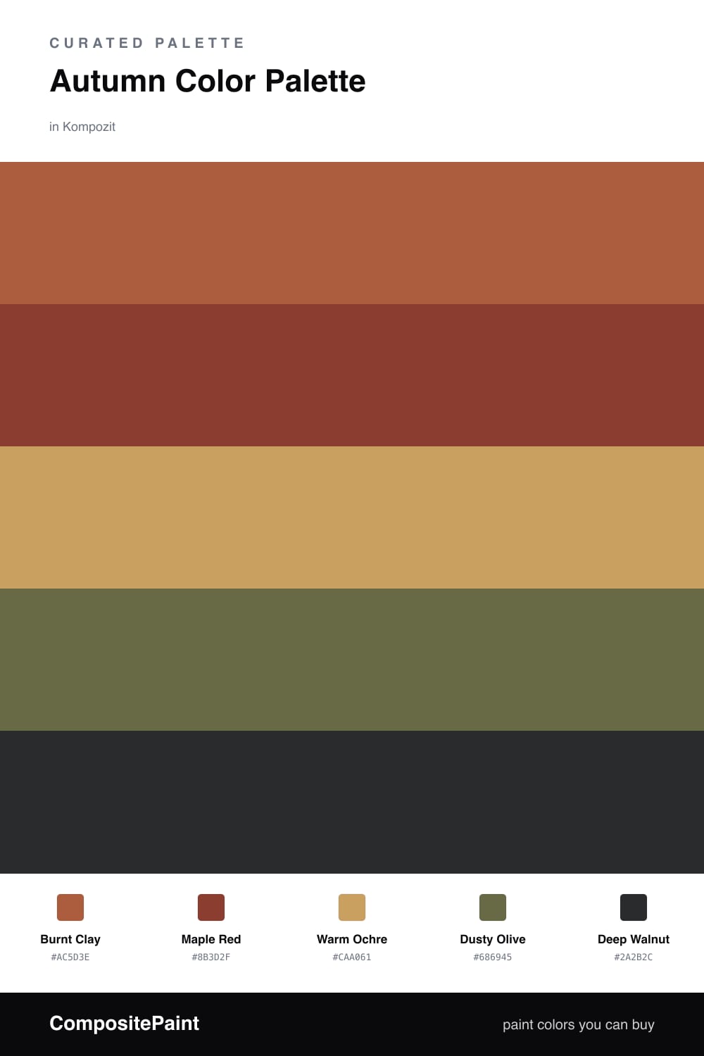
There is a moment in autumn when the light turns thick and golden, and this palette chases that feeling. Burnt Clay leads as a soft, earthy orange that reads warm without shouting, while Maple Red deepens the mix with the color of turning leaves.
Warm Ochre is the quiet workhorse here — pull it across walls or large pieces so the bolder shades have room to breathe. Dusty Olive brings a contemporary, slightly muted green that keeps the whole scheme from feeling like a costume, and it is one of the most-loved supporting tones I am seeing in 2026 interiors.
Finish with Deep Walnut in the smallest doses — a frame, a leg, a shadow line. It anchors everything and makes the warm colors above it glow.
Buy These Colors
Each color matched to the closest real paint in every brand, by ΔE2000. Kompozit first; take any SKU to the store — these mix on demand.
Questions
It feels warm and grounded, like late-afternoon light in October — the clay and maple tones bring heat while the olive and walnut keep it calm and rooted.
Let the ochre carry the largest surfaces so the deeper clay and maple read as warmth rather than weight, then use walnut only in small grounding doses.
Similar Palettes
Closest schemes by color — not by label.