Fall Color Palette — Velvet Harvest
A warm five-color autumn scheme of burnt orange, maple red, golden ochre, olive, and deep chocolate brown — every color matched to real paint you can buy.
By Jessica Williams · Color Stylist & Interior Editor
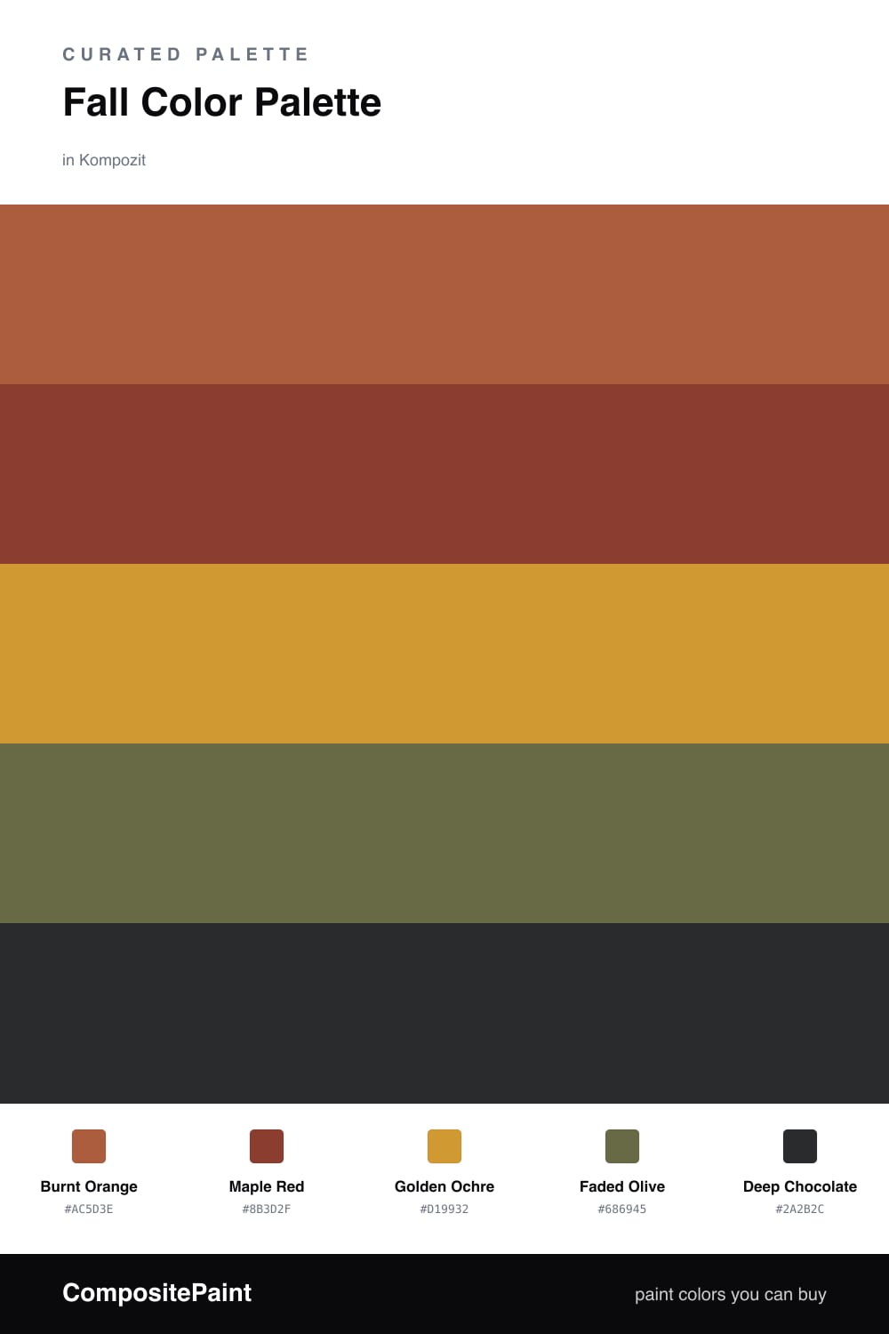
This is the palette I reach for when the light goes low and gold in late October. Burnt Orange leads the way, that lit-from-within shade you see on a maple just before it lets go, and Maple Red deepens it with a darker, wine-touched warmth.
Golden Ochre is the quiet workhorse here, soft enough to wrap a whole room without shouting, while Faded Olive slips in like a cool breath of garden green to keep everything from feeling too toasty. It is the move that makes this scheme read 2026 rather than 1974.
Ground the whole thing with Deep Chocolate used sparingly — a doorframe, a leather chair, the legs of a table. Keep the orange and red as your accents and let the ochre and olive do the steady, lived-in work, and the room will feel like a sweater you never want to take off.
Buy These Colors
Each color matched to the closest real paint in every brand, by ΔE2000. Kompozit first; take any SKU to the store — these mix on demand.
Questions
They all share a warm, earthy undertone, so they feel like one family pulled from the same fall afternoon. The olive cools things just enough to keep the oranges and reds from feeling heavy.
Let the golden ochre carry the larger surfaces and keep the deep chocolate for small grounding moments — trim, a frame, or a single piece of furniture.
Similar Palettes
Closest schemes by color — not by label.