CP

Autumn Color Palette — Autumn Smoke

A warm five-color autumn scheme built on burnt orange and maple red, grounded by ochre, olive, and deep brown — every color matched to real paint you can buy.

By Maya Patel · Reviews Editor & Product Tester

Burnt Orange
Dominant
Kompozit Pretty Parasol · 1039
#AC5D3E
LRV 17
Maple Red
Secondary
Kompozit April Love · 1061
#8B3D2F
LRV 9
Warm Ochre
Base
Kompozit Sunrise Heat · 0920
#CAA061
LRV 39
Smoked Olive
Support
Kompozit Old School · 0410
#686945
LRV 13
Deep Brown
Accent
Kompozit Silent Sea · 0515
#2A2B2C
LRV 2
View palette in

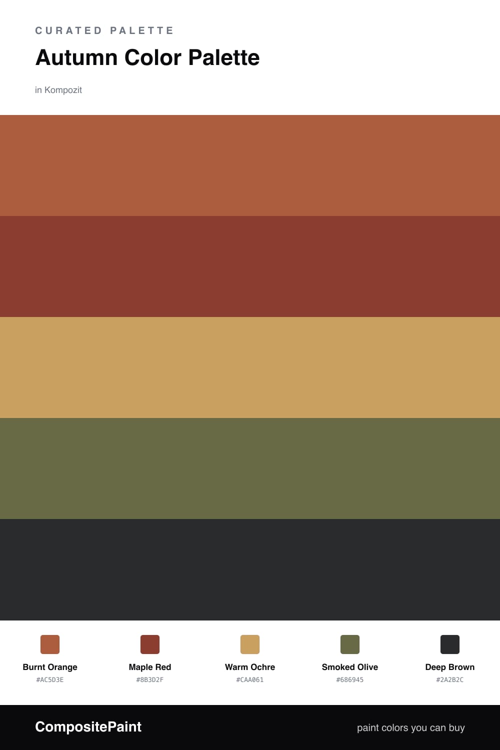
Autumn Smoke is what happens when you take a pile of fallen maple leaves and turn the saturation down a notch. Burnt Orange carries the whole scheme, the kind of warm, smoky terracotta that feels current rather than rustic, and Maple Red sits right beside it as a deeper, redder echo.

I’d build the room around Warm Ochre as the quiet base — it does the heavy lifting on the big surfaces and lets the brighter shades pop. Smoked Olive is the move that makes this feel 2026 instead of a 1970s den; that muted green cools the palette just enough to keep it sophisticated.

Use Deep Brown sparingly. A trim line, a single cabinet, an iron fixture — that is all it takes to anchor everything and give the warm tones something solid to lean on.

Buy These Colors

Each color matched to the closest real paint in every brand, by ΔE2000. Kompozit first; take any SKU to the store — these mix on demand.

Burnt Orange
#B45A2B · LRV 17 · Dominant
Kompozit Pretty Parasol · 1039 ΔE 4.34
Backdrop Bahaus · BD-BH ΔE 16.25
Behr Thanksgiving · M210-7 ΔE 4.69
Benjamin Moore Pilgrimage Foliage · 2175-20 ΔE 2.97
Clare Sriracha · PNT100-DP-29 ΔE 12.59
Dunn-Edwards Georgia Clay · DE5181 ΔE 5.17
Farrow & Ball Blazer · No. 212 ΔE 12.34
Magnolia Home On Bosque · JG-36 ΔE 5.58
PPG / Glidden Fragrant Cloves · 1199-7 ΔE 3.13
Sherwin-Williams Earthen Jug · SW 7703 ΔE 3.45
Valspar Ripe Peach · P045 ΔE 2.36
Maple Red
#8C3A2E · LRV 9 · Secondary
Kompozit April Love · 1061 ΔE 0.99
Backdrop Stage Beauty · BD-SB ΔE 4.65
Behr Firebrick · 210D-7 ΔE 2.56
Benjamin Moore Tea · 2091-10 ΔE 2.72
Clare Vintage · PNT100-DP-67 ΔE 9.71
Dunn-Edwards Deep Crimson · DEA152 ΔE 3.86
Farrow & Ball Incarnadine · No. 248 ΔE 6.82
Magnolia Home Create · JG-28 ΔE 7.79
PPG / Glidden Brick Dust · 1056-7 ΔE 4.74
Sherwin-Williams Bolero · SW 7600 ΔE 2.54
Valspar Decadent Red · 2002-5A ΔE 0.55
Warm Ochre
#C99A4E · LRV 36 · Base
Kompozit Sunrise Heat · 0920 ΔE 2.95
Backdrop Carry the Two · BD-CT ΔE 15.59
Behr Solid Gold · M280-6 ΔE 0.87
Benjamin Moore Maple Sugar · 2160-30 ΔE 1.55
Clare Good as Gold · PNT100-DP-59 ΔE 4.69
Dunn-Edwards Gingerbread House · DE5334 ΔE 0.71
Farrow & Ball India Yellow · No. 66 ΔE 1.69
Magnolia Home Juniper Tree · JG-166 ΔE 13.92
PPG / Glidden Allspice · 1207-6 ΔE 2
Sherwin-Williams Alchemy · SW 6395 ΔE 1.49
Valspar Wild Mustard Seed · M159 ΔE 2.72
Smoked Olive
#6B6A45 · LRV 14 · Support
Kompozit Old School · 0410 ΔE 1.04
Backdrop Buenos Aires · BD-BA ΔE 15.33
Behr Portsmouth Olive · HDC-CL-20 ΔE 0.57
Benjamin Moore Guacamole · 2144-10 ΔE 2.21
Clare Daily Greens · PNT100-DP-61 ΔE 8.52
Dunn-Edwards Spruce Woods · DE6238 ΔE 4.86
Farrow & Ball Bancha · No. 298 ΔE 1.45
Magnolia Home Landscape · JG-49 ΔE 2.62
PPG / Glidden Olive Orchard · 11-08 ΔE 2.66
Sherwin-Williams Oakmoss · SW 6180 ΔE 3.44
Valspar Fresh Cilantro · V059-6 ΔE 1.82
Deep Brown
#3A2A20 · LRV 3 · Accent
Kompozit Silent Sea · 0515 ΔE 10.84
Backdrop Hocus Pocus · BD-HP ΔE 12.7
Behr Bitter Chocolate · 790B-7 ΔE 7.4
Benjamin Moore Wenge · AF-180 ΔE 4.86
Clare Blackish · PNT100-DP-54 ΔE 12.42
Dunn-Edwards Black · DEA187 ΔE 10.32
Farrow & Ball Pitch Black · No. 256 ΔE 9.52
Magnolia Home Moments · JG-150 ΔE 5.8
PPG / Glidden Black Magic · 1001-7 ΔE 11.26
Sherwin-Williams Polished Mahogany · SW 2838 ΔE 6.79
Valspar Noblesse Oblige · 8004-2G ΔE 6.77

Questions

Why do these autumn colors work together?

They all share a warm, earthy undertone, so they read as one family rather than a clash. The burnt orange leads, the maple red echoes it deeper, and the olive cools things just enough to keep the warmth from going sweet.

How do I keep this palette from feeling too dark?

Lean on the warm ochre as your base and let the deep brown stay an accent. A roughly 60/30/10 split — orange and ochre up front, olive in the middle, brown in small doses — keeps it grounded but never heavy.

Similar Palettes

Closest schemes by color — not by label.